User Interface is for Cool Kids
Common Mistakes
UI is one of my pet peeves in lots of games, especially small ones. Usability and user interface is one of those things where it's easy to mess up when there's only a couple people working on a project because you get too close to project. It takes effort to think about what a player sees when they first boot up a game, ("What does THAT mean?" Syndrome),and it often gets lost thinking about more generally 'fun' things, like graphical effects and gameplay wouldn't-it-be-cool-if's (like: "Wouldn't it be cool if you could shoot lasers out of your FACE?"). Too often it seems like people get sucked into their own games, and forget people aren't going to know right away that font-size 6 number in the corner is their health or that the yellow bar on the left side measures how much energy they have.
I personally have a lot of fun designing HUDs and menus, which is probably related to the fact that I'm writing a whole journal entry about this.
What We Gonna Do
Make a HUD that's easy to comprehend and will allow the player to know what's going on within the first couple of minutes of playing. I want them to be able to glance up and understand most of what's going on. The shield is the most straightforward thing, I don't expect too many people to not get that, especially since we can assume most of our audience is going to be used to playing lots of games. Heat might take a minute, since you have to be firing for it change. I'm sure most players are going to overheat before they realize what it does, so we're probably going to include a couple of text warnings that flash on the screen before the actual overheat freeze ("Overheat Freeze," heh). Like having around 80% percent something like "Danger- Overheat," 90% "Overheat Imminent," with "OVERHEAT- PURGING SYTEM" if you get all the way there. Ammo itself is straightforward, but it's relationship to energy and shields is going to be tricky (see last entry).
Ideally, you'd have the Ammo and Shields next to each other somehow, with a large moving thing to indicate what was "charging," probably a big-ass arrow. Our HUD is already showing some signs of inadequate planning, however... you know what? I'm going to do that right now.
[At this point, I'd like you to picture a movie-montage of me studiously MS Painting away... set to the "It's a Montage" song from South Park]
So after realizing the way I made the old HUD was somewhat counter-intuitive (and hypocritical based on my dislike for crappy UI) I decided to implement some changes. I had already been working on making a more graphically polished version, but it was still kind of a pain to switch things around in a logical manner. Here's a graphical comparison of the old HUD and the newer, better-er version:

Yay or nay?
Further Reading
For some recent and excellent rambling on GUI's, check out EDI's journal. More specifically:
Minor Renovations
If you haven't noticed, I changed the banner a little bit and added my XboxLive Gamercard, because Xbox is really the only thing I have much time to play anymore. "Fuzzy Side," by the way, refers to the fact that this journal is non-technical (ie, non-programming) with a focus on art, game design, and writing at the hobbyist level.
Sometime I might take a crack at altering the color scheme, which would require some learning of CSS and the like, which I probably should have done years ago considering my 6th-grade level knowledge of HTML. See Slather's Journal for what I'm talking about.
Parting Shots
So Sir Sapo, Partisan's programmer and my long-time friend, is on the US Air Force academy flying team, and they have a joke about the airplane they fly, the Cessna 150. Since it's an official US Air Force aircraft, it has the same style documentation, manuals, etc. as say an F-15 or F-16. This leads to the team jokingly referring to it as the AC-150, a reference to the AC-130 Gunship (it was in Transformers). Apparently they wanted shirts made of a '150 loaded up like a real warplane, and Sir Sapo said he "knew a guy..."
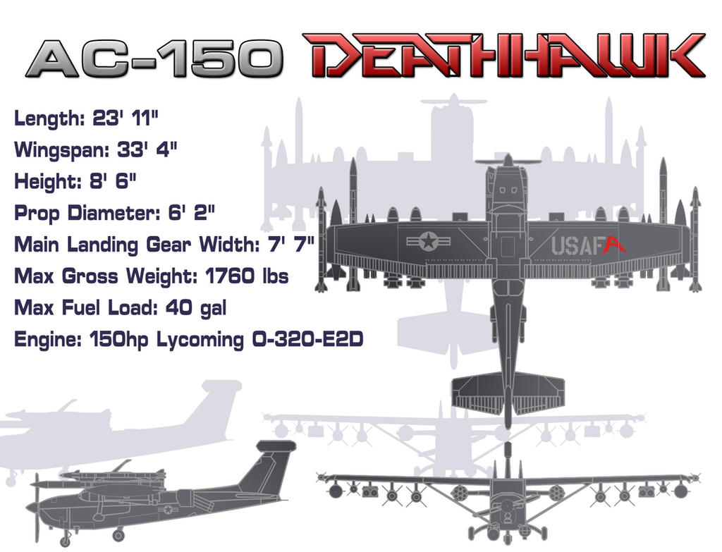
I'm that guy.
-Goodnight!