Introduction
I've worked building tools and engines for artists making games and visual effects for more than ten years, and I've always been baffled by the distinction that people make between "programmer art" and "real game art". Also, I've noticed that the only people who will give you a free pass for bad programmer art are other programmers. Regardless of how fun your game is, or how technically awesome your tech demo is, the non-programmers you show it to are going to think: Is that a jetpack or a tumor?Often, you can find a way to generate good art without having to create it from scratch. Mason McCuskey offers some excellent suggestions for sources of game art in his article "Creating Good Game Art When You're Not An Artist".
But sometimes, you just have to create your art from scratch. Budgetary restrictions or game contest rules, or simply a tight deadline for a prototype might require you to set down the figurative slide-rule and pick up a paintbrush.
But I can't draw...really.. I mean, look at this:
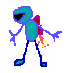
If that's what your programmer art looks like, this article is for you.
I thought I'd share a set of tips for making better programmer art. These tips are intended to be useful to anyone, regardless of artistic ability or experience. While tips like "practice sketching everyday" or "visit an art museum" might be useful for the aspiring game artist, this document is meant for the non-artist, how to trick people into thinking that you--the left-brained, code-writing, math-loving programmer--have some artistic ability. In addition, none (mostly) of these tips require "practice", because, while practice is useful and even essential to being a true artist, it always seems like the your deadline is coming up with the sunrise and you just need some damn sprites.
Some of this is aimed at Photoshop users, because that's what I know, but the same concepts apply to any paint program, and there are equivalent operations to everything I mention here in the Gimp, and probably in whatever package you use.
This is also aimed at participants in LudumDare or similar contests where you try to create a game from scratch in 48-hours. My compo games tend to fare well in the graphics category (alas, killer gameplay continues to elude me), even though I don't consider myself a particularly good game artist. Many of these example come from my LD entries, and much of this experience is stuff I learned by doing these contests and being forced to generate art with an insane deadline. Moreover, they should be valuable to anyone trying to produce quality art (or some approximation thereof) with a short schedule or limited budget.
Tip #1: Start with a Color Palette
The is the most common mistake I see, and the easiest to avoid. The default palette for most paint programs hearkens back to the DOS days (can you find the connection between the colors in this palette and the four-bit binary numbers from 00 to 15? Of course you can. If you couldn't figure that out, you'd be a real artist.)
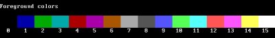
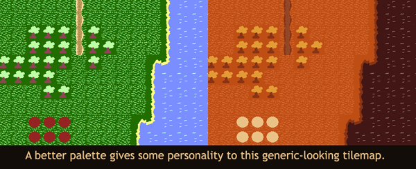
By palette, I don't mean a 16 or 256 color palette from the VGA days. I simply mean a coordinated color scheme for your game. If you start with a well chosen palette first thing, your scribbles will appear aesthetically pleasing and even intentionally "graphic designy" rather than "crap".
But where do I find a palette? I can't even coordinate colors when I dress myself in the morning!
Well, a little color theory goes a long way, and if you spend fifteen minutes googling "color theory" or "colour theory", which is the inferior British version of the theory, you'll be ahead of the game. But if you don't have time for that, here's a few things that work wonders:
- Use a photographic image. Think about the theme or setting of your game, and find an image that reminds you of it. If you're making an abstract game, consider theming it, but you can just find
any image you like. Then, when making your game art, NEVER use the color chooser, instead ONLY sample colors from your palette image with the eyedropper tool. With a little luck, your game will pick
up the "mood" of this image.
- Use a palette from a real artist. There are sites listed below that have great pre-built palettes to start with. Start with one of these, and use the colors in your game. With this approach,
you'll often need more than the 5 or so colors you get in the palette.
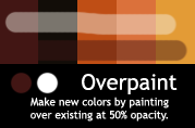
- Resist the urge to free-pick from the color chooser, instead, make new colors by combining ones from your palette. For example, draw atop the palette with a semi-transparent brush.
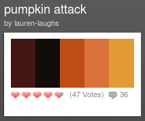
This example uses a "monochromatic" palette, all the colors are different shades of a very similar hue, other color schemes have more variety but what's important is that the colors all work together well.
Resources:
- Adobe's Kuler Site
- ColourLovers
- MultiColr from idee labs
This awesome site is the best of both worlds: make a palette and get a bunch of photos that go with it. Just pick a few colors you like, then pick an image that looks good, then color-pick from it. Done!
Tip #2: Hide your shame with a clever theme
I can't draw!
Maybe, you're just too cool to draw. Maybe it's intentional. That's it. Instead of making good art, choose a theme that requires bad art. It worked for "SketchFighter" and "Crayon Physics"


Or use what you've got available. Just got some crap on your desk? You could have made one of the most popular games of all time, Desktop Tower Defense.

People are starting to catch on to this trick, but it's got a few years of life left in it. Be creative... maybe your characters are all gingerbread cookies, and you can literally bake them up. Or some kind of zombie bacon attacking your kitchen. Or even a furry chest in need of a shave.
Tip #3: Simple Shapes and Silhouettes
Circle, Square, Triangle, Rhombus, Trapezoid, Parallelogram, etc.. You know how to compute their area exactly, but do you know how to draw them badly? Sketch a couple of shapes freehand, and then add eyes (for a character) or wheels (for a vehicle) or whatever. They'll probably come out wobbly and goofy, not very precise at all.
Depending on how much coffee you've had already, they might be a completely different shape. That's ok! That's good, in fact, as the imperfections and variations create "personality" and make them come alive. Don't use the "shape tools" in your drawing program, it is the destroyer of sprite's souls. By making their forms distinct, you make it easy for the player to differentiate between them visually.
"Smiles" from Sykhronics is a great example of this. Distinct shape and color help you immediately recognise the shapes. You could probably still play the game on a two-color iPhone.
Look at the silhouettes of the shapes. You can use "threshold" or select the outside, invert it, and fill on a new layer, to see this directly. Can you tell what they are just by their outline? Can you tell them apart at least?
This is even more important in 3D. Assign a solid black material and view the model on a white background (or vice versa). Zoom out until it's as big as you expect it to be on the screen during normal gameplay. Does it read?
Resources:
This is explained way more eloquently in this blog post:
Good Design lies in the foundation
Tip #4: Draw more than you need
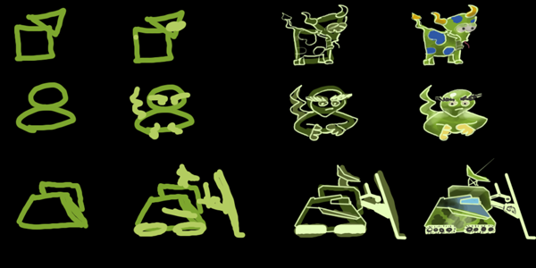
For the next few tips, we'll develop a sprite for a hypothetical platformer. Let's say we need an enemy, something you can't jump on top of without taking damage. My first though was some kind of spikey turtle (real original, huh?).
The first mistake a programmer will make is to think that his or her ugly sprite will get better by just continuing to work on it. It won't! If it starts out bad, it stays bad. So instead of pixel-pushing for an hour, just sketch a bunch of and only detail the one you like the best.
I started sketching some random enemies, not putting to much detail or thought into them. You can do this quickly and just abandon anything that's not working. I didn't like my turtle at all (he looks kind of like a vampire ferret that someone set on fire). I decided I liked the lobster guy the best, because of his interesting shape, clear silhoutte, and I think he's kind of a unique enemy.
Tip #5: Work at higher resolution
For sprite art, I work at 10x the resolution I need. So if I am making a 64x64 sprite, I work using at least 640x640. Sometimes, a rather ugly character at hi-res becomes a pretty good sprite. Even for backgrounds and logos and stuff, I try to work at 2-3 times the target resolution. If you are careful about the edges when downsampling (see next tip) you can get lots of detail with crisp edges.
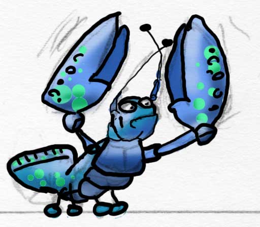
For the lobster guy, I took the original sketch and traced over an outline. I typed "lobster" into Google Images and that gave me the idea to make him blue instead of red, and gave me some ideas for more details. Then I colored him in on a different layer below the outline, so I didn't have to worry about messing up my outline. Once he was filled in with solid colors, I set "lock alpha" on and just added some shading.
Don't lose sight of the fact that you're going to downres the heck out of him. You can get caught up in drawing all kinds of fine detail, but it will all get turned to mush in the next step. It's always a good idea to zoom out to get an idea of what the finished product will look like (or just check the Navigator window).
He's still kind of sloppy and not very detailed but next we're going to downsample him and that will hide all of that. Well, mostly.
Tip #6: Watch your Edges
Photoshop (and other paint programs) tries to helpfully blend everything together, giving you nice, smooth antialiased edges. Which is great, except when you want a crisp edge for your 1-bit alpha. Photoshop has ruined many a 3D tree-billboard and beautiful 2D sprite edge with it's overzealous edge mushing. Here's my workflow for making sprites into game-ready images. I should make this an action or a script, someday, but it's pretty simple:
Step 1: Isolate the hi-res version on a transparent background
Step 2: Downsample to target resolution
Here's he's (just about) 64x64, still against a transparent background.
Step 3: Make a crispy edge
Here's how to get the edges right:
- Magic Wand the transparent parts. Important: Set a very low "tolerance" value and most importantly, make sure "anti-alias" is set to OFF.
- Invert the selection (CTRL-SHIFT-I). It should be about a pixel or so bigger than the subject.
- Make a new layer underneath the subject, and fill the selection with solid black (or your outline color).
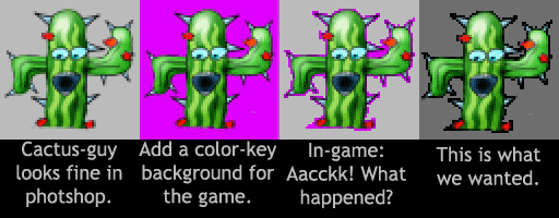
- If you're game engine wants a color-key background like in this example, add it now as a solid layer below. If you're using transparency, just leave the transparent background as-is.

Step 4: Clean up the pixels
Only now do you start messing with individual pixels. Your outline will probably be a little chunky, use the pencil tool to clean it up, and also add detail to the parts of the sprite that got a little blurred in the downsampling. Here, I just cleaned up the face, the tail, and the antennae.
The point is the most time-consuming way to paint a sprite is one pixel at a time. So you want to put off on this step until as late as possible.
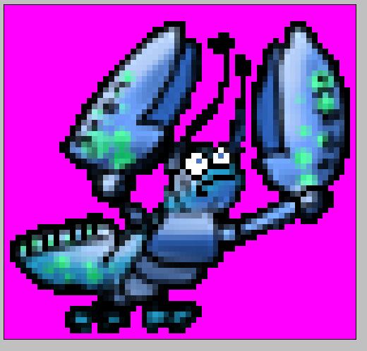
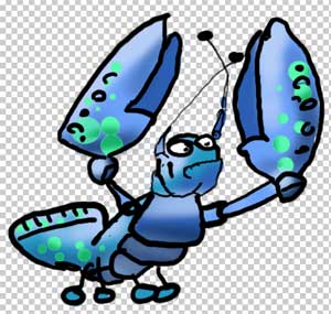
Done: The final enemy sprite
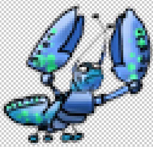
Here's the final sprite at regular and 2x size. It's not perfect, and it's certainly not going to get me a job at Square or anything, but it turned out all right for programmer art.
Tip #7: Create Variations
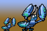
You might want twenty monsters or spaceships for your game. Great! But you only have so much time. If you create one or two monster-spaceships that you like, you can make variations of them. Change the color. Many of the creatures in "Diablo" were just other creatures with different colors. Same deal with Pac-Man. Or you can change the scale, cut and paste parts. Instead of a meatasaur, vegisaur and a monkisaur, create a whole genus of related meatsaurs with slighty different features. You can turn out five or ten variations in the time it takes to do one new creature.

With the hue/saturation tool, I made a red version of the and erased his antennae. Then I added wings to get a completely different enemy. An added bonus of this technique is that it will make all your enemies look stylisticly similar, so your levels look more consistent, almost as if you planned it that way.
Tip #8: Avoid Animation
The word "animation" comes from the ancient Sumerian "A'Nimaatii", which was a type of slave assigned to do a thankless, repetitive task such as rowing or turning a millstone. There is little more painful in game art than have to create not just one frame that looks good, but ten or twenty. So don't do it!- Use a theme that doesn't need it. Spaceships don't need much animation. Vechicles don't really, and you can fake wheels moving. If you can come up with a concept that doesn't need animation, you're much better off. And you'll save yourself some coding time, too.
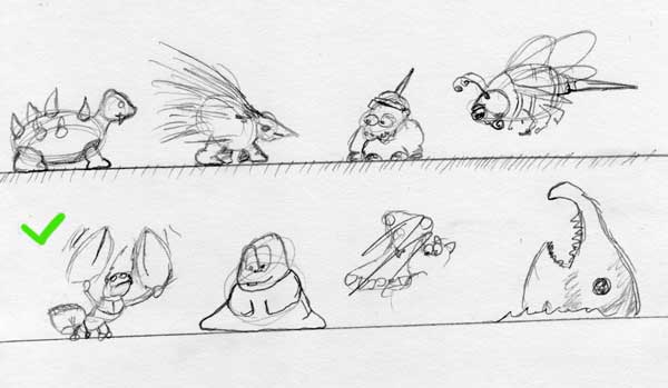
- If you must, start with simple cheats. Just flip an overhead sprite of a character horizontally and you've got a 2-frame run cycle. You can get away with amazingly few frames, look at sprite rips from old gameboy and NES games to see just how few. Final Fantasy Sprites
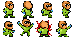
- Use templates. Don't steal a sprite rip, but steal the poses from it. For this sprite, I found an example of a sprite from Mega-Man, and drew a new sprite, but used the same poses.
- Rotoscoping: it's not just for singing orcs anymore. Many digital cameras have a "burst" mode, or you can film a short video and extract the frames. Film yourself doing a few simple actions, extract the frame and start tracing. Recognize this? Warning: this can turn into a time sink if you're not careful, so don't get carried away filming stuff. It's just a guide.
Tip #9: Skyboxen
Making a 3D game?
Implementing a simple skybox is not very hard to do. But in terms of visual bang-for-the-buck, they can't be beat. The skybox does the important job of FILLING THE SCREEN WITH SOMETHING.
I say "skybox" here but this could be any type of panoramic background, from a cube-mapped skybox, to a panoramic image on a sphere or hemisphere, to a simple background image for a 2Dish game.
But where do I get a nice skybox image?
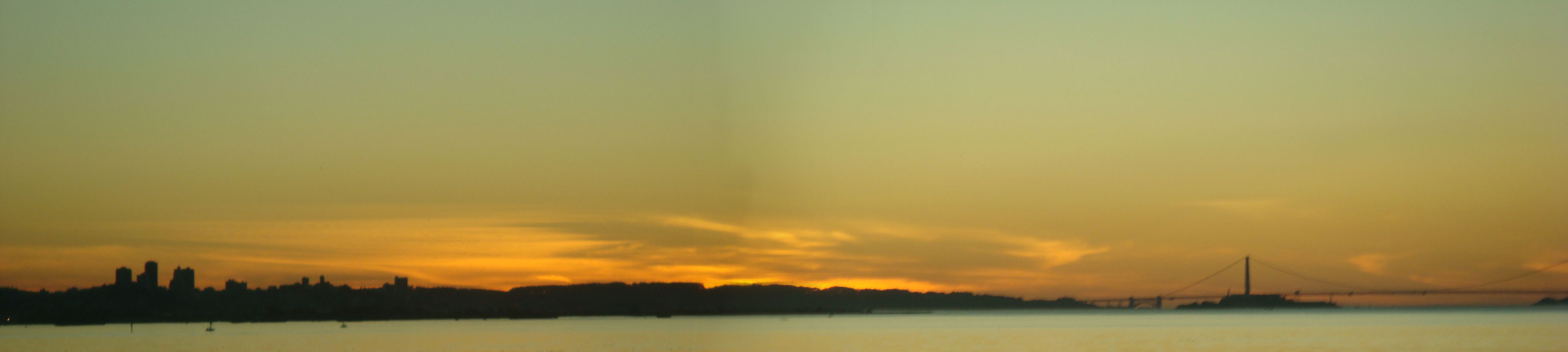
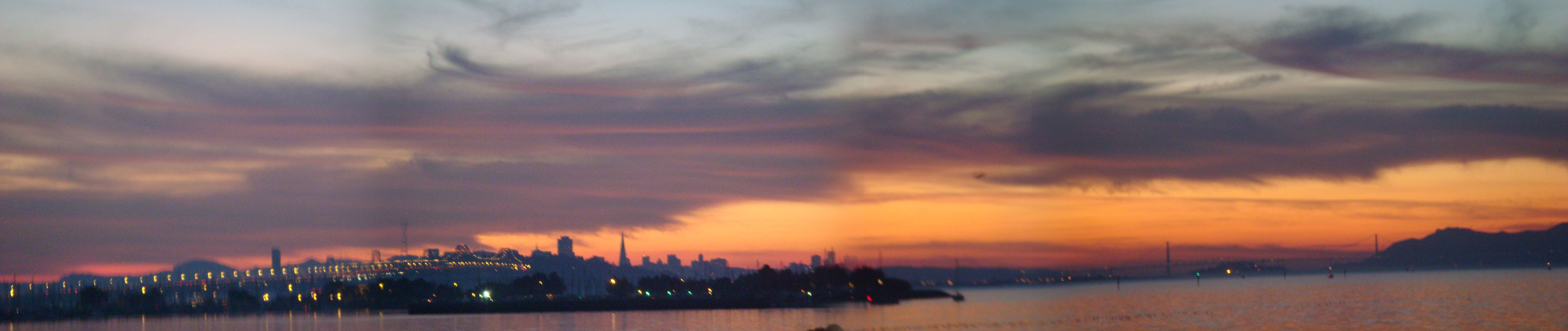
- Wait until sunset or a nice cloud formation wanders by, go outside (or get up to your roof) and take some photos. Obviously, this is weather dependent, you don't get brilliant sunsets everyday
(unless you live in Florida), but you can post-process the heck out of whatever you shoot. Just to illustrate, the day after I wrote this, I took these pictures on the way home from the supermarket.
This was a little unusual, where I live is not known for gorgeous sunsets like this, but even on a normal day you'll get something.


ps. They're a bit blurry, but I've included links to the full-res versions, so if you want to use them for something go ahead, use without any restrictions. - Paint it yourself! Here's a quick tutorial I whipped up on painting skies:

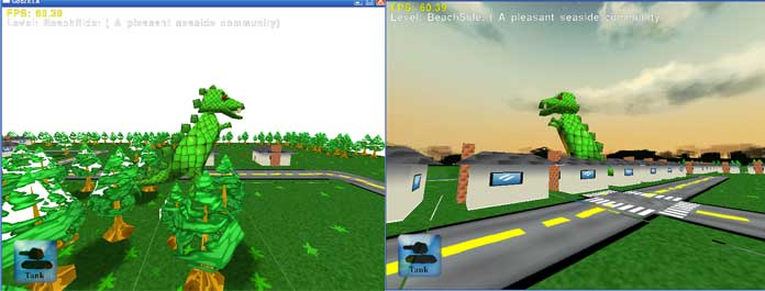
Compare how much better Zillagame (my first ludumdare entry ever!) looks. On the left, no skybox (and an alpha sorting bug), and on the right with the skybox we just made.
- If this isn't for a contest, there are tons of free or reasonably priced skybox images online.
- 1000 skies

- Just google for "Free HDR Skies". You don't need HDR for game purposes but that makes it easier to find. Or search for "Sky Pano" or "sunset" on flickr (but check the license before you use any of these).
- 1000 skies


Also, keep in mind that the sky is the major light source for the outside world. This goes hand in hand with the "color palette" tip above. Use colors from the skybox when making your level and setting up your lighting.
Of course, your game doesn't have to take place at sunset. Unless it's a racing game, I think there's some sort of law requiring that. A clear midday sky, a photoshopped alien landscape, whatever is most appropriate for the setting of your level.
Tip #10: Bake in lighting
This works for a level or a character. It might not be "correct", especially when you mix it with runtime lighting, but it looks good. If you texture your level/character without overlapping anywhere, you can do this without writing an extra line of code by baking light and combining it directly into your color texture map, and if you take a bit of time to handle multiple UV sets you can get full-on lightmapping in your game.
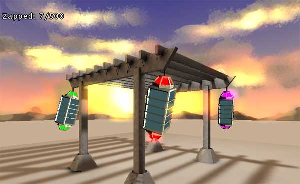
In my 48 hour game, "Bugzapper", all the lighting on the structure is baked into the texture. In fact, I ran out of time to even paint the diffuse texture. The light direction is totally wrong with respect to the skybox, but most people won't notice that, anyways.
Here's instructions on how to use Blender to bake. Maya and others have similar fuctions. Don't worry about baking all the fancy amboccl/normal map stuff, if you're not writing a real game. Just
bake EVERYTHING in ("aka full render bake") to the base texture and then use no lighting or very simple lighting in your game.
Baking Lighting with Blender
Here's another example of using this on a terrain in blender to make it look good:
Blender terrain baking
One word of warning, don't try to figure this out during a contest. Try it out beforehand to get the process down first, you can waste a lot of time figuring out how to do this, but once you have it, it can take 15-20 minutes during a contest and make a huge difference.
Also, wait until you are sure you are final with your model's textures before doing this. You can't unbake, and you don't want to have to do this twice.
Tip #11: Get a Tablet
Even if you have no aspirations to be a game artist, if you are doing any drawing on your computer at all, then you owe it to yourself to get a tablet. You don't need a big one or a fancy one, a 4x6 is fine. You can find used serial tablets on ebay super-cheap, and Wacom's new "Bamboo" looks very affordable. Drawing with a mouse is like drawing with a brick.When a lot of people I know first buy a tablet, they take a while to get used to it. Here's some tips to help make the most of a tablet
- In the control panel, crank up the pressure sensitivity towards firm. You want to have to really mash down on it to get full pressure. By default, the pressure is way too loose and you end up losing most of the control
- Drawing with a sheet of blank paper totally changes the feel. Different types of paper -- copy paper, magazine pages, construction paper, etc -- can totally change the feel. Experiment.
- Practice. I know I said none of these tips require practice, but I lied. Try these exercises:
- In Photoshop, make 10 squares in a row and fill them with greyscale from 0% (black) to 100% (white). Beneath them, make 10 empty squares. Try to shade the squares below to match the guide squares (if you squint your eyes at them). Try this with different brushes, practice the pressure sensetivity.
- Try handwriting something, like the alphabet or copy a passage of text. Start out very large, with huge letters, and get progressively smaller. This will both get your hand used to the tablet, and your eyes used to looking at the screen while you are drawing somewhere else.
Also, in this day of touch-screen interfaces, having a tablet can be a cheap way to prototype touch-style gameplay (though without the multitouch). It's not exactly the same but it's a lot closer than using a mouse.
