Hi! Welcome to Part 3 of my Minimal Pixel Art tutorial. This is the last one of this series & should be fun. Today I'll do some random drawing with you, show some of my favorite techniques for
easily making pixel forms that look like something in particular, and also explore some ways in which I draw the same subjects with varying numbers of pixels. I'll probably talk about other stuff as
well. If you haven't read part 1 or part 2, it might be helpful to do so first.
I'd like to start off with a couple tools I haven't mentioned yet - the Line tool and the Paint Bucket tool. I'll also re-visit one that I've already covered, the Pencil tool, to show you a line-making feature that is very handy.
The Line Tool (U)
If you want to make straight lines, the Line tool (U) is one choice you can make, and it may seem like the obvious choice, but I rarely use it. I'll show you why below, but if you don't care why, jump down to Exercise 9: Drawing straight lines using the Pencil tool.
So, back to the Line tool. The one thing I like about the line tool is that you can see where it's stretching as you prepare to lay your line down. If you want to try it out, make sure you have its settings set as I mentioned in part 1 of this tutorial, because it's got a few other shapes and different options it defaults to, such as drawing vector paths, which won't work so well when making handcrafted pixel art. For easy reference, here are the settings I suggest:

Select the Line tool, click & hold on any spot in a Photoshop document, drag your line to a new spot, let go. Your line is drawn. Easy. As you drag, the line tool will have a helpful outline to show you where it's stretching to. Try it out. To constrain the line to straight horizontal, vertical or 45 degree lines, hold "SHIFT" when drawing your line. You'll see the line tool snap to those angles. These lines will look the best in Photoshop. Other angles may not look quite so good. Below is an example of a bunch of different lines made with the line tool. Some look good, some don't look very good as far as straight lines go.
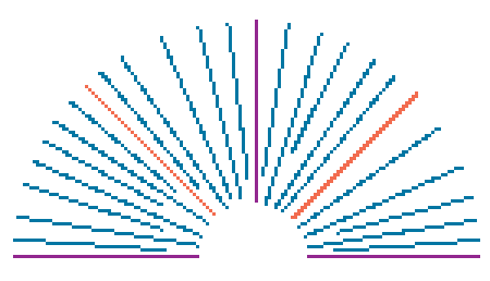
Let's look at this for a moment. As you can see, some of the lines look pretty good, some look kinda rough. Irregular surfaces, doubled pixels in spots that don't seem necessary, etc. This is the line tool doing its best to make these angles while Aliased with so few pixels. Both of the orange lines are actually true 45 degree lines, made by holding the SHIFT key. The reason the one on the right is doubled in thickness is because the Line tool results will vary depending on your starting point. In short, it's due to the computer display being made up of a grid itself, and the line tool just doing its best to make a 45 degree angle based on where I clicked in the first place & where I let go.
Given that the Line tool seems to make poor decisions on where to place pixels, and doesn't always keep to my "1 pixel" setting as well as I'd like, I don't use it. I find that the Pencil Tool does a much better job of making straight lines, particularly at odd angles, and keeping true to the "1 pixel" setting. The trick involves (drum roll please...) the SHIFT key. What a versatile modifier key! Let's draw some lines using the Pencil tool and the SHIFT key.
Exercise 9: Drawing Straight Lines with the Pencil Tool (B)
Open a new document, whatever dimensions you like. I'll make mine 200x100 pixels like the one above. Choose a Foreground color & select the Pencil tool.
To draw a straight line, start by clicking once somewhere on one side of your document, leaving one pixel in that spot. Next, hold "SHIFT" and click somewhere on the other side of your document. Viola! A pixel line is born. If you want to make a line from the last point you clicked, just hold "SHIFT" again and click another point. Or, if you want to start a new line, just click somewhere new without holding shift, and repeat the process. Easy! I don't think an example is necessary.
So, what's the benefit of making lines this way? Speed, precise control and smoother lines. The Pencil tool has a much better ability to make lines without bunching up on unnecessary pixels. I imagine it's partly because the starting and ending points are exactly rooted in specific cells on the pixel grid of your document. I will take the above Line tool example image and draw lines with the pencil tool on a new layer above it, starting and ending exactly where those lines start and end to see what kind of results I get...
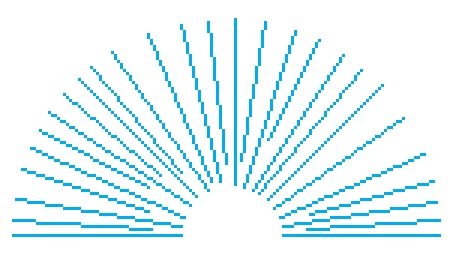
So nice! Clean 1-pixel lines. No doubling up whatsoever, no mess to clean up. Pencil is my hero!
Hopefully that illustrates my love for the pencil tool clearly enough.
The Paint Bucket Tool (G)
So far we've been filling Selections and Layers with color using the keyboard. This is still my main method of filling; however the Paint Bucket has some features that may be useful in more complex situations. Let's spend a moment or two getting familiar with it.
By default the Paint Bucket tool slot is set to the Gradient tool, hence the sensible "G" keyboard shortcut. So, choose the Paint Bucket. I'll show you how I've got mine set:

I almost always keep my tolerance set to Zero for pixel art. Just like the Magic Wand tolerance setting, the greater the number, the greater the range of color it will fill. For the following exercise I'll be keeping the Tolerance set to Zero.
Notice the "Contiguous" option. This is also just like the Magic Wand too. With this selected the Paint Bucket will fill only areas that are touching. Only having corners of pixels touching doesn't count as contiguous.
Exercise 10: Filling with the Paint Bucket tool
Open a new document, whatever size you like. I'll make one around 100x100 pixels. Choose a foreground color, select the Paint Bucket (G) and click anywhere on your document. The Paint Bucket should have filled it in completely. That's how it works at the most basic level. It also can fill Selections and pre-existing areas of color (or value). If you make a selection, click inside of it in order to fill it.
It's also got settings that can control just how it's going to fill what you want. I mentioned the Contiguous option. If Contiguous is turned off, it will fill the same color wherever it appears on a single layer. Try making separated areas (non-contiguous) of the same color on a new layer or the layer you just filled. Use any method you like. Pencil, filling selections, etc. Choose a new foreground color, uncheck the Contiguous option and click on any occurrence of the color areas you just drew. The new color should fill all occurrences of the original color with the new color.
filled it

drew separated shapes
filled 'em with one click.
Contiguous was not checked.
The Paint Bucket also has the ability to fill across multiple layers. Turn that little "All Layers" option on and that's what it will do. I don't usually use this option, but it may be the best thing for some multi-layered color changing situations.
Whew! Enough with the drawing tools! I'm thoroughly bored. Let's move on to one of my favorite techniques for working with color...
Adjusting Hue/Saturation
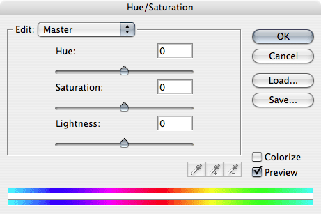
The Hue/Saturation controls allow us to make changes to the color in a very hands-on, real-time way. This feature consists of three sliders, which adjust Hue, Saturation and Lightness of pixel data. The panel looks like this:
The sliders affect your image, or parts of your image and you can see it happening as you move the controls. It's very intuitive and extremely useful. I use this feature all the time when deciding what colors I should make things, in relation to other colors that are present. Particularly towards the end of making an illustration. When I choose colors for anything in the first place, I know already that I may be adjusting the Hue/Saturation, and probably the Levels controls as well at some later point. This makes choosing colors to start with a breeze because it doesn't matter all that much. I try to make it into the ballpark, but sometimes my final colors are nowhere close to the colors I thought I wanted to start with. By experimenting with the Hue/Saturation controls you may find color combinations that are much more exciting than the ones you started out with.
I use this selectively though, usually on one color at a time. I'm not talking about changing the Hue of the whole image at once, which creates very odd results, although sometimes I will do that. More likely I'll make holistic changes with the Saturation or Lightness, or with the Levels controls. Experiment with different combinations for yourself.
Exercise 11: Changing colors using Hue/Saturation and Levels
I'll also touch on Adjustment Layers of these same sorts. Use whatever image you like, as long as you have pixels to adjust somewhere. Try it with a photo even. Hue/Saturation and Levels are great to use on photos.
First, select a Layer with pixel data on it. Open the Hue/Saturation controls with "COMMAND" + "U" on Mac, "CTRL" + "U" on PC. Or, choose "Image" > "Adjustments" > "Hue/Saturation" in the menu up top. Now, adjust the slider controls. Colors change magically before your eyes! Play around with the sliders to your satisfaction until you see what they do.
You can adjust the contents of entire layers, or choose specific elements of a Layer using the Selection tools. The Hue/Saturation controls will adjust only within selected areas if Selections are present.
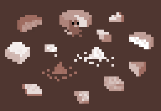
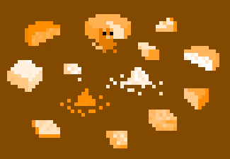
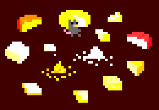
I sometimes check the "Colorize" option. This turns the image monotone, with values intact. Colorize usually only makes sense to try when there's more than one color that you're adjusting at one time. I'll demonstrate this quickly on this image of Rat from our game Ratmaze hanging out with an assortment of cheeses. Note: All of these pixels are on the same layer.
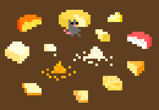
The original Image
I checked the "Colorize" box.
It defaults to a lightly-saturated Red like this.
I adjusted the "Hue" of the colorized version a little, and pushed "Saturation" all the way up.
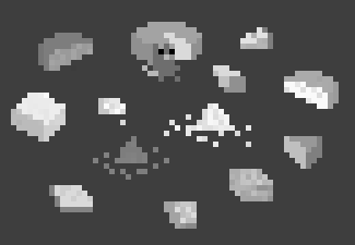
I slid the Saturation all the way down. Instant Greyscale.
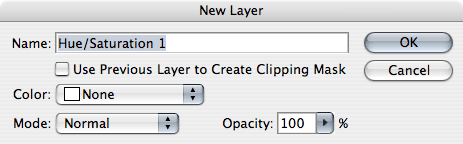
But what if all of the graphics are on separate Layers and you want to do this? This Hue/Saturation control is also available as an Adjustment Layer. This is really beyond the scope of this Pixel Art Tutorial, but I'll mention Adjustment Layers briefly. Let's say I wanted to change the Hue/Saturation of an image that had a lot of layers, and I wanted all of the Layers to be affected. I would add a Hue/Saturation Adjustment Layer to the top of my Layers Palette.
To do this, go to your Layers Palette (you'll have to have an image open to try this). Select the top layer, so that the new Adjustment Layer will be at the top, affecting every layer below it. Now in the main Photoshop menus, choose "Layers" > "New Adjustment Layer" > "Hue/Saturation..." (there's no keyboard shortcut for that). Before the Adjustment Layer appears, you'll get this box:
If you click "OK", this will open up the Hue/Saturation controls, and the changes you make will affect all Layers in your file. When you finish with your adjustments, the Adjustment Layer will appear in your Layers Palette. If you select the "Use Previous Layer to Create Clipping Mask" option, the Hue/Saturation Adjustment Layer will affect only the layer below it. Below is what it looks like in the Layers Palette for both options:
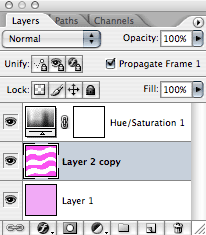
Will affect all Layers
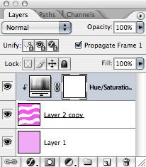
Will affect only the Layer below itself
Adjustment Layers are really great and are non-destructive, meaning they only affect your Layer(s) as long as they're turned on. You can turn them off, change the opacity decreasing their effect, go back into them to make adjustment changes, choose any of the range of blending options in the Layers Palette, etc. And there are other Adjustment Layers you can choose as well, including Levels.
Adjusting Levels
Just like the Hue/Saturation controls, there are Levels adjustment controls. If you have an image open and some pixel data to manipulate, open the Levels controls with "COMMAND" + "L" on Mac, "CTRL" + "L" on PC. Or, choose "Image" > "Adjustments" > "Levels". You'll get this control panel:
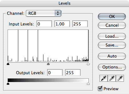
Levels are my other most-used controls. In the same way the Hue/Saturation is real-time, so is Levels. See the changes right before your eyes. I usually just stick with the 3 sliders for the main "Histogram" area. Dragging the Black one will darken the darkest parts of your graphics. The White one will lighten the light areas of your graphics. The Grey slider will affect the mid-tones. I'll use the Rat & cheese image again as my example.
Original image. Rat doesn't know what he's in for.
Some increase in the lights and the darks.
Extreme dark & contrast, sliders all very close to each other.
Extreme light & contrast, sliders all met at a point.
And of course, you can make a Levels Adjustment Layer just like we did with Hue/Saturation. Choose "Layers" > "New Adjustment Layer" >" Levels..." There are other adjustment types as well, but these are the ones I use most. Some people like Curves a lot, but I like these more. Hue/Saturation and Levels together really allow great control over color. Note to Adobe: It would great to see the Levels sliders within the Hue/Saturation panel as well. It would also be great to be able to zoom in well beyond 1600%.
Playing with Pixels
Alright. I think it's finally time to step out of the classroom to run around the metaphorical schoolyard. As if what we've been learning in class were the techniques of playing and now we get to apply them creatively.
I could also call this section "Explore", "Dive in", "Have fun", Finding your style(s)", or even "Allow things to unfold naturally ". That's my favorite one. Pixel by pixel, color by color, form by form, things emerge, inspiration strikes, ideas are followed, and nothing becomes something. Discovering what feels best when you see it, this is the path of finding one's own style. What feels good inside when you see it? Notice that. You may find many styles that you like to work with. It's being open to creative flow & process, as much as it is that the Pixelverse is sort of magical in its own right. How is it that these blocky forms are so charming? I don't know, and I don't have a need to figure it out. I am glad for it and whatever it is that keeps me compelled and feeling good about spending so much time in the pixel world.
I mentioned in Part One that I use a Wacom drawing tablet. I have done pixel art for a long time with the mouse, and even lots of time spent on the trackpad of a laptop, but having used the drawing tablet steadily for a while I have developed a real appreciation for it. If you're planning on spending a significant amount of time drawing on the computer (in any way) these are so great. And a small one is perfect since you can carry it around easily with a laptop, to coffee shops & the park for example. The laptop becomes a much more hospitable place for doing serious illustrating or the most simple pixel art.
Exercise 12: Make Stuff
How about we stop reading in a moment, go into Photoshop or other graphic editing program you are using, and just start making stuff. I'll do it too. I'll start with the pencil tool. I'll create a 300x300 window and zoom into all the way (1600%), which is not nearly as close as I'd like to get. I'll try to make 10 things or more that I like. I'm going into this without any desire to make anything in particular. I'd recommend you try this, but if you want some direction, choose an object, or an animal or something simple you'd like to see in pixel form. Things in profile are usually easy to get started with. Or just draw messes of pixels. That's also a great way to get started.
[time passes]
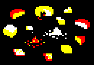
Alright, here's what I spent the last half hour doing:
I made a bit of a mess down there when I was starting out but it helped loosen me up, and enjoy the shapes. Sometimes they spark ideas. The cat started happening, then the girl & then the Owl. I began playing with some isometric shapes. I love Isometric pixel art and video games but have only minimal experience making it myself. It would be cool to make a game in that style, so maybe I'll get into it at some point.
In the above example, I didn't have any direction to start with, just to see what might happen. In this case I've got some stuff I can work with, the Owl, the little birds could become the inspiration for a mini-game, the woman's head is something different and I like it. It started with a mess of pixels that looked somewhat like female hair profile, and I went from there. It was a little tough getting started, but I relaxed about the outcomes and a good time was had. There are even some nice things that came of it that I can use later if I like in a game or some other art.
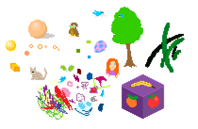
Other times I may go into drawing with specific ideas or intents, like designing characters and objects for a game. I like to make a "brainstorming" sort of file, in which I just explore and experiment on themes. For example, this is the file I worked with when creating much of the style and graphics for our game Gamma Bros. If you are a Gamma Bros fan, this may contain a few things that may make it into Gamma Bros 2. Spoilers, if you don't want to look. Click it to see it double size:
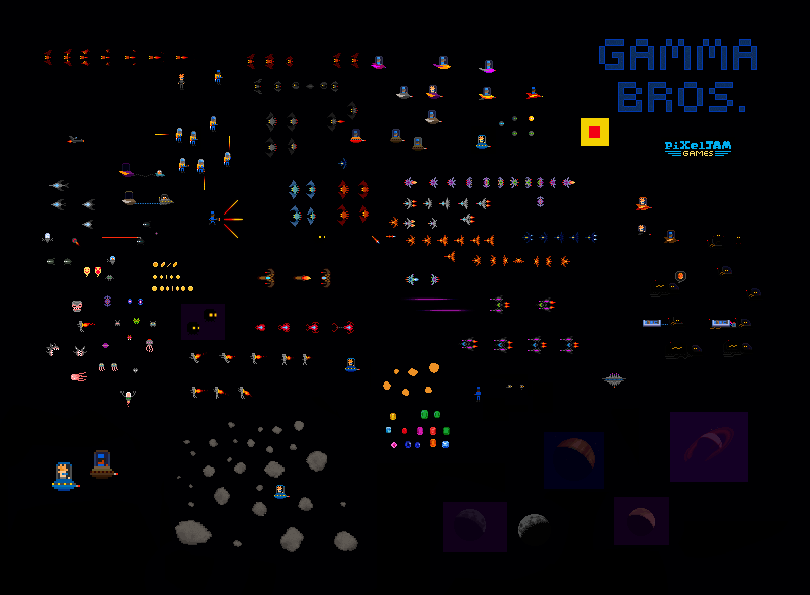
And to play the actual game Gamma Bros, go to http://pixeljam.com/gammabros. It's free.
Exercise 13: How Many Pixels, How Many Colors?
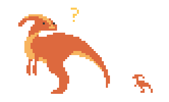
Oh the seemingly unlimited options! Choose an object, or an animal or something you'd like to see in pixel form, and spend some time making it, in as many different ways as you can. Start with very few pixels, as few as you can possibly use, and move on to another version, and another, and another. I'll show you some of what I've done with examples of Dinosaurs from our upcoming game Dino Run:

I have been enjoying making pixel dinosaurs for Dino Run. Dinosaurs look great at any pixel level. I could have played around with adding more and more color and texture, but this is as far as I want to take it in this example.
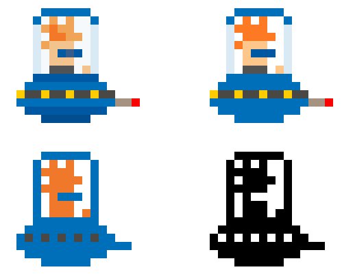
And what about varying degrees of color? Below is an example of Buzz from Gamma Bros with 4 varying degrees of color.The one on the upper left is the one we used in the game, but I would have perfectly happy to use the one on the upper right. I like the simplicity of that one very much.
Exercise 14: Tracing Existing Images
Is there something in particular you want to make into pixel art? I usually do some searching online and find images to work from or use as reference. When in doubt, look at existing photographs and illustrations, or the real thing. I spend a lot of time doing research and grabbing existing imagery online or elsewhere before embarking on some projects. I don't only grab images for tracing either. Most of what I find is more for reference, but sometimes it's just easier to use something that already exists as a guide for what I want. If you recall that Bee I demonstrated with in Part One of this tutorial, one of these was traced from a shrunk-down photograph. It's not an exact science, and get more difficult the smaller you go, but sometimes it works out great.
The basics of this are to copy/paste the image into your document. Shrink the image to the size you want your pixel object to be using the Transform controls. Then decrease its opacity to 25 percent, or 50 percent, or whatever you feel most comfortable tracing over. Next make a New Layer on top of it and choose a color to do your tracing with. You can most easily use the Pencil or the Lasso tool to do your tracing. Use the Eliptical Marquee Tool or a larger brush size for tracing circles and spheres. In the below example, I'll show you the steps in a tracing process:
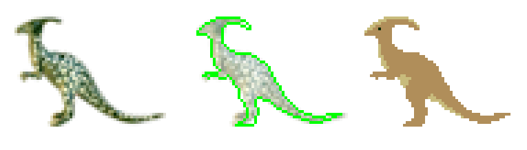
I found the image of the Parasaurolophus online and shrunk it down to the size on the left. Then I decreased the opacity of it in the Layers palette, traced the shape as best I could using the Pencil, then filled it with color. I also added my own areas of a lighter shade of color, just to give him a little depth. Here's one more. I've even made a step by step animation for you:
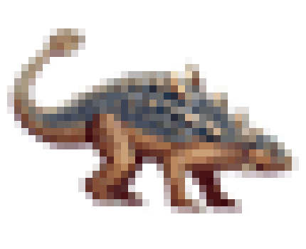
I found an illustration of an Anklyosaurus, brought it into Photoshop, shrunk the image down to the size I wanted my own pixel Anklyosaurus to be (you may want to set your Resampling preference to "Bicubic" when resizing photos and illustrations like this), and proceeded to trace. Some creative license was taken with the colors and the spiky spots on his back. The shapes I trace are more like guides, and then I work with my own interests regarding color and detail.
It's a good option, this tracing technique. It sometimes works just as well to have a source image visible and draw your own next to it, instead of on top of it.
Exercise 15: Indexing and Saving files as Gifs
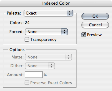
Once you've made your Glorious pixel art, you'll probably want to share it with the world. Email it, upload it to a site or as a social network profile pic... A perfect file format for pixel art is a "CompuServ Gif". Gifs are files with a limited color palette, up to 256 colors. This is what's referred to as "Indexed Color". Jpegs are good for photos, but not good at all for solid colors & crisp edges like with pixel art. When saving, make sure to keep your original Photoshop file version (.PSD) in case you want to make changes later on to the original, with all layers intact, but save a .Gif version as well. To save, go to "File" > "Save As...", and then choose the CompuServ Gif format.
Photoshop will do the indexing for you as you save, and it will likely be to the exact colors used. Click "Okay" when the indexing options come up. It'll look something like this:
Usually when saving pixel art to show to other people, it's necessary to increase the size of your illustration, so people can see the pixels up close as opposed to tiny 1x1 actual size. Before saving the .Gif, go to "Image" > "Image Size" and increase to multiples of the original pixel dimensions, making sure "Nearest Neighbor" is selected for "Resample Image".
Conclusion
I was going to go into some talking about Pixel Type, but I'm out of time. I've got to get back to work on Dino Run so we can finish it up as soon as possible. I'll leave you with a good resource though. Check out: http://www.dafont.com/bitmap.php?page=1 There are loads of existing pixel fonts out there, mostly for free.
And if you want to get further into learning about Isometric pixel art, these are some great pixel tutorials that I came across:
http://derekyu.com/extras/pixel02.html
http://www.19.5degs.com/element/833.php#b1
Some final thoughts..
- Take breaks! To be honest, I don't always do it myself, but when I do it's great and always a good idea. If you're feeling stuck or uninspired or burned out, don't force anything. Step away. Let what you've been laboring over sit for a couple days, or overnight at least. Allow yourself to get away from your work so when you come back to it you'll have a fresh perspective, new eyes, refreshed brain. Even short 15 minute breaks every hour or two are extremely helpful to both stretch your body and clear your head. Even if you spend less time working, breaks can increase the alertness and energy of your seeing and thinking, and ultimately increase the quality of your work, plus you feel better at the end of it. For maximum benefit of breaks, go outside. Nature and fresh air are excellent head clearers.
- Don't forget to spend some time zooming all the way into many types of images, just to see how images are actually made up. You'll probably learn a thing or two about how the eye and brain resolve pixels to create the illusion of forms and color.
- On the quest to make cool pixel stuff, be easy on yourself, especially if you're feeling frustrated. I've got loads of pixel art I've made that is pretty bad & have no use for. But I know the final designs I wind up being happy with wouldn't exist without each and every prior attempt.
If you would like to receive an email when our next game Dino Run is released, send an email to pixeljamgames@gmail.com. We will add you to the mailing list. Or just check our site, http://pixeljam.com in April. It should be finished by then and onto something new.
I hope this article was somehow useful. If not, that's okay too. I learned some things myself and had a good time at it.
Enjoy yourselves!
- Rich