Pixel Art feedback for newbie

Started by
8 comments, last by Drew Newman 10 years, 9 months ago

Hello

So, I've been working on upgrading the art for my game and, due to its relative simplicity and my very low artistic skills, chosen pixel art. Another reason is to make it a little retro.

For that reason I turned to Riuthamus for some help and he helped me greatly. Thanks to his help, I managed to create few good powerup icons and tiles. Game looks much more appealing now.

However, I need a feedback and a little more guidance. I don't want to bother Riuthamus constantly, he has his life and job, so I came here for some tips smile.png Of course, I won't stay idle and work on it more, and I also have other things to fix (found few major bugs in the game) and draw.

What I'd like to ask is some feedback about the tiles - how do they look and what should I improve.

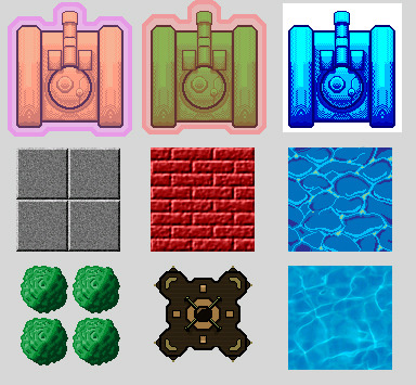
  • Tanks are made by Riuthamus, I just did the shading. Outline around first and second tank is supposed to be protective shield.
  • Concrete blocks are simple squares with applied Noise filter to get rough concrete-like surface.
  • Bricks were made with Texturize filter. I'm satisfied with effect.
  • Water... eh, the one in 2nd row I made by myself but I cannot make it look good. I've looked at few pixel art tutorials and followed them, but the result isn't satisfying. Water below it is downloaded from the Internet and I'd like to keep it but it won't follow the theme.
  • Trees I made entirely by myself using the example Riuthamus provided me.
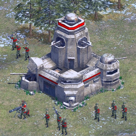
  • Fort... bleh. I have no idea how to make it appealing nor how to shade it. I wanted to base it off this but spectatularely failed.

In addition to that, I have a question (I don't know if I'll phrase it right): how often should I consider using Photoshop filters? I used Noise and Texturize because I though I'd get the result I want and wanted to speed up the process when I can.

Thanks in advance smile.png

Advertisement

The filtered stuff looks, frankly, out of place. Not so good, in other words. In general texturing, the filter thing is a nifty thing to do, but in an otherwise pixel-art game it's very out of place and I think it would look more cohesive to draw them by hand, without the texture perhaps. The shading on the tanks is lovely, and the hand-drawn pixel art water is also lovely. The downloaded water looks out of place.

The trees look great, only they clash a little with the blocky style of the tanks.

Good luck with your progress, though!

Thanks for the feedback :D

I'll redraw concrete and brick by hand; I used "quick fix" (filters) because I didn't manage to capture the texture of the bricks and concrete after few hours of working on those two :/ And I wanted to replace older sprites I temporarily used (first brick was out of place and overused Bevel, 2nd one was simply bad, while concrete was metal before, downloaded from internet). It seems I'll need to fiddle more with pencil and color pallete.

I figured out that downloaded water is out of place, that's the reason I hand-drawn it :)

If you want to make animated water you can try Caustics Generator (http://www.dualheights.se/caustics).

If you Photoshop the output from Caustics Generator by thresholding or changing the levels, you shall be able to get a similar result as what you have hand drawn.

The benefit of using Caustics Generator is that you get tiling and animated textures.

There's also another hidden gem of procedural water animation generator. Make sure to share this with your pals.

Holzchopf's WasserTextur: http://www.holzchopf.ch/?category=tools (EDIT: It's Creative Commons 2.5 free)

Hello there! Looks good overall, but of course random little things:

It looks like you are overdoing with the dithering on the tanks, you need to choose more values and then blend with only a little bit of dithering. Here is an old post about dithering you should glance at. The barrel in particular seems a little strange, like you alternate bright pixels in the shadow, and you're shading the intersection of the barrel and the turret. That part shouldn't have any real dark values because they're basically on the same level, and the line between them should be a lot thinner, otherwise it looks like they aren't connected.

I think you should also think about not worrying about pixel art at all, 1282 tiles are pretty big for pixel art, you might be better off with either not worrying about keeping it pixel-y or size it down to 642 frames if you want the pixel art look. You could mess with Posterizing the filtered stuff, which will limit the colors and make it look like pixel art.

As for the fortress, keep in mind that you'll have to exaggerate features quite a bit on some stuff to get the top view to look right. Plus shading does a lot to make it seem more 3D.

Edit: Hmmm, attaching images is broken right now...

-Mark the Artist

Digital Art and Technical Design
Developer Journal

Kjell, Kryzon, thanks for application suggestions. I'll look into them, if not for this then for next projects.

Prinz Eugn, thanks for your feedback :D I appreciate it.

Yeah, I overdid the dithering on the tank. However, that was my first shading attempt under the Riuthamus' guide (he did the shading of the barrel and the turret) so I didn't know better. I might re-shade it once I'm complete with everything else (and when I get better at it).

As for the size, I planned to use a little bigger assets which I'll downscale to appropriate size (resolution height / 15) with code.

And the fortress... I abandoned this one (hence no shading) and started drawing new one.

I thought id play around with this in photoshop for a few minutes. Not the greatest pixel art program but manageable.

I removed heavy shadows and added more highlights to the water. It is translucent and doesnt absorb light, just reflect, so there wont be heavy shadows unless it is in a dark container. clear liquid just distorts the color of the objects or containers it occupies, makes the color a bit lighter, and has tons of highlights.

I did a curves pass on your blue tank to bring up the contrast and the detail you put in, which feels way too subtle right now. I'd also recommend looking at patterns for the tracks, and add those to the big rectangles on each side for some nice detail.

And lastly i did a lil pass on the fortress, mimicing the color palette of the middle tank. Some light shadows, thickened cannons, stripe pattern, and softened the thick line in the middle base so the outer wall's line would be the most dominant.

Quick stuff, hope you enjoy and find some further direction!

And if you continue redrawing the fort, go for asymmetry!

tumblr_mpc0n98uNv1sycbsio1_400.jpg

Edit: aaah boo it garbled the fort... What site are yall using to upload clean sharp photos? It wouldnt let me link from my google drive or deviantart and i resorted to a private album on facebook to get an image in here..

Edit: I created a tumblr. Hope that works. The fort is much darker on my screen at work..If you want, I can lighten the ground a bit.

Sorry for late response, had an exam this week so I focused on studying.

@Run Cycle Media

Thanks for passing over sprites, I'll definietly use them for quite some time ^^

Oh well, maybe asymmetric for really is better.. Nevermind, game needs to improve constantly - maybe it would be better if I store levels as XML files instead of text file and represent tiles as various chars...

Summer is coming, exams almost over so I'll have lot of time to improve both art and programming. :D

Good luck dude! Feel free to post concepts on here more! I never mind grabbing an image and taking ten minutes to spruce it up. I do this for a living :D

This topic is closed to new replies.

Advertisement