GhoulsMiner

Started by
14 comments, last by StarMire 9 years, 5 months ago

finally all three of them are done. I still have to make their expression tho.

9hbU9rI.png

There's no one who know his name, but people simply refer to him as "The Devil". Unlike other demons, he is a fair businessman and very rational, so don't afraid to sell your soul to him.

Advertisement

this is our recent status update. we're working on the mission board along with the mission system, which is the second last important piece for the game (the other one being the cutscenes)

on another news, we had a composer joined us to work with the game music toast.gif we're currently waiting to hear back from him

here is a mockup sketch for the mission board (pardon the intentional misspelling smiley.gif

missionBoard2_zps42c35dc2.png

and an older sketch (rejected)

missionBoard1_zpsdf6cac83.png

made some progress on the intro, just started to understand Starling Filter a lot better. I'm just gonna leave the gif here. grin.gif
Pardon the unfinished dialogue, spiralhalo is too lazy busy to finish it at the moment.

GhoulsMinerIntro2.gif?dl=1

We're working on the story and dialog right now. Google doc is really helpful for us wink.gif

story2_zpsf5ef7f8e.png


also here's preview for the Trials Board

trialsBoard_zpsuc4f5kro.gif


and random drawing from spiralhalo, right one is the current design of Nion

nion_zps6d223fc5.png

working on tutorial right now, and I just realized that I could shrink the map size to add variety to our stage blink.png
anyway which one would you prefer guys? here's the full size

ghoulsMiner_tutor_pilih_zpsd7a61d26.png

Wow, this is amazing. I love to see talented devs getting things done like this! And apparently two great artists on one project? You guys rock!

As to the question at hand:

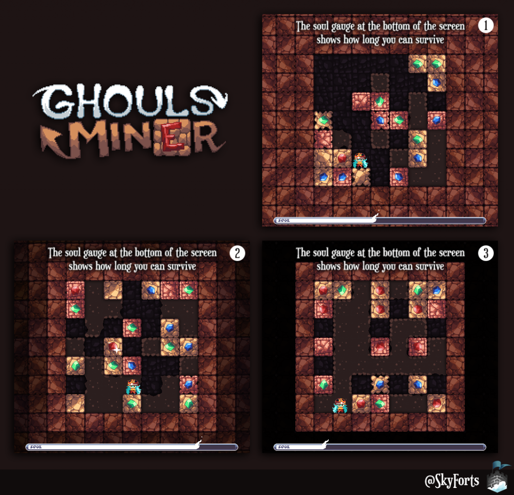
I like #2, but I think it would be better if you used different kinds of blocks out there (more like the background), to make it looks like it was kind of breaking away and getting darker in layers (if that makes sense), so that it still feels like the frame of blocks directly around the level is the highest point. I'm not crazy about the block by block gradient, I prefer clean material borders.

Let me know if that doesn't make any sense and you and me to do a quick edit to show you what I mean.

This topic is closed to new replies.

Advertisement