Hi guys, so I'm making a game that has turn based (classic FF style) battles, with the player's party on the left and enemies on the right.
I did this without much thought, but then an artist friend of mine said I needed to switch it around (party on the right and enemies on the left), saying it would feel 'wrong' otherwise.
He claims that in classic religion and mythology the left is associated with evil, as shown in classical art and so on. I suggested it might be because in Asian countries they generally read from right-to-left.
Either way, do you have any thoughts about whether this is important or not? And why? Thank you!
P.S my blog has some early screenshots-
http://necromancergame.blogspot.com
Little Combat Layout Question

Author

I'd try to be consistent with other popular games in the genre. What to they do?
I vaguely recall FF4 having the player's party on the right, and doing a quick google search pulled up these results:


I'm pretty sure the second screenshot is when you get "ambushed", but I'm not positive.
Looking at both of those images, which one feels more 'correct' to you? Personally, the first one, only very slightly, just because I'm vaguely more familiar with it, seems more correct to me. I'd be fine either way.
HOWEVER! Having the player's team slightly lower down the screen compared to the enemy's team I think is even more "correct" for me, personally. I'm guessing, it's because psychologically, the team is "nearer" to me (with the camera angle of the tilted floor), or maybe just because many RPGs have your party at the bottom fighting up.

(Enemies moved slightly up, allies moved slightly down)
In your screenshots, it's also hard for me to tell which people are mine, because they all look like monsters. Maybe make the player's monsters slightly brighter colors than the enemies? Or put indicators over their heads or under their feet?

(The yellow circle with the arrow indicator is the selected monster, any monster with a ring under it is an ally)
Further, simply as visual polish, you can dynamically scale the more distant enemies just slightly, to give a better illusion of depth.

(Enemies "farther away" shrunk down just slightly)
[Edit:] Plants vs Zombies has the good guys on the left.

I honestly don't think it's important so long as you're clear and consistent. I've heard the left/right thing in a number of contexts. For instance, a company logo with a directionality or arrow should never point left or down, as that supposedly symbolizes going backwards. Honestly, I think it's nonsense (you could have a mining company with an arrow pointing down, or a surplus company suggesting lower prices).
Although there are conventions you have to respect with each genre, I don't think this one matters. With the party on the left and the enemies on the right you could just as well make a solid argument that the visual style presents the heroes as progressing forward toward the end goal of the game. For gameplay I think this could be very motivating, just as if the progression were downward and you encountered say bigger and bigger gems or more and more darkness-- both would create a motivating mood (greed or foreboding, for example).

I'd say the party-on-the-right is more of a Final Fantasy convention than a genre convention. If I remember correctly, other games of that early JRPG era had a party that either wasn't visible on-screen or was at the bottom. (I seem to remember FF being the first JRPG where your party was visible onscreen.) And subsequent commercial JRPGs used a pretty wide variety of layouts, in part to differentiate themselves. (Subsequent indie and RPG Maker games seem to have a strong right-to-left tendency, though, because they're trying to invoke classic FF, not differentiate themselves from it.)
I'd say: going from right-to-left is a clear indication to the player, "this battle is going to be like a Final Fantasy battle", so they'll have certain expectations. If those expectations are going to be met, then right-to-left is a good way to telegraph this. If your battle system were entirely unlike Final Fantasy, I'd say right-to-left is a bad idea, because players would then expect certain conventions and be frustrated when they're not met.
Servant's advice is good advice, about keeping your party "closer" to the player. Maybe consider using a full "bottom-right-to-top-left" diagonal like in Breath of Fire or Suikoden. In those games it's pretty obvious which side is "yours".

FF1 had the party on the right, so I guess that's why it stuck.
The lufia series has the characters at the bottom, like BoF, but has similar gameplay.
DQ has only the monsters shown.
Chrono Trigger adapts to the situation.
I doubt there's more to it than merely how the design turned out.
I'd personally be fine playing from the left against the right.
Author
Thank you guys that was really helpful.
Moving the player's monsters a little closer down-screen might be a good option, but unfortunately right now I cannot re-size then because the resolution it so low it would make them look too crappy. For now as a little update I have added the player character as a sprite in the battle (to show the left side belongs to the player) and moved the HUD to the bottom to make the screen feel a little more open.
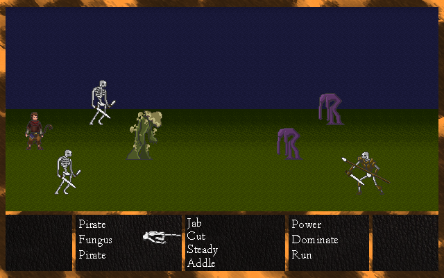
I think that's a nice improvement - both the addition of the visible player, and the moving of the commands.
Another visual cue you might want to experiment with, is making the enemy's side of the battlefield background slightly darker lit than the player's side.


I'm not sure about dimness--the enemies are a little less distinct in that edited version, I feel--but perhaps a change in light colour: blue for enemies and warm yellow for the player, for example. (Or whatever colours are appropriate to the natures of the two sides.)
True, it does make them look less contrasting.
The shading could be applied just to the background before the enemies are drawn, but leaving the enemies fully bright. Or it could be made subtler than I made it here.
[rollup=Example of background (but not sky or enemies) shaded only] [/rollup]
True on both counts, I think. (I'd probably elect to change only the background if I were to choose between the two: I want to be able to see the enemy sprites clearly, I feel.)
This topic is closed to new replies.
Advertisement
Popular Topics


Advertisement