There are proven psychological principles to user interfaces that work.
Whether you have a team of design experts or are just building with programmer art, you can use these principles to make your game easy to understand and a joy to pick up.
When you're putting together the user interface design for your game, whether it's a heads-up display (HUD), a level select menu, an in-game map, or a life meter, you want it to all work. Perfect UI design is invisible, that is, the user isn't really grappling with how the UI works - the UI disappears and the player focuses on what they want to do in the game.
My favorite analogy to this is driving a car. When you're first learning how to drive, you need to be taught what the steering wheel does, how the accelerator and brakes work, and the gear shifts. But once you learn these things, then they all disappear. "Turn the steering wheel right" turns into "I want to make the car go over there".
A good UI tries to get the player to this second stage as quickly as possible. Over at my site The Game Prodigy, we try to stress getting to this point immediately so that players can really get into your game.
To do this there are a handful of psychological principles you can use - scaffolding concepts, functional and color consistency, and the rule of 7.
Let's get started!
Scaffolding Concepts
When you're laying out your game's UI, what you are really laying out is a map of concepts.
The quickest way to explain a concept to someone is by making an analogy between the new concept and something they already understand. In teaching and education this is called "scaffolding" - by propping up new ideas with old ones, the new ideas are easier to comprehend.
Life bars are used almost universally in games, and they build on the common concept that people understand from progress bars or gas gauges. If the bars are full then you have much more to go. If the bars are low then you're almost out.
You can see how this analogy is used in Kenji Inafune's recent kickstarter project,
Mighty No. 9:
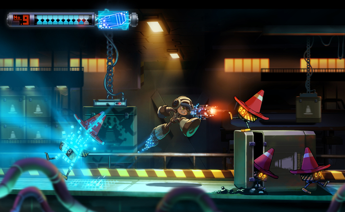
The best is when you can scaffold with an object commonly understood in real life.
One note is that all players are different in terms of their knowledge. If your game is for casual players or typical "non-gamers" then you may have to try and pull concepts from real life to use as your analogies. If your players are gamers and familiar with many game conventions, then it will be easier to borrow from other games and expect them to know how certain elements already work.
Some other concepts that are useful to use are light switches, dials (like on a stove), on/off switches, elevator buttons, escape buttons, or clocks/alarms. The more common the real world object, the better.
Application: When developing your UI, ask yourself these questions:
- Are there any UI concepts or analogies here that will be totally unfamiliar to players?
- Can these new concepts be scaffolded with old concepts to make them easier to understand?
Strive for Consistency in Actions and Colors
When you introduce a UI concept to players, then you want to make sure you are as consistent as possible across the game.
In accordance with the scaffolding concept we just discussed, consistency helps players understand what's familiar. The worst experience is teaching the player how something works, and then in another area of the game, it doesn't work as you've taught them.
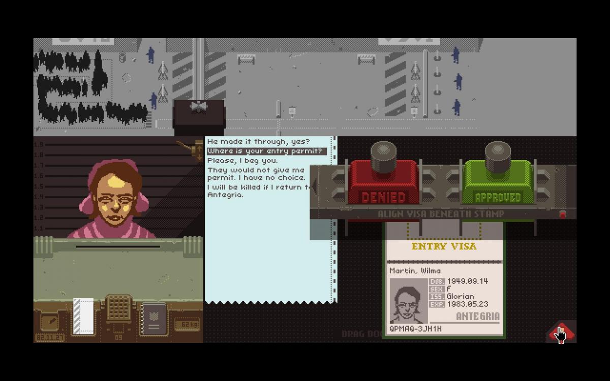
A great example of this done well is in the recent indie hit
Papers, Please. The game asks the player to deal with a variety of items in deciding who they should let through the immigration border control. These include passports, permits, photographs, and more.
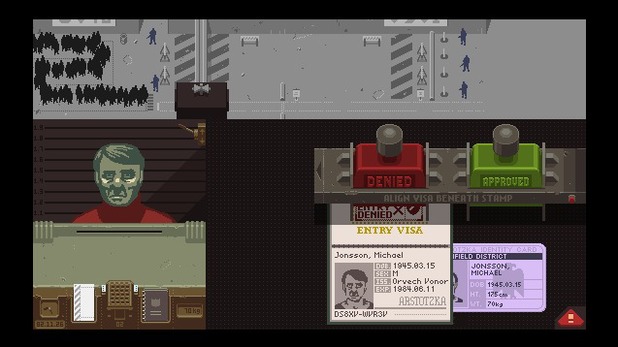
Each of these is interacted with using the mouse to drag items around on your desk, since that's a sensible way to handle papers. However, the game also has lots of dialogue between the characters. Dialogue is typically done in a floating box on top of the screen, with up and down used to select menus (think Final Fantasy or Mass Effect dialogue menus).
But that interaction style wouldn't fit with how the player is interacting with the rest of the game.
So to keep the UI consistent,
Papers, Please also makes the dialog an object on the desk via a printed transcript. This doesn't require the player pull up some new menu or learn a new way of interacting with the world - it's the same as all the rest of the objects. This helps the game feel consistent and the player immediately understands how to interact with it.
Colors can also be a great way to drive consistency and is one of the big concepts we teach back at The Game Prodigy. Different colors have meanings associated with them in culture, and keeping these colors consistent in a game makes it more intuitive.
Red in Western culture typically means stop (from traffic lights), warning, or bad. You can see this in the typical "Damage Taken" red shade that appears on map UI in
Grand Theft Auto V...

..and also associated with UI around enemies in
Nimble Quest. The red skulls represent how many "bad guys" are remaining, which again is associated using red:
These colors make it possible make quick sense of what's going on in the game world.
Application:
- When designing your UI elements, try to have consistency between them. Don't switch from one interaction type to another, especially if it's different throughout the game
- Make use of color to subtlely point out similarities between game elements to your players
Digit Span and Chunking
Let's do an exercise. Memorize these numbers, and then close your eyes and try to recite them from memory:
4930661
If you're just trying to skip ahead, don't do it. Actually try to memorize them, it will help with the illustration.
Have you done it? Great! Now try these numbers:
5982385741
How did you do? According to research, the first set should have been simple, but the second much more difficult. Why?
Studies have shown that people can only hold about 7 unique numbers in their head at a time, give or take two. This is called "digit span" and is the reason that phone numbers are 7 numbers (without country or area code).
This concept can be used in a more abstract sense as well. If there are 7 ideas presenting themselves to a player at the same time, that's reaching the limits of what most players can handle. Beyond that it becomes jumbled and confusing.
However ideas can be pulled together to form one higher level idea. This is called "chunking" and appears frequently in psychology literature around memory.
For example, try and memorize these numbers
199020012013
This is much easier to memorize if you chunk them into years: 1990, 2001, 2013. Simple, right?
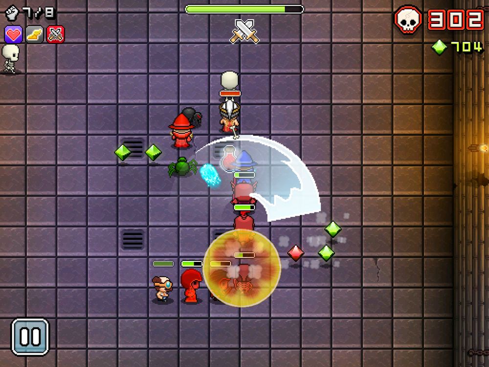
Let's look at this example of digit span and chunking in games from
Dark Souls:
There are a lot of things going on here, 9 total UI elements on the HUD:
- Health Bar
- Stamina Bar
- Level
- Up Item
- Down Item
- Right Equipment
- Left Equipment
- Currency
- Interaction Dialog
However, four of them, the weapons and items, are chunked together so that the player can think of them as a single concept that maps to the D-pad.
This brings the total number down to 6 total elements: combining all the Up/Down/Left/Right into one item: "Items". By using this chunking and mapping those 4 elements together through both how they interact on the controller as well as how they look on the screen, the
Dark Souls UI comes across to players as just simple enough.
Let's look at another example from Terraria:
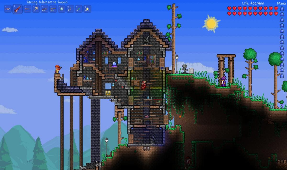
Using chunking, this UI is made up of only 3 main elements:
- Life bar
- Mana bar
- Items bar (chunked together)
This visual design makes the game trivial to pick up and understand immediately what's going on.
Application:
- How many unique UI elements does the player have to pay attention to at once? If it's more than 7, consider reducing them or chunking common ideas together
- Make sure that chunked ideas are interacted with in a similar manner
Summary
When you're designing the UI for your game, try and draw analogies to knowledge and concepts your audience will already understand (even if you are making something new you can still pull parts from common ideas). Keep your interaction styles and colors consistent in order to allow players to navigate through without being surprised. Limit the number of ideas or concepts you are showing at once to no more than 7 to keep from becoming too jumbled.
All of these are rules and there are exceptions of course. But adhering to them will help to make your game more quickly understandable.
With some smart psychological principles, good UI can help your players get through the menus and into the game world you've created.
Good luck!
For more information on how to build and design games and a game career,
visit The Game Prodigy for a free 29-page eBook.
Article Update Log
- 10/23/2013 - Added another Papers, Please screenshot to make point clearer


Nice article - interesting, concise and well illustrated.