Example of a Next-Gen Gangster...

Published August 03, 2007
Advertisement
I'm evaluating artists/studios to create 30+ next-gen character models for the game [7 gang types, cops, civilians, etc.]...I just got a model from one of the artists, it took him about 2-3 days to crank this out, I think it's astonishing.

This artist also created all the tree / foliage models that I'm using in my game...

I'm probably going to get two sets of character models created and go with the best set...that might sound wasteful but it's well within my budget and I think it'd be the best way to ensure I have top notch art assets in the game. I can have my cake and eat it too...in a sense.

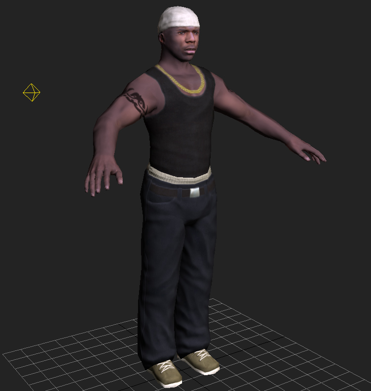
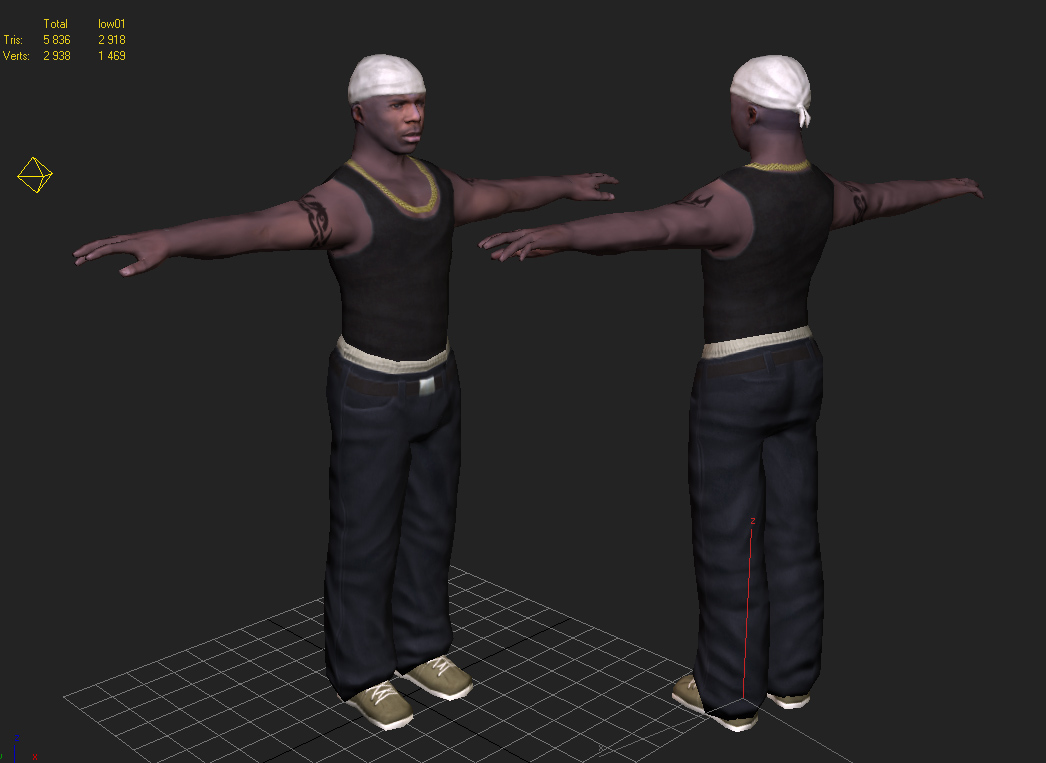
On to the screenshots...


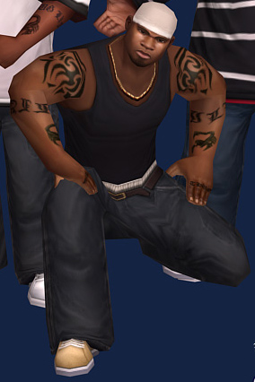
The old gangster used as a reference...


[EDIT]
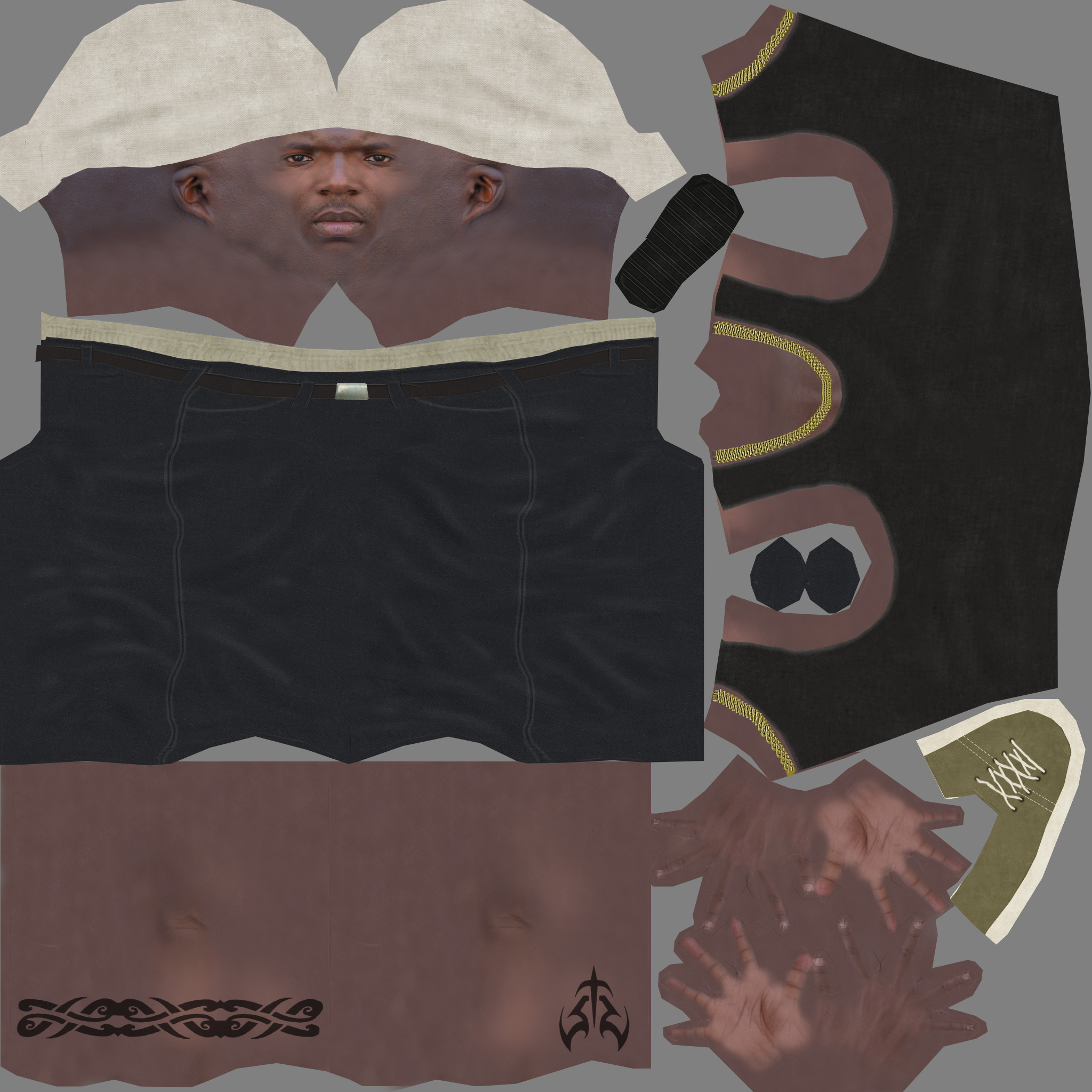
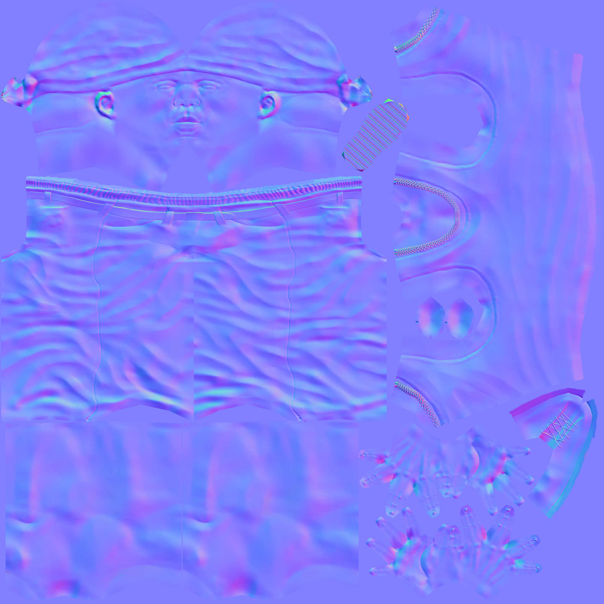
Here are the 2048x2048 color and normal maps for this character so you can see the detail...


I get delivery of the first next-gen car on Monday of next week...so I can't wait for that. It's actually 3 cars...a police car / taxi / sedan.

More information soon...

- Danny
0 likes 8 comments

Comments

ViLiO
I think I actually prefer the old gangster model [ignore]

The new one looks very washed out and is missing definition around the chest. It may just be that I am too used to that certain style of the old models from looking at your screenshots over the years [smile]

All the best,
ViLiO
August 03, 2007 04:44 PM
dgreen02
Nahhh I like the new one a lot more...I mean the old one was amazing for the specs (1200 tris, one 512x512 color map).

I'll probably be getting two sets done, each by different artists so I can decide which new style I like the most.

I've updated the entry with the color / normal maps so you can see all the details...

There will also be a specular map for each character...textures are 2048x2048.
August 03, 2007 06:34 PM
Gaheris
Could we see some wires? That would be great, I'd like to know where all those tris were spent.

The texture job is okay, some parts (face) are better than others. The shirt/skin transition is horribly blurry in the screenshot, maybe a few well spent tris to define a real edge could make it look nicer and less painted on. The clothes are definitely way too clean and new. At least the shoes should look like they have been worn before.

Is there any reason why the guy painted highlights and shadows onto the pants when there is a perfectly okay normal map? That's quite last-gen and kinda defeats the purpose of the normal map.
August 03, 2007 07:18 PM
ViLiO
I think I've put my finger on what it is I find weird about the new guy, and it is the colour of his arms and neck etc. They are a bit dull/grey [dead]

It looks like the texture has been made using photographs and in places looks really good, but maybe the photo of the skin used for those body parts was poorly lit, because I think it lacks warmth (which the old gangster has in abundance [smile])

The colour of the face looks great though [cool]

Can't wait to see the new character and car models in-game [grin]

All the best,
ViLiO
August 03, 2007 07:18 PM
dgreen02
Yea if you compare the skin colors of the old/new gangster it's obvious that's what the issue is...though a simple color replace operation in paintshop can fix that.

The clothes on my old model were just as "new" looking, I'm fine with that. I think he added the slight highlights because he knows what he's doing :-) I'm not going to question his texture work, I think that is the strong point of the model...even though it's normal mapped it's good to have some slight highlighting in the color map.

I'm going to have the other artist I'm talking to create 3 models using the same reference artwork as this artist used...I could use those 3 character models to decide who I want to go with. Though with my current budget I'll probably just get all the artwork done by both.

The greyness of the skin is def. the odd part about it...also the model lacks a specular map, and was rendered with 3 lights affecting the model.

I think it looks awesome, personally :-)
August 03, 2007 07:28 PM
coderx75
The modeling work is fantastic! He isn't that intimidating though where the old one looked like T-Bone the Barbarian. =b My first reaction to seeing the new model was "It's Ezal from Friday! Hey, Smokey back here takin' a s@!t!!!" =b

EDIT: On second thought, that could just be the positioning of the character.
August 03, 2007 08:42 PM
dgreen02
It's a sick model...but don't worry there are still at least 2 more models coming from this artist, and at least 3 models coming from another art studio.

The winner shall get to create 30+ models for me.

Plenty more eye candy to come...
August 04, 2007 12:48 AM
dgreen02
Also the blurryness of the character renders is probably a result of the mip-mapping filter used...they are screen captures of a DX HLSL shader, I have a feeling he was only using bilinear filtering, and so the texture used in those screens probably has an actual size of 512x512 or 1024x1024...you can see all the extra details in the color map that aren't visible in the renders.
August 04, 2007 01:01 AM
You must log in to join the conversation.
Don't have a GameDev.net account? Sign up!
Advertisement