I was thinking about having a name-contest for the game, with a prize of a $5 gift-certificate to Wendy's for a bacon and cheese sandwich - Ok, I could probably spring for a cooler prize if somebody can come up with sick name.
Well...what's a new name without a logo, I spent probably 4 hours working on this today. I'm pretty happy with it. My plan was to draft up a bunch of logos, but IMO this one is pretty good - read, good enough to be done with it lol. EDIT - It looks a better on a black background.
Clicky & scope the front page ( the rest is temp on this site ) -
www.ArmoredWarfare.com and www.ArmouredWarfare.com
I was going for a multiple-scene-in-one feel for this image/banner ... the left bottom shows some soldiers running from a giagantorz mech, the bottom right shows a tank flying across some open terrain, and in the top right of the screen there are some drop ship transport thaaaangs rollin' in. I added some grunge and wear/tear to the logo, and all the usual stuff. Pretty neat how the two Rs line up in the middle of the logo as well.
As usual feedback is always appreciated. On the logo, and I could also use some feedback on the layout / setup of the Armored Warfare website. I was going for a basic php thingy, I moved away from a Drupal based CMS for the Warbots Online website, and unified on my own php based framework, I just find it easier to work with... I only use newspro for updates on the front page, and I also use a thumbnail library for the gallerys on both Armored & Urban homepages.
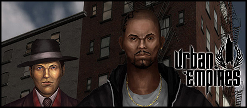
Urban Empires Website updated with actual content!
Speaking of Urban Empires... guess what... I also updated that website while I was at it. The homepage for my gangster RTS/Action multiplayer game had ONE screenshot in the gallery ... for like 2 years. So I fixed that, straightned up a bunch of stuff, and overall I think people can get a good impression of the project by simply viewing the front page.
Try it out ....
www.UrbanEmpires.com and www.Urban-Empires.com
Summary
I think both the homepages for Urban Empires and Armored Warfare should give a pretty much instant feel each game, there are 5+ videos on each, and a sh*t ton of images. So this should also help people get a quick feel for for the games.
Yay time to sleeeeep, after a 20 hour work day on web-stuff! I'll finish the websites 2morrow and then get back to coding and preparing the 4-5 new HD Videos for the release of Armored Warfare BETA 2.0 , which shows all the new stuff I've added since August.


1. Your page has too many boarders. I would remove the white boarders around the menu and the content area.
2. I think there is too much content on the main page, it reminds me of a my space page. On the main page I would have a small description of the game with some highlights, maybe a few thumbnails which open in a pop-up or Lightbox and finally a trailer of the game. Move everything else under screen shots/media.
3. I might be nitpicking but I think the header's right bottom corner looks too angular, I think it would look nicer if it blends in with the black.
I uploaded a Gimped screen shot of the site bellow of how I think the site would look nicer. Keep up the good work man, I really think you are doing a great job.
http://img257.imageshack.us/img257/3364/homepagep.png