Pixelcraft: The Colors of Frogatto

Published July 29, 2010
Advertisement
For quite some time I've been intending to write about pixel art technique. Today I stumbled on a pixel-art platformer game called Frogatto & Friends which has inspired me to get on this because I was struck by the game's lovely art. (I haven't actually played the game yet, though it is available for free on PC/Mac/Linux, and the code, but not the assets, is open source.)

So let's see if I can explain what's going on with the pixels of Guido Bos and Richard Kettering (who it seems also lead the art for Battle For Wesnoth; neat).

Use of Color

The artwork of Frogatto nicely demonstrates the intentional use of color (hue, in particular) to emphasize the depth of a scene. Warm colors pop out to the foreground while cooler colors recede to the background. I've pulled some of the color palettes out of a screenshot to show how this is operating:
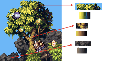


Notice how much warmer the lighter colors are - the green and brown are pretty much the same shade of yellow at their lightest, while the stone's gray takes on a noticeable brown tone at its highlights. On the other end, the green cools down even to the point of using a shade of blue while the stone goes toward a more neutral (and relatively cooler) gray.

The use of a blue tone in the tree is particularly interesting. It's actually lighter than the mid-dark green but is so much cooler that it fits with the shadowy parts of the leaves - and the blue reflects the ambient, bluer light of the sky rather than the direct yellow sunlight -- the use of color in the tree tells us a lot, very subtly, about the lighting in the environment.

As an experiment I replaced the original colors with "naive" color palettes that are simply light to dark gradients of a single hue with no change in 'temperature' or saturation.
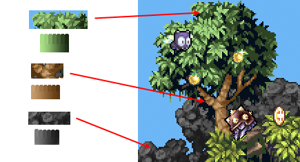


The scene still works (ignore the yellowish leaves in the lower right), which is a testament to the skillful use of tone and shapes, but it's flatter and less full of life than before.

  • In general, warm hues bring things forward, cool hues set things back. (Sometimes I like to play with inverting this rule to make a scene look weird.)

  • Ambiantly lit shadowy areas can be 'lit' with a color that offsets the primary lighting; Consider what color is coming from the rest of the environment, or what color the sky is.

  • Color can be used very subjectively. It doesn't matter what exact color your color-picker displays, and it definitely doesn't have to match the "naive" understanding of what color something is. What matters is how the color you use works in-context with the rest of the colors of the scene; Indeed, leaves can be blue.


[Yes, I've spoken out about how I don't care for using small fixed palettes in pixel art. The upside of the practice is that it forces artists to be very conscious about their color choices, so from that perspective it promotes some artistic rigor and, on occasion, very creative use of color.]

And that's that for now. This game has wonderfully rendered shapes - those pointy leaves and contrast between bulbous and cubic rocks - so it feels like there's going to have to be another post on the art of Frogatto. Soon.
1 likes 9 comments

Comments

choffstein
I'm no artist, but that was a cool entry to read!
August 01, 2010 10:35 AM
LachlanL
I always love reading "beginner level" stuff on making art (especially pixel art). Thanks!
August 02, 2010 12:27 AM
Litheon
very interesting
August 02, 2010 03:24 AM
Prinz Eugn
Ha! Gradients, my only weakness...

Excellent post, keep it up!
August 02, 2010 08:00 PM
dbaumgart
Huh, thanks for the nice comments!

I guess everyone is really into hearing about the nitty-gritty of pixel art. I'll definitely have to do more posts along these lines.
August 02, 2010 08:51 PM
Prinz Eugn
So basically more like this?:
August 02, 2010 10:17 PM
dbaumgart
Prinz Eugen:
Hmmm, it is indeed colorful and vibrant, but I'm not sure that colorful and vibrant matches the tone of a soviet missile truck!

This brings up a heck of a lot more that I ought to get into about what I've found in how to use color. The big one that comes to mind is this time I was making terrain tiles for a World War 2 game - it kept looking too bright, not like a WW2 game until I went and made the grass nearly gray. For some reason it looked more fitting to the tone to downplay the color.

Same thing here, I think. The subject of my post is a really cartoony game so the very colorful style fit it, but your sprite is presumably for a game that plays it more straight, so I think the super-saturated color scheme of something like Frogatto doesn't fit.

I messed around with the colors in your image to try this out:


#1: Reduced the saturation of the greens a bunch and moved them more toward yellow for a more military olive-green look. (Hmm, though real soviet missile trucks actually do seem to have a pretty strong green color to them sometimes.)

#2: Shifted all the green to one hue, just to see what it looked like. Seems colorful to me.

#3: I took #1 but I actually desaturated the highlights to give a bright-grey rather than yellow tone to highlights. Much more grim, and feels more correct to me, though this depends on the tone you're going for of course...
August 03, 2010 12:43 AM
Prinz Eugn
Nice!
Yeah, I think the more flat/real tone of our games has let me get away with not thinking about color too much. The truck was just a piece I had been struggling with getting to look right, and isn't really the best example. Always fun to expand the skillset, though, which is why posts like these are so good- it's something easy, you just have to know think about it a little.

After all, real trucks look more like this. It's kind of sad how much I like this one.
August 03, 2010 10:23 AM
You must log in to join the conversation.
Don't have a GameDev.net account? Sign up!
Advertisement