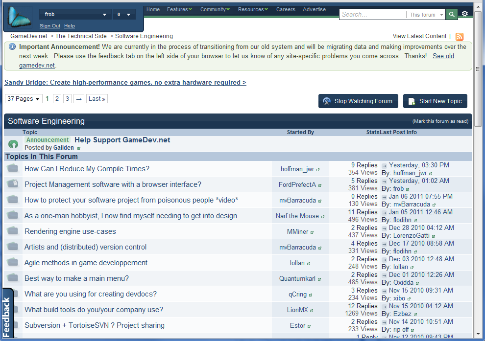
I have trimmed down the top menus, assorted boxes and dialogs, and forum post tables. I toned down the background and adjusted a few colors. I moved the feedback image so it doesn't cover the text, and moved the "loading" tab to the side for the same reason.
I'm developing it in the Chrome browser because it is surprisingly easy to create style rules, edit them, and review changes on the fly. I have no idea if this works in any other browser. Let me know if you like it.
I've still got a lot of work left on it, but if you want some changes please let me know and I'll incorporate them.
Enjoy the file. I hope you find it useful.
EDIT:
Pictures!
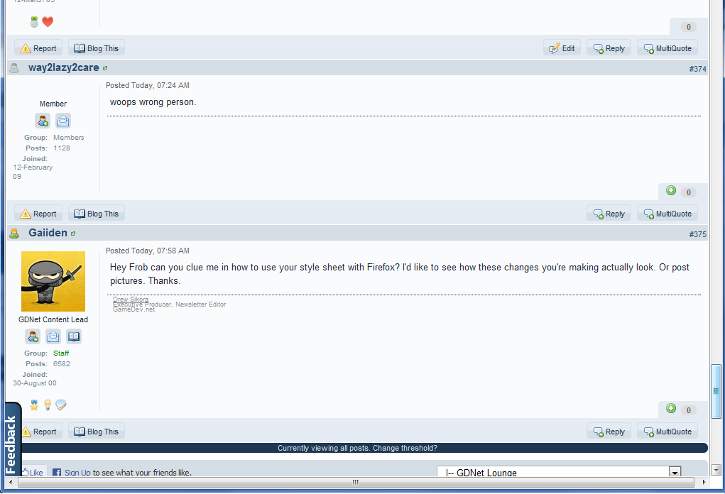
The next item on my hist list is the user info boxes on the left side of forum posts. They take WAY too much vertical space.

