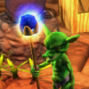
Character Sheet Area Update

Published September 18, 2012
Advertisement
Charsheet5.jpg

Version 1
Charsheet8.jpg
Version 8 - Blue

Converting the game to 1280x720 has opened up more space for information and while that can be great for players it was hard to get the space to look "right". The grey squares are Skills (smaller boxes) and Talents (larger boxes) we do not have art assets for them so I have not placed this screen in the video.

This area is called Head Quarters in Porats Aurora: Arrival it is the normal character sheet from most RPGs.
There is a star system map in the window, but players do not normally use it for system interaction and therefore it is a smaller size.

Any comments or suggestions for improvement would be amazing.
Previous Entry RPG Promotion Sites
Next Entry Ding Screen
2 likes 11 comments

Comments

riuthamus
This is looking very nice. I think it is a bit clustered so a proper layout might do you wonders, but for the most part I really like what you have here.
September 18, 2012 01:12 PM
JTippetts
Seems kind of stressful, to me. Red is a color commonly associated with danger and urgency, which I don't think you should get while browsing a UI. I'd prefer cooler colors myself, greens and blues rather than red. That would also make it feel more "spacey" and less "bloody".
September 18, 2012 01:16 PM
Navyman
Riuthamus:
The current layout is clustered. There is a lot of information to be displayed or at least that the player needs to have access to. I think that the next real revision with have less shown and more ability for only what a player wants to focus on to be displayed on the screen. The Left and Right sides of the image were once in totally different windows, but with the increase in screen space the idea was to combo them. Still it make the screen look "busy" and somewhat confusing as to what is really important.

JTippetts:
I was torn between red or blue. Blue being the color for the Galactic Senate would have been nice, but I was out voted. The idea being to invoke danger and fear. This outside force is invading and it has changed the way the people in the game view the universe. Therefore, red seemed to be the most fitting. Still I am going to see if we can do a blue version for comparison.

Thank you both for your feedback.
September 18, 2012 01:40 PM
Servant of the Lord
I think if you use the extra whitespace padding some of the widgets on each panel and surrounding the entire window to instead enlarge one panel in the center of the window, it'll seem less cluttered.

Right now with every panel about equal in size, the user doesn't know where to put his focus, so it seems over cluttered. By putting one panel more towards the center and make it alot larger than the other panels (even if that one panel isn't important or even interactive), it grabs the attention, and I think it'd make the user feel less confused and overwhelmed, and from that starting point then they can 'explore' outward to the other widgets now that they have a clear starting point.

Here's an example of how you can still show the same amount of information, but visually make it seem less overwhelming:

[img]http://img855.imageshack.us/img855/4291/gui1q.png[/img]

Another thing is that the widgets around the side shouldn't have anything that drastically contrasts and steals eye focus from the central window. The huge white talent boxes currently contrast too much; once you get actual images in place, hopefully that contrast would be reduced.

I also agree with JTippets about the GUI color. You don't want to make the user feel [i]always[/i] in danger, or else when he's really in danger during the game, you can't heighten the tension much more... If he feels in danger constantly, once he encounters an enemy he can't feel too much [i]more [/i]in danger, which removes some of the impact of the enemy encounter. Once actually in combat, a shift to a red GUI might actually work very well.

Here's a quick example of a cooler (temperature wise) GUI you can show your team, along with JTippet's and my comments on the matter:

[img]http://img341.imageshack.us/img341/9102/gui2j.png[/img]
(Clumsy coloration, so I missed a some red spots that still shows through)
September 18, 2012 05:19 PM
Navyman
WOW! Okay I have been sold on the blue.
I have been working with a few fans from Reddit and have created a more streamlined version that I think everyone will like a lot.
Question, how did you make it blue so easily? Sorry not an artist.
September 18, 2012 05:28 PM
Servant of the Lord
I'm not an artist either. =)

I popped it open the entire screenshot in Paint Shop Pro, selected the red areas using flood-fill ("Magic Wand") selection, and did "[i]Adjust->Hue and Saturation->Colorize[/i]". Then I just slid the little color [url="http://img37.imageshack.us/img37/6281/pearlsbeforeswinephoto.gif"]doohicky[/url] until it looked halfway decent.

I'm sure Photoshop or Paint.NET (free) or GIMP (free) can do something similar equally easily... I even added that colorize feature to my 2D tile engine, so I'm sure any halfway-decent photo program can do it, even though MS Paint can't.
September 18, 2012 06:00 PM
Navyman
Ah. Thank you. I was thinking it would be something like that, but figured it would be best to ask. I am loading the newest version in this entry in a second. It is not blue yet. Still need to show the others.

Maybe the new version is stills suffering from widgets that are of similar size.
September 18, 2012 06:25 PM
arthursouza
Awesome tips by Servant, hahahaha. Really liked the blue UI, I have seen your journal before, and the red UI really is too much, red may seem cool, but it gets tough to look into it too much. You can really add both options on the game!
September 18, 2012 06:54 PM
Navyman
Okay. I have posted a Blue version now to just get the right blue and that correct widget placement.

JTippetts: Thank you for suggesting the blue color shift.

Servant of the Lord: Thank you for showing off the blue.

Edit: Credit assigned to individuals.
September 18, 2012 09:10 PM
Servant of the Lord
(For posterity, JTippetts suggested the blue first)
September 19, 2012 02:02 AM
Programming020195BRook
I like the blue a lot, very nice!!!
September 19, 2012 06:19 AM
You must log in to join the conversation.
Don't have a GameDev.net account? Sign up!
Advertisement