So I've been working on the menu of the game and it is close to being finalized. Not happy with all the sprites and colors, but I think I've achieved a "retro sci-fi" look which fits the game really well. Captured some footage from most of the screens in action (sorry for the minor bugs, cut it together from multiple recordings):
Other goals, beside achieving a good style, were presenting all the relevant settings and match info whenever possible, while not being too cluttered and having a straight-forward workflow. I hope I've got this right?!
Took some screen shots this weekend too:


Okay, so we are over the "boring" part (I guess no one gets fired up by some menu screens
 ), onto news. I have a kind-of release date. No exact day, but based on the work left and the free time I will have put aside for development in the upcoming month, it is safe to say, that after three more weeks (max four
 ) the game will be complete. From the beginning I've planed to release a demo too and no change on that front. Probably within two weeks I will have it ready. Stay tuned...

") . At first I wanted to do a similar look you proposed, but also wanted to keep the menu ASCII based as much as possible. As an example, did not want to rotate characters. Hence came the idea of "+" sings. My fiancée also noted, that they are not working too well and gave the idea to try it out with slashes. Here we go:
. At first I wanted to do a similar look you proposed, but also wanted to keep the menu ASCII based as much as possible. As an example, did not want to rotate characters. Hence came the idea of "+" sings. My fiancée also noted, that they are not working too well and gave the idea to try it out with slashes. Here we go:
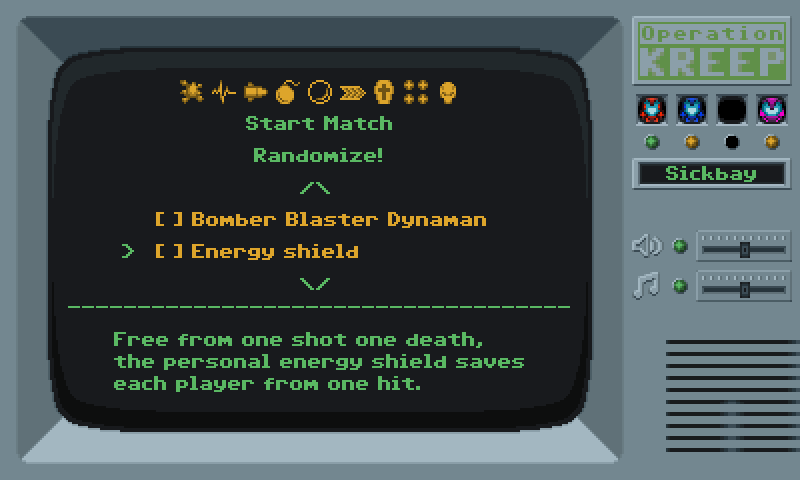

Not al all, I actually loved the screenies. The menu is the very first thing that a player will see when firing up a game, and a nice menu gives a good impression. I think you nailed it, it looks fantastic.
I love the little bars on the right side that move when you change the music or the volume. It would be nice to have little things for the other options as well, like little lights and stuff like that.
The only things that bothers me (judging by the video) is when there's more stuff down a list. I don't think "++++++" is a good indicator, I was actually a little confused by watching the video. Maybe you could arrows instead:
Or maybe that's just me