Originally posted on FidelumGames.WordPress.com
Version Control Commit Comments
In my last post, I said that I hoped my blog posts would start getting more frequent. That was over a month ago ?
But that doesn’t mean I haven’t been working on things, I just don’t have anything new that’s super interesting and warrants a blog post.
However, I really want to make these posts frequent and keep everyone who’s interested up to date on what’s going on with the game’s development. Because of this, I’ve decided that between meaty, interesting posts, I’ll simply post each of my version control commit comments as I make them.
I figure this will keep the posts coming, give you all a sense of what I’m working on and what I’ll be working on next, and provide some insights into the minutia that come along with game development.
I set the current repository up fairly recently, so there aren’t a ton of commits as of yet, but here is a dump of all of the currently existing comments:
8/29/2017 4:06 PM – Initial Wayfarer project commit
10/23/2017 5:08 PM – Milestone #1 Commit – Stable, first feature set complete.
11/4/2017 9:29 PM – Updated GDD with Overview and Implementation algo for player combat (attacking and spellcasting).
11/9/2017 11:24 PM – Added basic player attacking functionality, as well as initial defense and dodge calculations. Player’s EndTurn, when striking an enemy, is now called by the enemy being hit after its animation is done playing. The next step is to do the same for when the enemy strikes the player. Noticed two bugs: Player gets his turn back too often, and the enemy calls TakeDamage on itself when casting a spell on itself which inflicts damage (Blood Magick). Need to figure out why the player is able to act so frequently, and change how self-injuring spells subtract health from the caster (another function, or maybe a flag to the existing function). These two issues are probably related.
11/11/2017 11:38 PM – Fixed bug where player could attack too frequently. Also modified Stats.TakeDamage to have an optional paramter shouldPlayTakeDamageAnimation (or something like that) in order to prevent self-damaging spells (blood magick) from triggering the take damage animation.
11/14/2017 1:29 PM – Basic functionality for both player attacking and spellcasting is complete. Still have to add some tweaks for reactive animations and turn ending when an actor is hit by a spell.
11/15/2017 12:13 AM – Added target effects for spells which have an immediate effect. Added additional EndTurn triggers to handle these. From what I’ve tested so far, all cases where the player attacks or casts a spell on an enemy work as expected.
Next thing that needs to happen is enemy death. The dissolve assets have been brought back into the project, and just need to be called when the enemy dies.
After that, adding reactive animations for the player when a spell is cast on him, or when he is attacked (dodge, get hit, etc.), and ensuring those reactive animations trigger EndTurn in the correct Enemy. This will probably be in TakeDamage(since it has a reference to the Stats of the attacker anyway).
11/16/2017 11:20 PM – Death animation now triggers dissolving. Found a bug where an enemy gets an extra turn when taking damage. Dying doesn’t occur as expected. Fix this.
11/20/2017 10:08 PM – Fixed some problems with turns ending at the incorrect times/too many times caused by some poor logic in SpellManager. How spells work and the exact point at when they have their effects applied, as well as when turns are ended has been more tightly defined. All callbacks from animation events triggered by spells or attacks targetting the enemy are working as expected, with the exception of Healing spells. This is because of the current AnyState->AnyState transitions used in the animation controllers and the close proximity of the Heal Casting animation and the Get Healed animations being triggered. The state instead transitions right from Heal Casting back to Idle. Because of this, the animation state machine will have to be more properly arranged.
Once this is done, callbacks for when the player is the target of spells need to be added (none are done). Also, these animations will have to be set up for the player (mostly utilizing iTween).
Even though all of the spell stuff is mostly working well, it just doesn’t feel right, and is a likely candidate for redesign later.
11/21/2017 10:15 PM – It seems that all callbacks for both the enemy and player are complete for all permutations of both self inflicted and opponent inflicted effects (Damage, healing, status effects, etc). This also takes into account and plays the appropriate animation for affinity to magick types (having greater than 100% fire defense will heal instead of hurt the attackee when a fire spell is cast against them). Of course, all graphics, vfx, and animations are currently placeholder, but it seems that the code is solid and complete.
In order to accomplish this, the enemy animator has been totally revamped.
Still have to test more thoroughly (with multiple enemies, additional spells, active combat mode, etc.)
Have to perform clean up on some unused animation boolean sets in code.
11/22/2017 10:01 PM – Milestone#2 complete! Player actions are working perfectly and complete combat cycles are able to be completed with either the player or enemy being defeated. Player is able to attack and cast all spells, although no mechanism to change equipped spells or weapons currently exists (except for through the editor [weapons cannot be changed at all]). One small bug still exists where the Enemy is able to cast some ranged spells when not in line of sight of the player. It seems only range is being taken into account. This should be an easy fix, and not something I’m currently worried about. One small fix was made to a bug where the player would become misaligned with the grid if attempting to move while a player animation was being played (dodge, damage, taunt).
Tests with multiple enemies were successful as well.
Need to decide what Milestone#3 will be: UI Design seems like the most reasonable candidate, as this will lay the style and determine the framework for most of the systems to come (inventory and player management, including weapon/equipment management and equipping, spell selection, and levelling up as well as all other core gameplay areas including dialog, quests and pretty much everything else to come).
Paralysis by Analysis
Things have been moving slowly lately.
The game is at the point in its development where things really can’t progress until some UI has been put into place.
The player is able to both attack and use spells, but there is no in-game mechanism by which to switch spells or weapons (the spell system, as I’ve mentioned before is done, but the placeholder weapon is purely superficial; it doesn’t affect stats or combat at all.).
Because the AI and base player combat mechanics are complete, it seems the best thing to start next is looting and inventory management. This will range everywhere from the player looting enemy bodies (or bags dropped–not sure how I’ll handle it yet), to changing equipment, spells, etc.
I could write the back-end for this stuff, and just switch things out in the editor for testing, but it seems the best way to progress is to at least have some idea of what my UI will look like and how it will function so that I can best design the code.
This is where I’ve been having difficulty.
The only other game I’ve completed to date was a single screen 2D shooter called ‘Pixel Zombie Shooter’ (you can play it on Newgrounds), and it had a pretty minimal/simple UI.
Needless to say, I have little experience when it comes to UI design, and I’ve been struggling to figure out what would best suit The Wayfarer.
So far, I’ve completed a ‘mock up’ of the main game’s UI (the one the player sees during combat and exploration). Have a look:
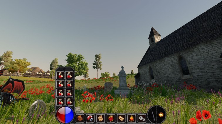
Before I get into my major complaints and problems with this mock up, I’ll explain what you’re looking at first.
The items along the bottom (red and blue orb, bottom-most panel buttons and two circular buttons to the right) are always present.
The panel containing the potions slides up from the bottom when the red portion of the orb is clicked and held, or when it’s right clicked. It’s intended to be a quick access menu showing only items that will heal the player.
A similar panel would appear containing mana-restoring items, equippable weapons, and spells when the blue portion of the orb, the sword or the fireball looking button are clicked and held or right-clicked, respectively.
Basically, I wanted to give the player automatically filled quick-access buttons for commonly used items (health and mana items in particular), as well as a quick way to change spells and weapons.
I think this is a pretty good design functionally, and would help alleviate some of the pain of navigating through tons of menus that is so commonly associated with RPGs, but I’m not sure if I’ll stick with it or not–simply because I think it’s a bit of an unconventional and nontraditional design that might not be intuitive enough for players. (Psst: I’d love to hear some feedback.)
On top of having the ability to display these quick-access menus, left-clicking on the red orb would automatically use the healing item best suited to the player’s current health (healing as much as possible without wasting the item’s healing potential). The same thing would occur with the blue orb, but for mana.
The sword and spell icon would simply attack with the current weapon, or cast the most recent spell, accordingly.
The icons along the bottom, from left to right, would allow the player to:
- Access their inventory
- Access their character Screen
- Access the map
- Access spells
- Access quests
- Rest
- Access the settings/pause menu
Of course, each of these functionalities will also be able to be performed with shortcut keys (‘I’ for Inventory, ‘R’ for Rest, etc.). In the end, nine of these eleven buttons (all but the health and mana buttons) are ultimately redundant because their functionality will be duplicated with key presses. However, I think the benefit of intuitively letting the player know the functionality exists by showing it up front and center probably warrants their presence. Again–we’ll see.
Now for the problems I have with this so-called ‘mock-up’ (perhaps a mockery of a mock-up is a better description).
First of all–just look at it. While it’s not perfect in its appearance, it looks pretty damn close to a polished UI. The problem with that is that it’s a mock up. It’s not supposed to look polished.
While I did do some pencil and paper experiments first, I think I spent too much time making it look good, and I think that’s a bad thing–at least for this stage of development.
I should be focusing on layout and functionality, not final appearance (although that’s probably a good thing to keep in mind while designing).
While the mock up you see above only took me a couple of hours total to put together, it caused complete paralysis when it came time to design my next UI (specifically my character equipment screen).
I started drawing stuff on paper, then went on to photoshopping, but ultimately wound up with nothing.
My mind was too all over the place.
Something like this went through my mind:
Quote
Do I want a diablo-esque equipment screen? No. That’s a top-down game–does that really fit for me? What about a more abstract equipped item scheme using ‘isEquipped’ markers like in ‘The Quest’?
Should the equipment screen always have the inventory screen attached? Or should it always have the character stats screen attached? Or both? Or none?
Should my menus be tabbed, allowing the player to click through the menus, or should they be independent floating windows? Do I want a full-screen menu system, or windows?
Jeez, I don’t know. It really depends on how the game plays and X, Y or Z. I don’t know X, Y or Z yet.
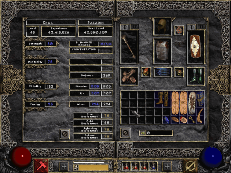
Diablo II Equipment/Inventory/Character Menu
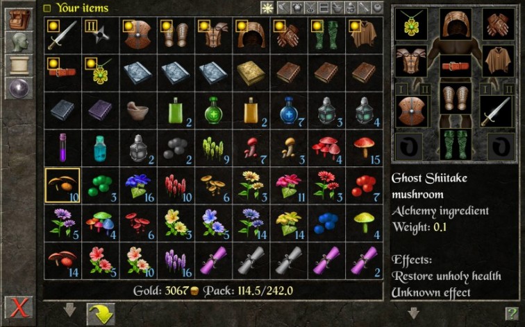
The Quest Inventory/Equipment Menu
Although I have a pretty solid overall vision for the game’s theme, look and feel, there are still a ton of unknowns. It was at this point that I fully realized that really, I’m still prototyping.
Rather than trying to make all of these decisions during design, I need to be doing some bare bones experimentation to see what works and what doesn’t in order to make my decision making part of the design process.
So, rather than developing further semi-polished mock ups like the one I’ve already made, I need to have some super basic black and white boxes with text instead of images for buttons, etc.
I need to be rapidly prototyping, testing, scrapping and refining these UI menus directly in the game (maybe some quick pencil and paper first). I think I need to make a UI for each of the questions I’ve been asking myself and actually trying it out, instead of just trying to imagine the pros and cons of each. I need to test each one (and hopefully, get some others to test them too).
Ultimately, even if I’m not able to make some final UI decisions right now, I don’t think it’s a big deal. I just need to get something relatively close to what will work best so I can move forward with developing future mechanics.
There will be lots of time to revamp the UI later if I need to.
That’s it for now, and please, if you have any feedback or critiques, share them!