I decided to call this entry "Borders and a Goal" just to make it easier to remember than "Progress Report 10-Nov". I feel like I've spent the majority of time downloading and going through free effects packs, mostly fruitlessly. Kind of starting to hate particle systems, to be honest. From the beginning I imagined that I could actually draw at least fire by hand... which is, of course, not necessarily a piece of cake, but I'd feel more productive than this.
It also turned out that my worries about glitches in the standalone were unfounded. Well, they only come up at qualities below good, I think. Which is an easy fix.
Brainstormed a lot about such aspects of gameplay as how to limit the play area, what to have as pick ups, and especially what to have as the goal, while staying with the theme. Managed to implement some parts in today's video. Speaking of which:
Oh, and finally, redid the normals for one tile type properly (baking from a higher-poly mesh), and as expected, any supernatural lighting behavior disappears. Actually comparing the two textures on the Unity preview sphere it's pretty clear that something's wrong. It's like its back side manages to catch light from the front. I'd say it's more of a hypersphere than a simple sphere, which could be interesting if I could produce this result on purpose.
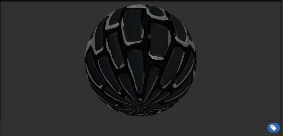
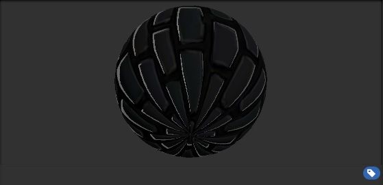
First - old; second - new.

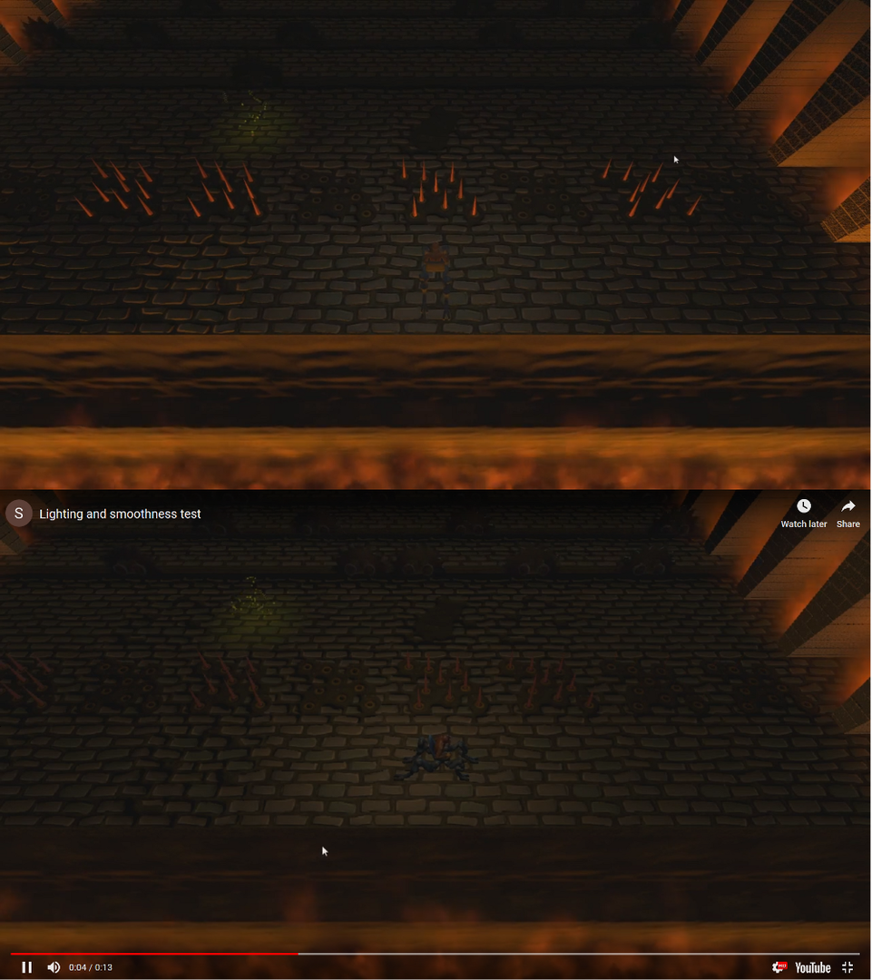
Damn!! This is awesome!! Only critique, the player character is hard to see, it doesn't stand out at all. With all the awesome going on here, you may want to highlight your super cool character as well.