Quote:ghosted
'Obvious' was perhaps a poor choice of phrase but it was just a simple suggestion that when someone is representing such a restriction it's typically done with a classic red cirlce like that. I just liked the idea of adding a more comedy/slapstick impression with the businessman robbed of his suit and left with his briefcase. As if to suggest the compnay is not about denying boring suited types but completely refusing any sign of stiff behaviour.
Though I won't use your "robbed businessman" idea ;-) I appreciate your reply, since you've given me reasons to think of a more originall logo. It'll contain that "suit" and some kind of restriction on him too, but... maybe it'll look different.
Quote:Pruvaloo
First off, id say the new name is cool, however, the new logo needs to be a lot higher res in order to look professional, at the moment its looks way too pixelated
Ok, that's great - third person says he likes new team name! :-)
About pixelization: it was somewhat intended... but read on.
Quote:
also, i imagine that you are trying to copy the style of that material version, looks like youve tried to emulate the folds and creases in the material, however, this just makes the cirlce look, well, wonky, and the man leans over to one side
if this was on material then fine, as material moves and folds and creases etc, but for a team logo, its just looks too amateurish
i dig the design quite a bit, so just make the man stand up straight, make the circle a proper circle and make the res nice and high
Lol :-) I'm not trying to copy or emulate anything, nor circle nor man, I just opened that originall picture in GIMP and started editing :-)
IMHO, idealy round, perfect circle without any folds etc. would look more boring to eye than how it looks now.
Hmmm, leaning man to the left can be explained by:
1. in originall picture he was also leaning, and I'm lazy
2. he's keeping heavy briefcase
Choose the one that best
suits you :P
Quote:
oooh, also maybe sort that text out, it has a deffinate retro feel, looks like it belongs in the original Doom. The rest of the logo has quite modern feel, so either try and retro up the man, or stick some more modern text in there. The black background is a little harsh as well, maybe try it with a nice halftone grey?
Now, that's what I wanted to hear - it has retro feel.
That feeling is what I'm struggling to put in my games too. You see, graphics take second parts in my games - more important are: story and gameplay. I'm fed with all those flashy games in 1600x1200x32, which IMHO adds nothing to the fun you have.
You see, today I played with my sister for 2 hours in Super Mario 64 on Nintendo 64 - game and console from about... 8 years ago? And I tell you that it was fucking great - SM64 is IMHO one of the best games in world, I've been playing it constantly for 5 years.
I think today most games have too much polished graphics, at the expense of gamplay and fun - and I think that other people feel the same. It's one of the reasons I've chosen "Suits No More" team name - from various postmortems, rants, articles and forums I've often heard that programmers in big companies, that produce AAA titles, often want to code good gameplay or include some other "higher art" elements, but "suits" tell them "no, it's game for mass market, so, you'll do this and that, or I'll fire you".
Maybe that's not happing very often, but you all probably know some facts about EA...
So, now you'll probably understand me - that logo is some kind of protest against such evil practises. And in this case, it would be dead stupid to polish it... :-)
Quote:
Woah, didnt mean to write such a long post but yeah, keep us updated with its progress
Me too :-) But I wanted to explain everything in fullest details...
Anyway, I also appreciate your comment.
Btw, ++rating for everyone for help :-)

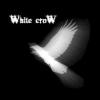
 New logo:
 Do you think...
- old name was better?
- old logo was better?
Does...
- new name sound stupid, silly or bad?
- new logo looks horrible?
Obviously, theese are only samples, you're encouraged to have own oppinion ;-)
Please be honest - I'm not native english speaker, so for me "Suit No More" sounds good, but other people may die laughing at the stupidity of it...
Btw, if anyone was interested, currently this "team" contains only one person - me :-) But that wasn't true at begginning, and may prove false also at the end. So if you're artist looking for a team to join...
Do you think...
- old name was better?
- old logo was better?
Does...
- new name sound stupid, silly or bad?
- new logo looks horrible?
Obviously, theese are only samples, you're encouraged to have own oppinion ;-)
Please be honest - I'm not native english speaker, so for me "Suit No More" sounds good, but other people may die laughing at the stupidity of it...
Btw, if anyone was interested, currently this "team" contains only one person - me :-) But that wasn't true at begginning, and may prove false also at the end. So if you're artist looking for a team to join...