Animation: probably the best animations are images with lots of contrast. As you can see in this frog, the key factor I think that played in making its animation look really good was element. For one, there are few colors--which makes it all the better. Some people go overboard on colors, wasting time and energy trying to reshade and match styles and whatnot, when in reality the most beauty comes in simplicity. The universe may have well evolved a color at a time, who knows--the first elements of the universe may have been a rock a single shade of purple. Who knows? Who cares, even? We all already know the outside world is so extremely vast that trying to duplicate it on a most realistic level is absolutely stupid, especially seeing as how functioning in reality itself is already a seeming extreme workout.
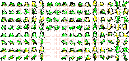
Okay, so perhaps it's not extreme--the point is, a frog, for the most part, needs only two colors, and then this frog uses a darker green and a darker yellow for shading. Apart from that, you have a black and a white which serve well for an outline and shading and also a highlight and detail. What is highlighting? Well, mostly detail. Shading and lighting are basically the heart of detail, I've found. Without it, the world is a practical rainbow, a single lightbeam shooting through a prism reflecting the forms. Without shading, there is little detail and mere color.
If you want to learn to draw beautiful art with a realistic element, not being extreme, you will look for darks and lights. If you look at a bush to see the darks, you will maybe see some Y shaped regions of darkness, some big sideways O shaped regions with bumpy edges, some various randomish dark areas, then usually above those dark areas you will see a bright area. Why? Because those areas are dark for a reason: something is blocking it's light. Usually it's the upper twig or something surrounding it which has some protruding areas that are catching the light. The lightest regions may be few while the second lightest are more abundant--and that is to be expected. It's like a reflection on a glass; the bright highlight is tiny and then things blend from there.
If you want to learn to depict any graphic, shading and contrast is key. Some people are either afraid of using few colors or using too many--so they may use something like one or two colors while someone else may use a bunch. Basically what you need to understand is that where there is light there you will have a set of three or four colors, and where it is quite dark, you will use darker colors with maybe some hints of gray, purple, black, and/or blue. 6 or 8 colors might sound like a lot, but believe me, it isn't. When coloring the lighter areas you may use 3 shades, then when it gets quite dark/is shaded, you may want to switch the 3 colors up to use some purplish blacks to give a great contrast of lights and darks to depict the object's form.
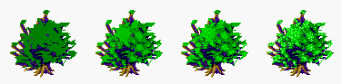
Ignoring the detailed trunk and branches, as you see on this tree (whose form was made by using a tree fractal program which can be downloaded from various websites who have a tree fractal former program for download), basically I went through and saw where I thought the tree would be protruding. Where that was so, I added big splotches of a lighter green--why big splotches? Because to get a quick and beautiful escape from a totally dark green tree, big splotches will add for a nice contrast without being too crispy.
I added a few highlights outside of the big splotches, so don't let that confuse you, if you will. She's turning out nice, indeed, but she isn't fnished in the second frame, and those various highlights are meant to depict "random" protruding leaves who are catching sunlight. The third frame adds another highlight to help define the leafy form and it's more "random" if you want to call it that, and it's also less abundant. It's less abundant because the second shade already helped sprude up the contrast/the big splotches that catch sunlight. Therefore, it already has its big bushy/bundly look to it, the third color which is the highlight is helping add more leafs and detail to it/definition. However, note if you would that there's no many of this highlight on the darkgreen...it's mainly centered around the original highlight because keeping with reality, you wouldn't find too many big bright spots in an area with shade. Anyhow, I topped it off with a last highlight which you can see is hardly much work, if you'll zoom in you'll notice it's more of adding 2, 3, 1, and sometimes 4 or 5 pixel areas of highlights to give it a natural look and not too bright.
You want the colors to compliment each other and blend nicely, so while contrast is nice to define shape, it's not the greatest for great contrast to be used as detail, necessarily.
You also will see that I used four colors for green, and three colors for the purplish/blue shaded areas of the leaves. They were shaded a similar way to the greens, so I did not bother including their progression in this tutorial. You do not need them, it's so simple and easy you should not need it.
Anyhow, as for animating the frog, what you will want to do is imagine your arms being the arms of a frog--this is spiritual, yes, so if you are too afraid you may stop reading. No need to force it, we aren't too desperate to pretend we're a frog here. Just imagine the frog's arms and hands, it's long bent legs and feet, its slanted back and abdomen which blows up and down like your chest but more dramatically with your groin resting on the ground. Feel your head and neck blending with your body, not too defined. The frog has hardly any neck, so if you would, imagine your neck and body being one. Now, as you draw the frog and feel it squishing to the ground to jolt back up for its leap, imagine the visual of its neck and its belly as it does so. As its arms bend out so that its throat comes closer to the ground, its back legs and butt are pushing up into the air to push it off the ground as it comes back up with the momentum of doing the pushup with its arms. So, as you feel yourself being this frog, look now at the frog: with its throat pressing toward the ground, from a front view, the belly will begin to disappear as more of its head and back come into view and the belly rocks back behind it as its legs and butt lift up into the air. When it comes back up, the belly and abomen are rocking back up in front toward the camera--or your eyes. As they do so, if this frog is doing a backflip, its head will lift up and you will begin to lose sight of its eyes and green back and its belly/throat will come more into view until it is completely vertical. When it is vertical, its legs and butt will become to come out toward you, and so the throat of the head will be swing backward from the camera, disappearing as the belly comes out in front of it and the but being closest to the camera. Likewise, the butt will get bigger and become visible while the belly and throat move back and become invisible. As this is so, you ought to keep in mind that the back legs are following this butt and the front legs following toward the throat--which is back behind its butt from this perspective. Therefore, its legs and feet will be closest to you if they are stretched out past its butt. Likewise, they will appear perhaps lighter in contrast with lighting, larger because of perspective (the closer toward your eyes something is, the larger is appears, while the further away it goes, the smaller it appears).
The green back is beginning to show and now the greenback is showing as the frog's belly and throat are not visible and its back is in front toward your perspective/viewpoint. As this is so, the frog is upside down with its head facing the ground. Now its head is coming out toward you, and returning to where it started. Okay, the frog has done a backflip and now he appears to be leaving back to the pond or something, I am not sure. A panda is chasing it now...hm...let's stop and go back to the point where the frog returned to the angle it originally began: you may loop the backflip now without redrawing this same angle.

You don't have to worry too much about having a realistic looking frog; I kind of stumbled onto a nice looking frog by the animation. Apart from the animation the frog itself would probably be rated as lowsy. Therefore, if you want to make good animations, imagine living in its anatomy--you don't have to be afraid or disgusted, because this is for understanding, and understanding is the most important thing in life as it sets you free. Therefore, most graphics are hideous, and most animations are hideous, but what makes them attractive is their liveliness. I think that all graphics are innately ugly unless animated; while this is true, still images can make good scenery and whatnot like a tree. However, for the most part a person is more interested in watching a good animated graphic than anything else, because like life, nobody lives in a snapshot. Life is not a snapshot, if you let yourself believe this then you are dying. Therefore, what makes something best is understanding its angles and movements.
I found that drawing the frog's angles and sprites for some of these frames with pencil was good for when turning them into pixel art. I looked at the pencil drawing and then drew it in pixels on the screen (I did not scan and trace over it), which is easy because 32x32 is not very big, and it turned out rather nice I think but I did not do it for a personal reward, but for other people.
Moral of this tutorial? Art is becoming one with an object; depending on what is depicted/its message/purpose is what makes art good or bad. Using less colors is great, and contrast and shading define an object.
Now, as for the physics of a hop, here is what we will do.
We will look at this frog as a 32x32 square. We paste it onto the ground, then as it begins to jump up into the air, it will first move off the ground 56 pixels (you can experiment with this to get the desired results), then each frame it will move the last amount of pixels minus 8 (the higher the number the stronger the gravity). So, the second frame it will move 56, then 40, 32, etc. until the numbers become negative and all the negative numbers added up equal the positive sequence.
Because this one worked out evenly, basically what you want to do is make the positives equal the negatives. So, if the last frame causes the animation to recede more than how high up it moved (in this cause it would be 56+40+32+24+16+8), you would cut the last frame down how much it has exceeded that count--or if it's a bouncy ball or something you would then go to depict a rebound.
Consequently, the height of the frog can be the starting height of the animation image. Likewise, to get the real height you would add 56+40+32+24+16+8 to the 32, which is what I am using right now. So, the height of the image should be 208. Now, because I already figured out the 56 starting point and gravity variable, this animation happens to time perfect with the number of frames and activity going on, so that the frog does not land on his head or back, or something. :-)