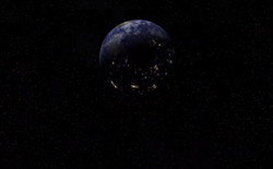
in this picture
green = 0 1 0
blue = 0 0.5 1 (0 0 1 is much worse)
are there known ways of balancing the colors more?
perhaps by using the inverse of the luminance
luminance = 0.3 * R + 0.59 * G + 0.11 * B;
in this picture
green = 0 1 0
blue = 0 0.5 1 (0 0 1 is much worse)
are there known ways of balancing the colors more?
perhaps by using the inverse of the luminance
luminance = 0.3 * R + 0.59 * G + 0.11 * B;
making blue etc stand out more

Author
in this picture
green = 0 1 0
blue = 0 0.5 1 (0 0 1 is much worse)
are there known ways of balancing the colors more?
perhaps by using the inverse of the luminance
luminance = 0.3 * R + 0.59 * G + 0.11 * B;
I'd say that the inverse of the luminace would be your best bet, but you also need to take gamma into consideration I think.
Quote:Original post by zedz
in this picture
green = 0 1 0
blue = 0 0.5 1 (0 0 1 is much worse)
are there known ways of balancing the colors more?
perhaps by using the inverse of the luminance
luminance = 0.3 * R + 0.59 * G + 0.11 * B;
You can't go above 1 (that would be like pushing the button to 11..), at least until high dynamic range screen are out, but what you can do is :
- reduce the brightness of the green object, so that the blue object doesn't look so dimm (you can also reduce the brightness of your scene). The luminance function will tell you that you need roughly 5 times more blue (in linear space !) than green to achieve the same luminance perception.
- do not use "pure colors" but instead slightly desaturated (a combination of blue/red/green). The more desaturated they are the brighter they will appear, with maximum white being the brightest that your monitor can display (you could have the blue object ramp from pure blue to bluish white).
- you can also "grow" the blue objects so that they take more space on the screen, with the assumption : more space on the screen = brighter (that's the reciprocal idea of how antialiasing works). You can also shrink the green one.
Be careful when doing your computations that you need to be in linear space. Rendering is by default in sRGB space (mid-level gray is at 186/255).
LeGreg

This might be (partly) down to the fact that the human eye is most sensitive to green light, possibly.
Make it glow. Give it a white or at least a light blue center. If you need a visual, just look at how starcraft 2 does blue.

Author
cheeers everyone
i did try scaling the green+redblue down by the inverse of the luminance, it did balance out the luminance but had sideeffects eg orange looked crap.
yes the best/easiest method is to just do a different effect when blue is used, increasing the width of the blue ring is good (as it gets fed to the glow buffer)
(starcraft 2's textures look very nice btw)
This topic is closed to new replies.
Advertisement
Popular Topics

Advertisement