Feedback on some coder art

Started by
2 comments, last by NetGnome 12 years ago
I'm making a topdown spaceship game as a personal project and I need some help with my spriting. I'm trying to go for a look kinda like this:
SMscreen09-1.png
(taken from a random post on the Battleships Forever forum)

Here are my attempts:
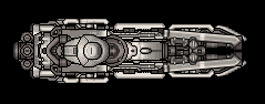
[attachment=7888:Cannon A.png][attachment=7889:Enemy A.png]

Here are it is in game:
[attachment=7890:InGame 1.png]
(click it to make it non-blurry)

I'm also thinking of scaling them up from 64 x 64 for the whole sprite sheet, but I'm not so sure.
Anyway, can you give me some feedback and pointers?
Advertisement
I think you should expanding the spaceship's scale,this way will make it looks more attracting,just like the example showing above.
And I also think the color needs more retouch.
Stupid suggestions,hope can help you!
Keep it consistent, you have a red and yellow wire and some blue detail on your ship, just pick a single color to add to the grayscale, or dig into color theory. Scrap the wires, you don't have enough pixels to have that kind of detail. Still you could try to pop some little details by shading it correctly.

While you have not much to work with, your shapes are all uniform, Try to add some interesting shapes, also don't pillow shade but pick a light source and shade accordingly, shading metal properly is hard though.
I like the original ship design but the actual in game ship size is disappointing. much is lost. if your game has to use that size i would simplify the design.
Another good place for examples of 2d-top down space games ins S.P.A.Z. (Space Pirates And Zombies). I would suggest you snag the demo and check it out, may give you some ideas :)

This topic is closed to new replies.

Advertisement