
I've just finished a demo build for my first game: A 2D fighting game heavily inspired by Smash Bros. It's shabby, lacks polish, and doesn't even remotely represent the finished product I first dreamt up--so I guess it's a pretty typical first game attempt. Anyway, this morning I was reflecting on the level design in Super Smash Bros., and it suddenly occured to me that there was one persistent element to most of my (and many other people's) favorite maps. Although it isn't the single component of any map that it's in, it is always the centerpiece--the main building block.
It's a shape. Well, it's actually kind of like a smilie face:

It's not very impressive, on first glance, and it may not look very familiar to Smash Bros. fans, until you see these examples:

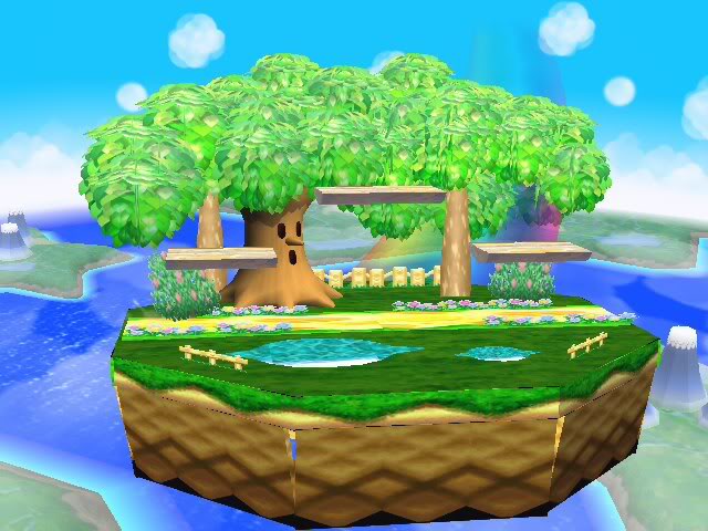


Can you see the shape in those few stages? It's likely that you'll remember it appearing momentarily in some other weird stages, too. Remember Captain Falcon's stage in Smash Bros. Melee? You spend most of the fight on this little platform that zooms around a race track, but every once in a while it stops and there's a platform or two you can stand on.
I'm calling your attention to this shape, not to brag about how observant I am, but to hone in your focus on what this shape means to the gameplay. Remember, this little smilie face is the thing players will be fighting on. When they fall off of it, they fall to their deaths, and the battle (at least until they respawn) is over. The smilie is the difference between life, and death. So it kind of matters, right? So what are the consequences of the smilie face exactly?
Well, first of all, a fight in Smash Brothers usually has four combatants. When the match starts, two combatants are on the smilie's mouth, and one is on each eye. Their spawn points look like this:

Each color is a different character. Note the arrows indicating the possible directions they can travel from their starting point, no matter which direction they're actually facing when they start. These starting points immediately imply something. Why are two players on one level, and the other two on another? Why is the top level split into multiple pieces instead of one long piece? Well, think about the different ways you can bisect the map so that there are only two spawn points on any given side: You can cut it down the middle vertically, leaving two columns of spawn points, or horizontally, leaving two rows. This is important for giving the player a subtle hint that in Smash Bros, for the most part, the players are going to pair off into their own mini two-man battles, the winners of which will then enter their own final two-man fight to decide the ultimate winner. It's like a tournament in which the rounds happen at the same time, on the same screen
But there's a lot more to it than that: This design forces players to do more than stay grounded and have a horizontal, street-fighter-esque match. Look at the options green and pink both have. None of their decisions entail staying on the ground. They can either jump across and fight one another, drop down through the platform and fight the enemy beneath them, or drop down either side; The one thing they cannot do is avoid being airborn. In this circumstance, they're forced to learn that you must be adept at dodging, attacking and even timing your jumps while in the air. Meanwhile, the players on the smilie's mouth are forced to learn that they will have to dodge, defend, counter and preempt airial attacks while on the ground.
Mind you, this is all in the first 5 seconds of gameplay, but it's essentially Smash Bros. 101. Now go back and look at those screenshots again, if you don't mind. You'll notice that the maps aren't actually very big. The smilie's mouth isn't suited well to holding all four players on it. This is another hint that the players should break up into two-man fights, the way the designers intended, so as not to get in each other's way; on the other hand, it keeps the two-man battles from completely separating which would eliminate the likelihood of occassional convergences of the battles, or spontaneous switch-ups, where players just suddenly decide to focus on another enemy (As a side note, it's this very reason that competitive Smash Bros. Melee players love maps like Final Destination, and Zelda's castle--they're huge and completely flat on top. You can pair off and have your horizontal Street Fighter-esque battle to the death with no interruptions).
Here's the picture again, with letters distinguishing the meanings of the different arrows. D means dodge, A means attack:

If you're making a Smash Bros. style game, this is the kind of stuff you need to study. Actually, if you're making any sort of fighting game with verticality (meaning you aren't constantly grounded, like traditional games in the genre), this is some brilliant design work. I could go on and on. For example, look at the eyes of the smilie again. They're baiting a grounded player. Haven't you often seen an enemy standing on a floating platform, not facing you, and just wanted to surprise him from behind? He's just right there! He's not even thinking about you! It's an easy kill, but you've got to use a jump attack to get to him; staying on the ground is not an option. This is called conveyence: It's a subtle message from the designer to you, and it says "Jump around! Don't stand there! This game takes place in the sky!"
Even if you never need a design strategy like this, I think it's important to use this example as inspriation when designing levels in your own game, be it a platformer, RPG, or MMO. Want to tell a player how important jumping is in the game? Make it impossible for him to advance without jumping. Or bait him into jumping. Or better yet, do both. Think of the start of Super Mario Bros. Those bricks floating overhead that it looks you can stand on or hit? The goombas that are moving toward you, forcing you to either jump or die? It doesn't get any better than that:

So what do you guys think? Am I giving the game way too much credit? Am I off the mark? Am I seeing something where there's nothing?


