Hello,
Not too long ago i started working on my project, called "Deluso", and before i set the art direction in stone, I'd like to get some feedback on the current art of my game.
The game is a 2D sidescrolling puzzle adventure game, where i do the art, the design and the code. Without saying too much about the concept, I'd like to hear your first impressions, and perhaps some more constructive, in-detail feedback where applicable.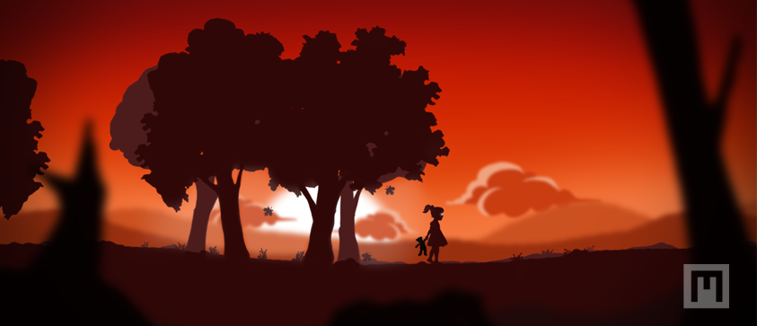
So what do you think? Its basically a silhouette foundation, with a limited color palette - but still with great variations in terms of color use throughout the game. In addition to the ones illustrated above, there will be 2-3 more "themes".
Is using such a wide array of color themes a negative breach of coherency, or a refreshing take with contrasts? Is it too similar to the art of already existing titles out there? Am i onto something here at all?
Feedback needed - 2D art

Author

The first one is gorgeous, wow. Great use of silhouettes and color. I'll admit, though, the little girl with glowing eyes silhouetted against a comparatively harsh environment brings to mind Limbo. That might be an unwanted comparison.
But if you don't mind that, the feel of this is lovely. I would continue the use of color-- that's the main thing separating it from Limbo in my mind without seeing gameplay. Perhaps every switch of environment could have a relatively drastic color palette switch?
For instance, the stormy night scene is the weakest here.
It doesn't do a fantastic job of convincing me that it would be raining nor that it's night, and that's not helped by having it right after a "morning" scene that had similar blues used for the background layers. The not quite seeming like night could just be the current color palette choice; but if you're going to have it raining/snowing try to have more cloud coverage. I know it's sort of trivial but it really took me out of the scene when I took a moment to go "...where's the rain coming from?"
Otherwise, looking pretty good out of context; I'd like to see more!

Yes, the first scene is really lovely. I would try to transfer the concept on the other scenes too.
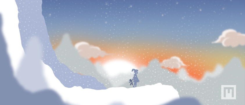
IMHO the snow scene is the weakest. For one you have no value gradient from low (foreground) to high value (background), ie the snow has the highest value ( and the sun). Then you use contrast colors in the background, which introduce some kind of disharmony, gathering too much attention (your main character should get most of the attention). And the contrast of the main char and the background is quite low.
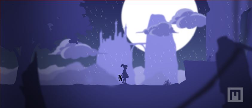
The third scene is better, but lacks the look of the first one. The background lacks the softer gradient of the first scene (you can read the silhouette much better in the first scene) and the foreground to background gradient is more limited. In the first scene the three center planes (very dark tree - main char - dark tree) consists of a color gradient and a very good contrast to the background. I would mimic this in the last scene too. And try to shift the hue too, if not done yet to (i.e. for the main char).
But otherwise very impressive !
IMHO the snow scene is the weakest. For one you have no value gradient from low (foreground) to high value (background), ie the snow has the highest value ( and the sun). Then you use contrast colors in the background, which introduce some kind of disharmony, gathering too much attention (your main character should get most of the attention). And the contrast of the main char and the background is quite low.
The third scene is better, but lacks the look of the first one. The background lacks the softer gradient of the first scene (you can read the silhouette much better in the first scene) and the foreground to background gradient is more limited. In the first scene the three center planes (very dark tree - main char - dark tree) consists of a color gradient and a very good contrast to the background. I would mimic this in the last scene too. And try to shift the hue too, if not done yet to (i.e. for the main char).
But otherwise very impressive !

Very nice!
I gotta agree with the others and say the first one is the strongest and that the others are a touch weaker, but still not bad.
The second one with the snow is definitely thrown off by the inclusion of the warm tones. When I've been in winter and frozen weather, it always seems like the sky is a sheet of grey and the sun is a tiny speck that really doesn't impact you. But that's just my experience and why it doesn't really impact me.
As for the third one, maybe try using a different palette? I like it but it does still feel incomplete to me but I can't quite put my finger on it...I think it's because the mid-ground feels so barren compared to the first and even second one...Oh wait, just saw that tree hidden in there...yep, that's what was off. I think finding a deeper contrast would really help more cleanly define the different elements in the scene.
Anyway, good job! Keep it up!

Pretty, I think it looks good for the most part. I might try to put it in Photoshop later and mess with the curves to see if I have anything more to say...
On the last one, I think it would look cool if you put some contrasty lights on the background castle, like yellow windows or something to bring it out.
On the last one, I think it would look cool if you put some contrasty lights on the background castle, like yellow windows or something to bring it out.
Author
Thanks a lot for the feedback! Very in-detail, and very helpful. I will do proper alterations to the 2nd and 3rd to incorporate the same quality as the first one.
I remember struggling a lot with the winter theme. My reference was a photo from a sunset in snowy environments, but such a clear sky could indeed not be, with that amount of snowfall! I'll re-iterate and see if I can make it better I'll share the rest of the themes as well in due time!
I remember struggling a lot with the winter theme. My reference was a photo from a sunset in snowy environments, but such a clear sky could indeed not be, with that amount of snowfall! I'll re-iterate and see if I can make it better
I'll share the rest of the themes as well in due time!

One thing that I feel makes the first one stronger than the others is the amount of detail put into it. There are leaves falling, grass flecks, and ferns visible. It makes it clear to anyone seeing that there is plenty to look at and admire. The snow and rain ones seem to fall flat in that, and so it comes off as lazier (not to say that you yourself are lazy).
For the rainy environment, try adding things that would contribute to the moody feel of it. Even something as adding vines or moss along the ledges is a good touch, and if it suits the level, maybe add statues or tombstones of some kind. Desaturating the colors of the rainy pallete might also pull together a darker feel. If you keep it at the brighter violets, it may come off more as bright and moonlit, which if it's raining wouldn't be the case. On the snow biome, add dead trees/shrubs, evergreens, and if you're feeling adventurous, maybe even a snowman or two.
The point is just make it seem like you're not walking on an endless expanse of nothing; people like having a lot to see.
As for the snow, I can say that snow has some general rules which you could follow:
- When agitated, snow will begin to start forming peaks. However if otherwise left undisturbed, it will round off. Depending on where you are supposed to be in the snow evironment, you can adjust these.
- On steep slopes, snow is almost always flat and thinly spread. If snow on a slope curves outward from its normal path, it cannot turn back. tldr: no bumps on steep slopes
- Snow will rest on the highest objects naturally. If you plan on having trees or other structures, think about how you would draw them covered in snow without confusing the player as to what it is.
- Any place in winter is almost constantly overcast with light gray clouds (become lighter the closer they get to the sun). There are still sunny days in winter, but if you want snowfall, expect gray skies.
This looks really good. Don't see anything wrong, it's crisp, clear and imaginative. Keep up the good work is all I have to say
Author
This looks really good. Don't see anything wrong, it's crisp, clear and imaginative. Keep up the good work is all I have to say
Thanks alot! Much work has been done, and soon I'll share some of it

One thing I really like about the first one, that isn't present in the other two, is that double layer at the character level.
Makes the scene feel like it has more depth.
I imagine the character to walk behind the darker trees, but in front of the lighter ones.
In the other two, there is just one layer at the character level, which makes it look more like a cutout, and makes the whole seem more flat.
Also the out-of-focus effect on the foreground and background seems a lot more balanced in the first one, contributing to the depth illusion
This topic is closed to new replies.
Advertisement
Popular Topics

Advertisement