Feedback on sprites wanted, please

Started by
5 comments, last by CoffeeCoder 10 years, 10 months ago

Hi all,

I've spent the last several days designing and re-designing these sprites/objects, and I think I finally found a decent style that works out pretty well. However, I would like some feedback before I progress much further on design, and any criticism would be great! Don't be afraid to be honest!

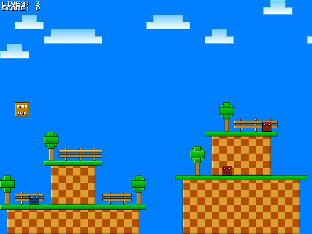
The game setting is that everything is either a cube or a rectangle and metallic in nature (hence the shading and 3D-ish effects), but I'm wondering if anything could be improved in the slightest. I'm still a little unhappy with the way the land tileset has turned out, but I like the clouds, trees and and fences pretty well.

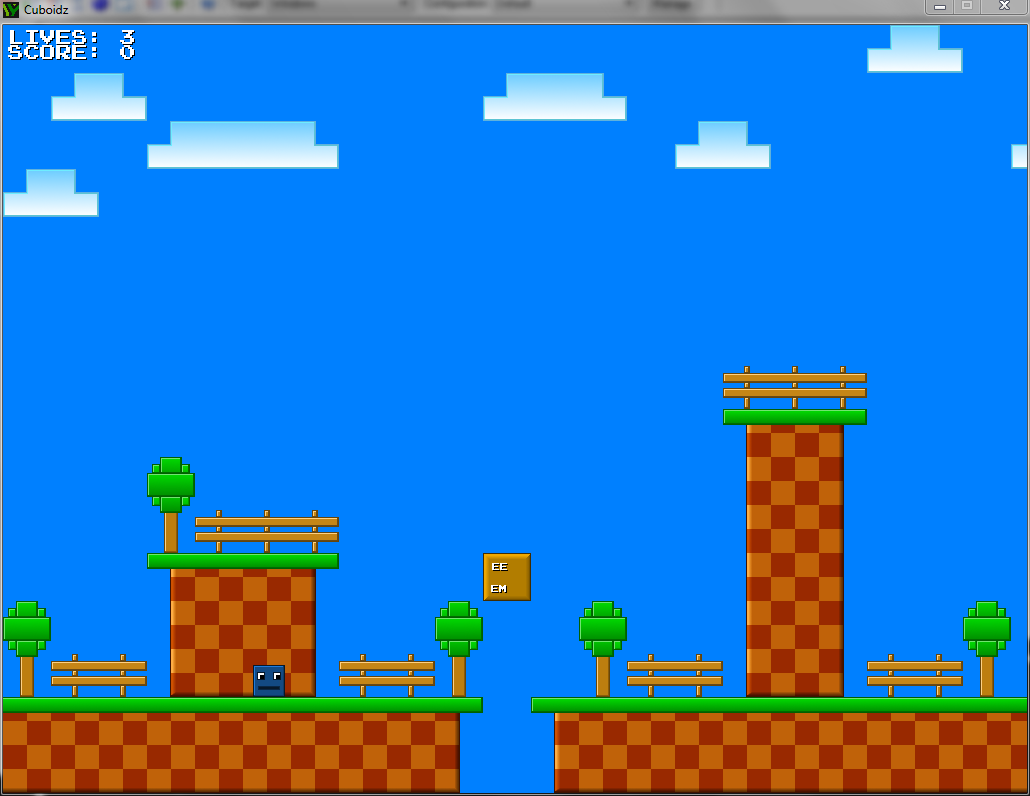
First, this is a video that shows the previous style I had. I found it too busy, and it distracted the player more than anything. Yes, I stole the Mario sound effects - don't worry, they won't be in the actual game. I just used them for testing purposes. tongue.png

">


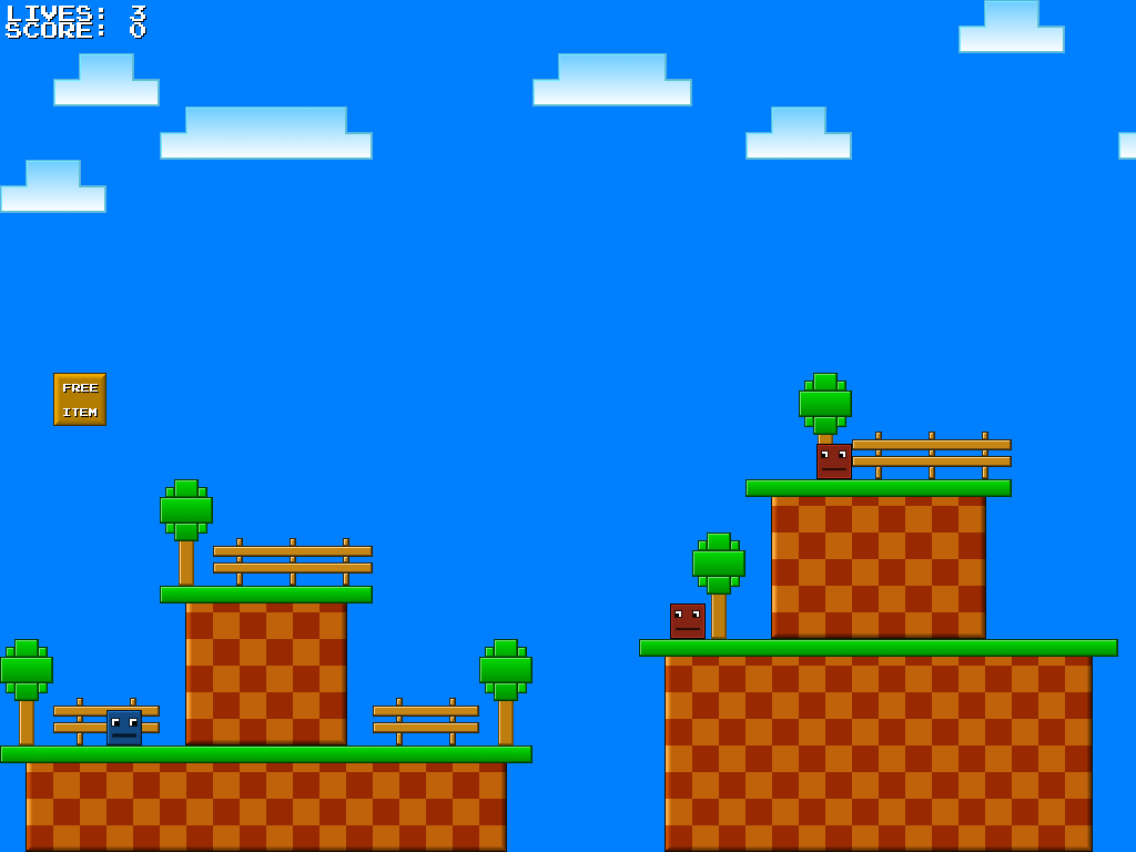
And here's an image, showing the most recent changes.

cuboidz_screenie04.png?w=1030

That's about all I've designed so far, but I've also been spending the days actually developing the game as well (as you can tell in the video). I've done all of this in the last 2 1/2 days, and that's why I'm asking for feedback on the overall design. I want to make sure the style works before I put much more effort into designing the rest of the objects!
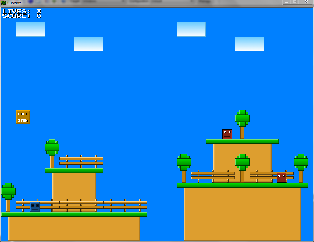
My website! yodamanjer.com
My development blog!

Follow me on Twitter! [twitter]jwg1991[/twitter]

Advertisement

The fences look quite good but they misleadingly appear to be foreground objects; consider replacing them with obviously soft decorations, like flowers and tall grass.

Omae Wa Mou Shindeiru

the gradients look nice. *thumbs up*

I like the cleaner new styler better than the previous one. Well done, looks like it could become a quirky little game :) The only thing I notice is that the clouds, while nice and minimalistic, kinda look like place holders, or not as refined as the rest. Maybe build them from a few smaller blocks to give them more of a cumulus-shape, to really accentuate that they're clouds. Just a suggestion :)

Petter Stenberg Hansen

3d artist/Developer

10ahead Games


www.10aheadgames.com

The fences look quite good but they misleadingly appear to be foreground objects; consider replacing them with obviously soft decorations, like flowers and tall grass.


Yeah, I'm thinking about ditching the fences and replacing them with pretty much what you suggested. Though I may keep them for a few things, and maybe I will make them foreground objects that the player passes behind in a few levels.

the gradients look nice. *thumbs up*

Thanks! Those were actually what I was most concerned about, I wasn't sure if the gradients would be an accepted style.

I like the cleaner new styler better than the previous one. Well done, looks like it could become a quirky little game smile.png The only thing I notice is that the clouds, while nice and minimalistic, kinda look like place holders, or not as refined as the rest. Maybe build them from a few smaller blocks to give them more of a cumulus-shape, to really accentuate that they're clouds. Just a suggestion smile.png


Thanks! And yeah, the clouds are kind of placeholder at the moment, I like your idea on how to improve them! My other plan was to just stretch them differently, but that wouldn't work out very well if I kept them as part of the tileset instead of separate objects.

Thanks for the feedback, everyone! smile.png

EDIT: Ok, I've some revisions!

I edited the clouds, and while I'm happy with them, I feel like I could do a better job still. Below is a screenshot that features them. I actually have two screenshots, and I want your opinions on which looks better - the "light" version of the land, or the "dark" version. First up, light!


cuboidz_screenie06.png?w=1024

And now the dark version!

cuboidz_screenie05.png?w=1024


I'm honestly leaning towards the dark version, just because I like the contrast better, but again, any criticism is welcome!

My website! yodamanjer.com
My development blog!

Follow me on Twitter! [twitter]jwg1991[/twitter]

Hm, looking better. I like the contrast provided by the lower ground, too, but in comparison to the first it looks a little less cheery. Your call on that one.

Though the clouds sparked a suggestion; what if background objects like the fence had a lighter (not black) outline? The clouds don't have one, after all. That might help separate them out.

I decided to go with the darker tones. It looks more like dirt than the lighter variants.

I took your suggestion, and made some slight changes to the outlines of the objects.

cuboidz_screenie07.png?w=1030

I think it helped quite a bit. :)

My website! yodamanjer.com
My development blog!

Follow me on Twitter! [twitter]jwg1991[/twitter]

This topic is closed to new replies.

Advertisement