Looking for feedback on UI components (Video)

Started by
48 comments, last by Orymus3 10 years, 5 months ago

I don't like it very much... These bars are not looking too good. Maybe make a small one (not that wide) below a ship (or two: red-hull, blue-shield). Also, I see no need for the cooldown bar at all, at least not on the main view.

But more importantly, where is the pause/rewind button? And "details window" (the one which gives you all current ship's parameters after clicking a ship)? These are supposed to be the main tools for viewing/analysing the battle, right? The main view of ships firing at each other in realtime is just an addition, right?

I suspect the main problem is that you don't "feel" what kind of information you want to convey. You don't find it "needed" as a player. I think you can go two ways from here, first try to understand the information flow and provide a rich feedback system, second ignore it and just make some ships firing at each other and just make it look good. Personally, I would vote for the second in your case.


As for ship colors, from an indie budget's standpoint, having each ship use color swaps would be a nightmare...
? All artists I met did recolours for free (or extremelly cheap). Actualy, adding icons would be more expensive...

Stellar Monarch (4X, turn based, released): GDN forum topic - Twitter - Facebook - YouTube

Advertisement

Imo, bars are both too long and not thick enough.

Also , I think you need visual clues (like smoke, damaged hull etc) for some milestone damages (25%, 50% etc.) as it is not good to stick some bars when it is a crowded screen.

mostates by moson?e | Embrace your burden


But more importantly, where is the pause/rewind button?

Not done YET.

I wanted everything in the background stage to work before assessing top HUD elements.

It will be located in the top left corner (play, pause, resume, rewind, next fight, etc.)


And "details window" (the one which gives you all current ship's parameters after clicking a ship)?

It will be broken down across the bottom part of the screen based on my wireframes.


? All artists I met did recolours for free (or extremelly cheap). Actualy, adding icons would be more expensive...

Depends on the level of reskin involved. Also, I'm considering having multiple status of destruction per ship, so this could quickly increase. I'm running on a tight budget here, even doing some of the art myself (bullets/beams for example).


Also , I think you need visual clues (like smoke, damaged hull etc) for some milestone damages (25%, 50% etc.) as it is not good to stick some bars when it is a crowded screen.

Yes, definitely thinking about that now. Would look better too.


Acharis, on 02 Nov 2013 - 12:44 AM, said:


? All artists I met did recolours for free (or extremelly cheap). Actualy, adding icons would be more expensive...

Depends on the level of reskin involved. Also, I'm considering having multiple status of destruction per ship, so this could quickly increase. I'm running on a tight budget here, even doing some of the art myself (bullets/beams for example).
Simple recolour will suffice. You can even order the image in 2 parts (PSD layers), the coloured one and the gray scale one. Then you render them separately and recolour the gray scale part on the fly (like glColor(1,0,0); for example :)). It does not add any work to the artist (if you get the PSD file and save the images yourself) since they heavily use layers anyway (to my experience).

Stellar Monarch (4X, turn based, released): GDN forum topic - Twitter - Facebook - YouTube

New Update!

[media]http:

[/media]

Here's what I did:

  • Added Red Masks (the ship turns to red as it takes damage)
  • Added Shields (the shield fades as it takes damage)

I've created 3 segments in the video, each with their own information flow.

Wondering what works best, and what I should keep building upon.

The number of weapon bars can perhaps be reduced by combining them into one, perhaps two if light and heavy weapons should be shown separated. For each weapon a thin mark is drawn onto the bar at the position corresponding the weapon's current state, and the bar coloring is done up to the maximum of all states. Hence, the coloring clearly shows the next available shoot, and the marks show the following shoots although less clear (so the importance is moved to what happens next).

To not contradict mippy's suggestion of segmentation (an idea that I personally find good), and to hint at their importance, the marks should not be confusable with segmentation ticks. While the ticks may be preferably thin and in background color, the marks may e.g. be colored close to the bar's color but more bright or saturated or so.

New Update!


Here's what I did:

  • Added Red Masks (the ship turns to red as it takes damage)
  • Added Shields (the shield fades as it takes damage)

MUCH better :) The 1 & 2 are very nice, the 3rd with bars was the worst.

I can see myself moving the mouse over a ship to get details when I see it getting hit. A nice general overview of what's going on.

Also I like the top "fleet" bar. I don't like how it looks (something is wrong with it, dunno what, maybe colour?) but I like the idea.

Generally, you are going into the right direction.

Stellar Monarch (4X, turn based, released): GDN forum topic - Twitter - Facebook - YouTube

Maybe tone down the effects a little. Have the mask go only half as red it does 0 -50% red I'm guess rather than 0-100% that way you can still make out the details of the ship and you can still tell its about to explode.

The shields might look better with an image overly that is darker at edges and lighter around the ship, some thing like this for instance:

shields2.jpg

The only other complaint I have his that the black background in 2 made it impossible for me to read the damage numbers. You might try making it a lighter colour like #333344. But it is looking good.


The number of weapon bars can perhaps be reduced by combining them into one, perhaps two if light and heavy weapons should be shown separated. For each weapon a thin mark is drawn onto the bar at the position corresponding the weapon's current state, and the bar coloring is done up to the maximum of all states. Hence, the coloring clearly shows the next available shoot, and the marks show the following shoots although less clear (so the importance is moved to what happens next).


To not contradict mippy's suggestion of segmentation (an idea that I personally find good), and to hint at their importance, the marks should not be confusable with segmentation ticks. While the ticks may be preferably thin and in background color, the marks may e.g. be colored close to the bar's color but more bright or saturated or so.

Arguably true, although I'm leaning towards removing these bars altogether. Truth be told, if there are 3 ships on either side, each with 5 weapons, we're looking at 30 gauges, which is far more than a player can focus on at any given point in time, even with slow motion.

This info could be available on rollover or click, but I'm leaning towards not binding it to the ship anymore.

That doesn't go to say that your suggestion didn't work though, just that I'm trying to make it easier to grasp and define where the player's attention should be upon first glance.


Also I like the top "fleet" bar. I don't like how it looks (something is wrong with it, dunno what, maybe colour?) but I like the idea.

What about the earlier suggestin to make it a tug-of-war bar? (aka, there's no grey area, only a continuum from green to red, and as red decreases, green increases and vice versa)?


Maybe tone down the effects a little. Have the mask go only half as red it does 0 -50%

Very accurate. I actually put it up as one of my notes on our Trello. The one reason I kept it as is for now is that full saturation is simple to understand, there's no doubt when the ship will break. 50% alpha will look arbitrary, and will take some getting used to for players to anticipate the "full damage" with an incomplete transition.


The shields might look better with an image overly that is darker at edges and lighter around the ship, some thing like this for instance:

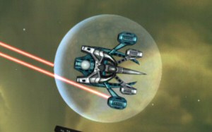
I made the shield myself, as placeholder art. You're quite right about it being ugly, I don't take offense. I was also considering to animate it through sort of "pulsed waves" that start from the center and "hit" the edges to give it more feel. If possible, some electric-current-like waves across the surface would be cool (especially when hit by projectiles) but I was only laying the base here, not the polish.

Thanks for confirming my fears though!

Was the ref image from Gratuitous Space Battles?


The only other complaint I have his that the black background in 2 made it impossible for me to read the damage numbers. You might try making it a lighter colour like #333344. But it is looking good.

Again, quite accurate. I simply took the "255" of R and B to return the color integer, and the actual colors don't look great. I'd need to increase G to get more vibrant (and closer to white) colors.

Duly noted, if I do end up keeping the damage "boxes", I'll definitely change the colors.

Thanks!


Here's what I did:

Added Red Masks (the ship turns to red as it takes damage)
Added Shields (the shield fades as it takes damage)

You forgot explosions, you've got explosions now! Great progress :). I personally like vanilla the most.


Very accurate. I actually put it up as one of my notes on our Trello. The one reason I kept it as is for now is that full saturation is simple to understand, there's no doubt when the ship will break. 50% alpha will look arbitrary, and will take some getting used to for players to anticipate the "full damage" with an incomplete transition.

What about using a multiply blend? Multiply the green and blue color component with health ratio.

This topic is closed to new replies.

Advertisement