I have heard several negative criticisms against the style of this in dark souls, so I am quite skeptical on whether I should create the game this style or not.
From what I've heard, Dark Souls is pretty hardcore (I ought to try it out! First person, you say? Mad Max is about the only game I've ever condescended to play 3pv only <g>).
Cartoons, cell shading, Anamie, etc are somewhat the opposite - not hard core - light - happy - cartoons - kid stuff.
even in the darkest moments of dragon ball Z, you know its going to be ok, cause the guys with spiked hair always win! <g>
Batman the animated series was the only one. There the trick was they drew it on black paper, not white. INCREDIBLE effect!
Ah, but how to reproduce that? that's the kind of thing you need - dark cell shading.
it's all about immersion!
I'll tell you right now, the pursuit of photo-realism is a straight up <everything horrible you can come up with> !
if you can use some other art style, life becomes much easier.
I wanted to disagree after reading the first few sentences in this paragraph but then you kinda turned around and I ended up agreeing with you ;)
Anyway, I think there are a TON of cartoon - comic - manga styles that are dark and brooding, ideal for a dark souls setting. Lets not forget that while there are a ton of "light and happy" animes, there are just as much creepy, eeri and dark ones.
And everything in between. If well done (which few achieve), animes have that unsetting ability to sometimes balance happy slapstick and a dark creepy story. Steins Gate is a very good example. The art style supports the story by giving hints at the dark and brooding reality behind the veils of normal happy life with cool effects, color, and art style changing for some scenes.
Really, some artists are masters at influencing the spectators mood with their art style. Some even go so far as to do the opposite, pair a light and happy art style with a creepy story, which makes things double as creepy. Some, like Tim Burton, do the opposite. Which is pretty much making his movies unique, quirky and charming.
Coming back to Dark Souls, lets not forget the big inspiration to it was Berserk, the long running Manga series. As a disclaimer, never played dark souls, most probably never will (unless I have a ton of time at my hands suddenly), but I have been a big fan of Berserk since when it was first translated to english decades ago. Until about volume 20 its one of the best comic series - well, stories in general - ever created. From volume 20 it kind of becomes a little bit disappointing, but lets not digress.
One of the important things here is, the art style. Its fitting the mood of the story perfectly, and it makes it clear that Berserk was created by one of the best comic artist of our time.
The amount of detail, and the 3 dimensionality is creating an image that looks hyperreal. Yet the missing color, and the way the black and white inking allows for extreme contrasts make the whole thing often look surreal, which is EXACTLY how a story like Berserk should look.
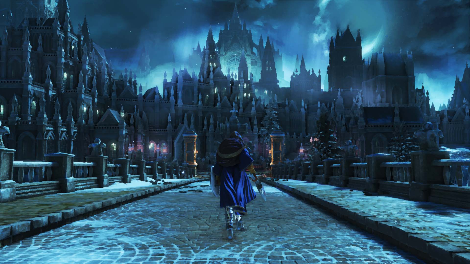
Personally, I think the guys who say "Dark Souls has to look realistic" have no idea what they are talking about. Dark Souls, if it really is as close to Berserk as some say, should look SURreal, not realistic. It should look realistic, but with undertones that make it clear this is not reality. It should be a creepy twilight zone where you don't know what is real and what is not. There should be no way to tell the magical from the physical, the real from the imagined, the living from the dead. There should be veils and mirrors that only let the few gifted see behing them and stare at a horrifying reality.
That is how Berserk is creating a world that is creepy and fantastic, incredibly gloomy yet fascinating at the same time. I guess that is how Dark Souls should look (and I would bet it does look like that, even with a "realistic" art style).
So I would say any art style that supports this "twilight zone" feeling, could enhance a dark souls game. A black and white art style, well done, could really bring out this feeling. A watercolor filter, carefully tweaked to allow for detailed and hyperrealistic characters up close, but letting the far away scenery wash together into a misty, mysterious mass of colors, could really make the setting look mysterious and surreal yet all to real at the same time.
Really, there are a ton of very, very good comic books and mangas out there that are enhancing gloomy, creepy stories with gloomy, creepy art styles. Many of which are using watercolored panels.
Some of my recommendations when it comes to dark comic stories:
- Berserk (already discussed)
- Curse of the Spawn (the What-if spawn spinoff where shit REALLY hits the fan)
EXTREMLY detailed art. Tons and tons of grit and dirt everywhere really hammer home the idea that the world has not only gone to shit but has become part of hell itself. Overuses digital effects like many 90's and early 2000's comics did IMO, still pretty cool.
Thanks to the artists style things look real, but not real at the same time. Similar "twilight zone" feeling to Berserk.
- Future Diary
A really, really good anime. The Manga is less good IMO, didn't like the art style, and the forced happy ending, which only gets hinted at in the Anime, kind of destroys a really cool not-happy ending.
While the anime art style looks pretty standard at first, they use it brilliantly to enhance one of the darkest stories in anime in recent time. The art direction manages to bring out a mood of despair and hopelessness perfectly at times, working with color, lighting, and extremly well designed characters that can express extreme feelings of fear, despair and madness with sometimes quite subtle facial expressions.
Even the "less subtle" characters (if you watched the anime, you know who I mean) work surprisingly well given how believable that characters still are. And thanks to the way the anime uses not only facial expression or body movements, but also the lighting and the whole scene to bring out the inner state of the character, it really affects you beyond what a normal movie could achieve.
There are some not-just-dark stories which also use the art style to get readers in the mood when they turn dark:
- Les Aventures extraordinaires d'Adèle Blanc-Sec (There are german translations, don't know about english)
An older french comic about a women in the early 1900's that gets into weird shit all the time... mumies, demons, creepy cultists. The stories are always quite dark and complex, the art is somewhat static (as is often the case with the french comic art from the 70's and 80's), but detailed and the art style supports the dark stories quite well.
Limit color palettes, quite dark scenes often taking place at night, creepy looking characters which may, or may not be bad guys.
- Battle Angel Alita (Gumn)
Another old favorite of mine, Alitas stories are often also quite dark and gritty. The art style is unique in its own way. Quite detailled, again using the stark contrasts allowed by the inking to create mood in dark scenes. I think the art style really brings out the postapocalyptic feel of the story, and switches between lighter, happier scenes and the scenes where stuff goes wrong, the madmen creep out of their dens and alita gets drawn into another dark story very well.
TL;DR:
Comics and Animes can be dark and brooding. They actually can be WAY darker and more brooding than realistic pictures and movies without digital effects.
The most important thing IMO is color, or the absence of it. Reduced color palettes, carefully chosen colors to make things look creepy, black and white styles can easely make things look creepy. This isn't just limited to comics and anime though, many movies used color and color palettes too to achieve those effects, especially now that digital postprocessing made that pretty easy.
The second most important thing is drawing style. It seems realistic and detailed styles lend themselves better to dark and brooding stories, altough there have been anime and comics which went with highly abstract styles and managed to make it look dark with the right colors or black and white contrast.
And then there is the thing where not matching art style to the story can really give you a nice effect, making things even creepier, ESPECIALLY if you go for a light and happy art style, with subtle creepy undertones paired with a dark and creepy story.
Lets not forget why happy tree friends was SO disturbing and gross :)


