Critique of RTS gui design

Started by
11 comments, last by aganm 6 years, 3 months ago

I need people to critique my gui design for a RTS. The game separates the unit building part from the RTS combat part. Right now, I only ask you to critique my combat GUI. The combat part doesn't have any construction mechanics so the GUI is quite simple. I feel like it could be better organized. If you could point me what could be improved, that would be helpful.

The first picture shows what it should look like in the game. The second picture shows detailed information on what each component of the GUI represents.


Credit: the art comes from https://opengameart.org/content/real-time-strategy-gui-hud-elements-unknown-horizons

gui.jpg

gui_detailed.jpg

Advertisement

Do you need the menu to always be displayed? I don't know what all the actions on your menu, but I'm not sure they need to be there all the time, as opposed to hitting ESC or whatever and having it pop up.  Similarly with unit stats, that seems like something that doesn't need to be displayed.  Hidden away to pop up as a tool tip, or a button on the selected unit's wheel to drop the full stats down.  Once a player knows that Unit X is an archer, the unit's HP / Morale are all that matter -- and should probably be displayed somewhere.  (or maybe just morale, since it looks like the units are like Total War, where it's 50+ people in a unit, in which case Unit Strength is more important than any one archer's hit points)

I'd suggest giving the menu bar, general controls, and unit roster a dark background of some kind to anchor them and give them a bit more contrast. In addition, some borders for the minimap and unit controls for similar reasons. Perhaps simple borders or boxes matching the selected unit's window style? Overall, I like the design I just think it needs a bit of contrast to give it a little more readability. I'd also suggest using something other than a white background to test it on and a color or combination closer to the terrain you're planning on displaying.

On 29/11/2017 at 3:33 PM, ferrous said:

Do you need the menu to always be displayed? I don't know what all the actions on your menu, but I'm not sure they need to be there all the time, as opposed to hitting ESC or whatever and having it pop up. 

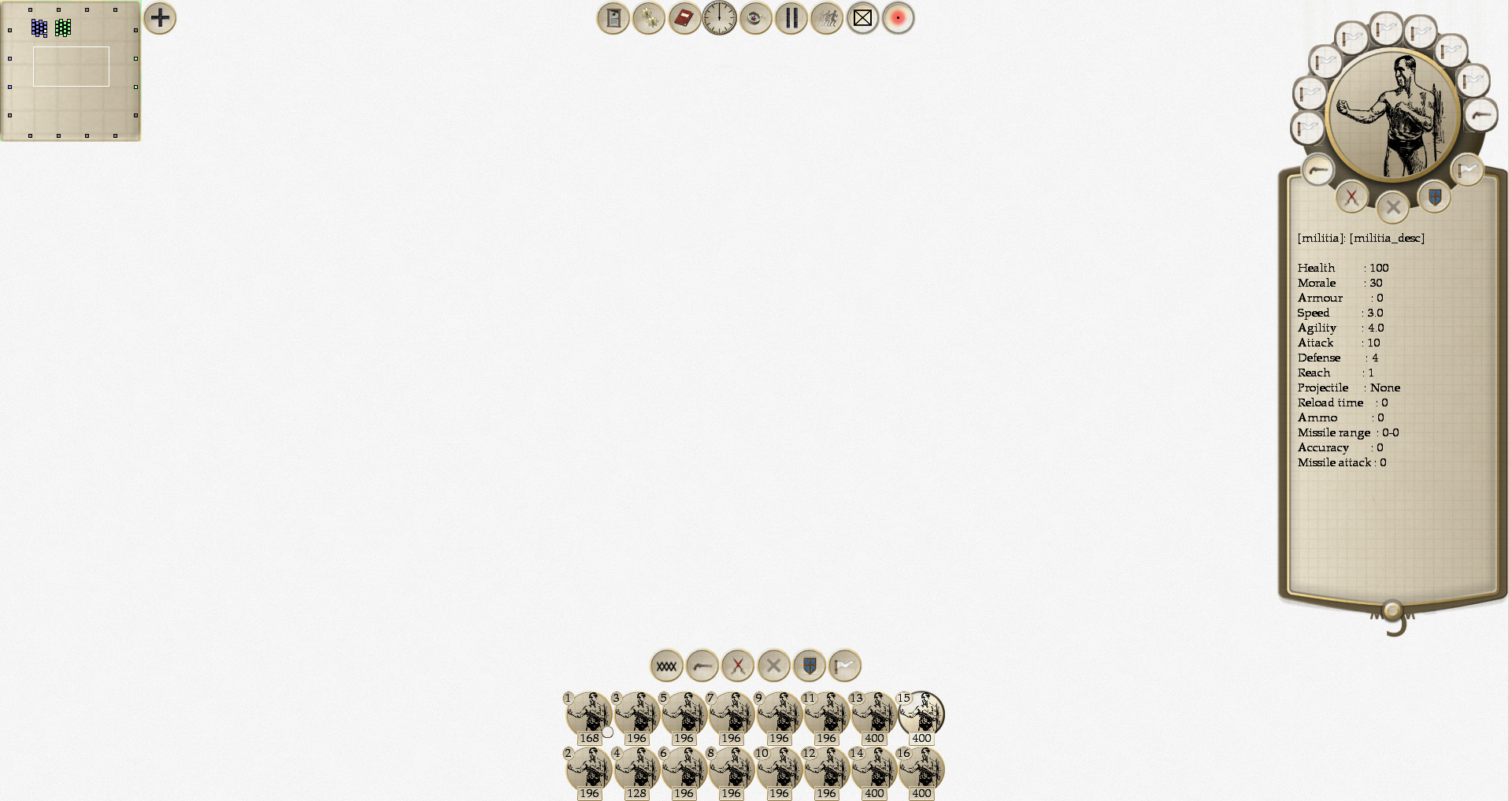
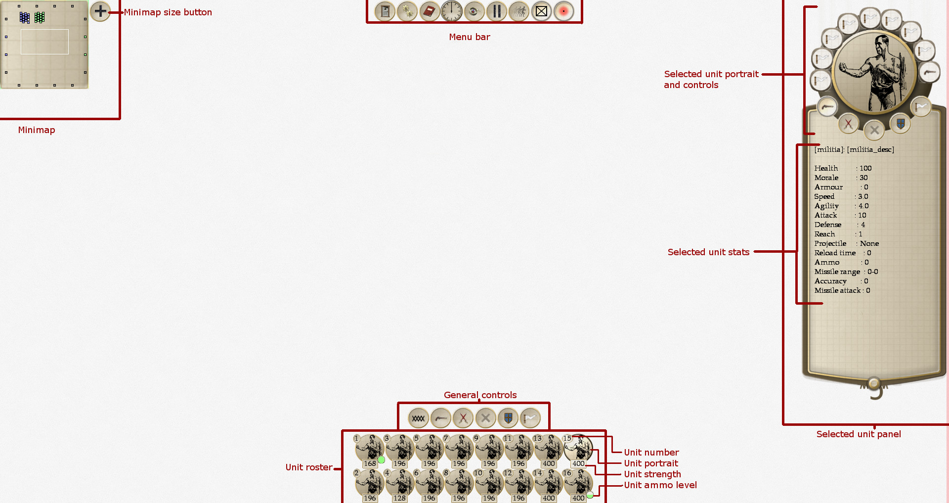
This menu contains mostly controls to customise the battle (slow motion, pause, hide flags, hide visual help, hide minimap, a clock). There is another menu when hitting ESC, but this menu is not related to the battle itself. The ESC menu is to quit the game or change settings such as graphics.

On 29/11/2017 at 3:33 PM, ferrous said:

Similarly with unit stats, that seems like something that doesn't need to be displayed.

That's a good idea. I'll probably hide the whole unit panel altogether unless the player asks for it.

On 29/11/2017 at 3:33 PM, ferrous said:

Once a player knows that Unit X is an archer, the unit's HP / Morale are all that matter -- and should probably be displayed somewhere. 

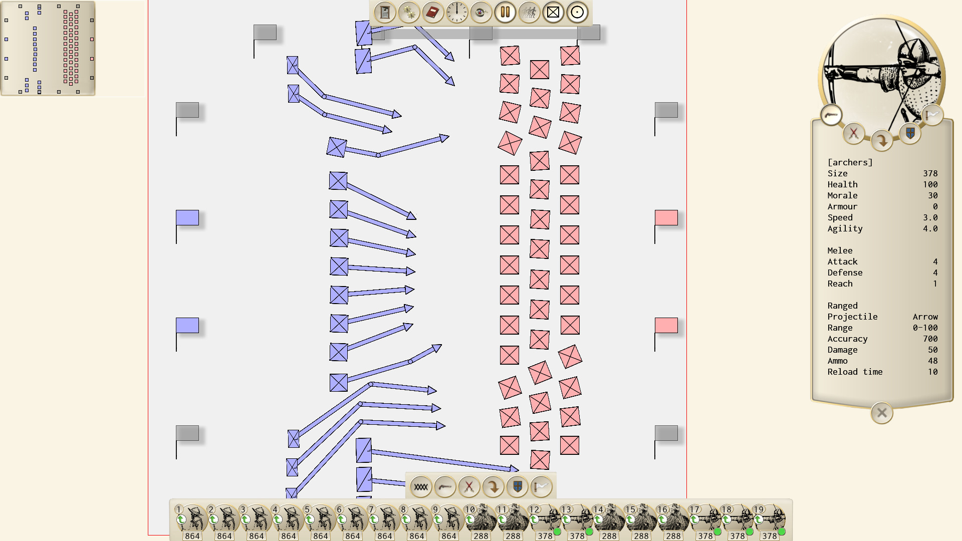
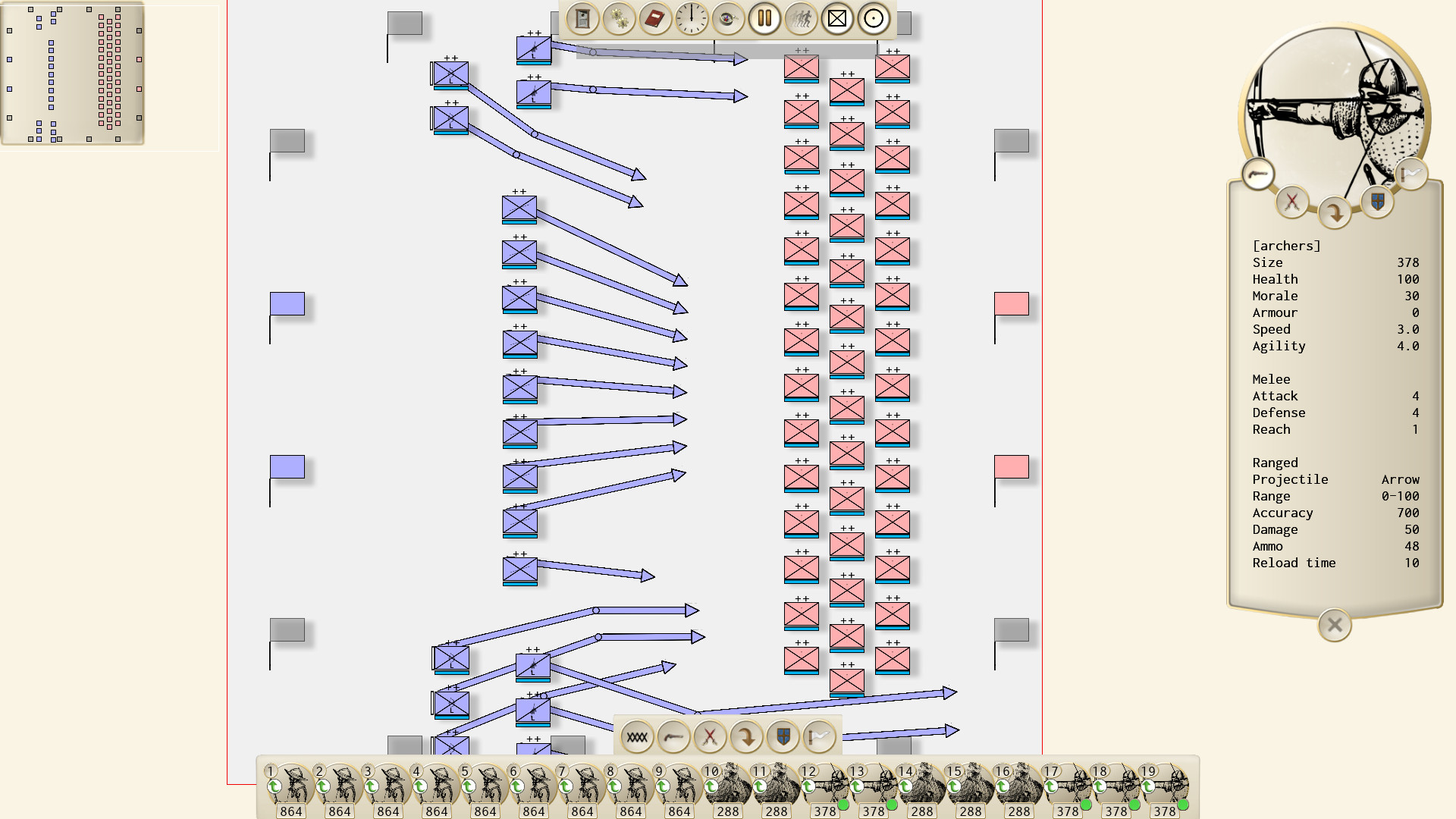
Actually, such information is already displayed on the units in the battlefield. I didn't show the battlefield because it's the heart of the game. Since it might take a while to complete, I wouldn't want to spoil it.


23 hours ago, cjmarsh said:

In addition, some borders for the minimap and unit controls for similar reasons.

I didn't put any so that the player can see as much of the battlefield as possible. I might add this as an option.  That way, people who want more contrast can have borders and people who want to see a bit more of the battlefield can hide them.

23 hours ago, cjmarsh said:

I'd also suggest using something other than a white background to test it on and a color or combination closer to the terrain you're planning on displaying.

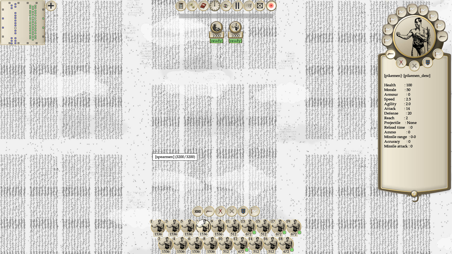
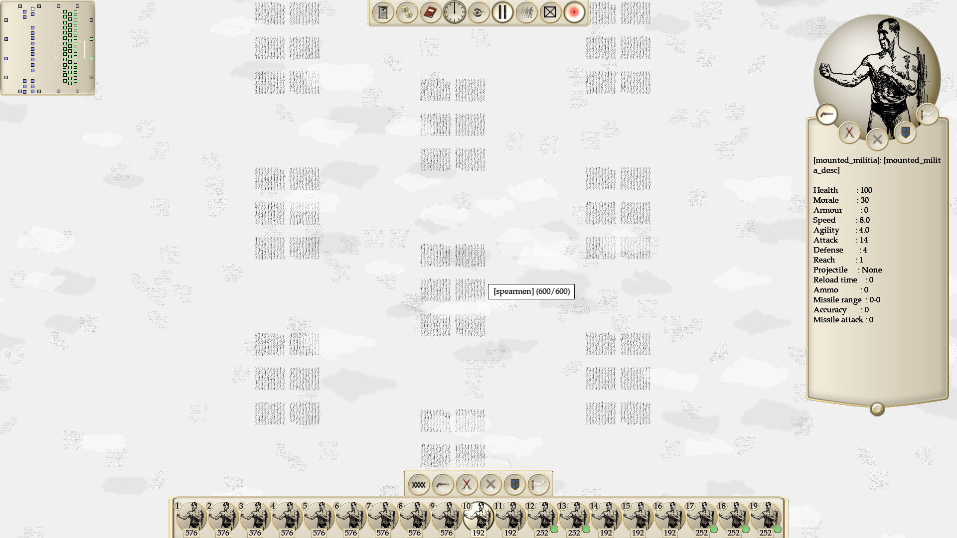
The art style is supposed to be pen and paper so white is going to be the primary color, but that white will be populated by colored battlefield entities. I will make sure to post further pictures once I get the actual battlefield designed.

On 02/12/2017 at 8:47 AM, cjmarsh said:

I'd also suggest using something other than a white background to test it on and a color or combination closer to the terrain you're planning on displaying.

Here is a picture with what the terrain might actually look like. 

good_ol_war.jpg

In that case I would recommend solid borders or boxes, at least for the top and bottom menus, even more. Especially the bottom where the numbers on the units tends to blend in with the background. While I appreciate the minimalist art style, it also needs to be legible to the user.

On 02/12/2017 at 8:47 AM, cjmarsh said:

give them a bit more contrast.

Now I know what you mean by better contrast. I designed this on an IPS monitor with pretty good color accuracy and contrast so it looked fine to me, but I looked at it on a TN monitor with much worse contrast and now I understand why it's so hard to see depending on your monitor.

19 hours ago, cjmarsh said:

I would recommend solid borders or boxes

 I add boxes to the groups of widgets that were floating and I removed the fat borders of the unit panel so that all borders are the same. I tried to give the look of an orb to the big unit portrait, it might be too dark. What do you think?


good_ol_war_05.jpg

I like it. You might also consider unifying or getting rid of the colors entirely in the icons. In addition, consider changing the size of each icon to be better balanced against each other. For example, the pause button and the tic marks on the clock look off, while the red button on the upper bar looks out of place. Optionally, you could also add an orb effect, or its inverse, to the individual buttons and/or a drop shadow around the frames.

Love the style. Just two things you should consider changing and both is actually the same thing.

Your text is small. People with bad eye sight will have a very hard time reading it. Remember 60% of your players will have some kind of vision impairment.

Then your text is too much, your displaying info that isn't needed. You could hide some info when it's 0. You could merge armor and defense unless they are drastically different.

All the stats for melee units after projectile will always be 0 if projectile is none. Players hate extra info they don't need.


So just the size of the text and amount of text.

The rest looks really good, especially the contrast on the menu and icons. The paper like color sets the right atmosphere.

On 07/12/2017 at 2:57 AM, cjmarsh said:

You might also consider unifying or getting rid of the colors entirely in the icons. In addition, consider changing the size of each icon to be better balanced against each other.

I changed them a bit. I agree that they don't fit very well, but most of them are either free assets or programmer art. They might as well be placeholders until I get a proper artist on the project.

On 07/12/2017 at 5:18 AM, Scouting Ninja said:

Your text is small.

Should be better now.

On 07/12/2017 at 5:18 AM, Scouting Ninja said:

Then your text is too much, your displaying info that isn't needed. You could hide some info when it's 0. You could merge armor and defense unless they are drastically different.

All the stats for melee units after projectile will always be 0 if projectile is none. Players hate extra info they don't need.

Good idea. Note that the unit panel would be hidden for the most part of the game. Players can open and close it whenever they want.


I'm now working on the symbology of the battlefield units. The game is supposed to look like a military plan when zoomed out. I have 2 versions of it. The first one is what you see when you zoom out a lot, it shows the units using nato symbols which are rotated and scaled to match the physical occupation of the unit.  The second one appears when you zoom in. The symbols contain more information, but they don't cover the actual unit because you should see the actual soldier sprites on the ground. I know the unit roster icons are a bit hard to see (same image as the portrait), but I'm not sure by what to replace them with. Maybe a small nato symbol or a small unique icon for each unit would be more recognisable. What do you think?


Thu Dec 14 13-17-05 2017.jpg

Thu Dec 14 13-18-01 2017.jpg

This topic is closed to new replies.

Advertisement