Hi,
why some games look orange/grey/brown/blue but not natural?
Here some examples:
gray (and shades of gray)


orange/brown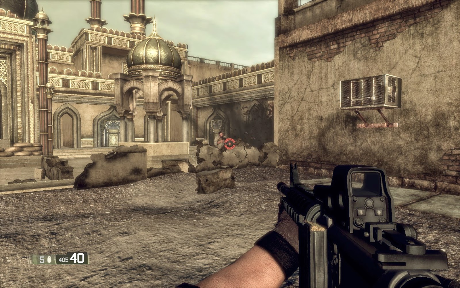


blue


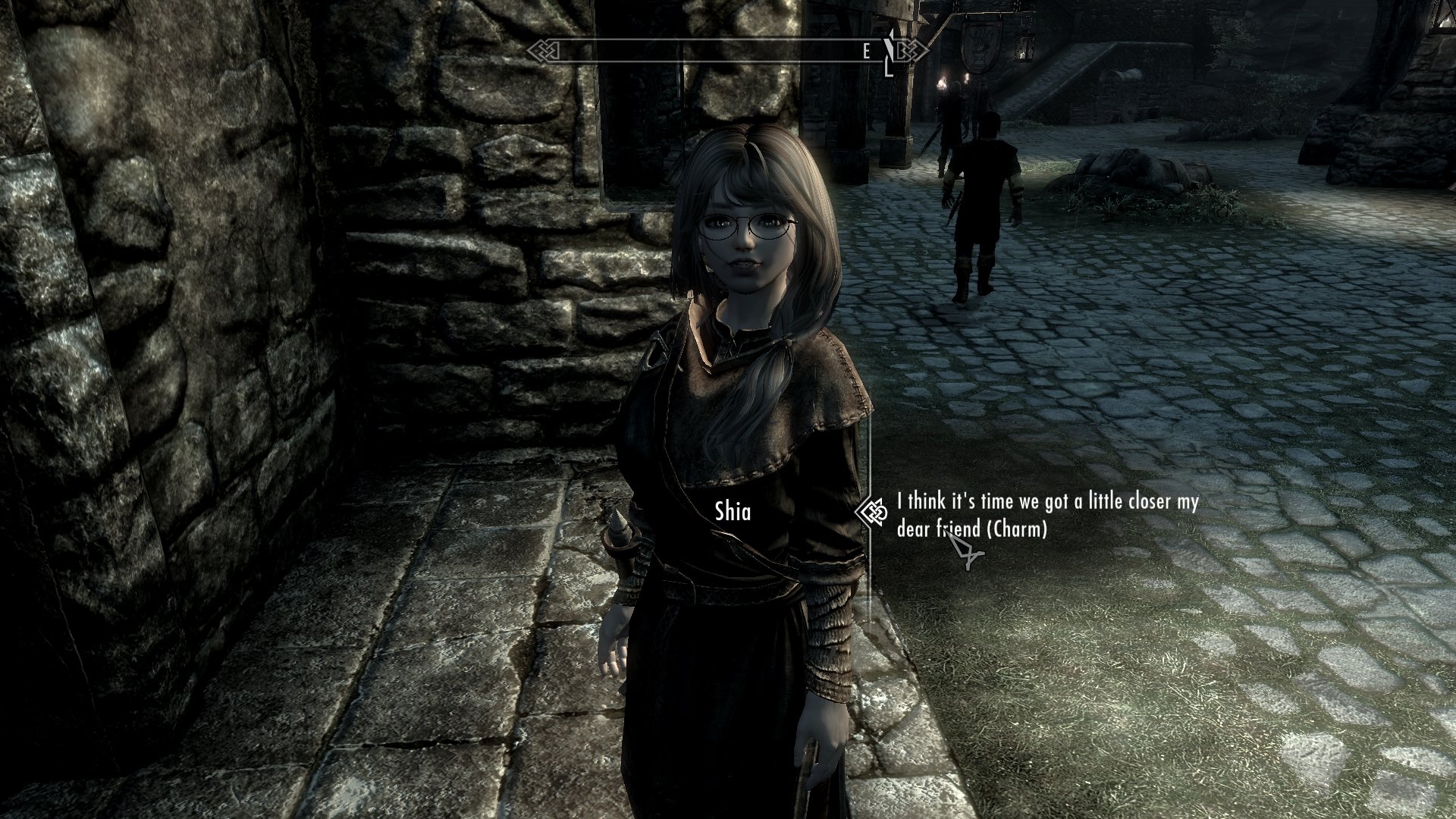
but these games look very natural


Why some games look orange?

Author

45 minutes ago, Michael Davidog said:but these games look very natural
I want to point out that the palettes for the last 3 is green. Also Skyrim uses all the palettes, it just depends on where you are in the game.
Author
16 minutes ago, Scouting Ninja said:I want to point out that the palettes for the last 3 is green.
I meant constans color tone in the screen space, not just color from dominating game instances like vegetation. Look at the sky - it doesn't contain any green, same goes to the ground and enviroment objects
Author
31 minutes ago, Scouting Ninja said:Also Skyrim uses all the palettes, it just depends on where you are in the game.
Skyrim is using very poor color palette, mostly shades of gray
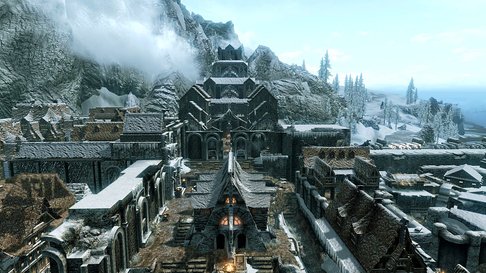
and it looks very unrealistic. Cinematic but not realistic
7 minutes ago, Michael Davidog said:Look at the sky - it doesn't contain any green, same goes to the ground and enviroment objects
Most of them have a very light blue, or yellow tint; these two are considered the most natural light. Then they use fog to fill in more blue tint, look into the distance of the images you showed(the first one uses greenish fog). Light and shaddow color is also tinted to change the color.
In short they are using more elements to tint the scene instead of just the composing filter.
7 minutes ago, Michael Davidog said:Skyrim is using very poor color palette, mostly shades of gray
Yes to prevent color from overpowering it should be almost gray. The first image you show here has a white to black gradient, second has a complete yellow gradient and the last one has a aqua to white gradient.
Use the brick textures and brown colors when looking at the image, these are the same textures used in all the scenes but because of the color tint you can see them looking different colors, the difference is the tint.
Also there are times in Skyrim when the filtering is aggressive:


How the tinting is used greatly depends on what kind of feeling and mood the developers want.
The rule of thumb for tinting a scene is that if you don't notice the tint with your eyes, then it's probably the right tone. However as the video @Hodgman linked explained, it could still have too many reds.
21 minutes ago, Michael Davidog said:and it looks very unrealistic.
Limitations of the hardware from back then, if you re-made Skyrim in Unreal it would have much better graphics. The biggest mistake, if you can really call anything the best selling game ever does a mistake, is that they used the light to tint things most of the time.
A aggressive light color causes things to look plastic, especially with the old shaders from back then.

Often it's hard to tell if this is intended or not, some good examples:
Destiny 2 has a green / red tint, which is really daring - ugly but very unique ![]()
Deus Ex has a gold tint, unique too.
Inside has very low saturation, but looks stunning.
The Witness has high saturation, very nice.
The Hollywood alike orange light and blue shadow looks always good, but is too common to look unique.
Older games however (many using Unreal 3 engine), with their brown / grey tint looked really terrible to me - unplayable. The dark age of video game graphics. I'd like to know if this came from some limitation (monochrome GI baking so no color bleeding? It really looks so.)
I still see this in recent games, for instance Wolfenstein Colossus. This game looks as if it would have used only one bounce or too much ambient occlusion for baking. The engine tech is very impressive, but the baked lighting is bad. Is it just my taste or did they something wrong and nobody cared?
2 hours ago, Michael Davidog said:2 hours ago, Scouting Ninja said:I want to point out that the palettes for the last 3 is green.
I meant constans color tone in the screen space, not just color from dominating game instances like vegetation. Look at the sky - it doesn't contain any green, same goes to the ground and enviroment objects
This is really interesting: One guy perceives images as natural, maybe because he unconsciously prefers a green tint? (I agree with both people here, but there is a green tint - on my screen at least.)
Maybe this is much more an issue of personal taste than i thought. Having worked as an artist for so many years i should know - but honestly i don't ![]()
8 minutes ago, JoeJ said:Maybe this is much more an issue of personal taste than i thought. Having worked as an artist for so many years i should know - but honestly i don't
This is why color theory teaches that the eyes is as good as the principle. Because understanding color doesn't give you any better way of letting people see what you want, estimating it is as good as knowing the right color.
Mostly it's because no two people see the same color the same way, in fact people don't even see color the same depending on what eye they use. It's also why color theory is not considered worth the effort of learning and there are many great artist who don't know it, going by what they see instead.
39 minutes ago, Scouting Ninja said:in fact people don't even see color the same depending on what eye they use.
Ha, did not know this, indeed my left eye seems brighter than the right (but no difference in hue) ![]()
I always think colors are similar to musical notes - it's the difference between them that matters, but there is no absolute reference.
It might be a nice idea to add a tint slider for slight color temperature adjustments to games, similar to gamma. (And please an option to tone down SSAO - just for me!)
This topic is closed to new replies.
Advertisement
Popular Topics

Advertisement