Dark Fantasy Environment and Props

Started by
22 comments, last by Scouting Ninja 5 years, 9 months ago

Hi,

First note that I'm not professional, these are only my personal opinions.


What I like:

- Lamps from first post, there are some nice shape there and I also like the crystal material

- Window and colored glass

- Combination of cloth and crates


What I would change:

- Symmetry and repetitiveness. In real life nothing is perfect. Even if the building is planned to be symmetrical you can break it with lighting or adding additional details (dirt, damage, props, decals).

- Use of ornaments. Check some real life ornament work and steal ideas. Ornaments have meaning if you want to use them you should understand at least some aspect. If you are using shapes from nature you should apply rules from nature to them.

- Story and realism: even if it's fantasy thinking about what is there and why can give you ideas. Two example:
Lamps from post 1: the bases of some lamps are too small, in real life those lamps would be unstable. This is not a mistake but might give you some tip on how to design the shape.
Castle: what is inside and what is the function of the building parts? Thinking about this can also give some hint. Like are there two floors where the doors are? There can't be two where the gate is, behind that one would expect a large hall or something. If the window parts are separate then they can be hallways I would guess but I still feel like the outer look allow really small spaces inside the building compered to what I would think behind a gate like that.

-Translucency: I really like your crystal material but in the bottom of the picture where there are more and you see a crystal through another it becomes super bright which ruins the effect. If you stick to translucency I would try to avoid situations where this can happen.


Anyway keep up the good work. I also use blender for environment asset creation nice to see that more and more people use blender. .)
Advertisement

I like the gate scene.

I think you need a irregular bricks texture, the current one has too much 'perfect' horizontal lines between the bricks (in the downsized view on this page it almost looks like an unwanted scanlines artefact).

Door rings would be great to break the repetive look, maybe also some more structure on the door frames sides, like a statue or some ornament. Scouting Ninjas gate is a good example of avoiding repetive look completely by using more interesting geometry, but i think you need only a few more things to break it. I would google images of gates and fantasy art for inspiration because i have no concrete ideas what to add.

The Ledge below the windows appears too thin to me - it's not the kind of solid and robust architecture resulting from building with stone.


Thanks for your feedbacks! I try to incorporate all your advice in my following works. Since these are a part of a larger modular pack, in some cases the bigger parts, like the walls have to be a bit simpler, to be used modular, and only a few object will have that "hero piece" feeling on it. The gate will be definitely one of these "hero objects" which can be used for important level parts, like entering to a boss fight zone, or exit a level.
And I already found that I have too few detail elements at my hand (like the ledge), so my plan is to expand the detail models repertoire (more wall consoles, ornament ledges, later on flags and iron grates etc.) and "dress up" the plain walls with them.

2 hours ago, Runemark Studio said:

Since these are a part of a larger modular pack, in some cases the bigger parts, like the walls have to be a bit simpler

The simpler design is also often better for scene props, this was one of the main things I noticed about your set from the start.

Lots of new artist are so excited about making details that they design these extravagant props, these props look amazing when placed on there own. However because these models are flooded with details they are nothing but noise when placed together in a scene. Also allowing the developer to place there own details with "dress up" pieces is a fantastic idea.

Many artist and developers forget that the whole scene is an art piece, just like any individual art piece.


I like to think of it as making a balanced meal, if you use too many sweet or fatty foods then it will spoil the meal; no matter how good each thing tastes on it's own.


Unfortunately what makes them good functional art pieces is also what makes them difficult to sell in a asset store. Your models will be over shadowed by more extravagant and less functional props.

For this reason you need to focus on presentation, show what the props can do. Show why they are better than some over detailed asset.

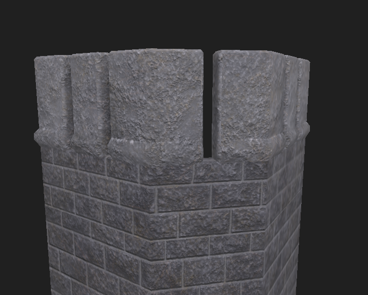
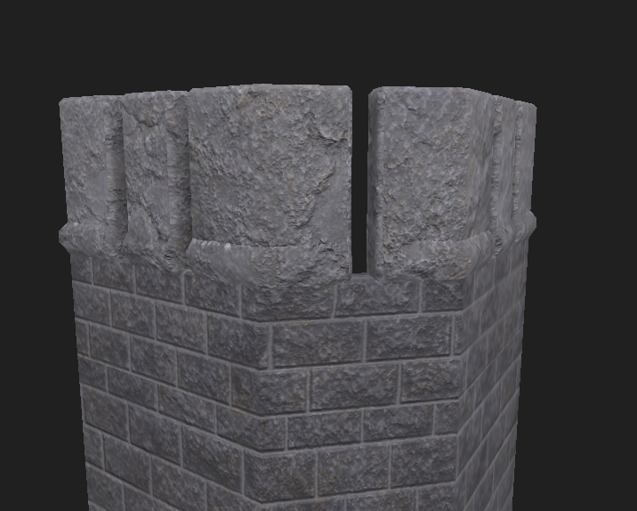
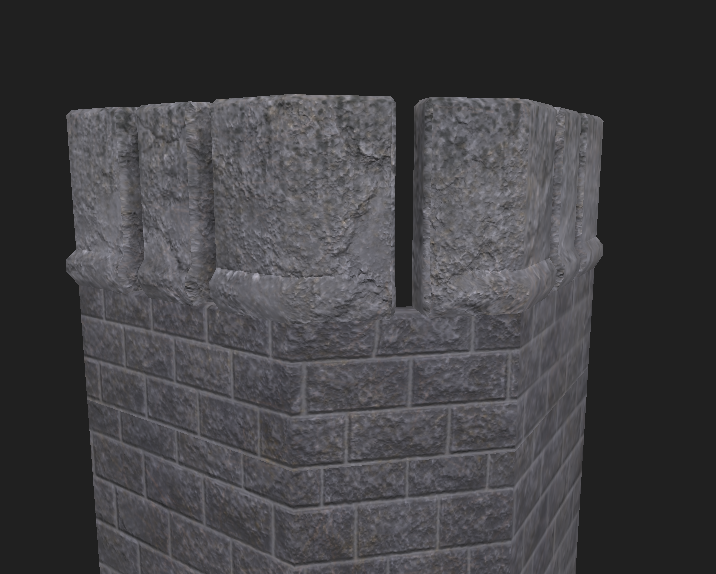
I'm making some progress on detailing the stone surfaces. I captured these images inside Substance Designer. The brick wall texture is unchanged as I focused first on the large stone blocks on the top. This stone texture will be used later on the gate stones too, and I wanted to refine it on a smaller model first...

Images: 1) base stone 2) added cracks 3) added rainmarks to the top.


Arrowslit_01.png

Arrowslit_02.png

Arrowslit_03.png

Edit: I see the edge seams! Triplanar projection will be used, as soon as I can figure out how to avoid projcetion stripes along the beveled edges. Maybe Substance Painter does this better than SD?

3 hours ago, Runemark Studio said:

I see the edge seams!

Substance painter would be better, you could just quickly brush over the seam. You can work from Substance Designer to Substance Painter easy.

I will try to keep updating in this thread at least weekly.
Here are the furniture items and some architecture elements:

chairs_wip.PNG

cupboards01.PNG

drawers02_wip.PNG

drawers01_wip.PNG

columns_wip.PNG

stairs_wip.PNG

Great.

Cant' critique anything but the 2nd chair from left with the spikes. Not even the devil himself would want this chair in his room, it's a death trap! :) (also, thin geometry like this causes aliasing)

All the issues pointed out early in the thread are gone. Good progress! :D


Edit: I really like the texturing of the wooden furniture. You still use quick repetive ornaments, but the low contrast makes resulting issues disappear completely. This is a great way of spending less work on less important details by toning them down i think. I learn from this.

Maybe you could try something similar with the bricks on the gothic structure on top of the thin columns. Here the bricks appear still too repetive and bumpy to me. Making the bricks less bumpy and adding a second bump map causing low frequency variation of height would make the whole thing more naturally imperfect and smoother. (Similar to the combination of wood and ornament texture on the furniture.)


4 hours ago, Runemark Studio said:

Here are the furniture items and some architecture elements:

Good work, that is a lot of improvement over such a short time.

The curved presentation of your furniture looks fantastic, however I also like how the stairs are angled then aligned. The curve wavy form of the stair steps, is a fantastic detail; looks brilliant.

All of your texturing looks better in the new models. Higher texel density or cleaner UV maps, it's hard to tell; whatever it is, it looks good. 


The only two downsides I see now is that your other textures isn't as good as your Albedo textures, so the material looks a bit artificial.

It also looks like you aren't using bevel edges, could be that you are using them but your normal map isn't showing them. There is a new-ish way of doing bevel edges: http://polycount.com/discussion/154664/a-short-explanation-about-custom-vertex-normals-tutorial 

It's actually a old trick that has been revived now that computers can support the extra polygons. Basically you either manually assign your normals or you bake them into the mesh from a high poly. The Order 1886 uses it a lot and looks fantastic.


Your dirt is just right, for the fantasy theme. I like how on the chairs the wood texture actually shows where the pieces connect, small touches like that is always good.

Most importantly your image arrangement is very good here. Starting with image 1 that is your best and ending with the stairs that is almost as good as the first; your are starting and ending with a bang.

This topic is closed to new replies.

Advertisement