Hi DeltaKshatriya, I saw this on the front page, sorry it's taken me a while to sit down and write this. I've only done "some" 3D modelling, but I've done a lot of fictional airplane design. Note that I naturally lean on realism when I design stuff, so that's how I tend to think about designs.
First, it looks like a great start. I'm sorry if this seems overly critical. Creating art is a constant learning process and hopefully this helps.
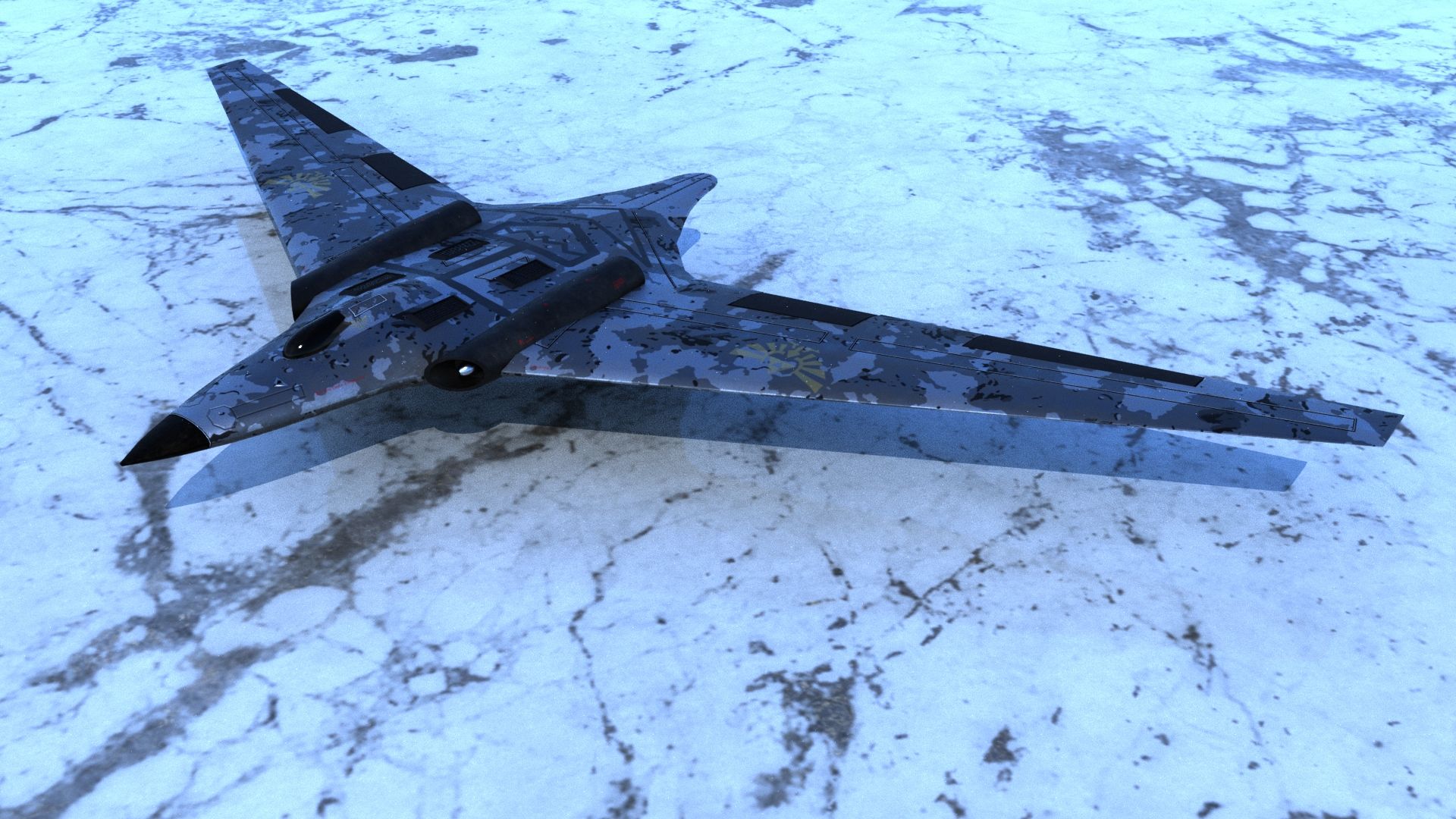
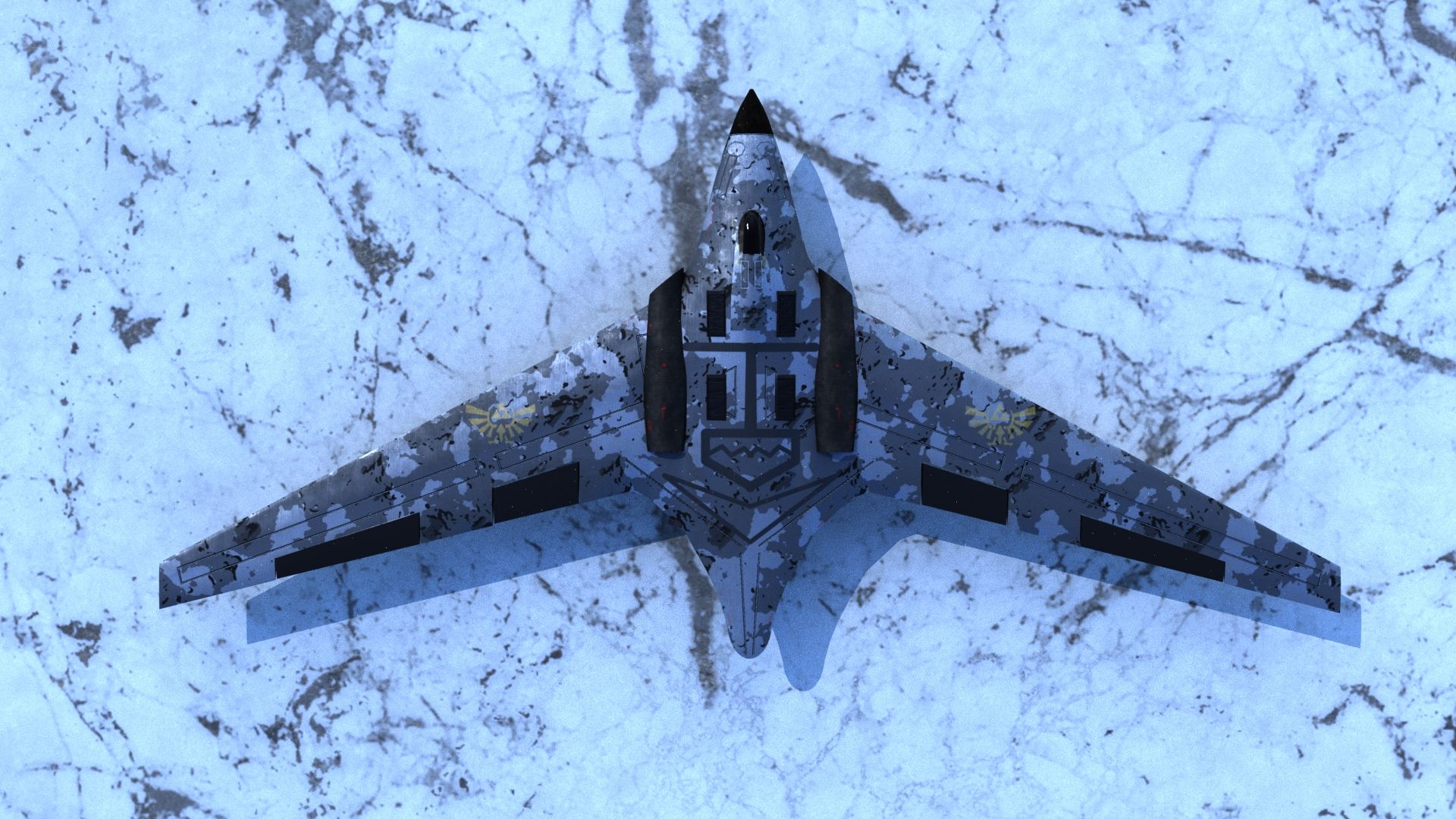
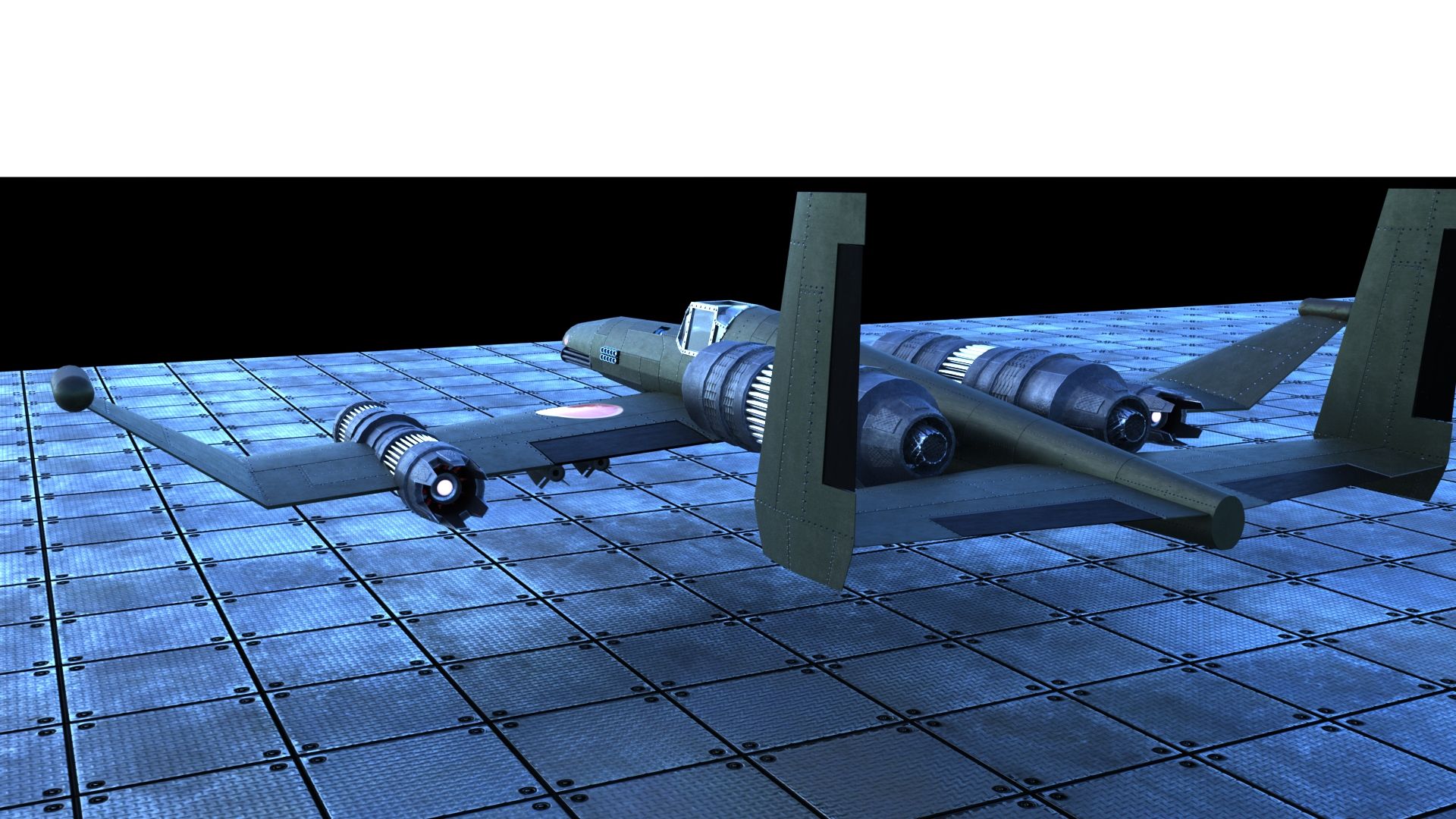
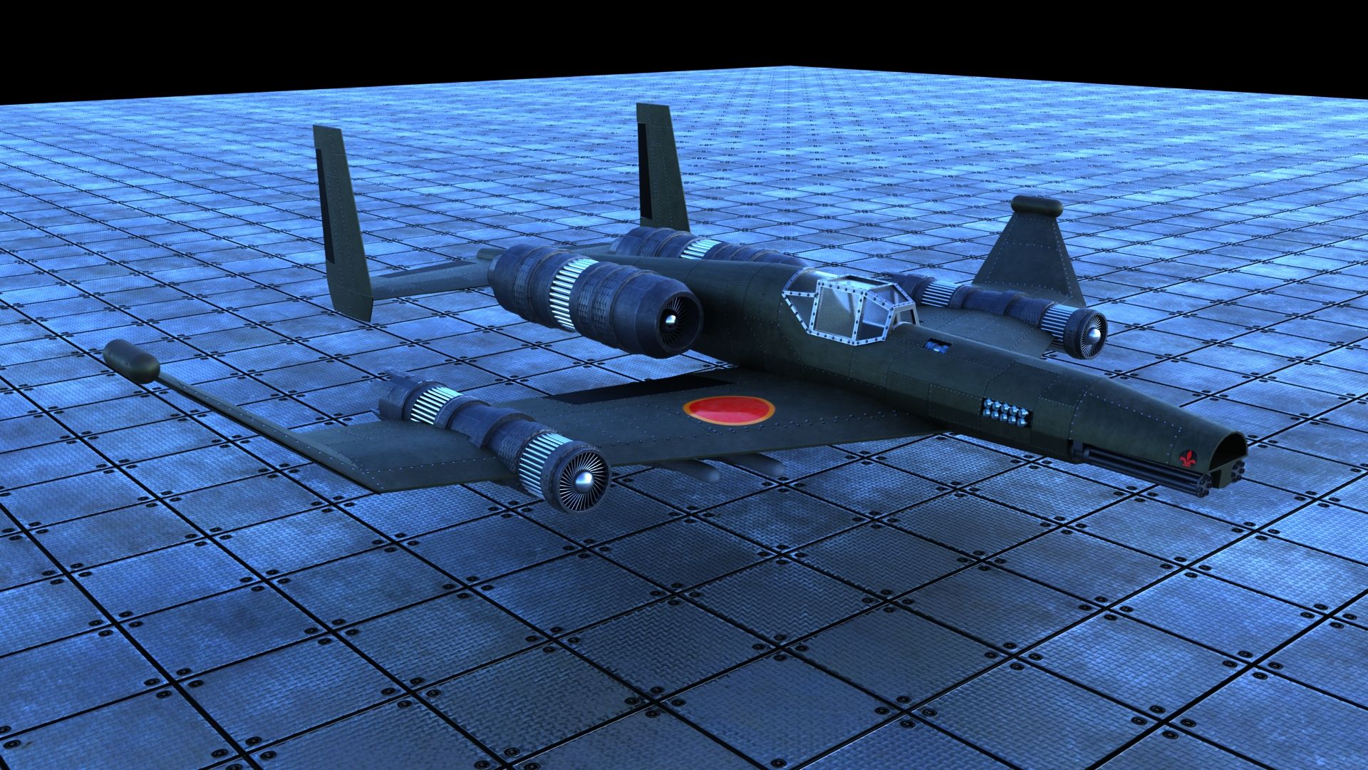
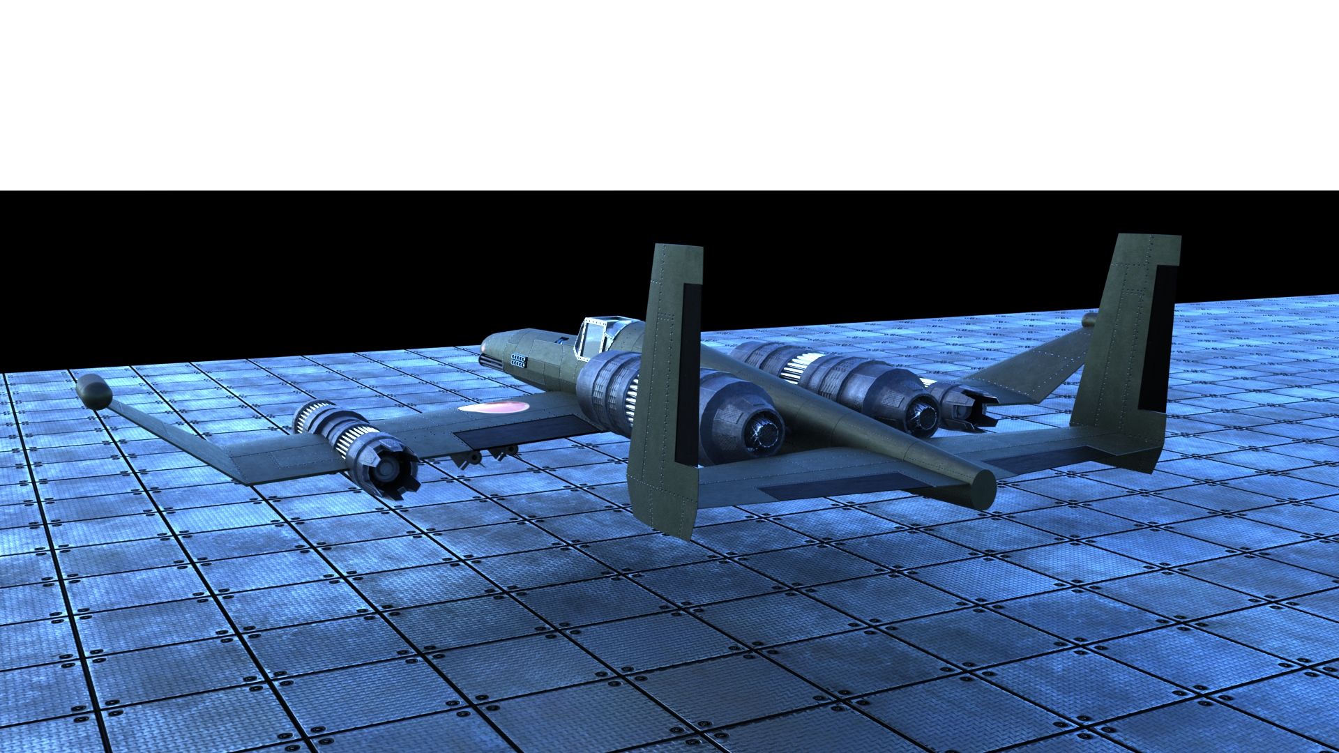
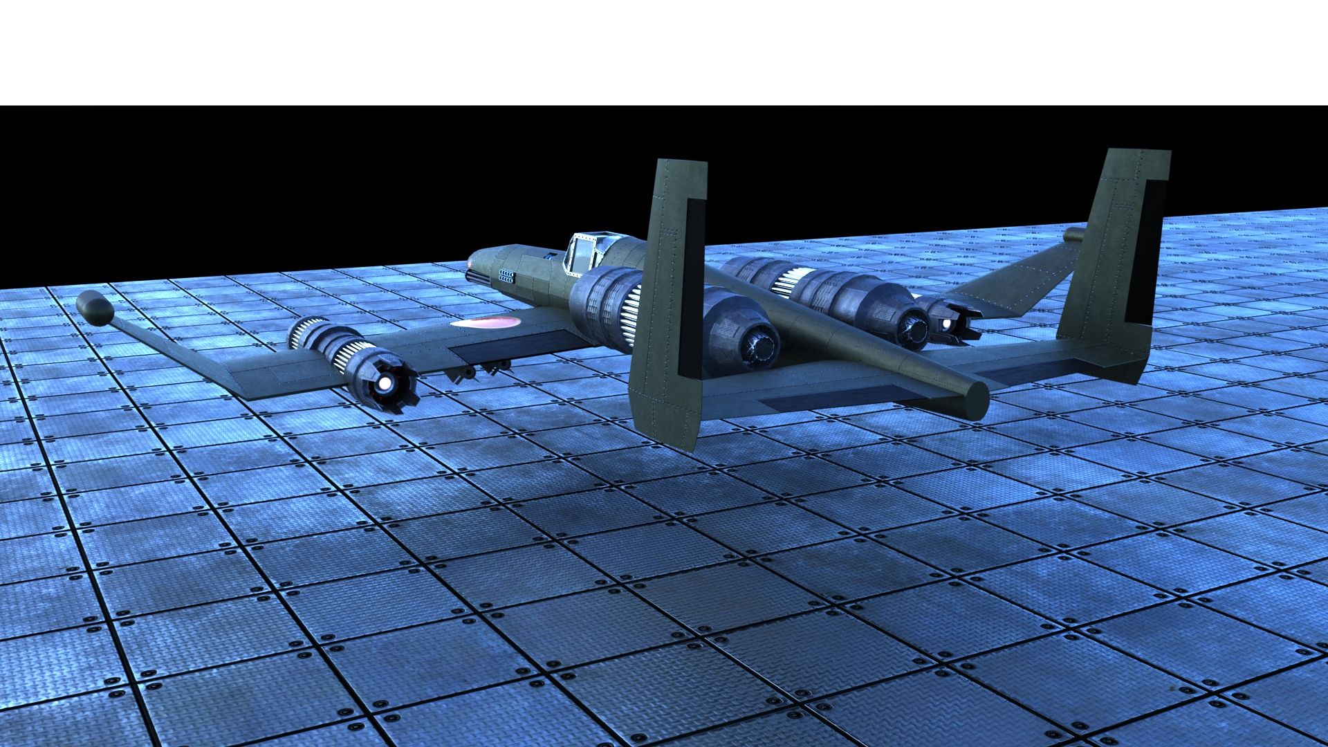
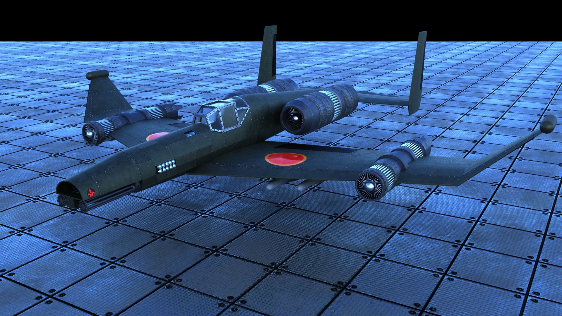
The overall impression for me is kind of retro-futuristic, like something that would be futuristic in a WW2 context. In fact it looks a lot like the Horten Ho 229, not sure if that's intentional.
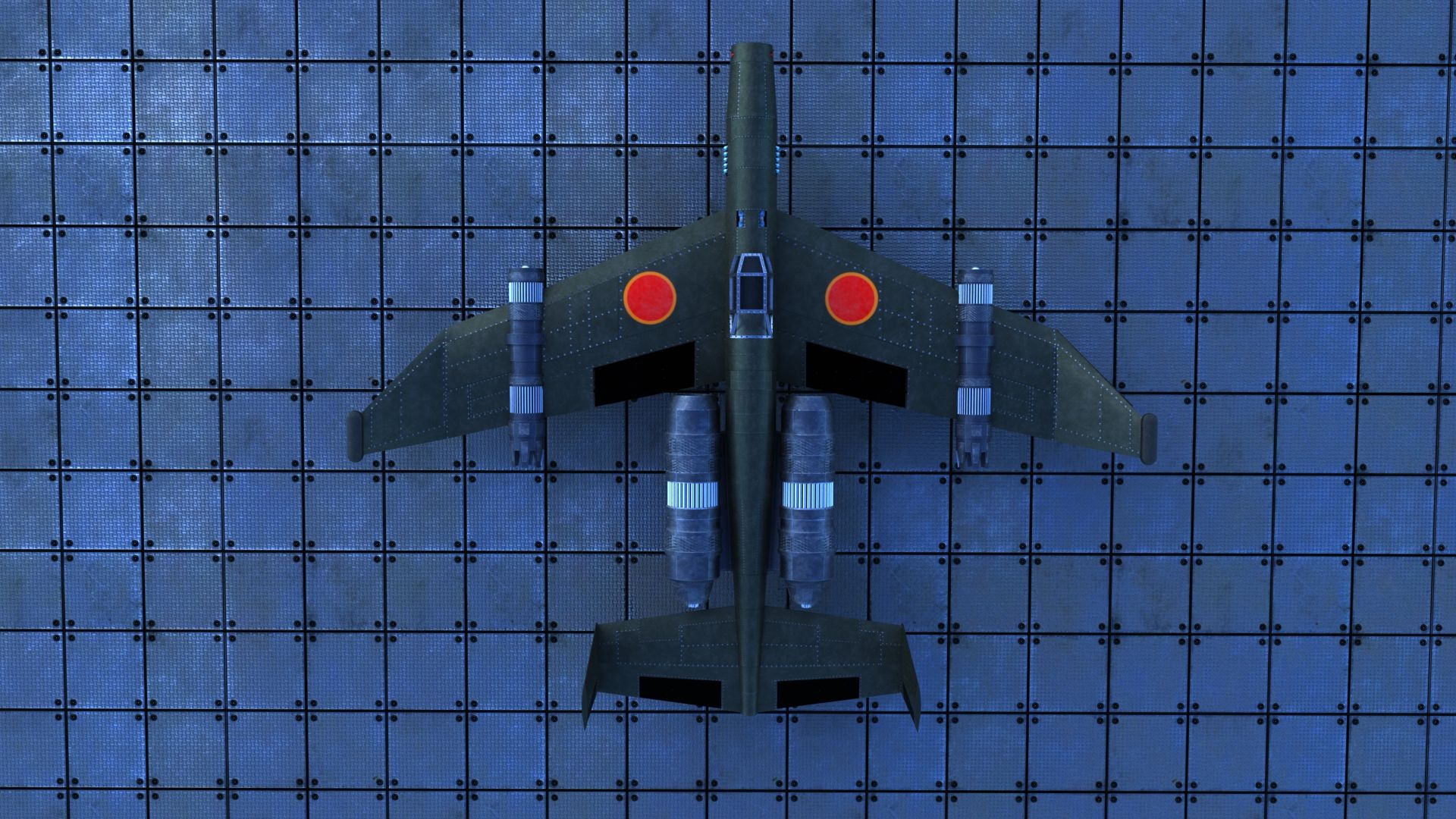
Other first impression is that it looks more like a bomber or a drone than a true fighter. The biggest reason for that is the really long wings that aren't swept back very much. Generally speaking, sharper the wing sweep, the faster something is, or at least looks. If you look at modern fighters, they almost all have delta or trapezoidal wings with much, much sharper sweep. Fighters also usually have more, bigger control surfaces proportionally. Maybe a canard up front could help?
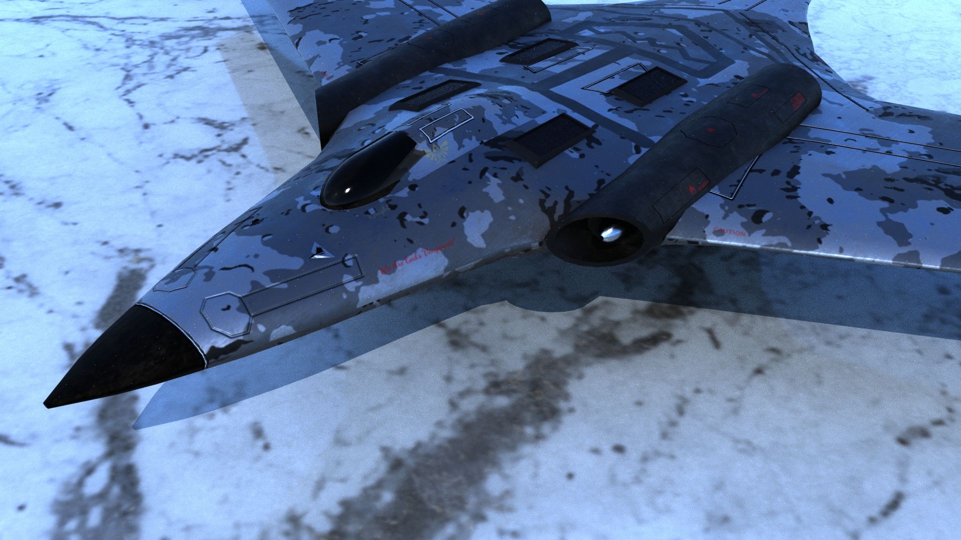
You mentioned issues with the cockpit... So I think the cockpit is way too far back. Generally they are much closer to the nose (so the pilot has some downward visibility). Moving it forward will also help with the fighter "look". They are also usually a little longer, too, proportionally.
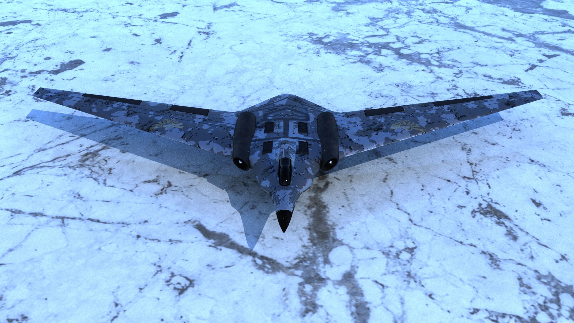
The curve of the nose looks off, too much like a flattened cylinder. It lacks geometrical complexity, like there aren't really compound curves. And it doesn't really look that, um, fierce? You could try adding chines ( see attached example), which are the edges on stealth aircraft that basically are the dividing line between radar waves being deflected up or down. They look pretty neat too, in my opinion, and would help "sell" it as a stealth fighter.
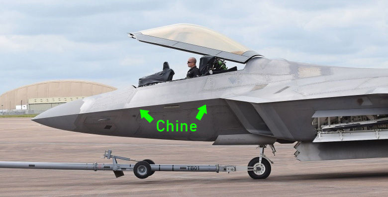
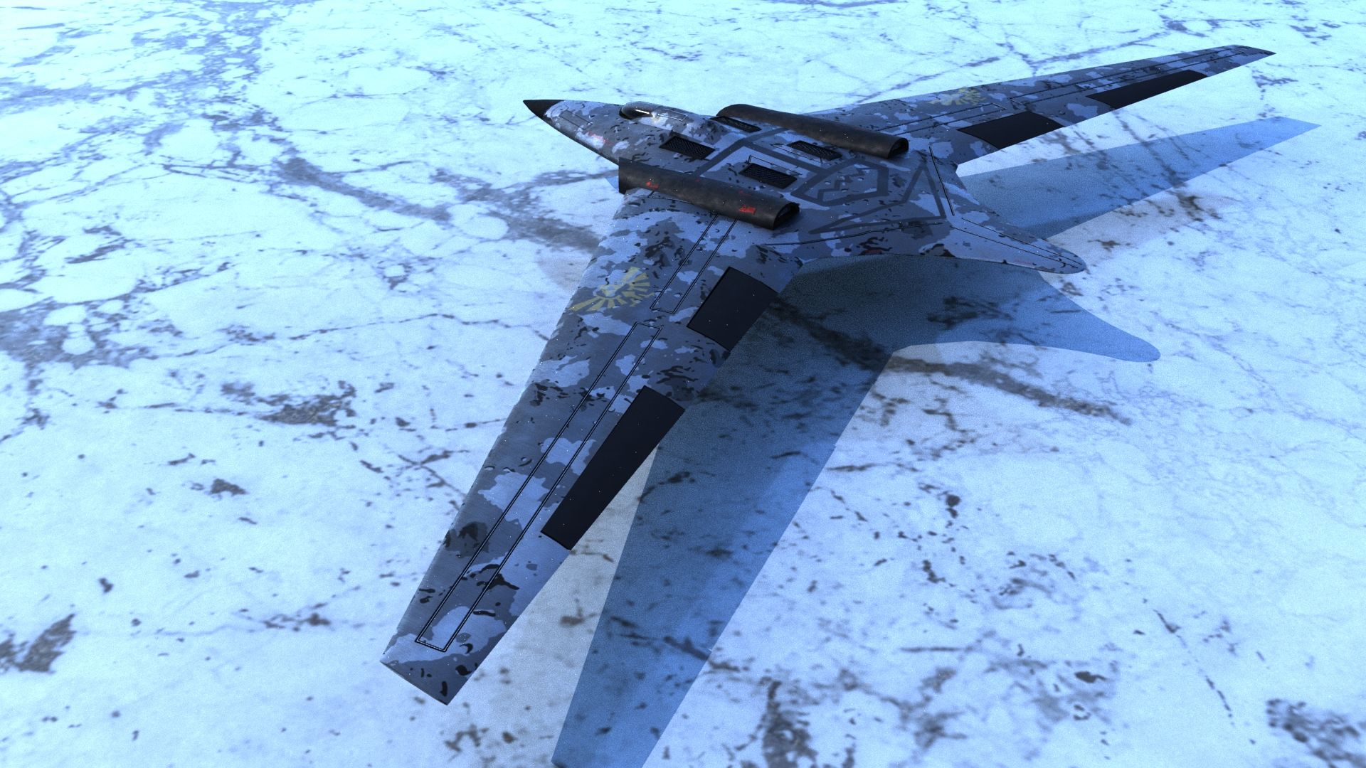
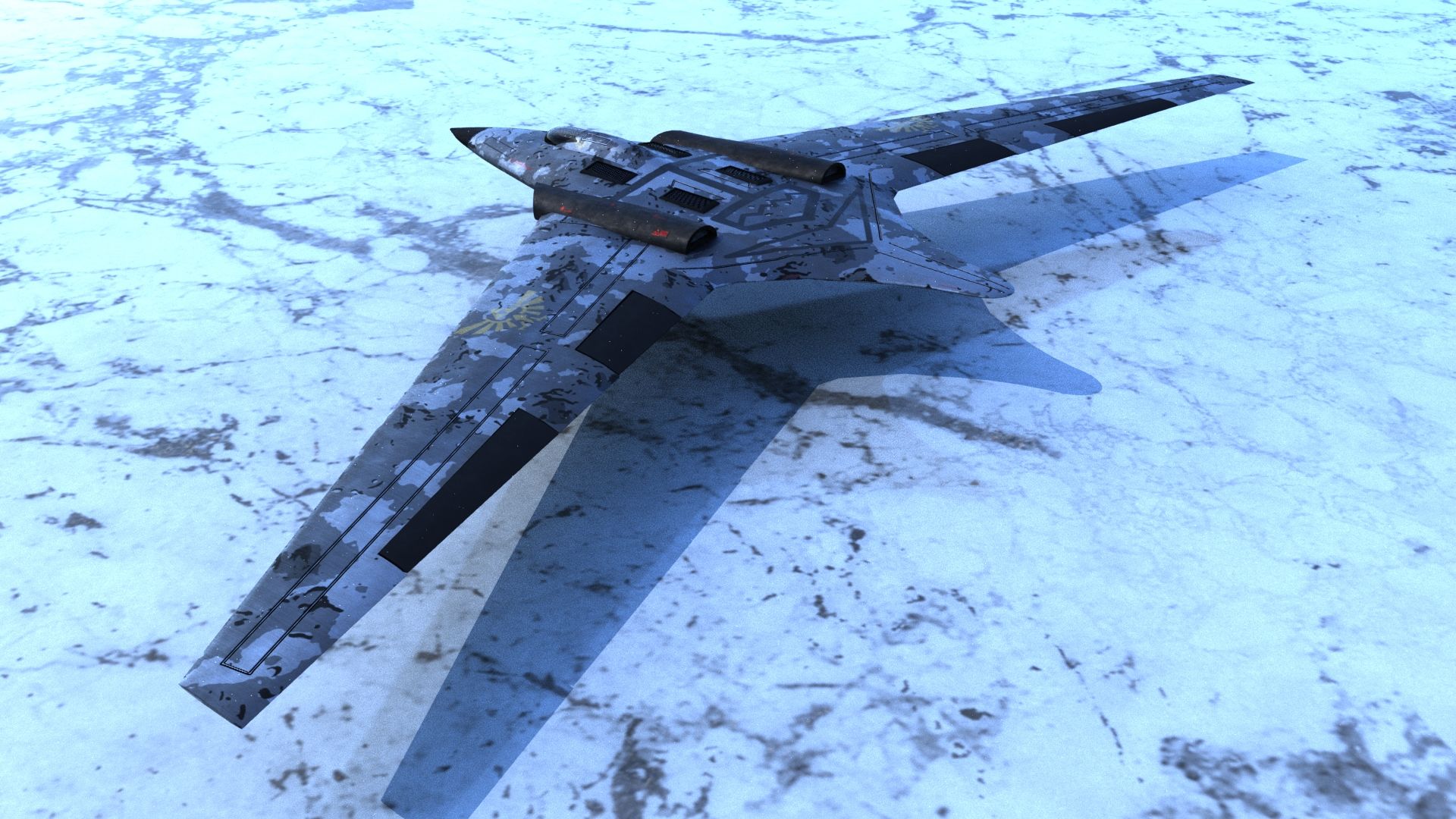
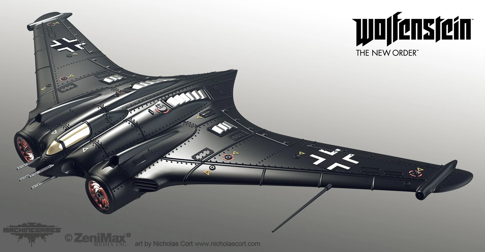
Your panel lines look a little haphazard to me, you should take a look at some more real-world examples or even concept art. They usually are where parts connect, so having them floating in the middle looks kind of off. For example, check out the major panels on an F-22:
More on the modelling side, the panel lines on the front fuselage (in front of the cockpit) look out of place, and a little too normal-mappy, like it's obvious they are not geometry.
The tail looks a little goofy to me, it reminds me of a platypus. It might work better to cut it shorter, make it more angular, and maybe add some control surfaces, maybe even a V-tail or something.
Note: If you want to get even more realistic, I would look into "planform alignment," or how on stealth aircraft the flight surface edges and panel lines are all designed to be parallel or perpendicular as much as possible. This is why panels on things like the B-2 and F-117 have that distinct diamond look, and I see you emulated that in the big panel lines on the back. Adding those jaggy edges to the nose cone specifically I think would be pretty neat to try.
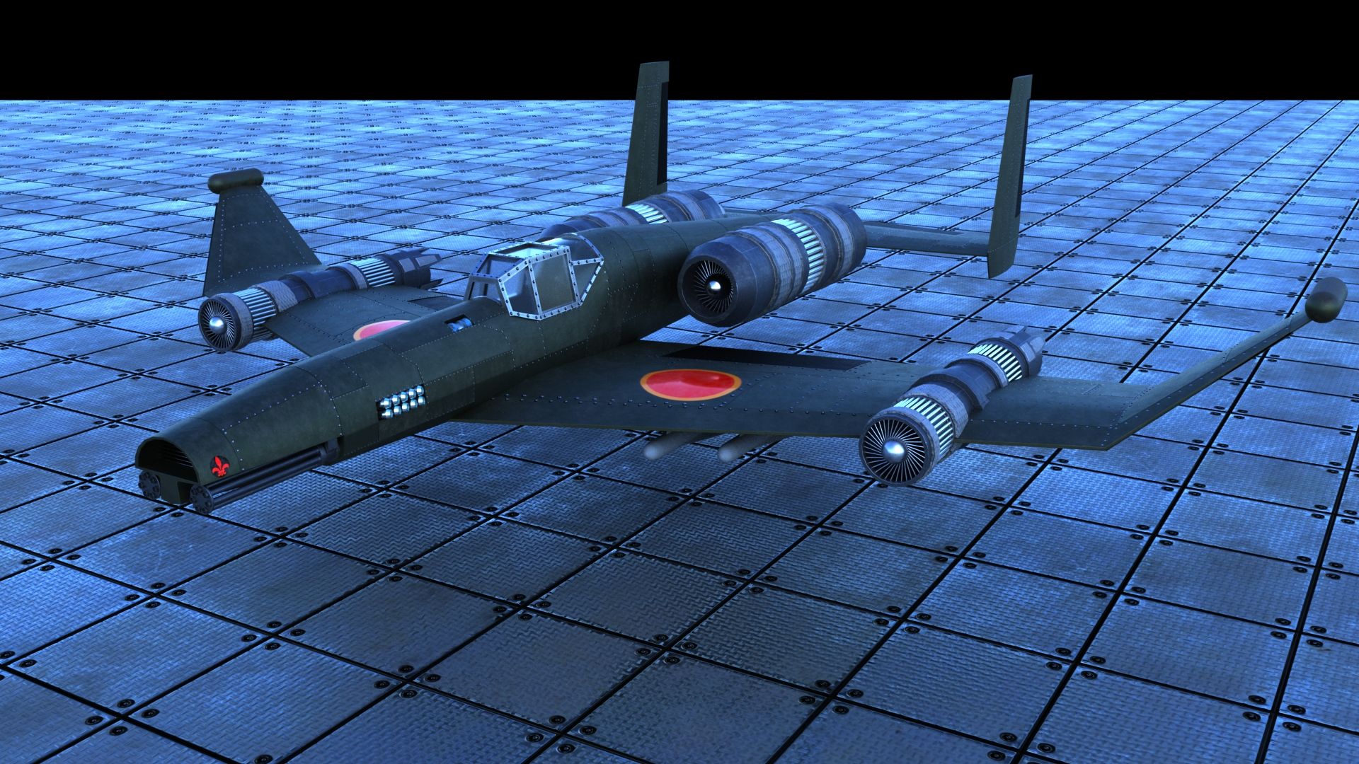
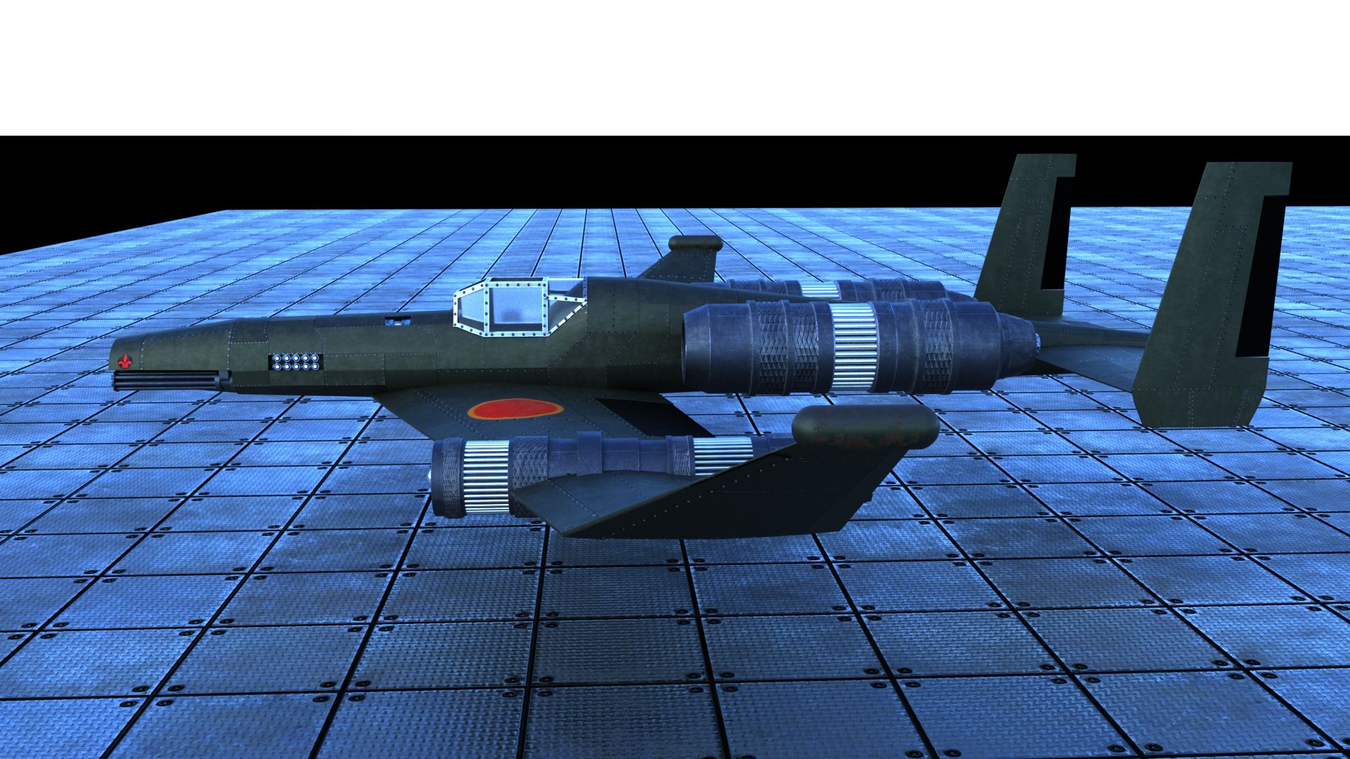
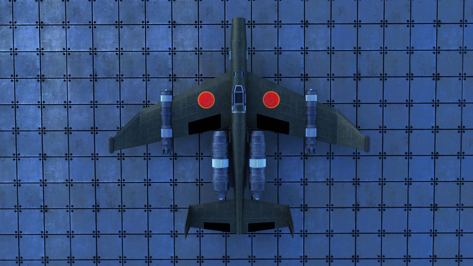
Some of the geometry/features don't seem well integrated into the overall "look." Namely, the engine pods look almost like an afterthought, and it looks like they pretty roughly clipping into the body of the aircraft. The panel lines on the wing seem to be like partly covered up, too, like they don't make sense. Not to get too much more into "realism" stuff, but the podded engines look very dated, since stealth aircraft try to "bury" their engines as much as possible. Regardless, the exhaust just coming out onto the fuselage looks very strange (like there should be scorch marks).
The vents on top look out of place, too, also like they are stuck on, rather than part of the jet.
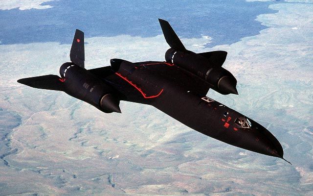
Colors and stuff: The camo looks okay, but be careful trying to figure out camo too early in the design process. It tends to cover up things that look wrong (which is the whole point of camo), which can hurt the final design. When I draw planes, I always add camo last for this reason (and it's really easy to change compared to everything else). In this specific context, it might be better to stick with dark gray, or some other more subtle scheme. People will immediately jump to "stealth!" when they see dark gray or black, like the classic SR-71 (note the chines again):
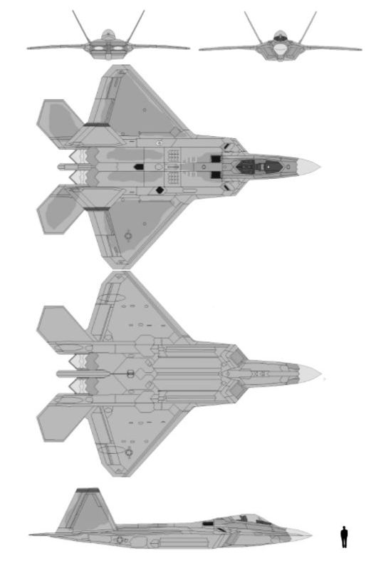
0r0d noted the black areas, which is related to the overall color. Right now they are a little too constrasty, like they are drawing more attention than you really want (other than the cockpit, which should be a focal point). You might try experimenting with panels of subtely different colors or finishes/reflectivity (gloss, matte, flat), which you can kind of see in the F-22 photo above.
Okay, so that's a lot and I'm going to stop... and I see you have a new one, too. I guess my overall would be there are quite a few things I would experiment with to make it look "stealthier" and optionally more "realistic" (realism may or may not be important to you).


