So here's a quick background: I now have the fantastic opportunity to put my Wild West RPG (I know, odd timing for a Wild West game) on the [redacted] platform and have a second chance to possibly find the audience that I was unable to find on Steam. In order to maximize my chances of this, I am taking great care to improve the storefront/box art of the game. Unfortunately, I'm not a great artist and have little sense of visual design. Now I wanted to post this in the "Business" forum because the point here is not just to make a great piece of art, ultimately it has to achieve it's purpose - does it attract the right people who would be interested in my product?
Speaking of said product, here you can find it on Steam and here's some images from my website.
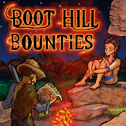
Originally, I tried very hard and came up with this - which, while very good for me, is not so good by actual game box art standards.

(Click for actual size)
I didn't get a lot of specific feedback on that. I heard things like "badly drawn" and mostly "there's too much going on" and "the eye doesn't know where to look." See? I just don't get visual design.
So the [redacted] Storefront needs images at 1000x1000 px so I made these four new versions:
Version A: This uses the same concept but I increased some of the saturation and made it even more colorful and moved a few things around. The focal point of the image is more concentrated on the fire.
(Click for actual size)
Version B: So then I was thinking... maybe there is too much going on. I looked at other examples of storefront art and realized that they usually just have a single thing happening. So I removed the characters, which aren't that well drawn anyway, and just have the fire. Maybe this adds some mystery so people will be more likely to visit the storefront when they see this image?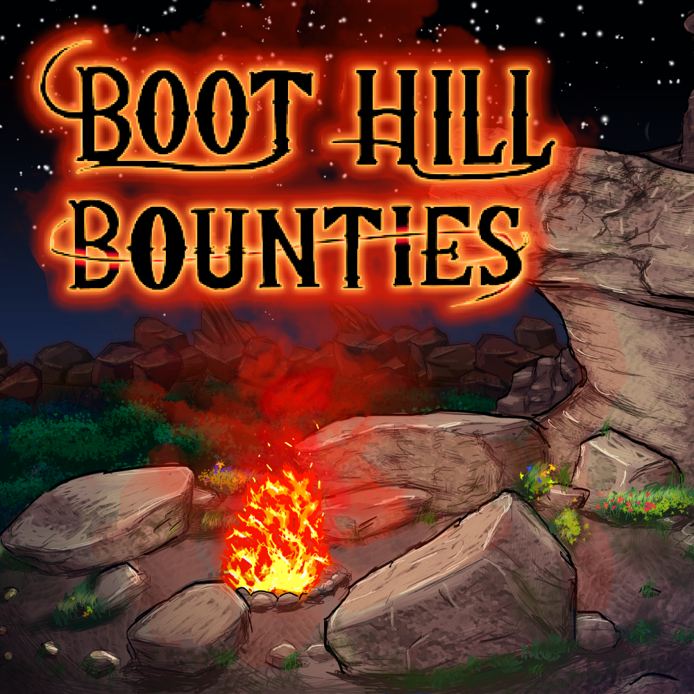
(Click for actual size)
Version ? Here I'm starting to think, this is a pixel art RPG, so why hide from that? Why not show that to people up front so the audience that is interested in such things can identify it more easily? This one has the same campfire concept, but now I'm using the pixel art.
(Click for actual size)
Version ? I thought that maybe that last one was too dark and wanted to try something else. This one just has a sunset over a cemetery with a couple of the characters while still showing the observer, yes this game is pixel art.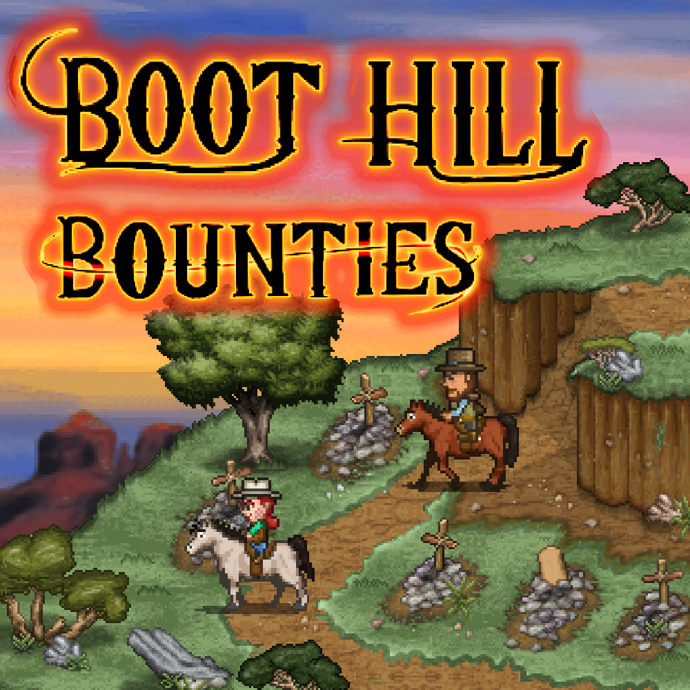
(Click for actual size)
Version E: This one is similar to the last although the logo is featured more prominently and there are no character sprites. Somehow the colors look better here to me.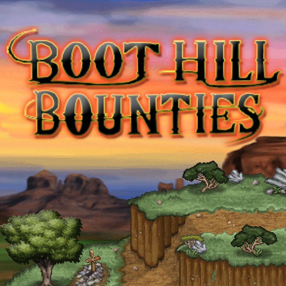
(Click for actual size)
Version F: Version E which is not pictured here, is the option that says "None of these four would be good enough box art, instead pay an actual artist to make new box art." If it's the best way to maximize this games potential I'm happy to go with this option.
Version G: This suggestion says "Your concept is good, but there are too many artistic flaws. You should pay an actual artist to improve upon what you have and/or clean up the uglier bits that they can point out." If you vote for this option, please also pick which version (A, B, C, D or E) is your preferred concept.
So please vote below for Version A, B, C, D, E, F or G and add your feedback in the replies blow. I really appreciate all your feedback. I'm flying solo here so I don't often get it!
Version H: Here's a new version I made after posting this from suggestions another artist gave me. It's zoomed in just two characters and some colors and shading are different. The fire is smaller to distract less.