Need some advise on main character

Started by
18 comments, last by WGS_Stillwater 4 years, 4 months ago

Hello everyone! I've just finished my main character model. This was my third attempt and I feel like I screwed it up again. I don't know, but I feel like my characters miss something and it makes them lifeless and forgettable. The only thing, which I like is a helmet. Before modeling process I draw a side view of it. I'm really bad in drawing and never draw something serious before. It helped, but still helmet miss details. I want to ask your opinion on it and maybe some advises (skinning and pose are very bad).

screenshot001.thumb.png.2c82a4fe8d1f4de497316acc6ffb9991.pngscreenshot002.thumb.png.5e74d7f8feeeacc73a177d358b574e92.pngscreenshot003.thumb.png.a96d8acfe8f71e674142b8450428dd1d.pngscreenshot004.thumb.png.30fafbef41f20732316fda855511e6e5.png

Advertisement

Looks fine too me. Maybe explain a little about what this character is going to do so that we can see a use case?


If it uses specular instead of metallic, then that could be it.  Metal needs metallic.  The shin plates are kind of low detail.

I am an indie game developer who enjoys pixel art games.

1 hour ago, Pepsidog said:

If it uses specular instead of metallic, then that could be it.  Metal needs metallic. 

I've tried to achieve a look of painted metal, but my friend said that model looks like toy. And I agree with him, but this is not the critical thing, I'm not satisfied with shapes.

2 hours ago, SIr Pep said:

Looks fine too me. Maybe explain a little about what this character is going to do so that we can see a use case?


So he's going to be a new type of soldier. He is very fast and mobile, but on the other side he must have some protection. Also he have a jumpbag which allows him to make a double jump and a long jump (fast way to move around the level). If you can do a long jump it means that you can fall from high altitude. So this is why his legs are well protected. Soldier uses only one-handed weapons or weapons, which attache to his lower arm armour for move mobility (you can see that his right hand more protected and have a special binding).  

Green lights represent his active armour level (it's a gameplay feature: they change color from green to red). Orange light on his back represent his energy (it's also a gameplay feature: it works like R.I.G. in dead space.) 

I've tried to think of it like it's a soldier suit in real life before modelling. So I decided that he will have some kind of underwear, you know like a base. Then he will put on some basic protection pieces on the chest, legs and arms. And at the end he will put on heavy armour plates. Maybe it's the problem it the modelling process. I've spent some time examining how characters from HALO and multiplayer DOOM were made and decided that they were made like this: you got the base (just a character from MakeHuman for example), then you model the base just a little bit and add details, then you just put on it armour and that's all. That's what I made and I don't know it isn't worked out for me. I don't want to make an Iron Man putting hole character in the metal (especially when I got robots as main enemies in my game).  

So let me ask you something here: what sort of artistic style are you aiming for? Are you trying to be photorealistic? Are you trying to aim for a comic book style? That will inform you and us towards what we should critique.

The next question I have is a bit more technical. What tools are you using in your workflow? I saw you mentioned MakeHuman, but I'm curious what you are modeling this in, what are you texturing it with, and what you are rendering this in. Anything else you used would be very helpful as well.

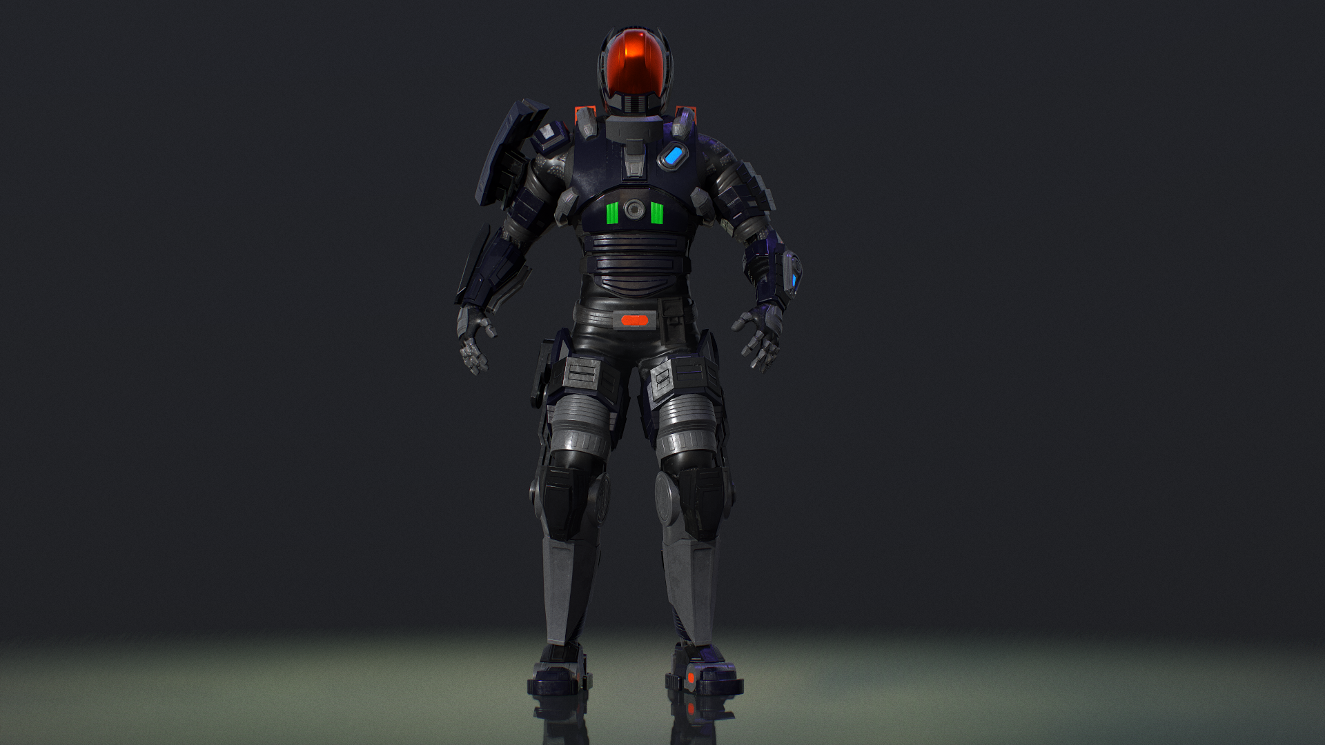
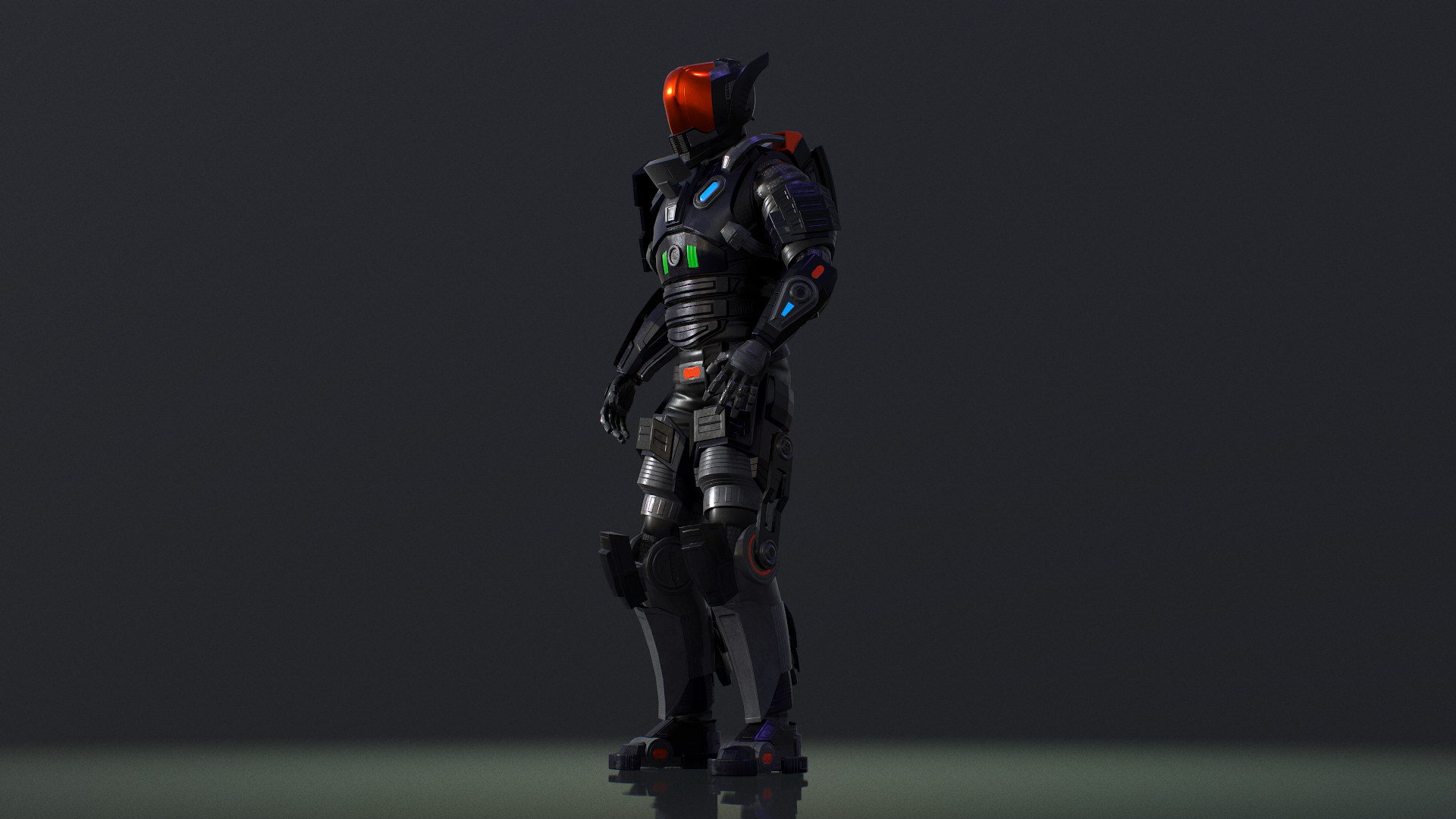
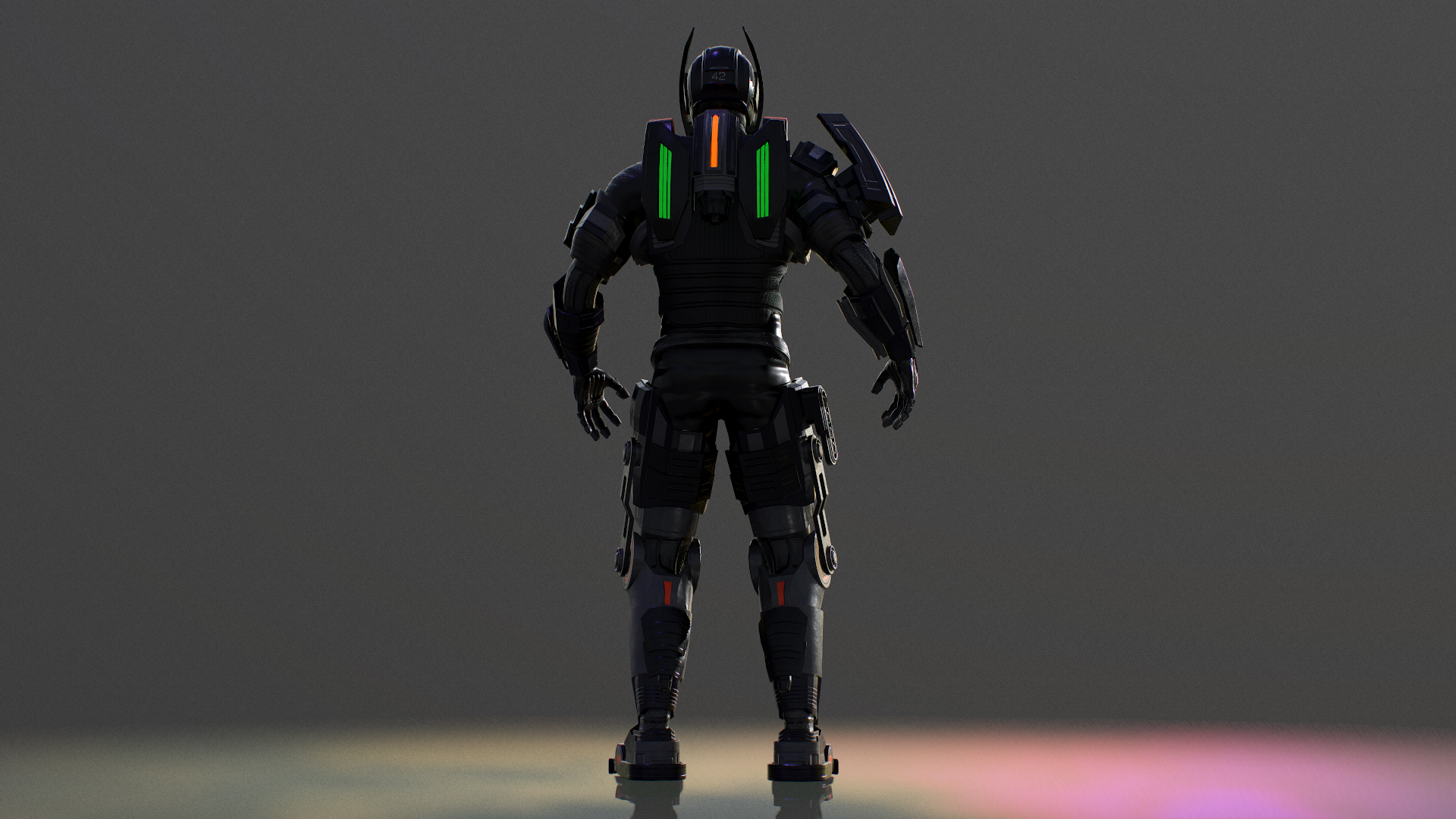
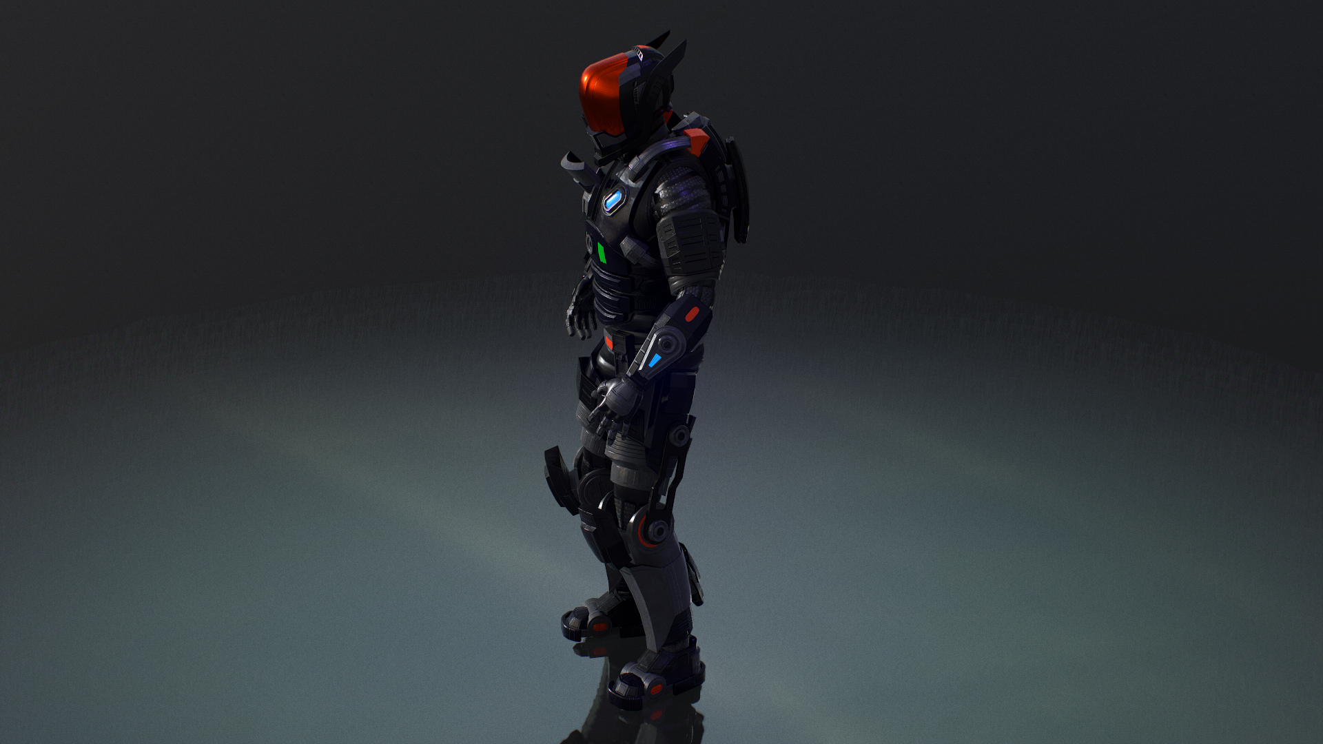
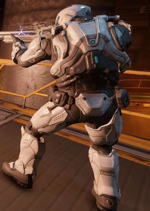
Without those answered I can still provide some critique. Honestly, don't beat yourself up too much here. I have no idea what your skill level/experience is, but I think you have solid geometry for this character. The forms are clean and it's pretty evident what they are meant to represent. So that is a great start.

1 hour ago, G-Dot said:

I've tried to achieve a look of painted metal, but my friend said that model looks like toy. And I agree with him, but this is not the critical thing, I'm not satisfied with shapes.

So it looks like you aren't a fan of the texturing and it I'm going to infer that you are aiming for a more photorealistic look (please do let me know what you're aiming for though). I absolutely agree with @Pepsidog: the problem is with the textures you've used for the model. Right now, the textures aren't coming off as very painted, but rather as plastic looking. The first reason for this is the glossy look of it. Without knowing what texturing tool you're using, it's tough to say which settings you'd need to adjust. You are trying to achieve the look of painted metal. Can you post some pictures as to what you are trying to achieve? Good reference pictures will help you and us with our critique. Painted metal is very much of a layered texture. You have a metallic base, and on top of that, you have the actual paint, which is itself another texture. What texturing tool are you using?

My other critique is of your emissive textures: they aren't coming off as very real. It looks very cartoony, contributing to the whole "toy" look. This may partially be because your rendering engine doesn't support good emissive textures. I know Unity isn't easy to get the emissive to look right. It's not casting any light on anything else on the mesh so my guess is that your engine isn't superb at this. I am not very experience with using a game engine to achieve emissive effects, so maybe someone else here can help you. Another thing is that if you want them to 'glow', then you need to ensure that the center is brighter than the edges, to make it look like there's a source that is 'glowing'. 

Finally, a more generic critique is that the textures are too 'clean'. There's no dust, wear, anything on this model. Even the most finely and newly factory built goods will have some sort of variation in specular roughness, dust, etc. This is also contributing to the toy look. You need more wear and variation on it, since nothing in real life is this clean.

Is this glossy paint? If not, then I'd also add that if you're doing a 'painted' texture, then this advice applies doubly so: paint is usually never applied this cleanly nor uniformly to the sort of parts you are applying them to. Paint always is very 'rough', with all sorts of surface irregularities that are never uniform. Even in the case of 'glossy' paint, you still need some wear and what not. This highly depends on what you are aiming for though, and this is where a picture would really help.

In general though, I'm curious what the specific pieces are supposed to look like. What materials are they made of? If you can answer those questions, it'll help us critique.

If you can answer my questions though, I can give you some more specific advice as well.

No one expects the Spanish Inquisition!

There is something off, but I can't tell what.  Sorry.

I am an indie game developer who enjoys pixel art games.

The pose is very off-putting. That's what makes it look like a toy. A neutral pose that looks cool is definitely needed.

Just some food for thought with this link... https://80.lv/articles/comparing-team-fortress-2-and-overwatch-art-direction/

I'm not a strong drawer either, which is why I make character designs in Inkscape as 2D vector art. Draw the character from one angle with simple shapes/components/armour pieces until you get a nice balance. I find it way easier to manipulate a few points of a simple polygon rather than redrawing/remodeling something. Create a nice silhouette by turning all the character shapes to black and see where weak areas exist. Work in shades of grey until your satisfied with the design. Avoid colouring things early on because it distracts from the design. Also, shrink your view to see the character at half the height it might normally appear on the screen and make sure it's still distinguishable. And lastly, make each character have one or two things that are really visually unique about them. For example, you talk about this character jumping a lot and landing from extreme heights. The legs should be constructed for springing forth and shock absorption. Think of the hind legs of an animal, like Anthem's Javelin suits, and maybe some short burst thrusters on the back.

Also, really take the time to gather inspirational art and then borrow the cool elements from it... https://www.google.com/search?q=art+station+armoured+future+suit&tbm=isch&source=univ&client=firefox-b-d&sa=X&ved=2ahUKEwjT2_D14szjAhUGEXwKHRekCtoQsAR6BAgJEAE&biw=1920&bih=925

I hope some of these suggestions help.

9 hours ago, deltaKshatriya said:

So let me ask you something here: what sort of artistic style are you aiming for? Are you trying to be photorealistic? Are you trying to aim for a comic book style? That will inform you and us towards what we should critique.

The next question I have is a bit more technical. What tools are you using in your workflow? I saw you mentioned MakeHuman, but I'm curious what you are modeling this in, what are you texturing it with, and what you are rendering this in. Anything else you used would be very helpful as well.

So I'm using 3ds Max to modeling, Substance Painter to texturing, MakeHuman to make human bodies and Marmoset toolbag to render models. I'm learning modelling and texturing by myself and have 2 year experience in it. I've tried to achieve more realistic look and my main reference picture for texturing was this one from DOOM's multiplayer:
doom.png.2e9288cfe3d8004d7839f1610afb2006.png


Also I know that emissive materials looks bad for two reasons:  I'm not sure how to set up them in marmoset and how to make them right in substance painter and also there is not enough need for it science this materials will have a gameplay purpose and I decided to make them inside engine (I'm making my game with Unreal).


I've added some dust rough dirt and a little bit of scratches, but I think that effect is too settle. But I don't want to go crazy on it because this suit suppose to be used it's very first time.

This topic is closed to new replies.

Advertisement