Need some advise on main character

Started by
18 comments, last by WGS_Stillwater 4 years, 5 months ago
10 hours ago, G-Dot said:

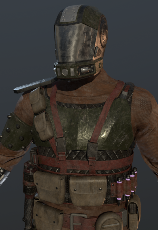
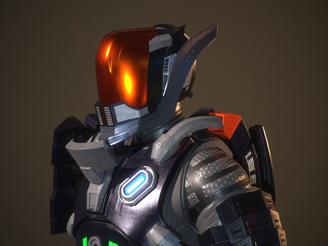
So I'm using 3ds Max to modeling, Substance Painter to texturing, MakeHuman to make human bodies and Marmoset toolbag to render models. I'm learning modelling and texturing by myself and have 2 year experience in it. I've tried to achieve more realistic look and my main reference picture for texturing was this one from DOOM's multiplayer:

Ok, I'm familiar with all of that except Marmoset. I usually use Arnold to render, but then my aims are pretty different. 

So the Doomguy reference helps a lot. Whenever I look at his armor, it always reads as plastic to me, at least portions of it. You're right, it should be a cleaner look, but at the same time, I do urge you to look a bit closely even at Doomguy: his armor reads fairly clean but it's not 'perfect'. Adding minute imperfections will really make your model 'pop' a bit more. Substance Painter has some great masks you can experiment with to add some subtle changes. I think part of the issue though is also partially lighting: your model is a bit too dark and unevenly lit. Try to make some more 'natural' lighting., Give a different pose a try as well. I would also note that there is some inconsistency in how you've textured the model. Some parts that honestly shouldn't read as plastic read as plastic and vice versa. 

You may be a bit too focused on Doomguy as your reference. Your model is pretty different aesthetically from Doomguy. This isn't a bad thing: in fact, it's a great thing! It means you've got originality. Experiment with different texture and color palettes. Right now the whole model is very dark. Drop some contrast in the colors! Even Doomguy goes from white to black! Try making some pieces not plastic but instead more cloth based or even some other material. I would play around with it a bit.

I would also recommend dropping the emissive. I don't think they add much to the model, and contribute too much to the cartoony look.

Post some new shots once you give that all a shot!
No one expects the Spanish Inquisition!

Advertisement
5 hours ago, deltaKshatriya said:

I think part of the issue though is also partially lighting: your model is a bit too dark and unevenly lit. Try to make some more 'natural' lighting., 

Yeah, I think I went to far with contrast and currently scene have too many lights.


6 hours ago, deltaKshatriya said:

You may be a bit too focused on Doomguy as your reference. Your model is pretty different aesthetically from Doomguy. This isn't a bad thing: in fact, it's a great thing! It means you've got originality. Experiment with different texture and color palettes. Right now the whole model is very dark. Drop some contrast in the colors! Even Doomguy goes from white to black! Try making some pieces not plastic but instead more cloth based or even some other material. I would play around with it a bit.

I think that soldier shouldn't have a very bright outfit, because he need to be unseen. But from the over hand it's an art and I think that ultimate  feature of it is freedom, so maybe I did a wrong move by making things, that are "closer to real life". However I've got another color pallete, which was used to create the first character, but it was some months ago and my game was looking a little bit different from the current state. This pallete was inspired by Star Wars theme and here is a picture of my old game character:

screenshot009.thumb.png.b3e2dd63dccf643fff94f2569deac5dc.png

6 hours ago, deltaKshatriya said:

I would also recommend dropping the emissive. I don't think they add much to the model, and contribute too much to the cartoony look.

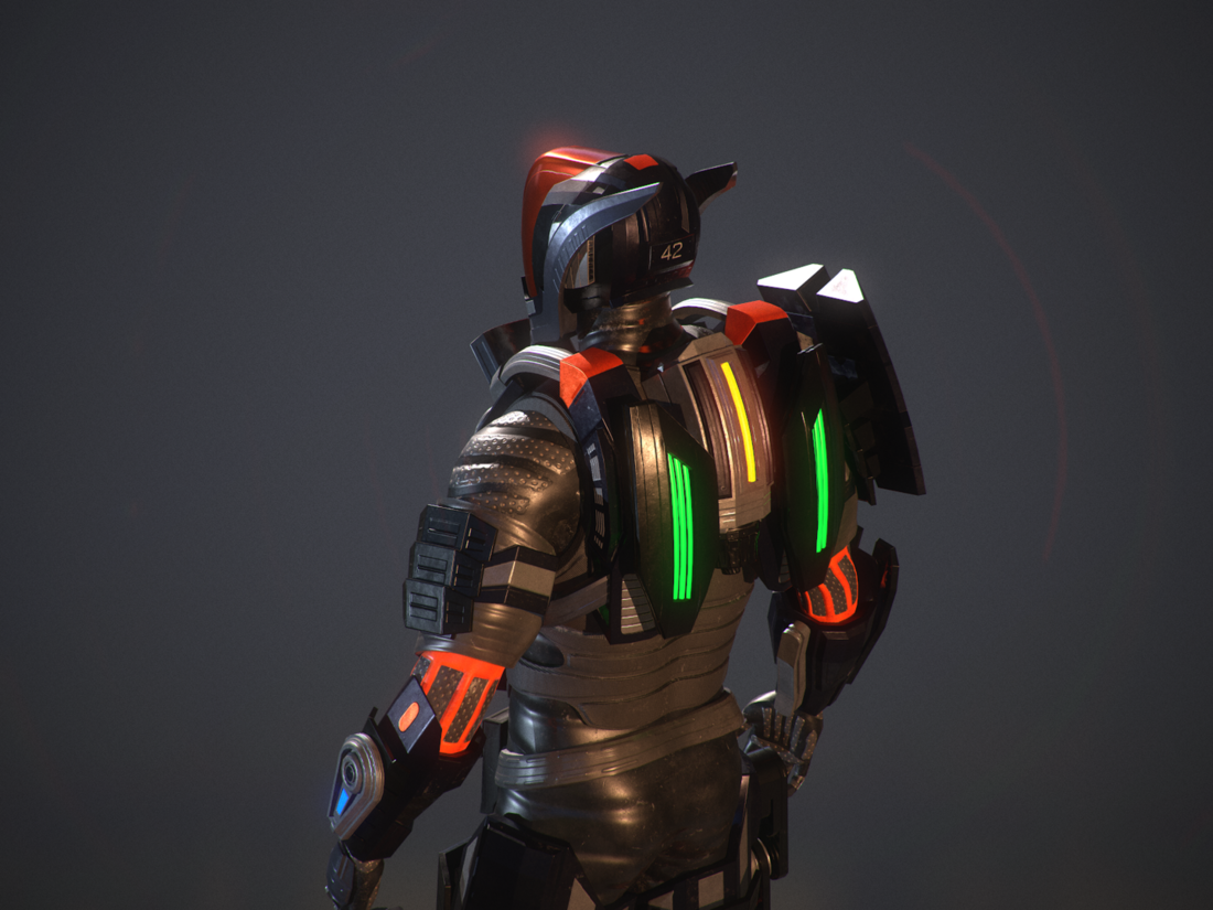
This emissive parts will carry on a valuable information for a player (cause he will always see back of the character) and so I don't want them to miss from player's view. Also they are pretty badly, cause I don't know how to do them right in Substance Painter and set up in Marmoset. I think I should take some shots inside unreal with emissive materials on.

17 hours ago, G-Dot said:

I think that soldier shouldn't have a very bright outfit, because he need to be unseen. But from the over hand it's an art and I think that ultimate  feature of it is freedom, so maybe I did a wrong move by making things, that are "closer to real life". However I've got another color pallete, which was used to create the first character, but it was some months ago and my game was looking a little bit different from the current state. This pallete was inspired by Star Wars theme and here is a picture of my old game character:

There isn't a need necessarily for a brighter outfit per se, just more color variety. Even in real life, rarely are things fully monochromatic. This isn't to say that your piece is monochromatic, but some strategic use of different colors can make different parts of your model stand out, and enhance the overall look. And as you said, this is very much art at the end of the day, so you don't need to replicate everything in real life. Of course, I don't mean you should just get clashing colors together for the sake of color variety. But try out some things, maybe a different color palette altogether. Also try out different materials too. I don't mean just colors here. I also mean that maybe some areas should use something other than plastic etc.

My overall point is that just try and experiment a little with the textures. Your geometry looks fine, overall, but I suspect what's contributing to the 'toy' look is primarily that the geometry doesn't align with the texturing very well. Try some things out, and see what you get.

17 hours ago, G-Dot said:

This emissive parts will carry on a valuable information for a player (cause he will always see back of the character) and so I don't want them to miss from player's view. Also they are pretty badly, cause I don't know how to do them right in Substance Painter and set up in Marmoset. I think I should take some shots inside unreal with emissive materials on.

Have you added an emissive channel in Substance Painter? Once you do that, you can either use the fill or paint emissive on to the surface by enabling emissive in the settings for the actual painting. I can't help you with Marmoset unfortunately.

I would also suggest setting this up in Unreal and seeing what you get, since you are ultimately making a game character right?

No one expects the Spanish Inquisition!

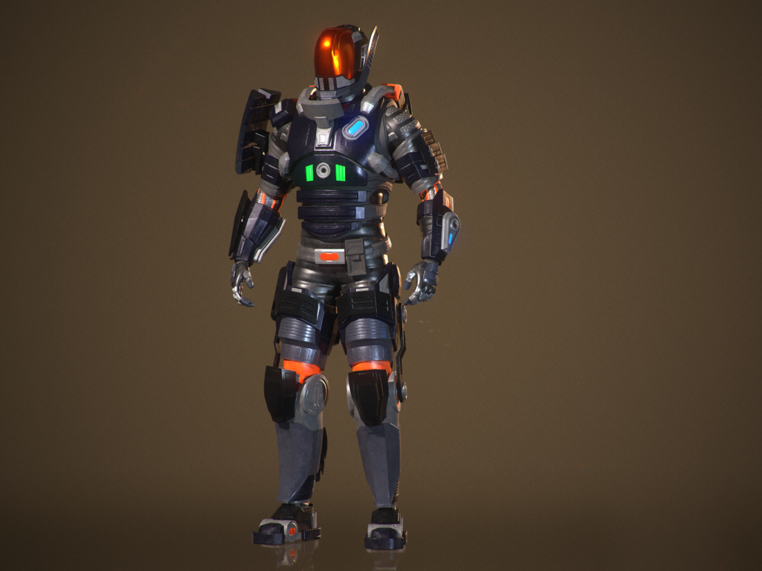
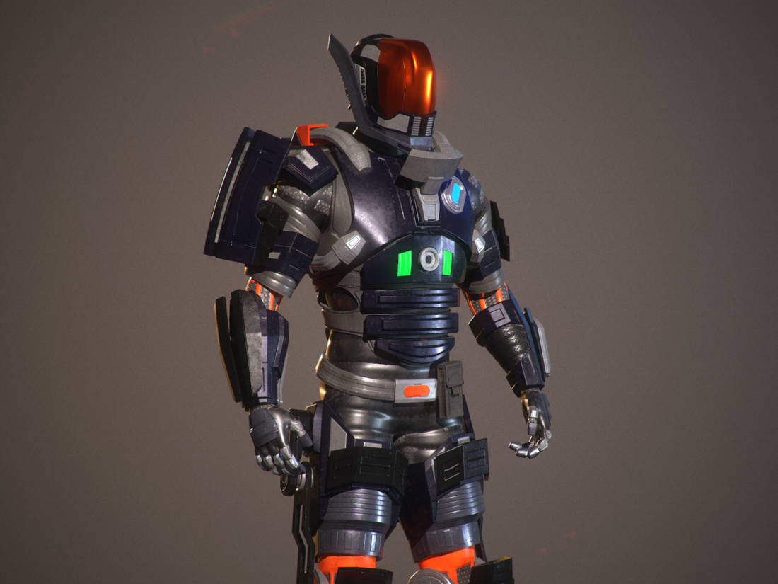
So I finally retextured my character model a little, change pose and lights. It's looking better for me but still I don't get that WOW! effect. I think that this is because of the design. It's kind of strange to say, but I think that  I messed up with the geometry and shapes. Even now I'm looking on it and think of places which can be better. Maybe it's by the way of creating this character. I didn't have a clear concept and vision before I start it and this is the thing. I thought that I will figure it out in the process. But actually it was pain in the ass and ended up being not very good (in Russia we got proverb for this situation: turkey thought, but fell in soup). For now I think I will keep this model, but after some time give another try to create a model of my dream (considering my mistakes and things I learnt).

screenshot000.thumb.png.472f5ea28429b1292f147c6b3799af00.pngscreenshot001.thumb.png.63b69d4cd61d896b1d5e4aecddcdc73b.pngscreenshot002.thumb.png.d4e978109556a1ab1dbfc7033bb8ca96.pngscreenshot003.thumb.png.1307de05937a16a4bc3603b6a37dcb36.png

I actually think you're being too harsh on yourself. This is a great model! The changes are making it look a bit more like metal and less like plastic. The glow effect is somewhat improved but still remains as one of my main criticisms. I do think that you should at least post a couple of renders without the emissive, so that we can see what it looks like. Otherwise it's a good model. It may not be what you expected exactly, but it is a good render.

No one expects the Spanish Inquisition!

23 hours ago, deltaKshatriya said:

I actually think you're being too harsh on yourself. 

Maybe. But It don't match with my vision (which formed after completing it). And it's a very bad and terrible thing. However I've got some advantages:

  1. I've finally get the look of the model
  2. It have some common parts with current model

This advantages will help me to finish new model faster (if I will have time for it). I've experienced almost same problems with enemies in my game. I' ve made a model for enemy a whole month and never managed to finish it, then I switched my mind and decided to design differently. I found a common concept and now I can make enemy model in one day (it's not the greatest quality, but enemies don't live very long on the battlefield), despite the fact that in my game each enemy type must have unique and clear silhouette.

16 hours ago, G-Dot said:

But It don't match with my vision (which formed after completing it). And it's a very bad and terrible thing.

Many a times I've had a vision for a model and many times it doesn't at all mirror what the final result is. And what I've learned is that that's completely ok.

But I will also add that if it's definitely something that you don't want, you should never be afraid to start over. 

Best of luck!

No one expects the Spanish Inquisition!

I like it. I think a nice addition would be to have the red visor in front be slightly transparent so you can see the outline of a face. That would give it 'life'.

I feel like the belt doesn't fit the rest of the model, I feel like the belt would be more robust and fit the armored / rigged / plated look the rest of the suit has rather than something resembling cloth or leather.

I would remove the orange on the undersuit. The orange added in a few places on the plating is a nice touch but I feel like the undersuit orange detracts from the emissives contrast. Perhaps just darkening the orange on the undersuit so it blends rather than "stands out" would be a good solution if you wanted to keep it.

I'd also add another layer of plating to the shins using the darker colored plating to break up the aesthetics a bit. Like a thinner strip down the middle of the shins plating.

Other than that the rest of the model looks great and the textures have definitely made a big a difference. You'd have to tweak the emmissives in UE4 anyways so I wouldn't get hung up on that.

This topic is closed to new replies.

Advertisement