I would outline the object with another color. If you've ever seen a movie with closed captions or subtitles, you would likely find it difficult to read the words if the background color is similar to the font color. The remedy for this was to outline the text with another color (doesn't matter what). That way, the words are clearly visible regardless of the background.
In terms of selection highlights, you can do that in several ways (to draw attention to the selected button). You could do a button pressed graphic (literally, makes the button look pressed in), you could make the button slide out when the mouse is over it (for instance, 32 pixels to the right if the interface is along the left side of the screen), you could change the alpha (make it transparent, or more transparent if it's already transparent), you could make a shuriken fly into the button that's selected, etc.
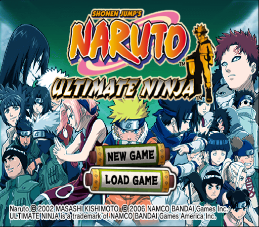
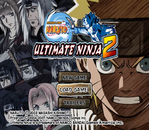
Are you making an engine? A lot of people are concerned about reusing their code in several projects. I understand not wanting to reinvent the wheel, but you also don't want to be too repetitive with your design, even if you're developing a series of similar titles. Take the Naruto: Ultimate Ninja series for instance. The design is slightly different each time (I was unable to find a screenshot of the third PS2 title). These games also utilize outlines for selection, and also animation once pressed.
Please forgive me if I misunderstood your question. I hope I could help somewhat!


