 If you guys could let me know which one you like the most, and if you want to expand on your answer go for it! Thanks ahead of time for any feedback guys!
- Danny
If you guys could let me know which one you like the most, and if you want to expand on your answer go for it! Thanks ahead of time for any feedback guys!
- Danny
🎉 Celebrating 25 Years of GameDev.net! 🎉
Not many can claim 25 years on the Internet! Join us in celebrating this milestone. Learn more about our history, and thank you for being a part of our community!
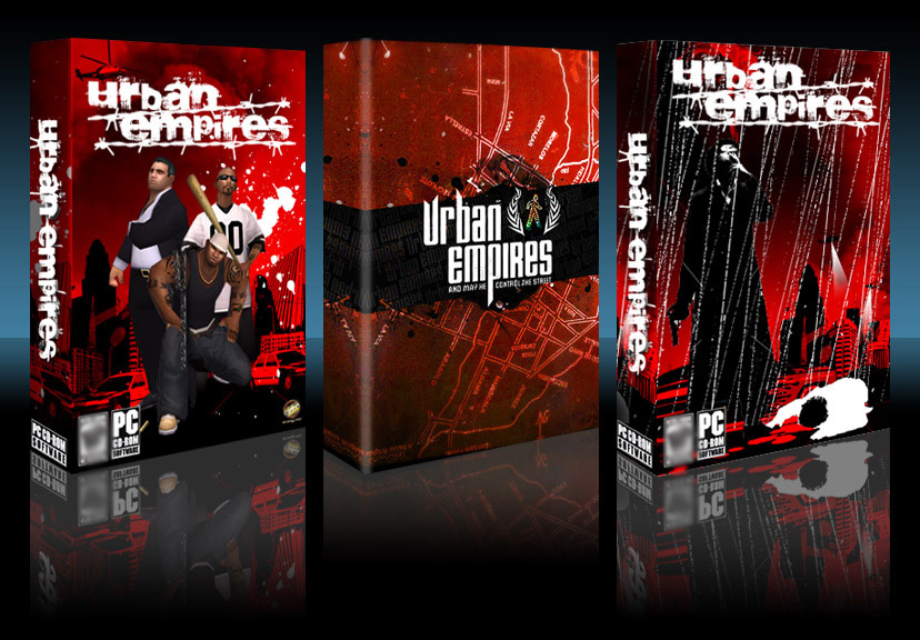
Urban Empires - Help me pick my game's box art!

Author
Hey guys,
As some of you may know I've been working on this game for 3+ years, and it looks like it'll have a 4 year dev. cycle [fun stuff I know]. I've written the entire game from scratch & did most artwork by myself. It's being published by Strategy First when it's finished. The game used to be called "Gang War", though it's now called Urban Empires [for copyright, and asthetic reasons].
If I had to sum up the game in a few words it would be "Age of Empires + SimCity + GTA with multiplayer". If you want more information about the game, check out the Radioactive-Software Homepage or my Developer Journal here @ GameDev. [Official Website Coming Soon]
Anyways...to the heart of the matter...it's about that time to decide on the box-art for the game. Just as a side-note the final call isn't mine, it's up to my publisher to make the decision based on feedback from the major distributors [EB Games, Best Buy, etc., etc.], but I really wanted to get some "real" feedback from you guys [developers/gamers].
I have a clear choice...but I'm not going to say :-) I will say that #1 and #3 were created by my publisher and are VERY EARLY mock-ups [and will improve greatly]. They created 8 totally different layouts, and these are the 2 we liked most.
Also #2 is a mock-up created by our very own SALSA! I contracted him for a little logo work & design.
Well here we go...
I guess images are blocked in the lounge :-/ so here is direct link.
If you guys could let me know which one you like the most, and if you want to expand on your answer go for it! Thanks ahead of time for any feedback guys!
- Danny
If you guys could let me know which one you like the most, and if you want to expand on your answer go for it! Thanks ahead of time for any feedback guys!
- Danny

I like #2 the best. It conveys the idea that there is more than just random violence involved. #3 is too busy and makes me think of Max Payne for some reason.
#1 just doesn't do it for me, its not bad, but its not great, and all it tells me is that I probably get to beat someone with a baseball bat. And that there are cops.
#1 just doesn't do it for me, its not bad, but its not great, and all it tells me is that I probably get to beat someone with a baseball bat. And that there are cops.
I like #1 the best as it gives more of an idea of "What" it is, with #2 being second best but not very close (too simple to convey the potential feel).
I don't like 3 at all for this.
I don't like 3 at all for this.
I like salsa's logo -- except for the little stick figure guy -- I can't really figure out what he is for. #3 is pretty cool, but I don't like the rain streaks -- it makes it hard to tell what is going on. #2 might work for the back of the box -- with the guys from #1 on it.
That is probably how I would do it. #3 is the front of the box (with less rain). Use Salsa's logo instead of the barbed wire crap. #2 is the back of the box, with the guys from #1 superimposed. Sexy.
Or just use all three. Do that whole 'limited edition' thing.
That is probably how I would do it. #3 is the front of the box (with less rain). Use Salsa's logo instead of the barbed wire crap. #2 is the back of the box, with the guys from #1 superimposed. Sexy.
Or just use all three. Do that whole 'limited edition' thing.

I agree, #3 doesn't look good at all.
I personally lean toward #2, becuase I like clean and simple more than something suggesting random violence.
Maybe mixing the background of #1 and #2 and using the foreground of #2 would be your best bet.
I personally lean toward #2, becuase I like clean and simple more than something suggesting random violence.
Maybe mixing the background of #1 and #2 and using the foreground of #2 would be your best bet.

#3 is my favourite; #1 makes it look too much like "generic rap-themed shooter," when it obviously isn't.
Pitching this as a generic "urban stereotype" game will turn off exactly who you want to target with a strategy game: people who buy "non-AAA" titles.
I like Salsa's logo; try putting that on the box for #3.
Pitching this as a generic "urban stereotype" game will turn off exactly who you want to target with a strategy game: people who buy "non-AAA" titles.
I like Salsa's logo; try putting that on the box for #3.

Author
Some interesting feedback/opinions so far, keep 'em coming! The more the better.
Thanks again guys.
- Danny
Thanks again guys.
- Danny

#1 is too bland; it isn't bad per se, but it looks like every other GTA wanna-be game I see on the shelves. If I saw this on a store shelf I'd just scan over a box like this without a second glance.
#2 is nicely minimalist; it looks more like a strategy game, especially with Salsa's logo. I'd probably check a box like this out.
#3 is very busy but it does catch my attention. The rain like scratch marks go well with that logo. The box has an edgy look that reminds me a bit of the feel Max Payne was going for. It doesn't look like a strategy game however.
I'd go with #2 for the strategy look or #3 for the edgy look.
This topic is closed to new replies.
Advertisement
Popular Topics

Advertisement