Hello, everyone! SunStrike Studio creates graphics for mobile and computer games. Below you will find detailed feedback on one of the tasks performed as part of our open test assignment. The author of the work has given us permission to publish this information.
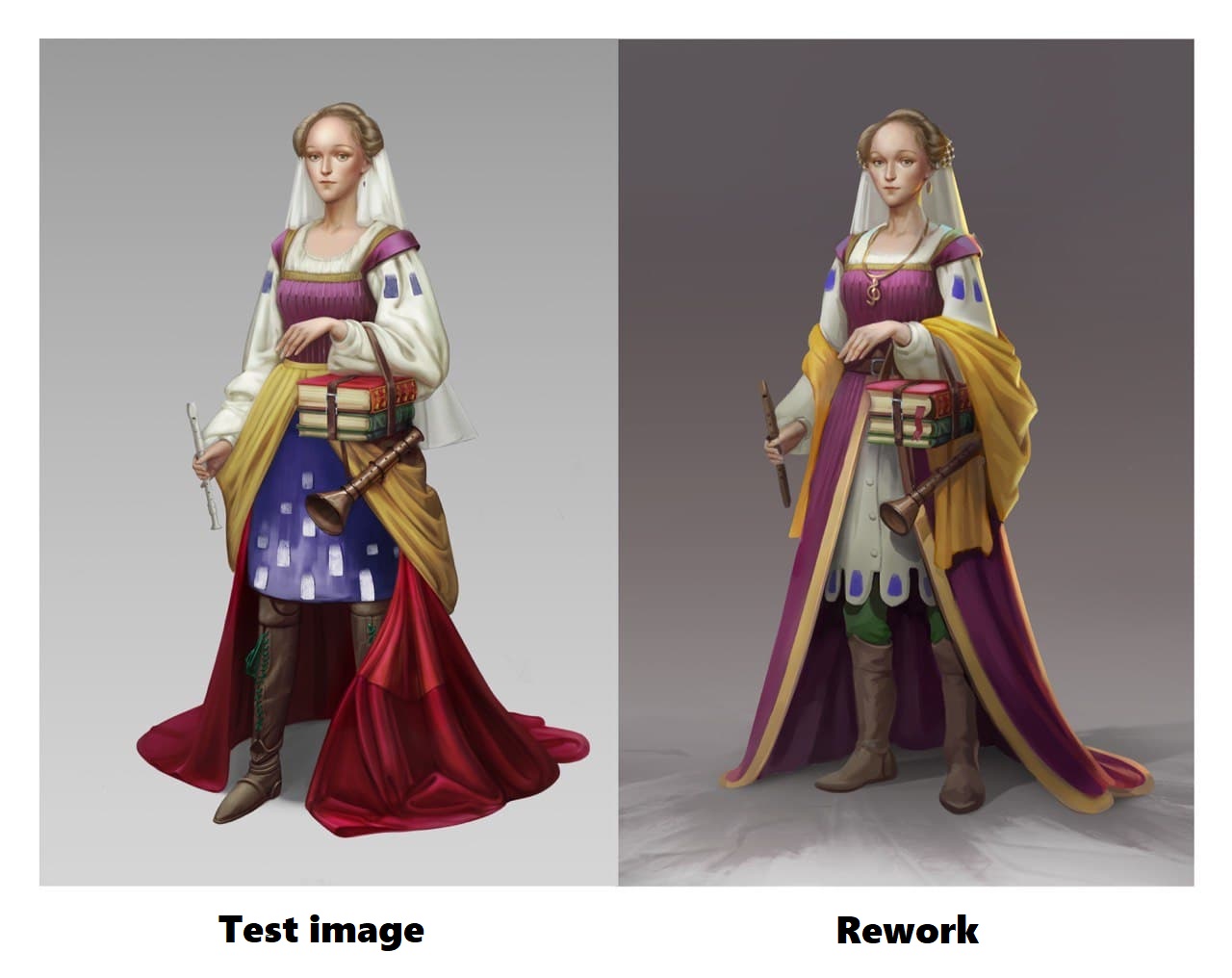
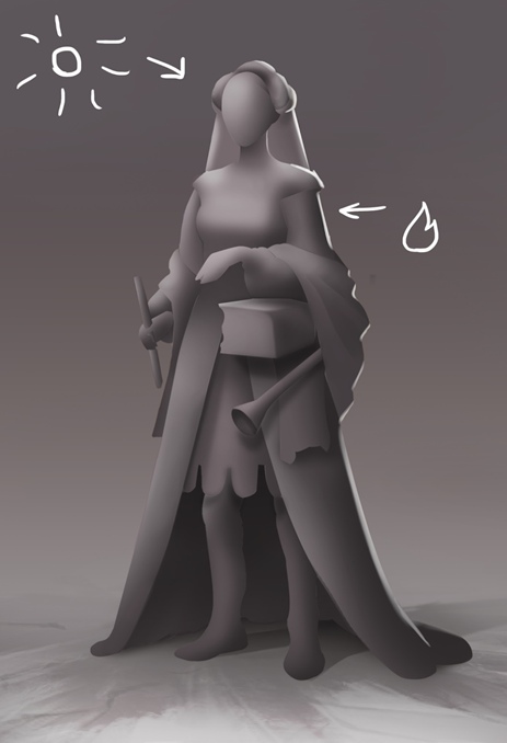
First of all it is worth mentioning that this work portrays an interesting and expressive character executed in the correct style. The layered nature of the costume shows that there was a good effort made to make sure that the outfit is not overly sexualized as well. That said, however, there is a number of items that could be improved upon and we will focus our today’s discussion on them.
Anatomy
Anatomy is one of the first obstacles when drawing characters, so it is best practice to recheck all of the proportions before finalizing the piece:
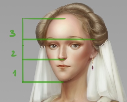
Traditionally faces are subdivided into 3 parts of equal size:
1. Chin to nose
2. Nose to bridge of the nose
3. Bridge of the nose to hairline
(since here we are accounting for the fact that during the Middle Ages women used to shave their hairlines to create the illusion of a larger forehead, the line appears to be a little lower)
In reality these proportions are much more flexible and could vary. Even so, this character’s chin seems too massive and protrudes too far forward. We can make it a bit smaller.
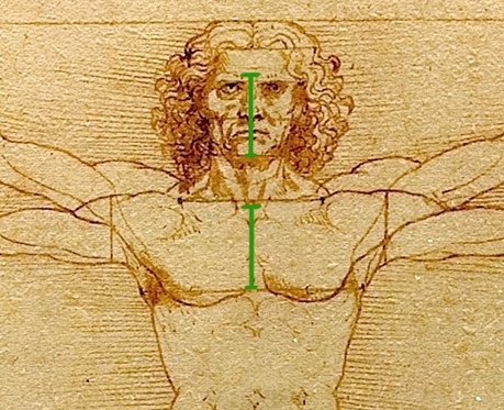
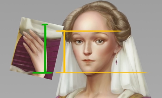
The chest should be positioned slightly higher. We can check this by comparing the size of the character’s hand to the distance between the sternal notch and the height of the nipples (usually it is the distance between the chin and the top of the brow ridge). Since the character is wearing a corset, the bending point should visually be even higher:
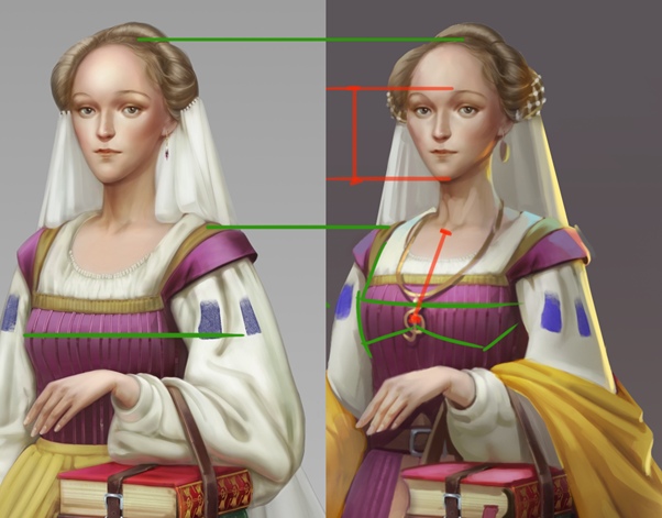
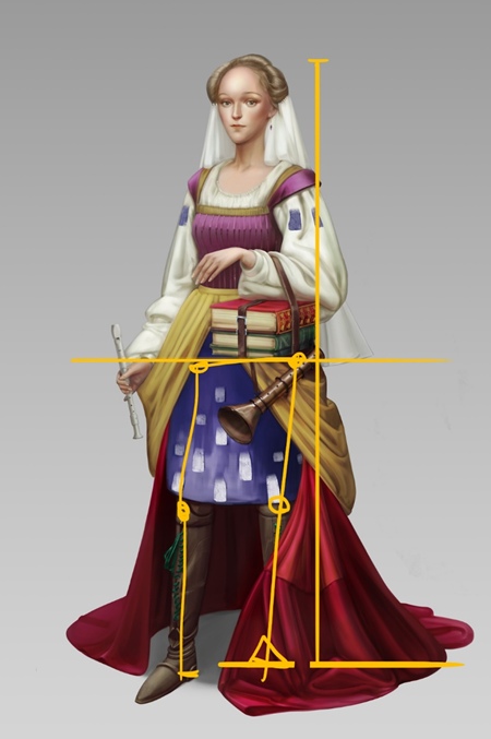
The arms look to be a little too long and should be shortened. The hands too could be made to look a bit smaller. As mentioned above, hands should be the same length as the distance between the chin and the top of the brow ridge:
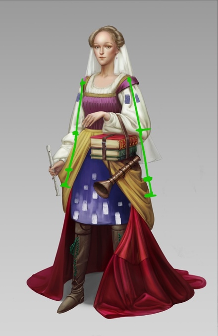
The character’s pose as well as the position of the right leg seem to be slightly unresolved. Based on the feet, the character is standing in counterpoise, but the same cannot be said of the top portion of the body. The provided example shows a more stable pose that does not involve counterpoise:
It is also worth taking a closer look at references for the position of the feet. They can help make the character seem more dynamic:
Costume
When designing a costume for a character, it is important to make sure that it flows logically and would be convenient to use. Let’s go over the costume piece by piece.
We see that there are 5 design elements, which are in no way connected to each other. It is poor design:
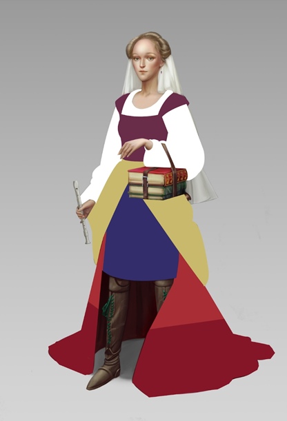
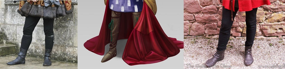
The bottom red skirt also seems odd. Its left side looks longer and is elevated mid fold as if someone was pulling it upward by an invisible string. The right side, however, looks geometrical, which would have been natural if the piece of clothing had a metal arch sewn in. But that would make it very inconvenient for walking:
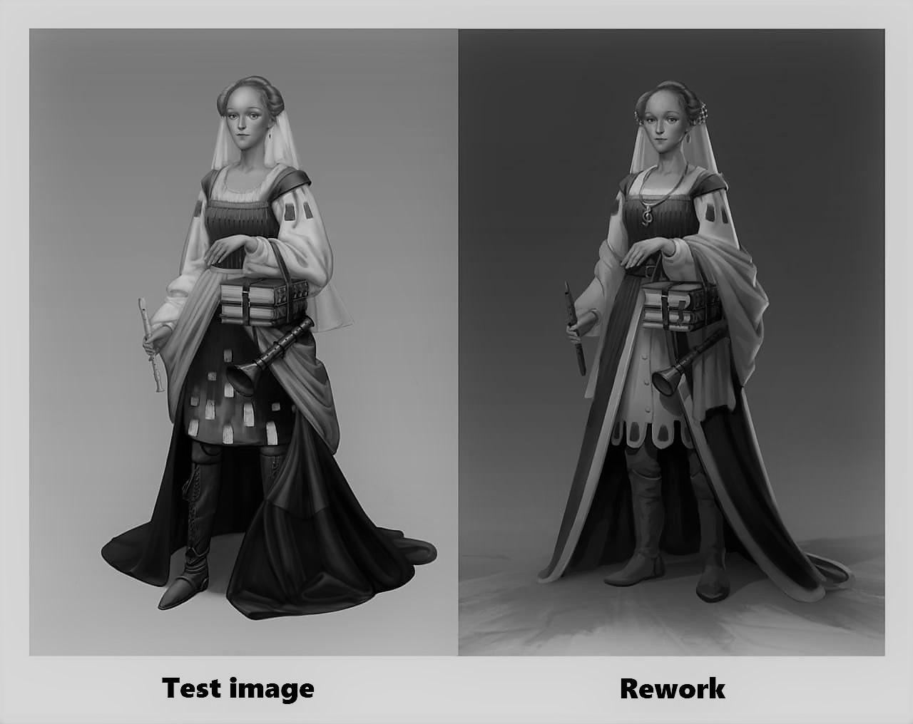
In this case we can make the skirt of the dress double layered - bottom shirt and a top dress. For additional layering we could also add in a shawl on the shoulders.
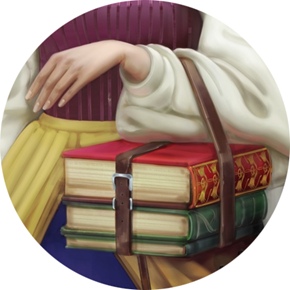
We should also keep an eye on the sizes of the blocks of colors. All visible pieces of different colors in this work are of different sizes. It would work much better if they were broken down percentage-wise. For example: 60% purple, 20% yellow, 15% white, and 5% other colors. The highlight colors from the 5% would look best if they resonate with some of the other elements of the clothing. For example green pants and the green covers of the books:
Tone
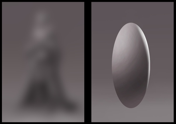
It is also important to keep track of the tone by occasionally flipping the picture to black and white.
One way to do so is to switch the layer to Black and white. This will create a new layer that will show you what the picture will look like in black and white. This layer would also be easy to hide when it is not needed.
You can see that the lower portion of the character is too homogenous in tone, which should be corrected. It is also important to keep track of lighting and to use it as a tool to draw the viewers’ eyes towards the most important portions of the character as well as to indicate volume. If the shape is simplified, it looks like an ellipsoid. Both a complex shape an and ellipsoid obey the same sets of rules. The difference is only in the details, which obey general volume rules.
It is also important to choose a background that will help display your character in a more favorable way. In this case, a darker gray background works a bit better:
Details
Details make the character more interesting, which means that they deserve special attention.
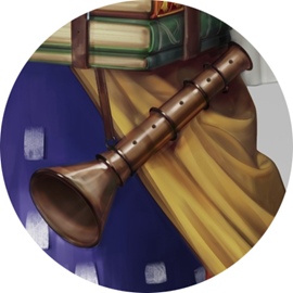
The pipe blends in with the background and it is not obvious what it is made out of. It would be better to make it look wooden:
This instrument is too shiny and the lighting on the wider part is not quite right, which makes the shape look deformed:
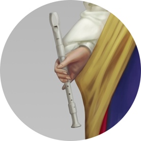
The second part of the strap slung over the arm is missing:
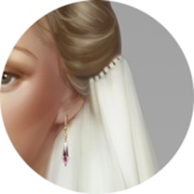
The veil seems to be sewn into the hair and the earring is too small:
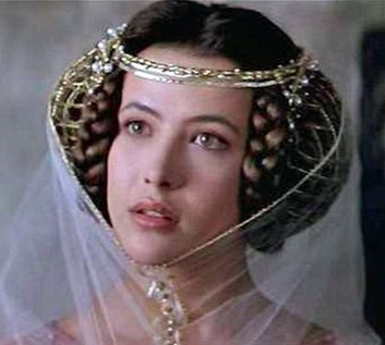
The headpiece can be decorated with a mesh embellishment, typical for the Middle Ages, and the veil can be attached to it:
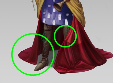
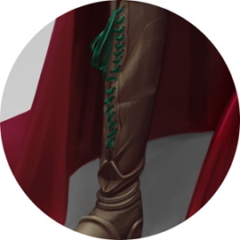
References should be consulted to improve the situation with the shoes. The elements of the boots look more rigid than leather normally would. The lacing on the boots is also questionable since it somehow involves only one string:
The main piece of feedback is that this work shows a very interesting image, which can be improved further to achieve perfection. It is not unusual to forget the basics while working on a piece. To minimize these mistakes make sure to go over the main points again with a fresh eye:
1. Intent, Technical requirement
2. Composition
3. Anatomy
4. Tone
5. Volume
6. Color
7. Details, Rendering
Look for more test task reviews from us in the near future!