Main Menu Redesign...

Published May 12, 2007
Advertisement
Not that you guys would notice ;-) Since the BETA hasn't started...but I spent a few minutes changing around the game's main menu....

Before everything was handled by the in-game GUI, and the camera circled an area of the city where a battle was going on. It was a bad idea because people w/low end computers don't get the same effect as I do with everything enabled.

ENTER - FULLY 2D menu system.

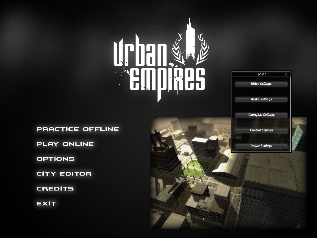
By removing the background elements of the game, I havn't changed anything, but I did boost my FPS to 2000+ and it'll allow me to make things 'cleaner' for when the user first sees the game. First impressions are a "big deal" apparently.

Anyways here is my little mock-up...click for larger image...


So yea the clouds in the background will be animated/scrolling. The layered scrolling clouds will either make or break the screen & effect. I'll probably add a "thunderstorm" effect in the background too. I'm sure it'll look cool in an hour or so.

I'll have a slideshow of the game's best screens going in the bottom right...and of course some badass mouse-over effects for the main buttons.

Also you can see an example of the in-game GUI, the options menu...in that screenshot.

Since I'm going to be adding a lot more gang managment / online / community features to the game I'm going to re-do the in-game lobby to allow for 18 players per-server...and also a "community" lobby. This will be increadibly cool if I can pull it off.

Yea...now I just need some perfect music to set the spooky yet epic mood...

Well I'll get a small video of this together sometime soon. I'm still focusing my efforts on the web/database side development with an in-game "side project" here and there. BTW I'm working on a dynamic grass system and it's looking really nice...

I was also a little off with my time estimage of "TOTAL WORK HOURS" left until the game's done...it's actually 693.5...yeaaaa, so re-adjust your calanders.

Ok back to work...

- Danny
0 likes 7 comments

Comments

Gaheris
Nice and I suppose it looks even better in motion.

But please, get a different font for the ingame GUI! The current one is ugly and hard to read.
May 12, 2007 09:15 PM
Ravuya
oh no! the batman forever font.

hold me.

so cold...
May 12, 2007 09:16 PM
dgreen02
I love that batman forever font [if you cant tell].

Regarding the font on the buttons, a while ago something happened to my arial font and ever since then all the buttons in the game have been italic...it makes it nearly impossible to read. I don't think it looks like that on anyone else's computer. But good point I gotta fix that.

I should just allow the user to select the font they want, since someone will anways complain about a certain font, everyone has their preferences...though the italic crap going on now is a no-no...I've just gotten used to it I guess, I didn't even notice [grin].

It will look good in motion that's the whole point of the smoke, when I put up a video you'll see :-D
May 12, 2007 09:32 PM
dgreen02
Quote:Original post by Ravuya
oh no! the batman forever font.

hold me.

so cold...


*Starts singing that U2 song*
May 12, 2007 09:37 PM
jollyjeffers
Looks very stylish [cool]

Although, to be honest, the floating options menu looks out of place...

Keep up the good work!

Jack
May 13, 2007 04:55 AM
dgreen02
Well the options menu was just an example, all the standard options menus / GUI / server finder / etc. would still be done with that GUI. The clouds / etc. would just be the new background, verses having a realtime city in the background as it has been.
May 13, 2007 04:42 PM
mrlachatte
I would recommend making the text in the options menu larger. It's a common problem on the web too, and I find that a good rule of thumb is that 12pt is the absolute lowest value you should ever use - anything else, and reading speed drops off sharply.
May 14, 2007 07:11 PM
You must log in to join the conversation.
Don't have a GameDev.net account? Sign up!
Advertisement