For historical purposes, UI v1 was an MFC-based UI, and as such, looked very "Windows", and very bland. Here's the HUD ("Heads Up Display", meaning in-game interface):
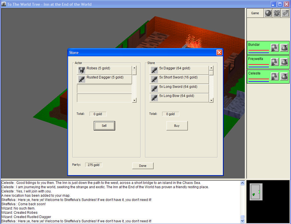
And here's a dialog; a store dialog, in this case, but representative of the overall look:
Looking back, I don't think they're that bad. But everyone I asked disagreed with me; I guess no one wants Windows in their RPG.
UI v2 was a completely new interface. As an aside, I've maintained pretty clear boundaries in the engine code between gameplay engine, graphics, and UI. As such, I've had a lot of success dropping in a new UI without having to touch much other code. Yet another instance where good code design (well, good for me, anyways) and modularity proves its worth!
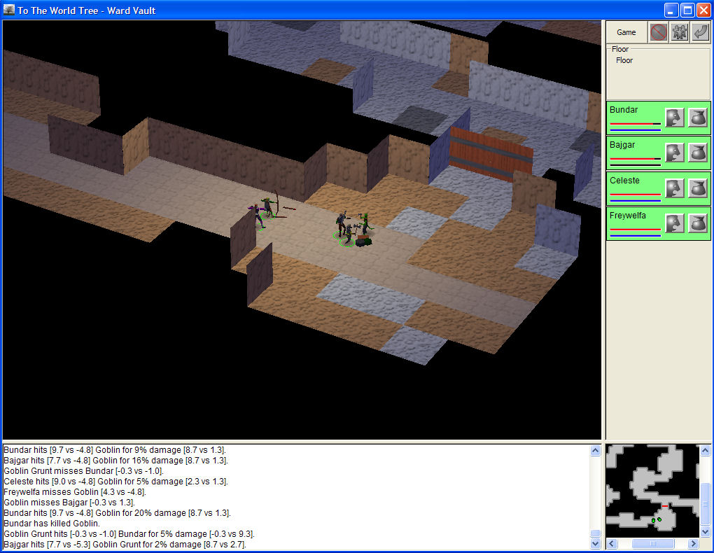
Back to the interface, v2 was recoded, written directly on top of DirectX and Windows messages. I heavily used the D3DX extensions like ID3DXSprite. Here's the HUD:
And here's a dialog; once again, the store dialog:
This UI drew mixed reviews; anywhere from "functional but bland", to "it looks like an old DOS game". I thought the "DOS game" comment was unnecessary piling-on, but still, clearly a revamp was needed. I'm OK with the HUD, even still, but I agree that the look of the dialogs was pretty poor.
Now that I had the code in DirectX, changing the look was pretty easy. I was already pretty happy with the "feel" of the UI; things were nice and snappy, drag-and-drop worked properly, and so forth. So, I came up with the new design principles:
- Make the UI look more modern, with a white-on-black look, and removing the bland backgrounds. I didn't copy NeverWinter Nights, exactly, but I did want my interface to look more like that.
- In the previous UI, I tried to make the UI scalable, where the dialogs would get bigger or smaller depending on the resolution. They looked OK at the small resolutions, but looked funny at the higher resolutions that most people would play the game at. I dumped this idea, and went with fixed-sized dialogs for v3.
- Also, in the previous UI, when displaying an item, spell, or other things like that, I tried to display the icon, name, and other information right in the UI. This led to largish UI elements that were hard to fit properly into dialogs. In v3, I put these things into a 48x48 element, and displayed most of the information in a hover window.
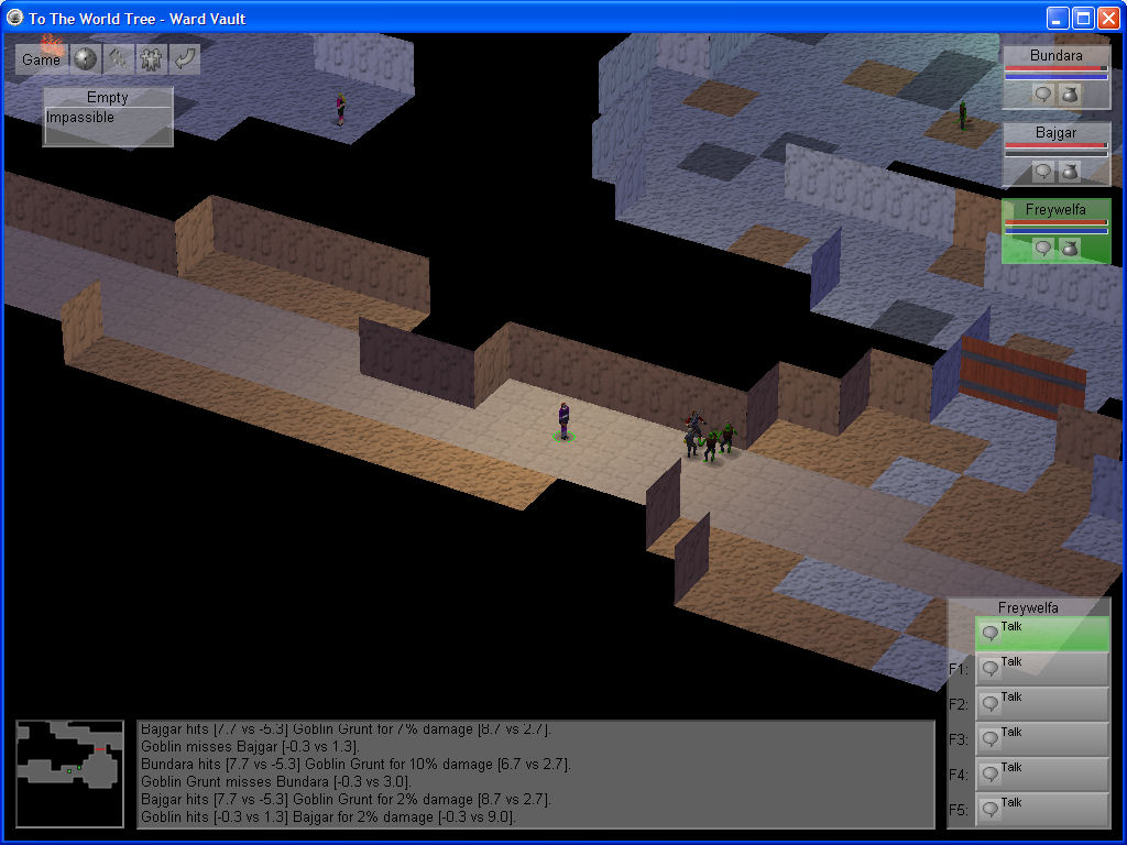
Here's the new HUD; this is actually pretty similar to the old HUD, but with the new look:

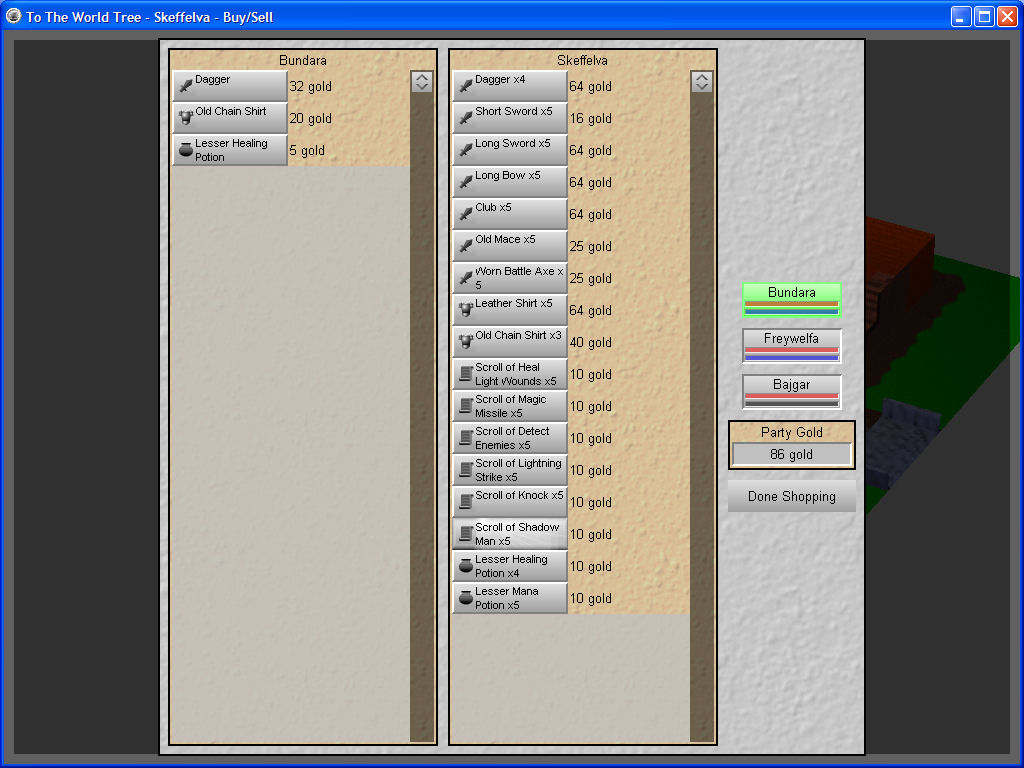
Here's the new store dialog:

And here's the new inventory dialog:

I'm pretty pleased with the new look. One note I would make is that I'm still using the icons from the old UI, which are too dark for the light-on-black look. I'm still only going to have a few icons, so, for example, all swords will have the same icon. But, I support icon coloring now, so a magic sword could glow light blue, instead of the generic gray of a normal sword.
Unfortunately I've changed to engine too much for "To The World Tree" to work with the engine anymore, so I can't release a demo with the new UI, so you'll have to live with the screenshots. As always, comments and questions are welcome.


Just noticed this. Will keep an eye out. It looks really well/far developed.