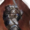
Which looks better?
Which one of these posters looks better: the first of the second?

 thanks
-Sage13
 Liquid Moon Team
 Project X2
[edited by - Sage13 on October 20, 2002 12:51:51 PM]
We''ll just quietly ignore the fact that they''re both terribly cliched shall we?
The lightning of the top looks quite nice, but the red X2 logo looks better IMO. Either way i''d lose the guy right at the forefront of both (with the yellow hair, side on) since it really doesn''t fit in with the whole thing. If you''re going to keep the lightning you''ll probably want to make it''s affect on the characters more pronounced.
The lightning of the top looks quite nice, but the red X2 logo looks better IMO. Either way i''d lose the guy right at the forefront of both (with the yellow hair, side on) since it really doesn''t fit in with the whole thing. If you''re going to keep the lightning you''ll probably want to make it''s affect on the characters more pronounced.
the second one looks best for a poster. I has a fuller feel to it. and text. text on posters is great, but not done enuff.
----
Insanity in disguise.
----
Insanity in disguise.
quote:Original post by Sage13
Which one of these posters looks better: the first of the second?
thanks
-Sage13
They both look awesome. The bottom one seems to be the better one of the two though. Excellent work.
quote:They both look awesome. The bottom one seems to be the better one of the two though. Excellent work.
I Agree. Did you draw them?
the second one looks better for a poster...but yeah, there''s something missing there. the picture appears to be "center-centered." The characters are not distributed equally, they are all in the center, while the poster itself is pretty wide (too much unnecessary space). Hm..try to make the poster less in width, about the size of the first one.
My compiler generates one error message: "does not compile."
My compiler generates one error message: "does not compile."
I''d have to agree with the above posters, the second one is the better of the two. Great work by the way.
Ok , thanx!
I think cropping the second one down a bit is a good idea.
thanks for the feedback!
-Sage13
I think cropping the second one down a bit is a good idea.
thanks for the feedback!
-Sage13
I like the second one as well. Although I think that the lightning should be casting light on the characters. I also feel that the guy at bottom center turned sideways seems kind of passive in the poster, perhaps if he was turned toward the reader face angled down staring straight at the reader would be a little more dynamic. And just wanted to mention the the X2 should have the broken up rings (not sure how to descirbe them) that the X2 has in the first poster. It helps draw the eyes to the game title, something you''re probably shooting for. Hope that helps.
Take the logo from one, position it center-bottom on two, et voilá.
If at first you don''t succeed, call it version 1.0
SketchSoft | SketchNews
If at first you don''t succeed, call it version 1.0
SketchSoft | SketchNews
This topic is closed to new replies.
Advertisement
Popular Topics
Advertisement


