[web] New Layout - Need Suggestions

Author
Hey all,
I'm working on a new layout for my site.
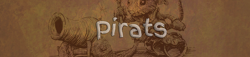
New Layout Here.
First let me state what I'm going for: Something very simple, that flows nicely with itself. Nothing too boxed up and cramped looking, but a little flair and style for good measure.
Now the problems:
Overall: I can't come up with something that looks good as a whole. I love the masthead graphic, and I like the style of the sidebar, but together they just don't work that well. I'm not too sure if the colours work either (the light blue sidebar with the black text and grey links).
Masthead: I'm not sure branding GroZZleR.com on the right looks that good, but I can't flip the image and brand it on the left, because then the image looks like shit (the helmet just looks awkward). Yes that's the power armour from Fallout Tactics.
Sidebar: I can't find a clean way of sepearting the sidebar from the content, without boxing it up. If I move the bar to the left, and the content to the right, it looks much better but the branded GroZZleR.com on the right of the masthead looks out of place.
Heading: The bar beside News looks terrible, but I need a way to seperate the title / heading from the content.
Anyone have any ideas or suggestions? I'm all ears and open to anything, even boxing it up, if you can think of a way to make it look nice.
I think it would look a lot better if you rethought your colour scheme. It also seems like the background should be black, but at the very least try using a navy blue or something darker instead of the light blue you currently have.
I like it a lot!
You might want to change the colour scheme around a bit though. The light blue on the white makes it look a bit too bright. A darker colour would be sufficient.
... And try justifying the text.
[Edited by - Rob Loach on September 20, 2004 4:57:13 PM]
You might want to change the colour scheme around a bit though. The light blue on the white makes it look a bit too bright. A darker colour would be sufficient.
... And try justifying the text.
[Edited by - Rob Loach on September 20, 2004 4:57:13 PM]
Author
I've boxed it up, darkened it up and more or less made it match my original layout.
Any thoughts?
(The footer is going to get smaller, but I don't like it the way it looks, it's too 'there' and not subtle enough.)
Any thoughts?
(The footer is going to get smaller, but I don't like it the way it looks, it's too 'there' and not subtle enough.)
Quote:Original post by GroZZleR
I've boxed it up, darkened it up and more or less made it match my original layout.
Any thoughts?
(The footer is going to get smaller, but I don't like it the way it looks, it's too 'there' and not subtle enough.)
much better...the orange gives it the bit of contrast it needed. the footer is distracting, but you have already mentioned that you will change it.
The only thing that I can see unsettling is the way the navigation bar fits in with the entire design scheme...it's not bad or anything, it just seems ever so slightly...off. I'm not a designer, though, so I'm sorry to say I can't really think of any way to make it better.
Overall, excellent work. Keep it up!
Quote:Original post by GroZZleR
I've boxed it up, darkened it up and more or less made it match my original layout.
Any thoughts?
(The footer is going to get smaller, but I don't like it the way it looks, it's too 'there' and not subtle enough.)
Nice one!
It's light and fast, all that I content site need.
The colors are in harmony with our eyes.
Nice few notes
* the very bottem black bar would look nice if there was a 2-7 pix buffer from the buttom of the page.
* Darken the links just a little or make them just a tad more blue
* the very bottem black bar would look nice if there was a 2-7 pix buffer from the buttom of the page.
* Darken the links just a little or make them just a tad more blue
This topic is closed to new replies.
Advertisement
Popular Topics

Advertisement