My Character Design Art - would love feedback

Started by
3 comments, last by KingLuke24 12 years, 7 months ago
[color=black][font=Arial][size=2]Hey all,[/font][color=black][font=Arial][size=2]

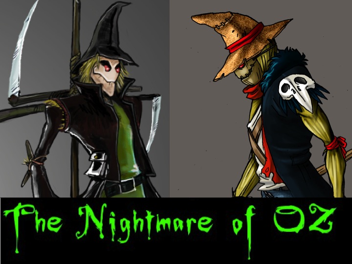
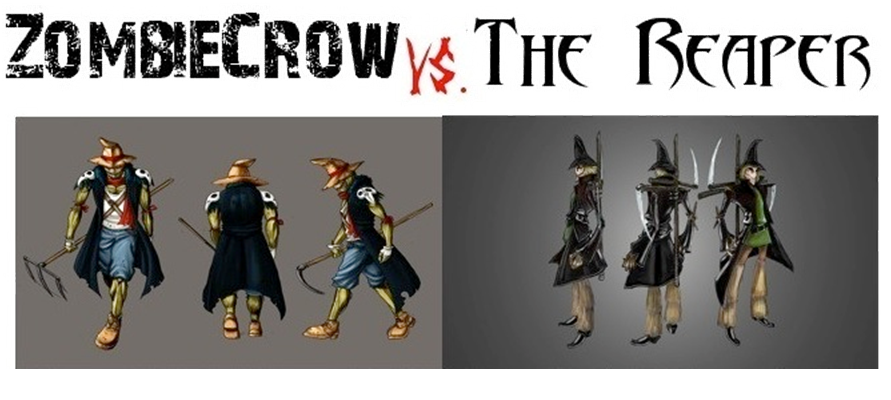
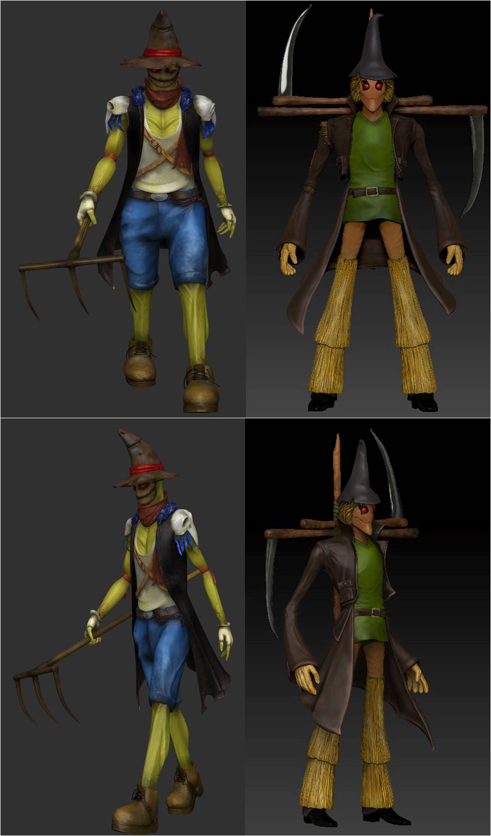
A friend of mine and I recently started a designcompany ([/font][color=#660000][font=Arial][size=2]http://www.shouldbee.com[/font][color=black][font=Arial][size=2]) that lets fans create their own action figures, games andcollectibles. We're starting with a dark fantasy re-imagination of the Wizardof Oz that we're calling The Nightmare of Oz. We'd love it if you could help uschoose the final design of the Scarecrow figure that we're going to make orspread the word. We're running a Cage Match type competition between our toptwo community-voted Scarecrow finalists on Kickstarter, whichever one wins, we make.[/font][color=black][font=Arial][size=2]

You can check us out and support us if you'reinterested here - [/font][color=black][font=Arial][size=2][color=#114170]http://goo.gl/fm3TS[/font][color=black][font=Arial][size=2]

Many thanks!

See our 2D images and 3D prototype images on ourblog:

[/font][color=#660000][font=Arial][size=2]http://blog.shouldbee.com/2011/07/22/the-nightmare-scarecrows-come-to-life-in-3d/[/font][font=Times][size=2][/font]


nightmare-updated.jpg


zombiecrow-vs-the-reaper1.png


picture2.jpg


Advertisement
I think I should reply, since no one on this forum replies to artwork of people. You did a great job on the characters. The only thing I don't like is 3D version of the second one.
Nice Burtonesque interpretation.

I really like the Reaper character, definitely the stronger design of the two. I would lighten his face up to more accurately reflect the concept. As a whole, both of these guys look a tad drab (a common side-effect of earthen tones). Since this is a non-realistic design (YAY!!!!THANK YOU!!) pimp the highlights in texture. Higher contrasting highlights will bring out more details in places like the faces. ZombieCrow would definitely benefit from a lighter face, as the color currently matches his hat, and they all sort of bleed together. His blue is a little too saturated for the rest of his palette as well.

Concepts look good.

Nice work ;)
It is pitch black. You are likely to be eaten by a grue.
These look amazing! Great job. :)
Very nice job on both! I like the Reaper model best! Keep it up!
<----HammerTime!!!---->

This topic is closed to new replies.

Advertisement