Looking For Feedback On My Writing/Game Design Portfolio

Started by
9 comments, last by Crashbang 4 years, 11 months ago

Hi everyone. I would love your help. Basically, I have been writing for games and designing for a little while and wanted to put together a portfolio so that maybe I could make some progress into better work. Now I'm looking for feedback, constructive criticism, anything really. I'm trying to figure out what I should be doing next. Should I work on more hard-core level design skills, and develop my Unity skills to create something more real? Should I get a hard copy of the board game made? What is more or less important in the portfolio?

I'm under no illusions about needing more quality in there for the future - the main issue, honestly, is figuring out what I should be doing next. Thank you all in advance.

RM Portolio.pdf

Advertisement

The main problem is the overall structure. The eyes and mind can´t fix on some anchor of savety in your portfolio. I would suggest to you to create a template for an overall frame to keep a structure (the section of your craft you present, etc.). This structure or frame stys the same. If you do this you give the eyes of the reader a kind of save haven. The first glance is essential. At the moment I get the impression that there is much going on... but I also get a feeling of doubt if you can keep up with months or years of game production. All of this just by the rather chaotic visual esthetics. You want to avoid this feeling inside the reader at all cost. Give the portfolio a repeating pattern.

 I would highly recommend to leave the qoutes out of the first page. or make them less. As mentioned above: my eyes don´t know where to start. A common way is to have the essential information in front and MAYBE some art, examples with oppacity in the background. They must NEVER conflict with the essential info! It doesn´t matter what your portfolio contains if the frontpage makes the reader quit because it gives the wrong impressions.

Give everything more space to breath! Quality over quantity. This makes it more readable and you reach the potential costumer.

That's something I hadn't considered before - thank you very much. I'll work on a simplified template, cut down and go from there. You meantioned that was a main problem of yours - did you have any issues with the rest of the content besides structure and the quotes?

Give it just one Font. I forgot that one. The rest is good. But the presentation makes me skip through it. I think thats the main issue at hand. 

I'm trying to figure out what that document is supposed to be.  I agree with the others, it has no direction, no purpose.

The first page looks like testimonials, the kind of quick statements you see on the back of a book that is effectively useless but tries to bring people in.  

The second page starts with a description of what you're trying to do, but then shows seven images that have nothing to do with what you wrote. The images themselves have no cohesive nature: a photo-style rendering, a cartoon-style backgound level, rough rendered comics, and typewriter-style font with poor writing that I think is meant to be depicting a joke. 

Pages 3-10 are a confusing mix of what looks like they should be a half page of a resume, or maybe a full page or two of a CV. No unified style, no cohesive thoughts, nothing that says "I need to hire this person".

The last page looks like "Here are a bunch of reasons you should avoid me in the company."  Every line is potentially a reason against you, not a tempting reason to hire you.

What is it you're trying to do with the booklet you've created? It is not a writing portfolio (where you give chapter-sized excerpts of what you've written) nor a game design portfolio (which usually showcases designs and the reasoning behind them, and often includes videos or playable segments that showcase designs). 

That was pretty frank - thank you. I'll work on that too. It's really meant to be a combination of the work I've done - a showcase of a wide range of work I've done. But I'll work on making it more cohesive and more focussed.

Don't showcase a wide range of work. Show only your very best work. You have a lot of competition, and you have to knock our socks off.

-- Tom Sloper -- sloperama.com

Don't put illnesses on your CV, that will scare most employers off immediately.

Regard the honesty of people as a gift not a curse and you will reach heights not fathomed by your current self.

To show you that we are not evil persons I made a template for you (File 13). Its a png DIN A4 and at 300dpi so you could even print it out.

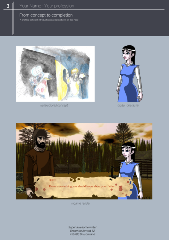
File 12 is a showcase how you could arrange things. 

- Top left is for the Page number <-- allways same position!

- Top header is your name etc. <-- I would recommend to repeat for each page

-underneath that you come to the actual description what is shown on this page and a brief but comprehensive description. 

All this must be aligned on an invisible line on the left. place it with spaceing in mind. 


- In the more blueish part you place your actual stuff with also minor comments if needed.

- On the bottom is your contact. Hyperlink everything etc. make it not so big but they must realize it´s there <---- REPEAT FOR EVERY PAGE!!!! 

I used Roboto font. If You want to go for more Serif Font Minion Pro is good. NEVER sitch font NEVER!!! Within these fonts you have different options which you can and should use BUT keep some restrictions on variety Fontsize and subtypes of font used. Do not surpass more than 3 variations!

Sorry for my bad english. had to slap this together very quick and I´m not an native english speaker.

12.png

13.png

This template can be used by whoever wishes to do so for his own personal use (your portfolio i.e.). Any commercial use (selling template and others) is forbidden.

Have fun!

'Regard the honesty of people as a gift not a curse and you will reach heights not fathomed by your current self.'

Oh I do - it's why I'm here. I've had much worse criticism then what's in here - I've been writing for a while. It can hurt but you roll with it in order to get better. I'm honestly just happy to have recieved so many comments on it - I was worried I wasn't going to get anything. So thankyou everyone, genuinely.

This topic is closed to new replies.

Advertisement