Hello, everyone! SunStrike Studio creates graphics for mobile and computer games. Below you will find detailed feedback on one of the tasks performed as part of our open test assignment. The author of the work has given us permission to publish this information.
Is it possible to improve the quality of your drawn character, pulling yourself out by the bootstraps from the pit of doubt and confusion? Yes, it is. Sometimes, as you work on a project your eye gets “muddy” and you stop seeing the mistakes, which in turn prevents you from improving your work and reaching the next level.
Below we will use a test project to illustrate 5 items that you should focus on to improve your character.
Position, proportions
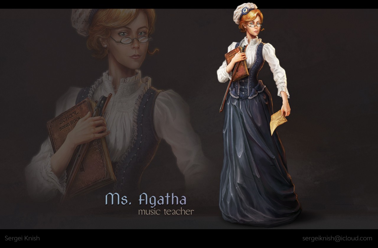
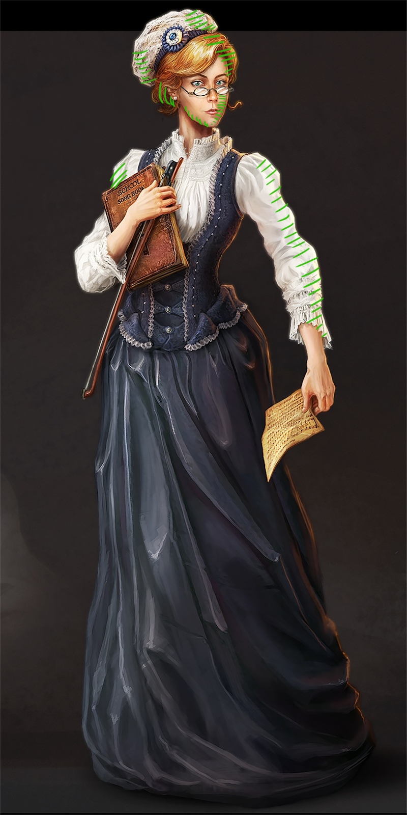
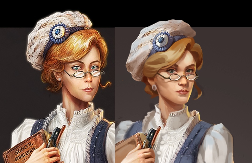
If you are not sure of the character's pose, stand in that pose yourself and ask yourself whether the pose feels comfortable, as well as whether it would be appropriate given the situation. For example, in this image the hand holding the sheet music stands out as odd. The hand is positioned far from the body and the woman is holding the sheet with just two fingers. It feels like she is about to raise her hand and wave the piece of paper like you would a handkerchief. The lady looks determined, which means that it would be more appropriate for her to hold the sheet tightly with her hand lowered. This is also a good time to check on proportions. In this example the shoulder located further away from the audience is a little too large.
Compliance with the request / original intent
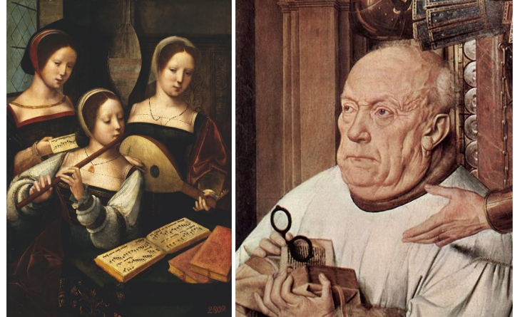
Before starting to work it is best to do a bit of research to make sure that all the details match the era, level of income, and age of the character. If you forgot to do so before starting, you can still do it at any stage of the task to avoid mistakes.
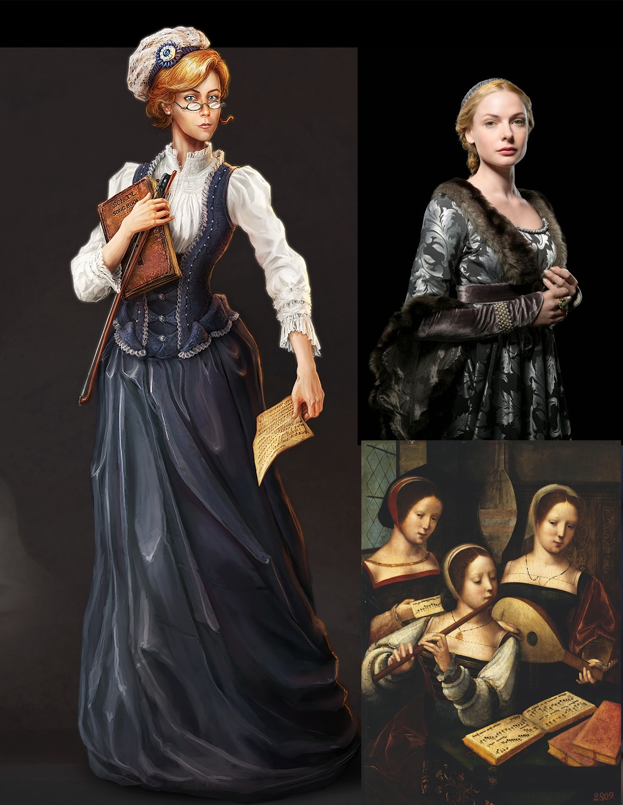
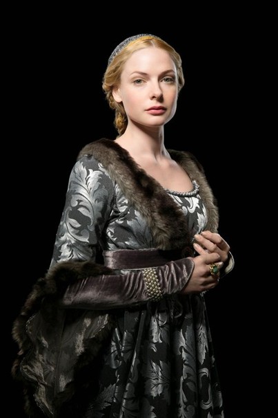
Video game graphics have a lot of conventions. It is doubtful that there were many female music teachers in medieval Europe, but we are making a concession to create an interesting character. The initial instructions define the following parameters for the task - medieval Europe, a woman of about 25 to 30 years old, the work should be vivid and with daytime lighting.
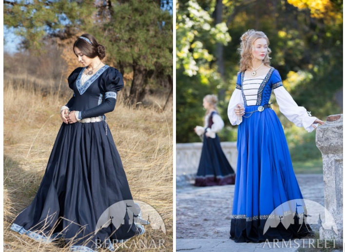
The first thing that catches your eye is the outfit. The upper part looks to be from the mid to late 19th century, when blouses of this type became popular. The corset vest and beret also look to be more modern than what would have been worn in medieval Europe. Then there's the question of glasses. Glasses with temples did not appear until the 18th century during the era of Enlightenment. The character seems to be wearing stud earrings, which became widely available in Europe only at the end of the 19th century. Next question: what font was used at the time? To figure out these types of details we should consult reference materials:
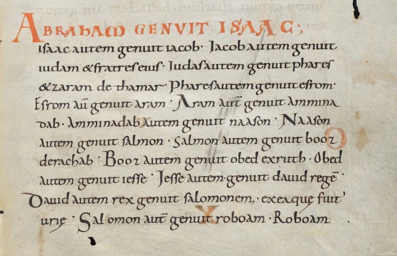
We can see that the font used on the sheet music book of the test task looks more modern. The script that is closest to modern fonts that was used in that era was Carolingian minuscule. You could use it, or remove the writing all together:
Lighting and volume
When you look over your work, make sure to check that the light is falling from the correct side everywhere, the shapes have enough volume. It might also be worth it to locate a reference document for similar type of lighting:
Let’s take a closer look at the rim light (contre-jour): the only way that it would be as thin as it is and present around the entire contour of the character would be if the source of light is located directly behind the character. For example, it could be the setting sun. If we give up on rim lighting, we could assume that the light is coming from the fireplace. In this case it should be made more "drawn out", so that the planes that are turned towards it are more widely illuminated:
Check color and background for distortions
You can do so by placing a realistic photo next to your work:
We can see that the warm colors look too “burned”, drifting into shades of red and orange. This can happen when Overlay or Color Dodge modes are used too often during the coloring process. This can be fixed by painting over the area with a brush, using a more neutral color in Color mode.
If we flip the work to black and white, we will see that the tone is irregular and some items contrast with the work (whites of the eyes, decorations, highlights on the folds of the garment). We can also see that the figure blends in with the background, which hinders the ability to perceive the silhouette as a whole:
The shadow on the neck is very bright, while the shadows on the face itself are very light. They have to be balanced out. Additionally, the lower jaw does not cast any shadow. This makes the head look as if it was cut out:
The work is also lacking colder tones from the sky, the addition of which would make the work more picturesque. It is very simple to fix: use the pipet on the base color, move a bit closer to grey on the pallet and that will help you “cool down” the color. Do not be afraid to use shades of gray. They will make your work more realistic and enjoyable:
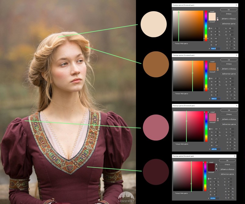
The book and the piece of paper also have a “burnt” look to them. Yes, they match the color in the painting in the lower right corner, but there the gamut is balanced. White clothing is perceived as white, but only within this picture, if you "take" the color with a pipette, it turns out to be a shade of gray and yellow. During that era people wrote on parchments. Parchments were not snow-white, but in a living space, they will be affected by the cold shades of the surrounding area.
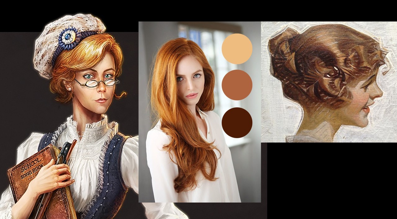
It's also not quite clear what the hair should have been like originally. The updated image has light-blond hair. But let’s take a look at the example with red hair. Even in the lightest part they will not be white. It is important to pay attention to this because otherwise the integrity of the tone is lost and the work start to "rattle".
You should also avoid unnecessary small and contrasting details, such as hair or fine textures that are too conspicuous. Take a look at the work by J.C. Leyendecker. He does amazing work illustrating volume for hair without being overly detailed:
Finally, go through the details, look closely at the references
For example, in real life the glasses will not have this much white glare. They would only slightly refract the light and have a few glares on the frame:
The neck will not be so straight, it will smoothly transition into the trapezoidal muscle of the back:
The folds of the dress in the test image are too angular and have contrasting highlights. They wrap around the legs towards the bottom, which would prevent the woman from moving. The skirt is a slightly different shade compared to the top. It would be best to even them out.
A similar trim could be added to the bottom of the skirt as is present at the top:
Textures should be applied more carefully to make sure that they do not look too rough or create any unnecessary “noise”.
When drawing a woman’s face, the proportions should be carefully exaggerated. In this case, the jaw and frontal lobes came out very large. Together with a very low angle of the lower jaw it looks exaggerated. You should also be more careful with skin folds and the grove under the nose. All of the above tends to age the character, while the description lists her as being between 25 and 30 years old.
The hat "sits" at the very top of the hair, which makes it looks unnatural. It would be best to place it a bit lower:
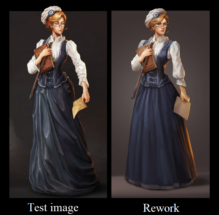
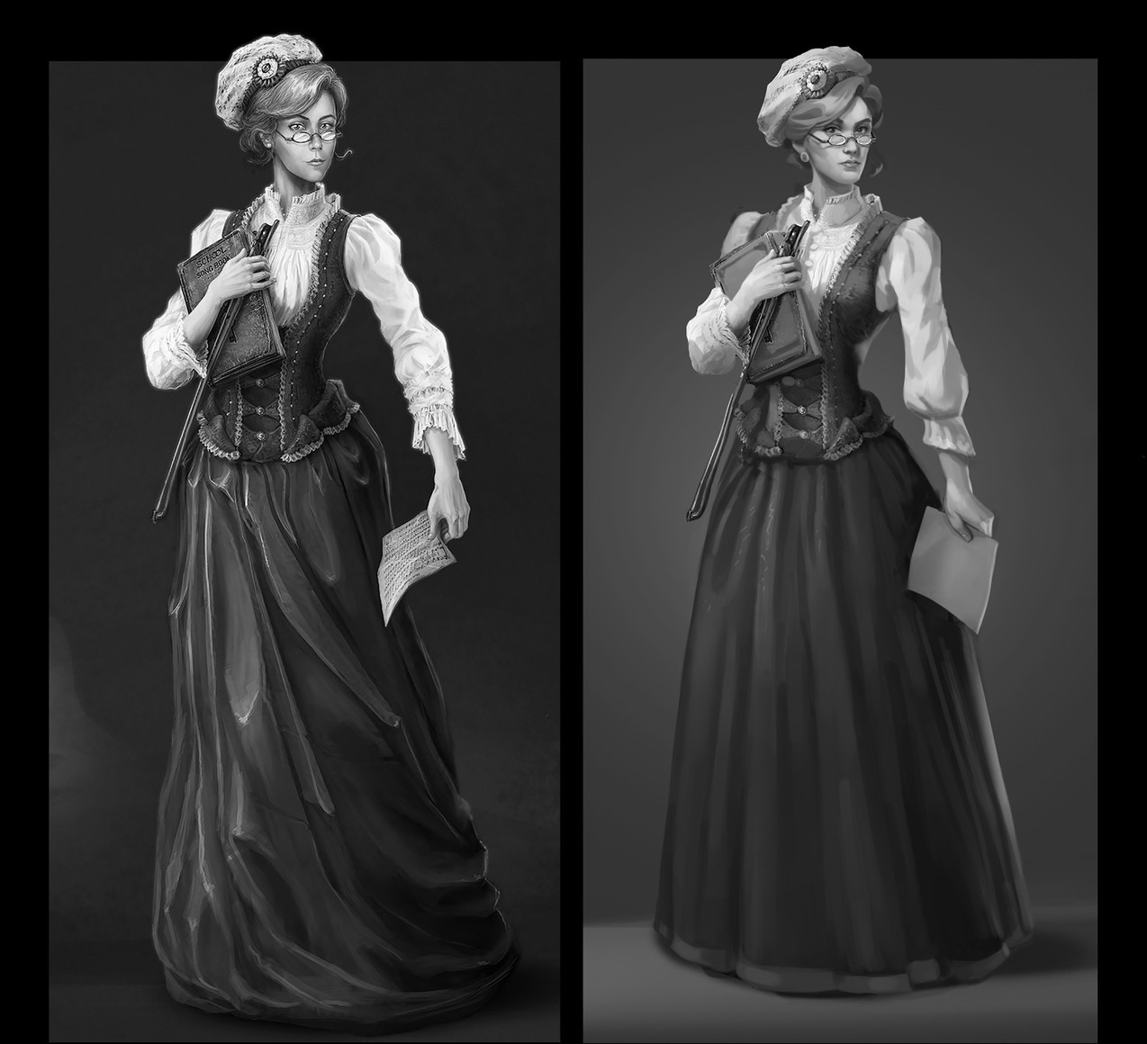
Overall, trying to make a character look more realistic is a very natural desire and the correct path to follow. When you take time to analyze your work, take it apart detail by detail to make it better, things move much faster. Below you can see once again the test image and the corrected version:

We hope you will find these tips useful as you work on your characters. Look for more test task reviews from us in the near future!
Stay tuned for more feedbacks on test assignments!
