
Designing a "Playable" UI That Secretly Teaches How to Play
How to create a fun user interface that teaches players how to play your game.
- Toto Temple Deluxe: Platforming (Part 1)
- Toto Temple Deluxe: Platforming (Part 2)
- Toto Temple Deluxe: Collisions for Platforming
- Toto Temple Deluxe: The Unique Experience
- Toto Temple Deluxe: Evolution Through Iteration
- Toto Temple Deluxe: Sacrificing fun to remove the no-fun
- Toto Temple Deluxe: Odyssey of a Bubble
- Toto Temple Deluxe: Powers Up!
How to play
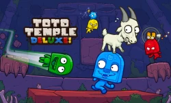
Just in case you haven't played the game, here's a short introduction to the gameplay:- Get the goat and keep it on your head to score points
- First player to reach 3k points wins the game
- If you don't have the goat, steal it
- You steal the goat by dashing onto the carrier (this is important)
- Dashing is not strictly reserved for stealing the goat
- It makes you move quickly in a straight line, so use it to move around faster as well (don't walk)
 Notice how Yellow got to the goat before Green did?
 First UI concept (jam version)
Before we talk about the UI system currently in place in Toto Temple Deluxe, let's see where we started. The first (and only) menu we had in the jam version was this: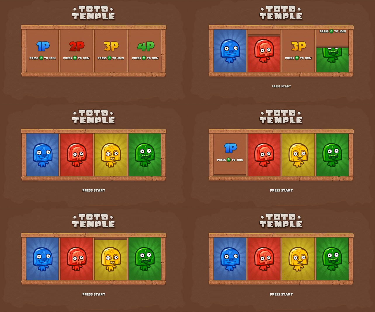 "A" to join, "B" to... un-join?
 Live events: Looking for trouble
Back in November 2013, the original Toto Temple was being featured at Gamercamp, a small and charming event taking place in Toronto.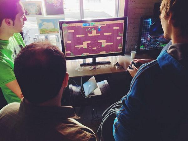
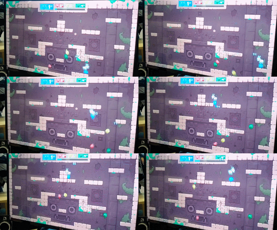 See? No dash. Oh wait! Green player is on to something...
 Back to the drawing board
At that point, we noticed that dashing in multiple directions was definitely something most players had trouble with. Dashing left and right was kind of okay, though. Since your Toto was automatically facing left or right, you ended up dashing in one direction or the other by simply pressing X (no direction). Dashing down is not often required at first (you start using it more as you start dashing to move around a lot). The real problem was dashing up. You had to dash up way more often than down, since gravity was pulling you down and you often wanted to go up in the level.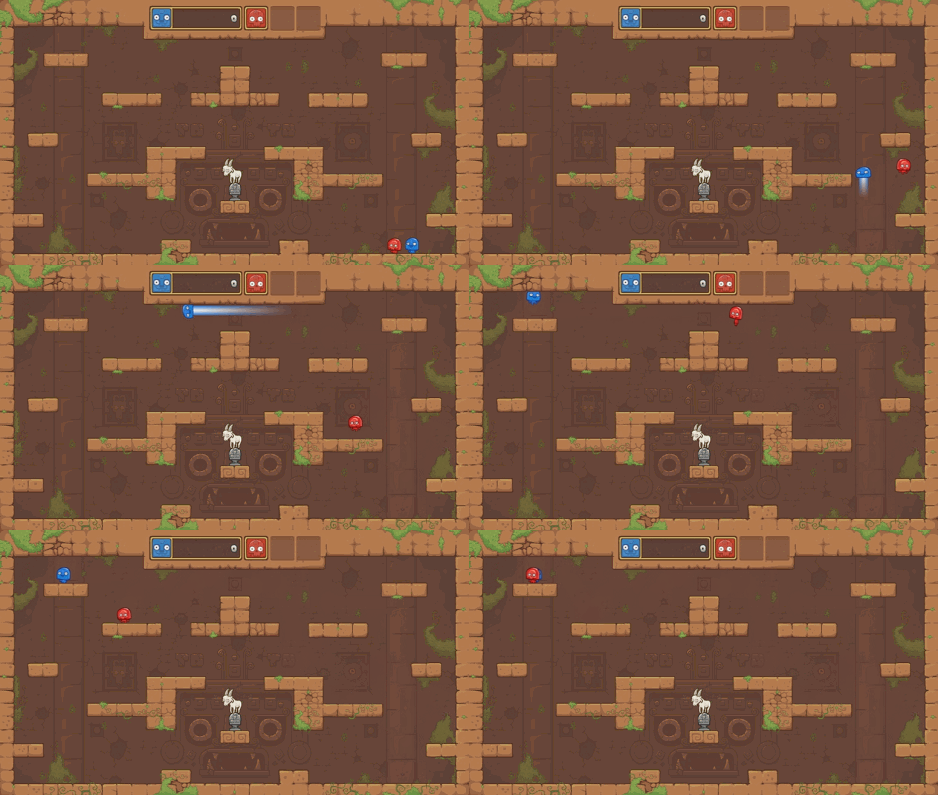 Dashing is noticeably faster than running and jumping
 Character selection: First lesson
A short time after gathering all that new information, we got invited to demo Toto Temple at a small gaming event in Montreal called The Prince of Arcade. It was a good occasion to try and improve the game's teaching methods and see it in action. First idea we had to solve the dashing problem was to bring the platforming and the physics into the menu and literally ask players to dash up to join the game, instead of simply pressing "A". It wouldn't teach them how to play, but they would at least be aware of the key combination.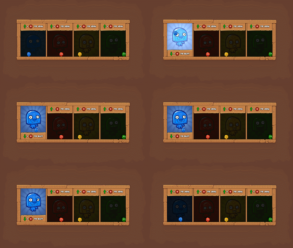 Dash up to join, dash down to quit
 Deluxe makeover
Shortly after testing out the playable menu, we got in touch with the great folks at Ouya and managed to get a partnership deal for a bigger and better version of the game. We had plans for more levels, new modes, power-ups, and of course, a completely new UI system. Since we were going for a physical and playable approach for the new UI, we decided to literally go "outdoors" with temple-like boxes, etc.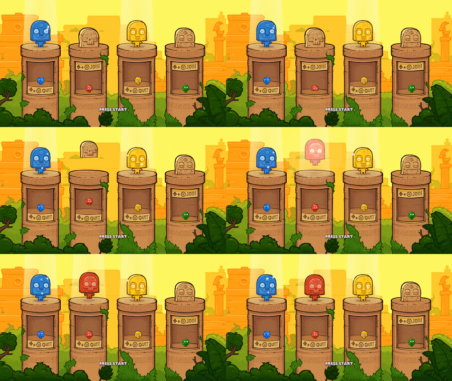 No more abstract boxes! Smell that fresh air?
 Weird behaviors
Now for some strange reasons we still don't understand, we've seen a lot of player dash up to join the game, then immediately dash down to leave the game. Then dash up, then dash down. Again and again and again. They would do that until someone pressed start, and if they were lucky, they would happen to be "in" as the game progressed to the next step. Most of the time, they ended up being "out" and we had to go back, wait for them to join, then proceed again. The worst cases were the ones when another player would mindlessly dash down and leave as we were waiting for the remaining player to join. What the heck? What we think is that players aren't used to have an impact on the UI by playing around with their character. They simply don't realize their actions are changing the game's settings.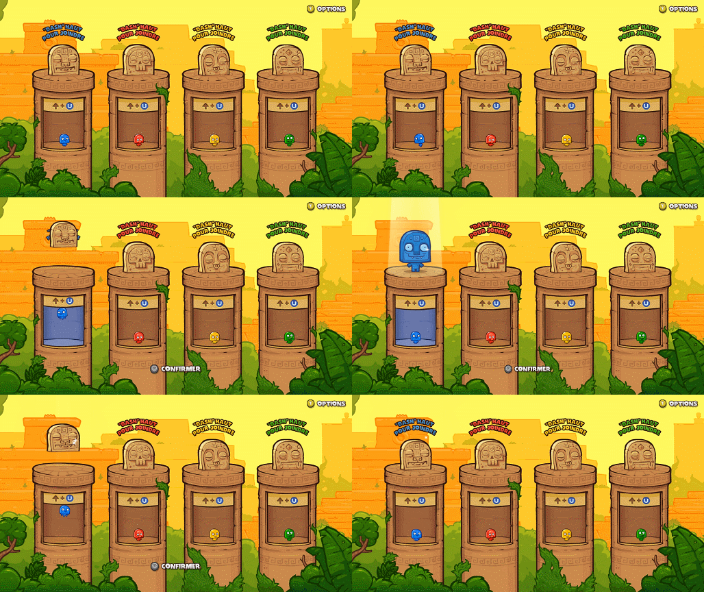 We also made the background light up to make it more obvious that you're in.
 More content, more problems
The new "character selection" was done and functional, but we still needed new menus for that new Deluxe content (levels, modes, etc). To be honest, we haven't thought much about that when we made the first playable menu screen. While designing pretty much anything, you usually want to keep visual and functional unity through the whole process. Since we had "buttons" that needed to be dashed into in the first screen, it made sense that we kept the same system for the other screens. The first menu to follow was the level selection screen, and things started to get a bit more complicated from that point in time. On a more fundamental level, the moment we switched to a playable menu system, most controller inputs became forbidden for anything except controlling your character. Moving the left joystick would now move your character, so we couldn't use any cursor or pointer. Pressing the A button would make your character jump, so we couldn't use it to confirm any actions. Pressing X would do the same thing, since you'd use it to dash into the different buttons. We already had that problem with the first version, but we simply went with the "Start" button to start the game. It was a pretty easy fix.Level selection: More teaching
The next menu screen we ended up needing was a "level selection" screen. We were aiming at 5 or 6 new Deluxe levels (or temples), so we needed a way to choose one from the bunch. Still with that same functional unity in mind, we came up with a first iteration using left and right buttons to choose your level (see below):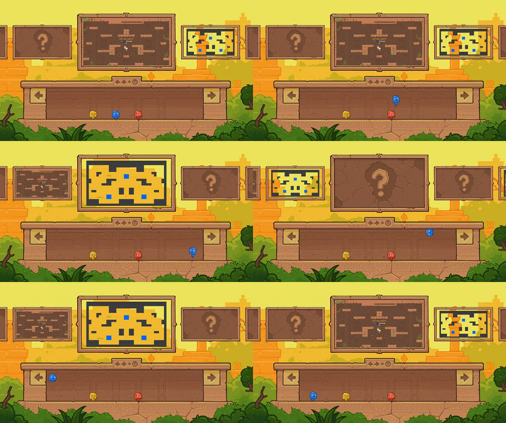 Still missing some assets, but you get the point.
 - You can dash up, but you can also dash left and right
- Those buttons are too high? Well guess what, you can jump and dash consecutively!
- We've seen a lot of players simply select the default level by pressing start right away on their first playtest. We concluded that it was okay since you usually don't know any of the levels on your first try (the first one is as good as any other). They saw that there were other levels available, so they understood that it was possible to manually choose.
- Most players recognized the buttons and the fact they need to bump into them, just like they did in the previous screen.
- Players understood the "jump and dash" combination, but since they were new at the game, they were having a hard time hitting the button multiple times in a row.
- The problem was coming from the fact that your eye wanted to look at the level thumbnails so you can pick the one you liked, but you felt like you also needed to look at your character to make sure you were aiming correctly at the button. It was weird and unpleasant.
- Some of them also took a bit too much time to figure out that the X button could be use for something else than joining the game (they probably didn't notice the dash animation while they were looking at their controller to spot the X button).
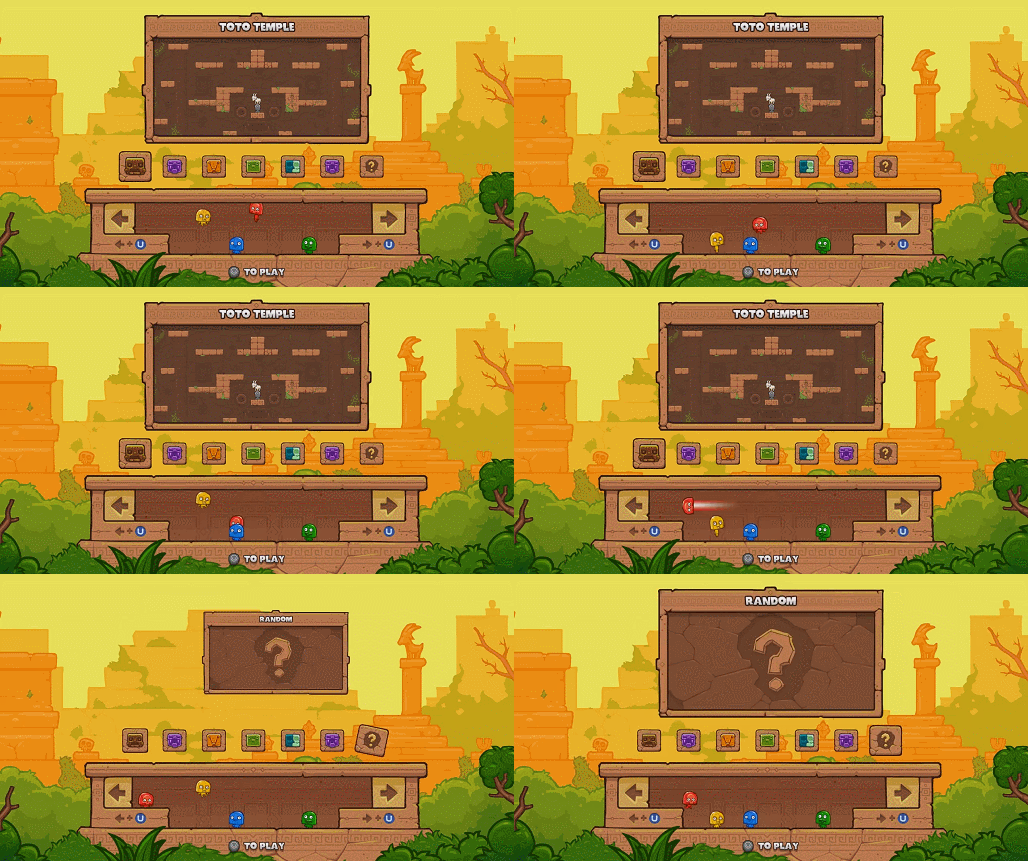 "Oh ok, wait. What are the buttons? How do I..." - Yellow player
 - To make it more comfortable to select a level, we added little step so you could mindlessly dash left or right and focus on the level thumbnail. It wasn't teaching you to jump and dash consecutively anymore, but it was at least teaching you to jump (necessary to reach the button), a thing that the previous screen didn't require.
- We added level icons with a single thumbnail so it could be easier to see the whole picture (how many levels total).
- We moved the "dash left / right" instruction from the middle top to both sides. They're also closer to each button so they were easier to notice and we made them blue like the actual X button (in this case it's U for the Ouya equivalent).
- It wasn't much of a problem, but we made the whole box smaller in width so it'd take less time to dash from one button to the other.
Mode selection: Final exam
The last menu to come in was the "mode selection" screen. Even if it was very simple at its core, it also happened to be the trickiest to implement. To quickly give you an idea of the UI flow before going further, here's the order in which you'd go through the 3 menu screens:- Character selection comes first since we'll need to know how many players will join for the next step.
- Mode selection is second, so you can quickly define the teams if that was your intention from the start. We want to let you set what you have in mind as soon as possible, so you don't have to wait and "remember it".
- Level selection comes last. If we ever decide to create "mode-specific" levels, the filter will already be defined.
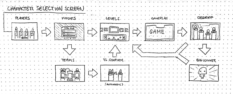 An early sketch the whole UI flow
 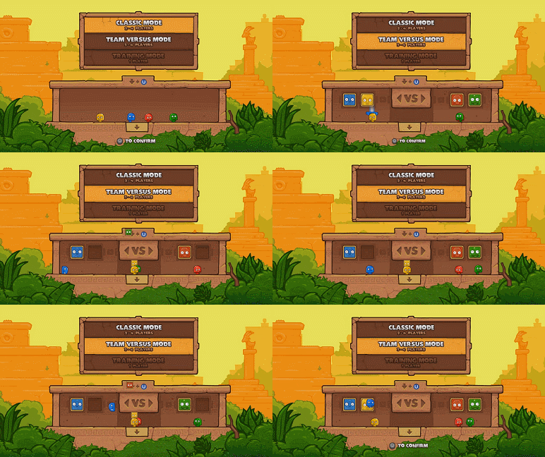 Position-based team selection ftw!
 - Avatar blocks are sitting on your head when you're not in a team, and they automatically snap in place when you enter a "team zone"
- A physical "VS" block to literally separate the two teams, which also acts as a "dead zone" to make the transition from team to team clearer
- A "dash down" button that makes the list loop around
- "Press start" indicator popping up when the teams are set
Quick teaching roundup
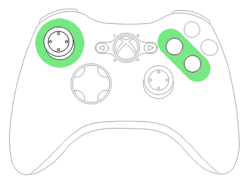
So far, here's what players should have in mind (subconsciously at least) before they even enter the game:- They should know that the X button can be used simultaneously with the joystick
- They should know that A is for jump
- They should know that X works in multiple directions, including up, left and right
Post launch: Player requests
Toto Temple Deluxe has been published and you've already seen the most of the UI that went into the game. Following the release, we did like we always do: we kept interacting with fans in forums, comments, blogs, etc. The 2 most recurring comments (or requests) we received were:- I don't have friends to play with, can you add bots?
- I want to be able to choose my color at the start of the game! I know it doesn't change anything gameplay-wise, but [insert color] is my favorite color and I'd like to play with it.
Update: Destroying a screen for 1 feature
Both "bots selection" and "color selection" are closely related to "character selection", which we quickly identified as a problem, UI-wise at least. Our current menu for "character selection" (if we can even call it a "selection") wasn't really designed to give players a choice of color or character. The pillar boxes are pretty small, and handling a bots selection system later on would also add up to the clogginess. We tried to think of different solutions to keep our current UI for that screen, but none of them was efficient, clean or simply felt right. We then decided to start over from scratch!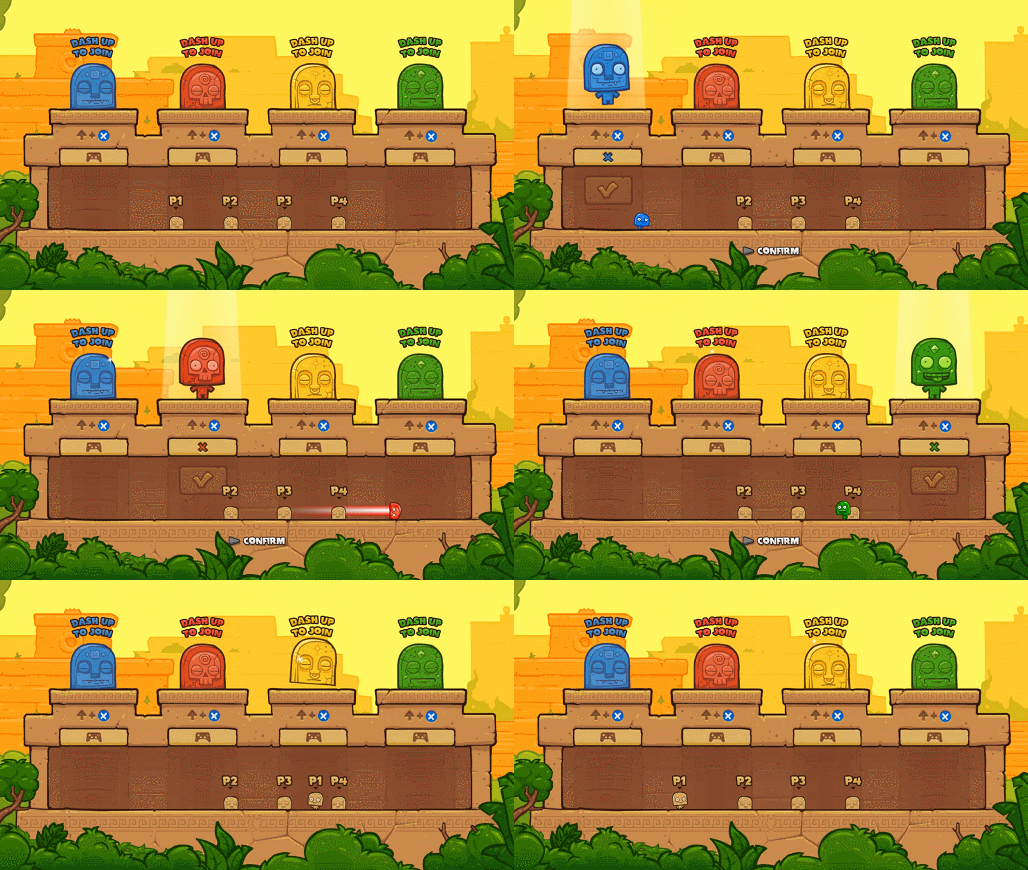 Characters automatically jump when you push the joystick to wake them up. That way, you can spot which one you are right when you're expecting visual feedback!
 - We kept the big statues. It's not a change, but we loved them too much to get rid of them.
- We now have a big public box, instead of beautiful, individual pillars (still sad about those pillars).
- We added uncolored Totos with player numbers over their heads so you can keep track of who you are.
- You can now choose the color you want by dashing in the corresponding button.
- You can switch from your current color to an unselected one directly.
- You can't steal someone's color, and vice versa.
- We do not have bots yet, but this design should let you decided if, for instance, green player will join in as a bot, etc. We'll simply cut the "join" button into two buttons: "Join" and "add as bot". At least that's the plan.
Conclusion: Benefits and difficulties
Making a fully playable UI was definitely a good experiment for us. Even if it wasn't completely necessary, it helped convey the complexity of the controls to new players. We could have relied on traditional, text-based tutorials, but most player would have just ignored them to then have a hard time playing the game like it's supposed to be played. Making a playable UI system is great if your game needs it, obviously, but it also comes with its share of difficulties: Benefits:- You barely notice that you're learning
- Way less boring than text and steps by steps / holding hand
- Eases the players into your game mechanics
- You don't have access to all controller buttons anymore
- Hard to strike a good balance between efficiency and clarity
- It's easy to start adding physical buttons everywhere, but that will get really confusing really fast
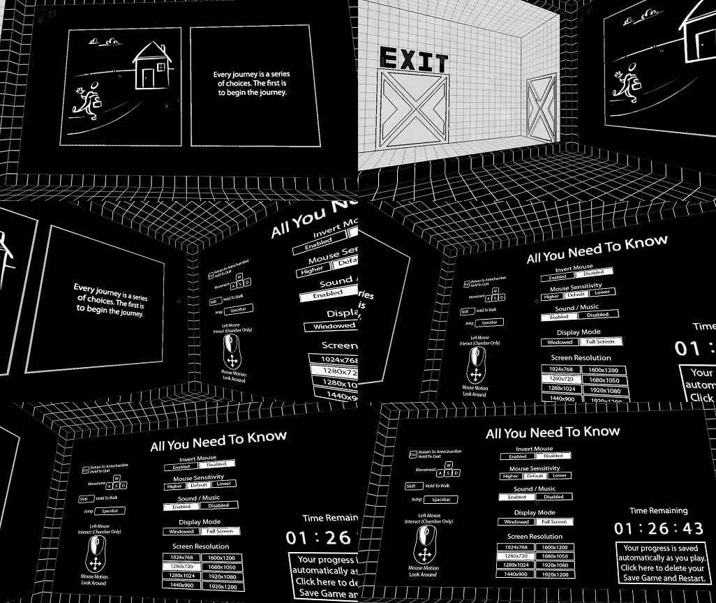 In Antichamber, you just need to look around and point at stuff to interact with the menu
 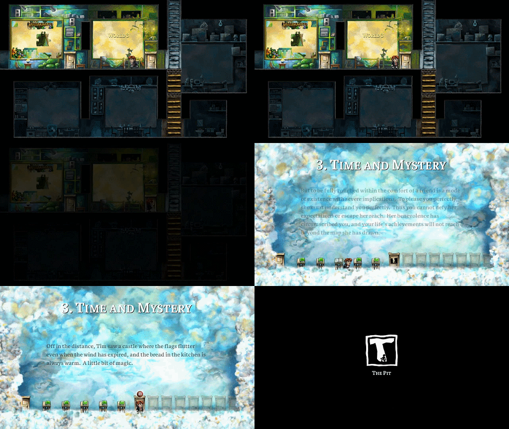 In Braid, you physically go through a door to pick a world / level
 Related Tutorials
Godot Engine Under the Hood
Over the past few years, the Godot Engine has emerged as the darling of the indie game development world. Born as an op…

Building a simple, lightweight, pure ECS in Javascript.
Building a simple, pure, C-like ECS in JavaScript. For newbies to ECS; many tutorials out there are misleading when it …
 Nick the Engineer
Mounting Script
Mounting Objects in Unity3d or Unreal engine.
 ZonalTycoon
Godot development using Godot Native and CMake
In this article, you will learn how to create your own Godot Native (GDNative) project and compile it for any platform …
 object71
Improving UE4 Blueprint Usability with Custom Nodes
This tutorial provides the groundwork that should allow C++ UE4 developers to construct new Blueprint nodes that can be…
 MagForceSeven

small3d Tutorial
First steps with small3d, a small, cross-platform, open source 3D game development library, written in C++
 dimi309
Discussion