The background of this entry is that for the sprite pack I'm making, I have basic fighter jet sprites complete and most of the animations done, but in order for them to be more useful in an actual game (and add value to the sprite pack), they need damage textures. Knowing Photoshop somewhat well, I figured out a pretty simple and easy way to make something look battle damaged relatively painlessly, and thought that it would be useful to share with you guys.
[hr]
MS Paint, No, Seriously, MS Paint
So I actually use Microsoft Windows Paint for a lot of art I do, mainly because it's so brutally simple that you can sketch out a pixel art subject pretty damn fast, and because it forces you to be considerate because there are no shortcuts to get to something pretty. I contrast that against the use of Photoshop, which lets you cut corners like a banshee. While this entry goes mostly into Photoshop territory, I always like to start in MS Paint.
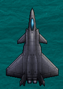
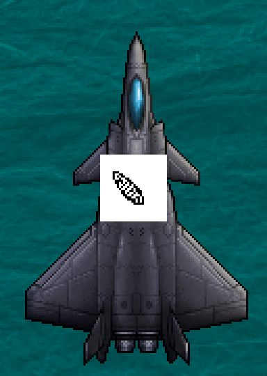
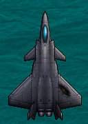
The size of the sprite to be damaged determines the size of the texture, and the airplane that's gonna get blowed up real good is 128 x 180:
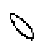
Normally I would do this in the margins of a copy of the airplane, but I separated it out onto a 32 x 32 image here so you could see it better.
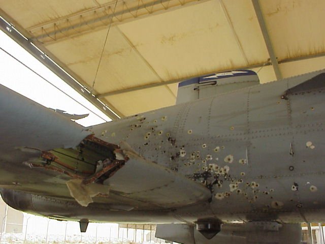
Where to start's a good question, but if you look at real battle damage it doesn't look that dramatic, and would barely be visible at this scale. So basically for coming up with a "look" I used some imagination and thought a big gash that revealed a little bit of the structure would look cool, like some big piece of shrapnel took a chunk out of the wing.
Blocking it out with the pencil tool, I came up with this:
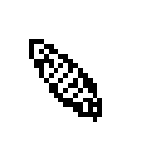
If I were working on a full sprite of something, I would make sure to take down those lines to a single-pixel width to get rid of the jagginess, but for this situation, jagginess is exactly what we need. For this inside, I added some straight lines that look vaguely structural and some squiggles that could be ripped up piping. At this scale, it's so ambiguous it doesn't really matter too much:
You could have also done all the above completely in Photoshop with the Pencil tool, but it doesn't particularly matter either way. For the following, however, you will definitely need Photoshop or GIMP (or some other higher-level raster editor) to replicate the effects.
[hr]
The Power... The Glory... of Photoshop
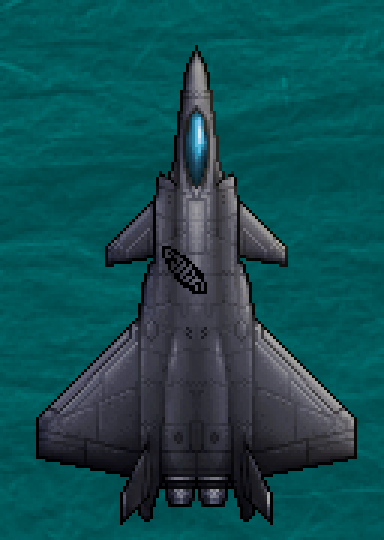
To get the pixels into Photoshop, it's just a matter of selecting the canvas (Ctrl+A) and pasting into Photoshop. I pasted it directly onto the airplane sprite:
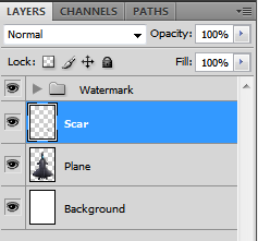
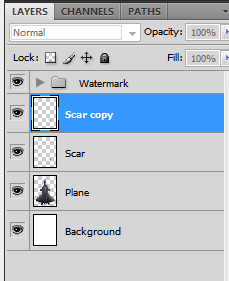
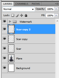
Pasting the image in creates a new layer- and Photoshop is all about layers. At this point the layers in Photoshop are these (Watermark just has some behind-the-scenes layers for generating these journal images, like the green background):
Taking off the white is just a matter of using the Magic Wand tool with the trick for pixel-perfect selection being a very low Tolerance with anti-aliasing disabled (and Contiguous enabled so we get the ones on the inside too). A lower tolerance will grab similar colored pixels in the area, and anti-aliasing with grab bordering pixels regardless of color, neither of which we need.
Moved (Move Tool- V key) and scaled up here from 300% zoom to 700%:
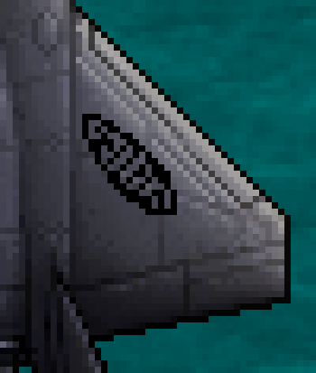
Moving into position on the wing is just a convenience thing, maintaining separate layers means we can move it wherever, whenever. I should also point at that naming layers is kind of like commenting code- it's not really for you right now, it's for you in the future.
Side note: One of the most frustrating things when learning Photoshop is when, for what seems like absolutely no reason, your tools stop working- your paintbrush won't paint, your eraser won't erase, your blur tool won't blur. 99% of the time, that's due to two things, either 1) There's a tiny, almost invisible area selected or 2) The wrong layer is activated. Layers rule everything, all your tools (well... most, Photoshop is complicated) can only act on a single layer at a time. Within a layer, actions only affect pixels within the selection area (if there is one).
At this point, we're looking at a very blocky outline of a scar that doesn't look like it's attached to the airplane underneath at all. We could have blurred or smudged it, but that would have destroyed the pixel-look pretty quickly. The way I've found to keep the best of both worlds is to save the original pixels and blur a copy. But howwww????!! you ask, enthusiastically? One of the many nice things about keeping distinct layers is that you can create a copy of them, to monkey around with while leaving the original pixels pristine. It's just a right click on the layer in the layer window -> Duplicate Layer away. The image as a whole doesn't look any different after the layer is copied in this case because the pixels are 100% opaque- more on that in a minute.
Blurring can be done one of a billion ways, but in this case I just used a one pixel Gaussian Blur (Filters-> Blur):
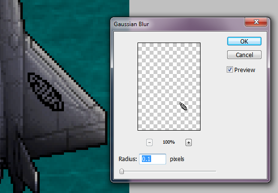
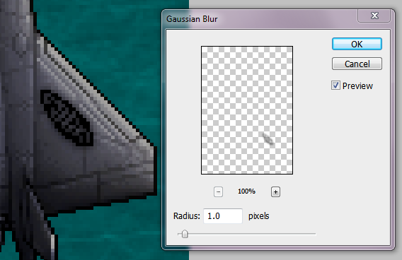
It looked better, but it's not strong enough to blend the Scar very much... what to do?
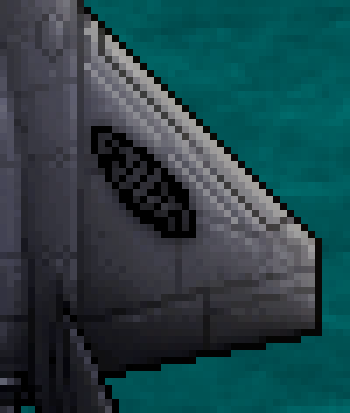
If you want a layer to be more transparent, you just turn the opacity down, but what if it's already at 100% opacity (the absolute limit) like this one? You duplicate the layer. Wait, what? It's pretty simple, duplicating the layer stacks those semi-transparent pixels, in effect making them more opaque. If you want, you can merge them to collapse the pixel information into one more opaque layer. Anyway, here's what duplicating that blurred layer (Scar copy) looks like:
I turned the duplicate layer (Scar Copy 2) down to 75% opacity to make it less black. Opacity adjustment is so useful that few layers in a complicated piece are ever at 100% opacity. Now it looks like a legit disaster befell this wing.
[hr]
Above and Beyond
For a lot of the scars last entry, I stopped at the last step, but for some of the bigger ones I wanted to add more detail... Adding some color makes it look more like the guts of the airplane are actually exposed ala a cutaway drawing. Making another layer (Ctrl+Shift+N) to hold the color pixels allows you to go back later and change the opacity if you overdo it without affecting the rest of the scar.
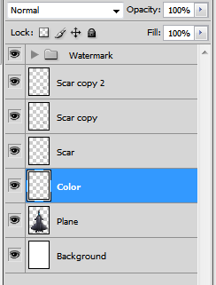
I used the Pencil tool at partial transparency to add red and a bit of dark yellow-gray to distinguish the inside of the scar from the outside, making it look like this:

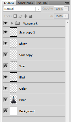
This looks pretty good, but kind of strange since that gash looks somewhat self contained, and the blurred Scar copy layers are a little too perfect, like they're airbrushed rather than violently burned in. As always in Photoshop, the solution is to add another layer! This time, it was to simply hold some more manually drawn scaring, this time with the Paint Brush (the difference between Brush and Pencil is that Brush automagically smooths the line as it draws with semi-transparent pixels). Using the Paint Brush with straight black and about 30% transparency, I added some slightly more elaborate charring, making it look more like an explosive impact:

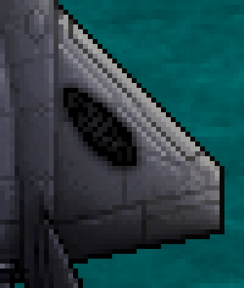
Aww yeah... lookin' good. From looking at real battle damaged airplanes, one thing that struck me was how often the damage took the paint off to reveal shiny metal, so I tried to replicate it by making... you guess it... another layer!:
Messing around with the Brush tool with white was a little too strong, so some selective erasing later got me here, more or less:
Hmm, I dunno. I moved the Shiny layer around:
...completely changing the end result so that instead of looking um, shiny, it makes the scar look deep and concave, like that side is lit up. Not really what I want, though.
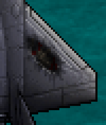
My mom taught me an old art trick years ago that looking at your piece in a mirror will make problems that you haven't noticed jump out at you. In the digital age, you can just flip the image, so there's no excuse not too. It often hurts to look at the image, but that's kind of the point- to rip you out of the comfort zone of familiarity you've built up over the course of working on it. So I did that, and fiddled around slightly and came up with my final version, this guy:
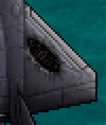
Just as an experiment, I took off that original Scar layer to see what that would do:
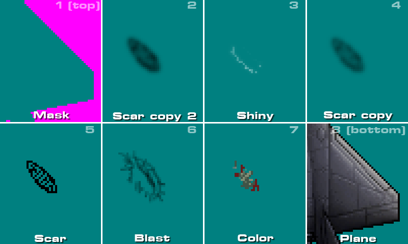
So obviously, having those jagged pixels still makes a difference (and makes it look more like actual Pixel Art). Here's what all those layers look like without an airplane backing them up:
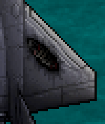
Finally, it's interesting to see what the layers look like individually. The top layer in this illustration is what would be the real top layer- a color mask (RGB 255,0,255) for transparency purposes, but all the other ones are the exact ones from above:
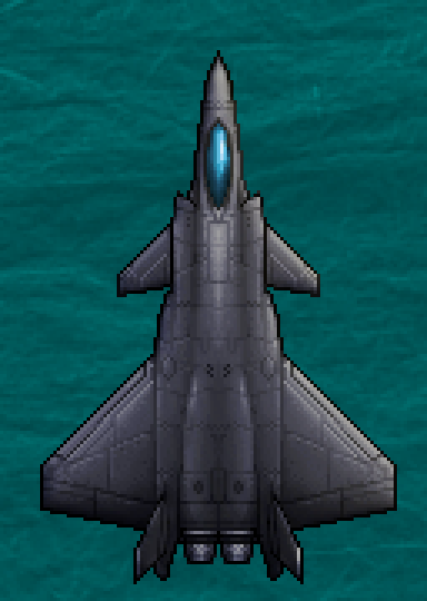
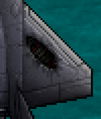
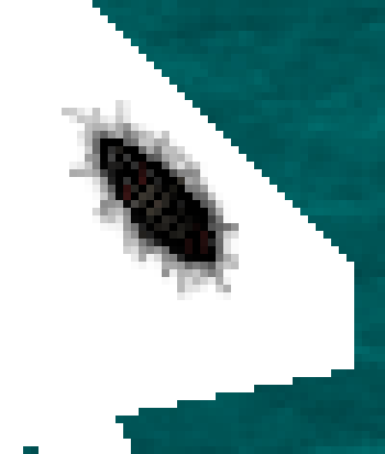
Here's what the finished scar looks like at actual pixel size:
Pretty neat, huh?
[hr]
Thanks to jbadams for suggesting I go ahead and do this! Have a jolly December!

