It demonstrates everything in the game so far: two ragdolls with blue and red braids, two numeric health displays, and a colored circle to represent an impact. The impact circle is bigger depending on the force, and fades to white in a third of a second. A blue circle means that the blue player was damaged, and similarly for a red circle.
I have been basing the color scheme on the Arms animation, which is fine but I think it could be better adapted for my game. Here is an example of an animation which is also very minimalistic, but I think has a nicer style by the way it uses color and sound.
I am also wondering about alternatives to the numbers representing health. I had originally made the braids fade with damage, but that got annoying and it was hard to tell who was ahead. I could put health bars up at the top instead, for example. And there are of course more unique solutions, like changing the background color or something. Let me know what you think.
For example, there could a sunset theme where the stick figures of light and dark battle to keep the sun up or down - hey, good idea! :p
I would really appreciate any advice or suggestions you could give me on how to make the style better. I want this to be the best game that it can be! Thanks! :D
[Edited by - axcho on August 7, 2006 4:37:15 PM]
Advice on art style in my game

Author
Hi. I'm working on a Flash game, and I am trying to figure out a good visual style for it. Right now it is very simple, which is good, but I wonder if it could be improved. Here is a screenshot of the game in action:
It demonstrates everything in the game so far: two ragdolls with blue and red braids, two numeric health displays, and a colored circle to represent an impact. The impact circle is bigger depending on the force, and fades to white in a third of a second. A blue circle means that the blue player was damaged, and similarly for a red circle.
I have been basing the color scheme on the Arms animation, which is fine but I think it could be better adapted for my game. Here is an example of an animation which is also very minimalistic, but I think has a nicer style by the way it uses color and sound.
I am also wondering about alternatives to the numbers representing health. I had originally made the braids fade with damage, but that got annoying and it was hard to tell who was ahead. I could put health bars up at the top instead, for example. And there are of course more unique solutions, like changing the background color or something. Let me know what you think.
For example, there could a sunset theme where the stick figures of light and dark battle to keep the sun up or down - hey, good idea! :p
I would really appreciate any advice or suggestions you could give me on how to make the style better. I want this to be the best game that it can be! Thanks! :D
[Edited by - axcho on August 7, 2006 4:37:15 PM]
The limbless character imply a sort of etheral and continuous motion, in my mind very eastern-like, and not just a punch and kick beat em up.
The braids should be larger and longer, IMO.
Don't forget, though, that a stick game or movie is ONLY about the animation, not the static art. Do whatever type of stick figure you feel most comfortable animating.
The braids should be larger and longer, IMO.
Don't forget, though, that a stick game or movie is ONLY about the animation, not the static art. Do whatever type of stick figure you feel most comfortable animating.
Author
Thanks for replying!
I can make the braids bigger. I'll experiment with that.
Actually both characters have the exact same body shape and number of limbs, they are just distorted by the force of impact in this shot. There is in fact no animation involved - it is all generated by the physics engine.
So I'm not really worried about the stick figures themselves. I am more concerned about the color scheme, layout and graphic effects. For example, I have thought of doing a particle spray to represent impacts, instead of the solid circle. Would that look better?
To respond to your other comment, the motion is very smooth and continuous, though I wouldn't call it "ethereal" yet. Once I get bullet-time working like in Ragdoll Masters, I think that will help give it a smoother feel. Right now it is pretty fast-paced, with the two figures flying around and slamming into each other repeatedly.
Could you elaborate on what "eastern-like" would mean to you in the game? I think that would help me get some ideas.
Author
Okay, some new screens! I've been experimenting with a few styles, which I'll probably release separately as variations of the main game.
Here's the first one, CORONA:

It is based on the thick stick figure style favored in many stick figure animations. The braids are also longer, as requested.
And here's the other, GLOW:

This one is based on the digital painting .pointzero. on deviantART. It has medium-thickness stick figures, with motion blur. I'm thinking of adding little firefly things that float around in the background.
Any comments? I'm pretty proud of these; they look a lot nicer. I've also added bullet time for when you score a hit, so it's pretty cool. :)
Here's the first one, CORONA:
It is based on the thick stick figure style favored in many stick figure animations. The braids are also longer, as requested.
And here's the other, GLOW:
This one is based on the digital painting .pointzero. on deviantART. It has medium-thickness stick figures, with motion blur. I'm thinking of adding little firefly things that float around in the background.
Any comments? I'm pretty proud of these; they look a lot nicer. I've also added bullet time for when you score a hit, so it's pretty cool. :)
I like your colour experimentation, but the figure designs were much more interesting in the first piece.. Those guys, with headbands, rags, stuff dangling would be cool. Coloured dayglow like the street gangs in batman forever..
Author
Thanks. Your reply is one of the most helpful I've had yet, since you gave me some specific ideas (that's not saying much, but I still appreciate it).
Yes, I agree that the figure designs were better in the original. The problem with the new styles is that they obscure the fundamental look that the style is supposed to be based on:

That's supposed to show two poses of the original ragdolls. Try refreshing the image if it is displayed as the first screenshot. It has the same URL, because I renamed a few images, so your browser may have cached it.
Anyway, the figure on the right with the blue braids demonstrates the basic pose I associate with the game. I want the style for the rest of the game to stem from that feel.
Dangling cloth and braids definitely fit the feel I'm going for. I'll consider incorporating more dangling stuff than just the braids, maybe for displaying health? I'll also investigate the style of the street gangs in Batman Forever. Are there any good pictures you could point me to?
Thanks for the feedback. :)
Yes, I agree that the figure designs were better in the original. The problem with the new styles is that they obscure the fundamental look that the style is supposed to be based on:
That's supposed to show two poses of the original ragdolls. Try refreshing the image if it is displayed as the first screenshot. It has the same URL, because I renamed a few images, so your browser may have cached it.
Anyway, the figure on the right with the blue braids demonstrates the basic pose I associate with the game. I want the style for the rest of the game to stem from that feel.
Dangling cloth and braids definitely fit the feel I'm going for. I'll consider incorporating more dangling stuff than just the braids, maybe for displaying health? I'll also investigate the style of the street gangs in Batman Forever. Are there any good pictures you could point me to?
Thanks for the feedback. :)
yeah I couldnt find any pics to illustrate my point, they are guys with chains, braides, rags etc painted in dayglo paint and shown under uv light, so they glow heavily, in various luminous colours. heres a vaguely similar pic: http://www.robosapien.fr/roboraver1_small.jpg
Author
Okay, thanks for the link. It looks kind of like a combination of all the styles.
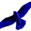
Here's one picture I like that has some nice dangling cloth effects, and a similar feel to what I'm going for in Braids. Coincidentally, it happens to be by the same artist who did that glowy picture I based GLOW on. How does that compare with what you are thinking of?
Here's one picture I like that has some nice dangling cloth effects, and a similar feel to what I'm going for in Braids. Coincidentally, it happens to be by the same artist who did that glowy picture I based GLOW on. How does that compare with what you are thinking of?
This topic is closed to new replies.
Advertisement
Popular Topics

Advertisement