Intro
Due to my belief in learning through self-discovery and my ongoing creative evolution, I've long put off doing any tutorials. However, after making pixel art for over 3 years I've established many solid techniques worth laying out in a concrete fashion. While I'm excited by the prospect of helping others with my experience, I still urge artists to explore things their own way. The wonderful thing about art is the unlimited number of solutions to a problem. I offer you solutions that have worked for me and I hope they work for you, but I will be even more thrilled if you discover a better solution along the way.
When it comes to pixel art, it all starts with a good color palette. Creating a custom color palette can be a very satisfying and powerful way to establish your own unique look. I'll guide you through my method as I create a new palette. But first, let's go over some basic principals.
It's all about HSB
I find it easiest to understand and control color through HSB.
Hue - The actual color (0 - 360º)
Saturation - The intensity or purity of a color (0 - 100%)
Brightness - The amount of black or white mixed with a color (0 - 100%)
By understanding and adjusting these 3 fundamental properties you can create custom colors with precise control. I recommend this article by Steven Bradley for more detailed definitions of HSB.
Color Ramps
A color ramp is a specific range of colors that work well together, arranged according to brightness. Here is an example of what I consider a good color ramp.

Brightness steadily increases from left to right in this example. As the colors reach high brightness levels it's important to decrease saturation, or you'll end up with intense eye burning colors. Also, colors with very low brightness can become overly rich and weighty with high saturation. Saturation peaks in the middle swatch in this example.
A good color ramp should also apply hue-shifting, which is a transition in hue across the color ramp. In the previous example the hue is shifting by positive degrees as the brightness increases.
Many beginners overlook hue-shifting and end up with 'straight ramps' that only transition brightness and saturation. There is no law that says you can't do this but the resulting colors will lack interest and be difficult to harmonize with ramps of a different hue. This only makes sense to me if you want a monochromatic look and stick to one straight ramp.
The Palette
A color ramp is essentially a palette, but most palettes contain multiple ramps. I like to create large palettes with lots of ramps, which I can then pull smaller palettes from per assignment.
Mondo - 128 colors

Become a Pixel Insider member and download Mondo
I took the opportunity to make a brand new palette for this tutorial. My intention was to create a general purpose palette that strikes a balance between vibrant colors and desaturated natural colors. So, how to make such a large palette?
First I decide how many swatches I want per ramp and how many degrees of hue shift. For this palette I want 9 swatches per ramp with 20 degrees of positive hue shift between each swatch. I like a lot of hue shift because it creates harmony between ramps and just looks neat, but 20 is about as high as I go.
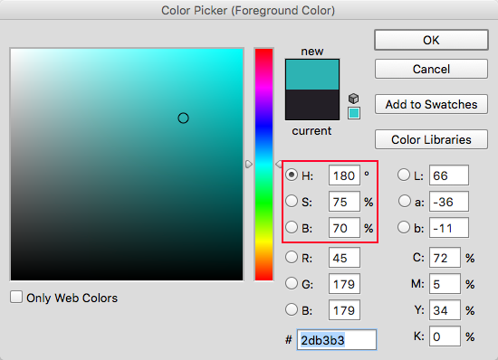
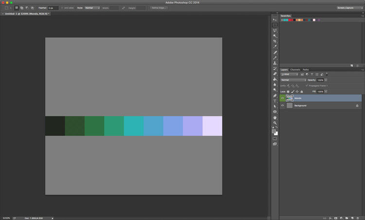
The color picker panel in Photoshop. We only need to be concerned with adjusting HSB.
I use Photoshop, but a similar color picker panel should be accessible in just about any graphics software. To start I pick a color that will fit right in the the middle of a ramp. The hue is somewhat arbitrary, but the saturation and brightness is critical. I want the middle color to be be the most vibrant so I set the saturation and hue to the max combined number I'm willing to go.
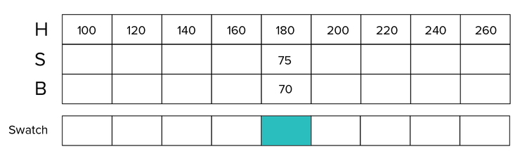
After I've chosen my first color I can set the hue for the remaining swatches based on the positive 20 degree shift I wanted. I could reverse the direction of hue shift if I want but positive hue shift usually results in more natural colors, warming as they become brighter.
I still need to sort out the increments for S&B. Unlike hue, shifting the S&B in uniform increments doesn't necessarily produce satisfactory results. However, there are a few tendencies I follow. Brightness consistently increases from left to right and usually never starts at 0, unless I want black. Saturation peaks around the middle and never fully goes to 100, or 0. The goal in mind is to create even contrast between each color.

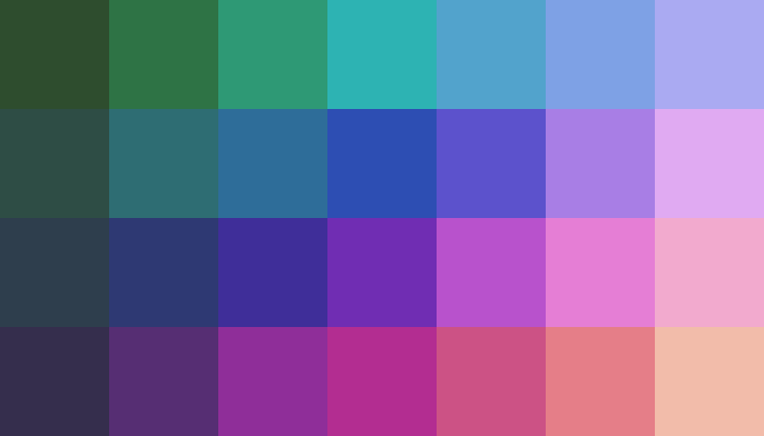
After some tuning and eyeballing these are my final values and resulting color ramp. The hue shift looks pretty strong but it will make sense when I add more ramps.
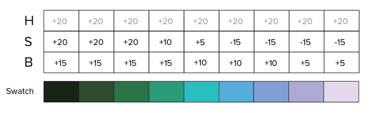
This version shows the difference in the increments. Pay attention to what the S&B are doing. You can see there is some consistency in the pattern. The saturation takes larger steps on the ends and smaller steps in the middle where it's the highest percentage. The brightness takes smaller steps as it gets closer to the end at full 100%.
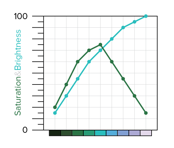
Here's another visualization that clearly shows the flow of S&B as line graphs. You don't have to follow this general flow of S&B. It just depends what look you're going for. I've made ramps where the saturation continues to climb as the brightness decreases, creating an X pattern. This results in vivid dark colors. The biggest mistake is combining high saturation and brightness, unless you want to burn some eyeballs. I recommend a lot of experimentation with the HSB values of your ramp. I've tried to come up with mathematically precise formulas but it always seems to come down to trusting the eyeballs to some extent.
Now let's finish the palette.
Up to this point all I have been doing is picking colors and drawing them as single pixel dots on a tiny canvas. I haven't actually added any swatches into the swatch panel. With the first ramp established all I have to do to create more ramps for my palette is shift the entire set of hues.
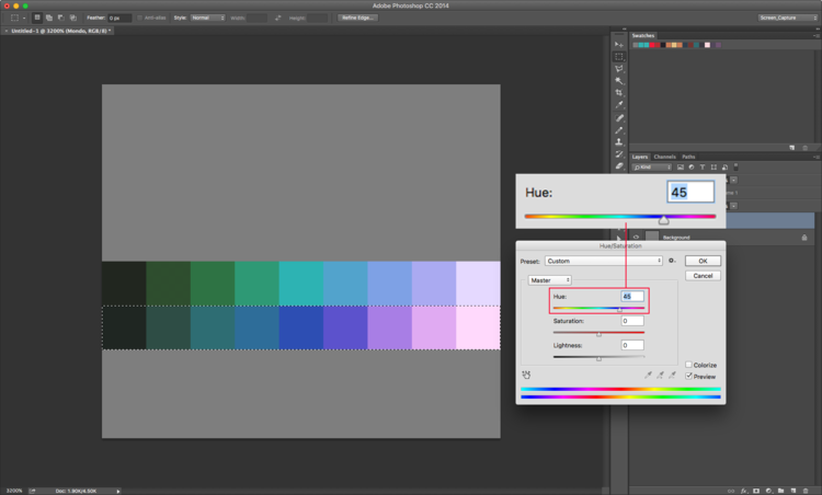
I want 8 ramps total so I will shift the hues of each ramp by 45 degrees to complete the 360 degree cycle around the color wheel. I could do this in the color picker by adjusting the H value one color at a time, but In Photoshop I can save a lot of time by duplicating the ramp and changing the hue of the entire selection (Image-Adjustments-hue/saturation, or ⌘+U).
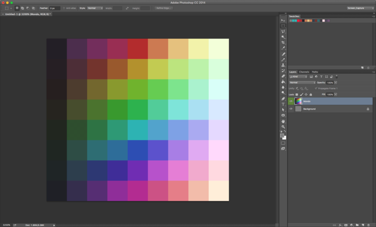
After adjusting the hue of all my color ramps my palette appears like this. It looks pretty nice but It's lacking more neutral desaturated colors.
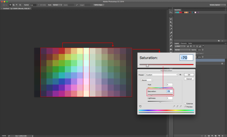
To add desaturated colors I duplicate the whole middle section of the palette, omitting only the darkest and lightest colors on the ends, flip it over and desaturate them with the Hue/Saturation panel. I omit the light and dark columns because they appear nearly the same as the originals. I flip the colors because it makes for easy navigation, and it looks cool. The desaturated colors can provide a more natural look, and work well as grays in combination with the vibrant colors.
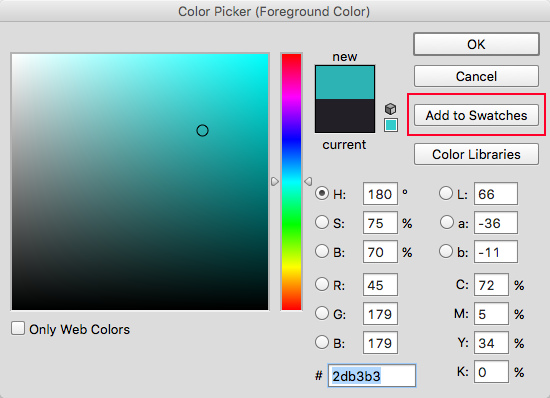
The final task is actually adding the colors into the swatch panel. With the color picker panel open I sample each color with the eyedropper and click the 'Add to Swatches' button. I add them from left to right, top to bottom so they will appear in the swatch panel in the correct order. This is quite tedious but the only way I know of to add the colors in the particular order I want.
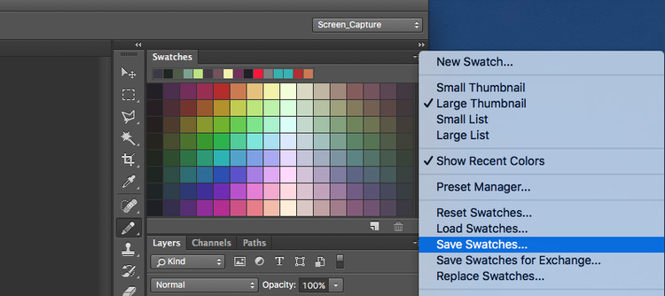
Once I've added all the colors into the swatch panel I click on the panel options and make sure to save my palette. I can then easily load the palette as a .aco file into the swatch panel anytime. Also, by selecting 'Save Swatches for Exchange' you can create a .ase file, which can be loaded into several other Adobe programs. Save the image of your palette as a .png file and you can load it into Aseprite.
Well, that completes my 128 color palette - Mondo. Now let's look at how I use the palette with some examples.
Picking Colors
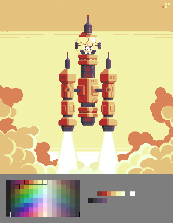
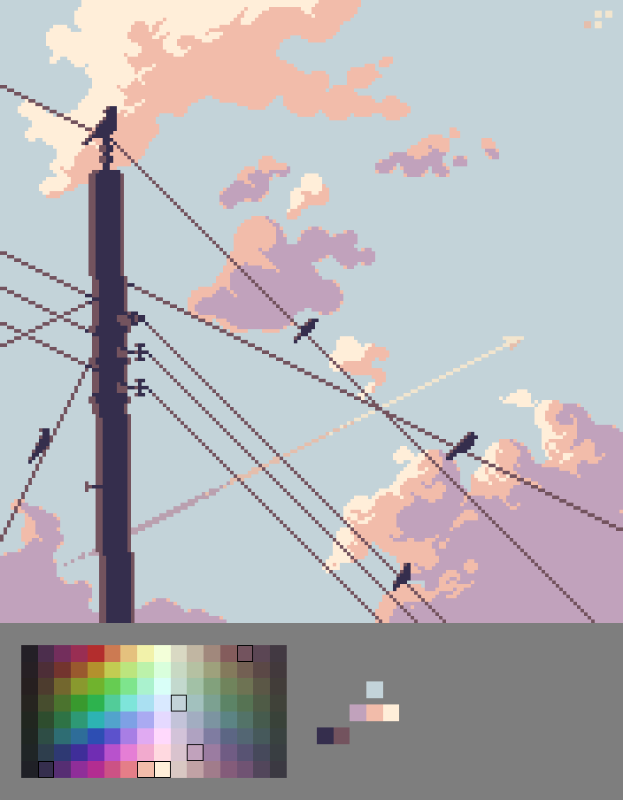
This example keeps it pretty simple, mostly relying on horizontal ramps of adjacent colors. You can also see how the warm desaturated colors work nicely with the vivid hues. I've added white into palette for extra contrast.
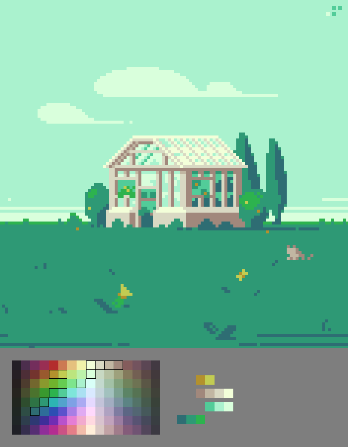
This example shows how ramps can move horizontally and diagonally. Because of the hue shift every color is surrounded by colors that can work together.
Harmony is everywhere, just pick and play!
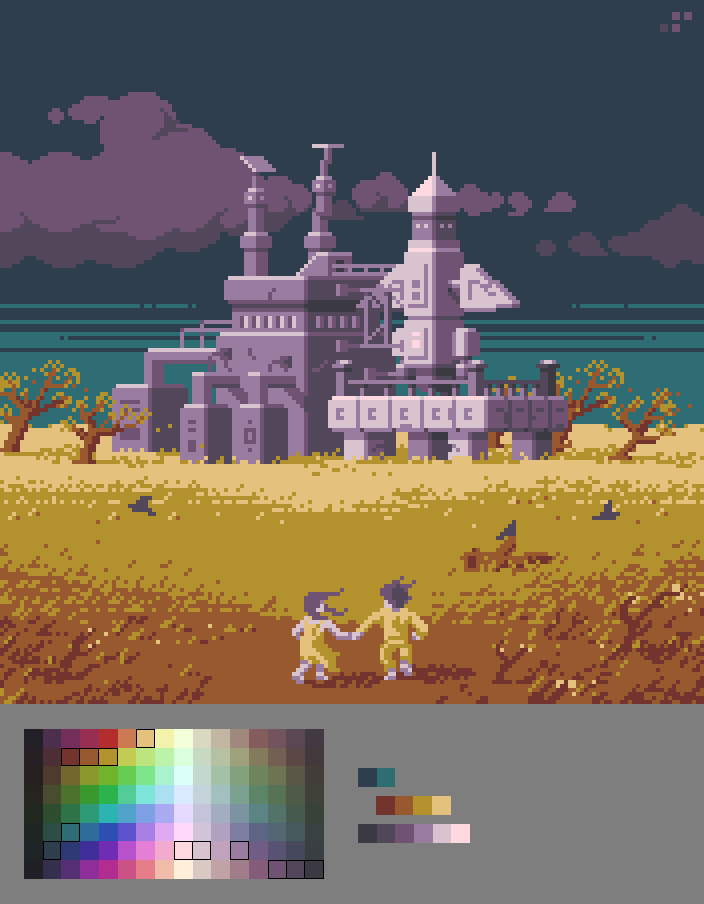
This example uses complimentary color in combination with neutrals. The result captures an ominous yet hopeful feeling that perfectly fits the mood I wanted.
Picking colors for your art always requires some good sense, but a versatile palette with criss-crossing ramps like this makes it much easier. A little color goes a long way with pixel art, as you can see I never use a lot of colors for any one image.
Creating a palette with this method also works great for game art, and will ensure everything in your game has consistent colors. I used this method to create a 160 color palette for Thyrian Defenders. We've been able to depict an incredible range of environments and characters while maintaining a consistent look overall. Other aesthetic choices come into play, but color is the fundamental ingredient that ties everything together.
Final Word
Overall I'm quite happy with how this palette turned out. I think you'll be seeing more of my work in the Mondo palette from now on!
I hope this helps you come up with some palettes of your own. I know It can take a bit of time to get a feel for HSB, but even if you're a beginner I think making palettes like this is a great way to understand color. Go crazy with HSB and don't be afraid to experiment with formulas that look different than my example. Also, you don't have to make such a large palette. Start with trying to make a small ramp.
About The Author
Raymond Schlitter (Slynyrd) is a former graphic designer who turned his creative passion to pixel art and game design in early 2015. Now he shares his knowledge with tutorials while he continues to make fantastic art and work on games. Support him on Patreon and get the inside scoop on his latest work.
Note: This post was originally published on Raymond's blog, and is reproduced here with kind permission from the author. If you enjoyed this article please consider supporting Raymond on Patreon, where he provides backers with exclusive downloads such the Mondo palette as .aco, .ase, and .png files. Get Mondo! You can also make a one time donation to the author if you prefer not to subscribe on Patreon.


Great guide!
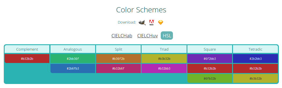
I want to share this web page in case you didn't know it: https://encycolorpedia.com/
Is a great web page with a big amount of info about a single color. One of then are "Color Schemes" it can help building a color palette too.
And you can download the color scheme.
Example of #2bb3b3: