Shadows & Ocean Sky-box

posted in the game for project unirule
Published February 03, 2019
Advertisement

Hello GameDev,

This blog entry will cover new visual features added to the project. 
They are in no particular order:
- Shadows
- A reflective ocean sky-box
- Vertex color noise for vegetation.
- Preliminary client GUI


But before I get to that I'd like to mention that I'm still plugging away on dynamic assets.
If you haven't had a chance to check out that blog you can view it here


I decided to spice up the look of the project.  I thought it needed more juice, more oomph.  It's been over a year since I've done anything visually significant. 
I am limited with what I can do but I enjoy working within those boundaries. 

Shadows
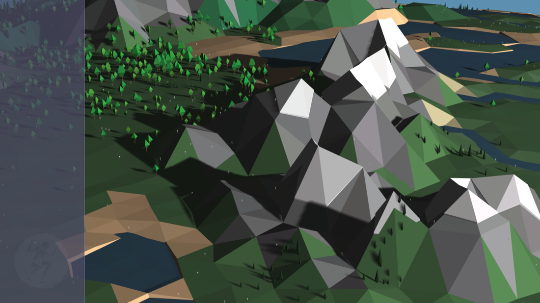
A common observation that people would make about the look of the simulin was that it appeared as though they floated above the ground ( because there were no shadows ).  I've toyed with Three.js shadows before but was never fully satisfied with the result.  In a way I kinda think the Three.js shadows betrayed the visual look of the project; however, I certainly don't want people to be under the impression the simulin are floating.

The problem I had was the shadow map size needed was too large.  The fps dropped.  My approach to resolve this issue is to update the shadow map's position relative to the camera's.  This way the shadow map size can be reduced to a level that doesn't hinder performance. 
For a more thorough explanation:

Spoiler

The directional light positioned is set to ( 0 , 0 , 10 )
A normal of the light's position is obtained and used as as a reference plane called shadowPosition.
The ray is caste from the screen's center ( 0,0 ) towards the globe.  The point obtained by the ray is then projected onto the reference plane.
The position of the shadow map for the directional light is updated to the projected point. 


let quickPosition = intersects[0].point.clone();
quickPosition.projectOnPlane( light.shadowPosition );

light.shadow.camera.bottom = quickPosition.y - camera._shadowDetail;
light.shadow.camera.left = quickPosition.x - camera._shadowDetail;
light.shadow.camera.right = quickPosition.x + camera._shadowDetail;
light.shadow.camera.top = quickPosition.y + camera._shadowDetail;

Then three.js will recalculate the shadow map via


light.shadow.camera.updateProjectionMatrix();

And voila!

2030496883_Screenshotfrom2019-02-0313-04-36.thumb.png.5b6e99cbad54c9d10b1d238d4917a6e8.png


Ocean Sky-box
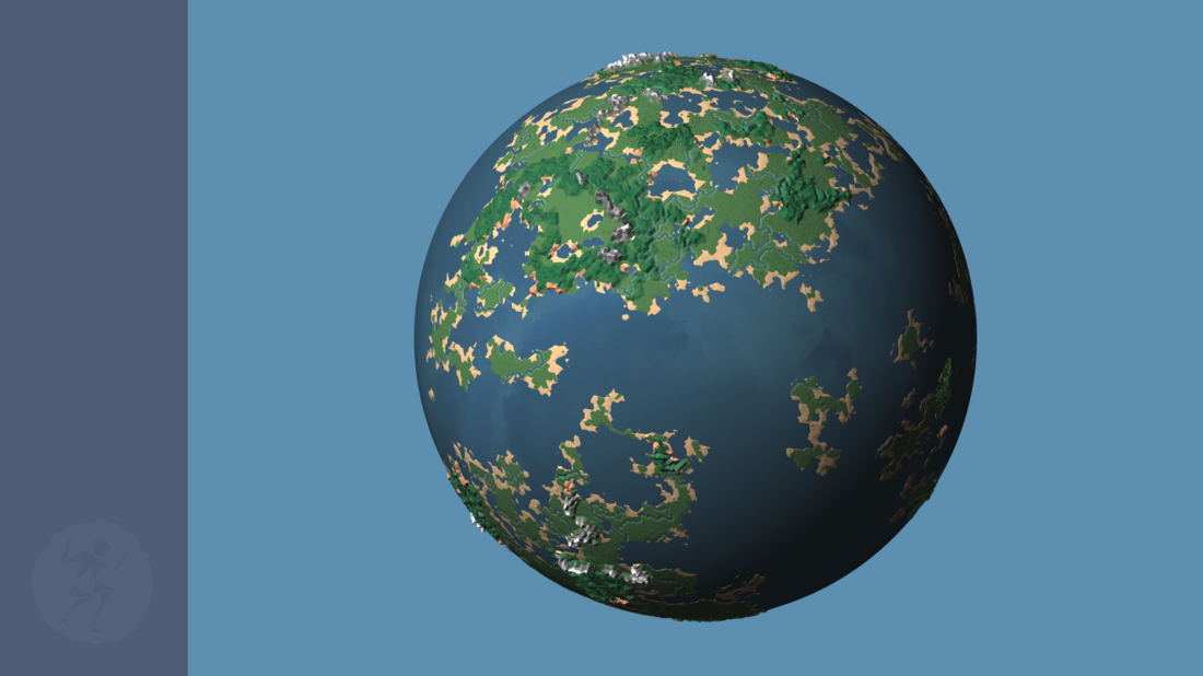
After I added shadows to the world I noticed that the water was look pretty flat.  It just didn't pop.  I quickly scrapped together squarish looking clouds and made a sky box for the ocean.  All a did was snag a sky-box texture off google and used a filter to pixelate the image with large overlapping pixels.   The ocean looks way better now.


Color Noise for Vegetation
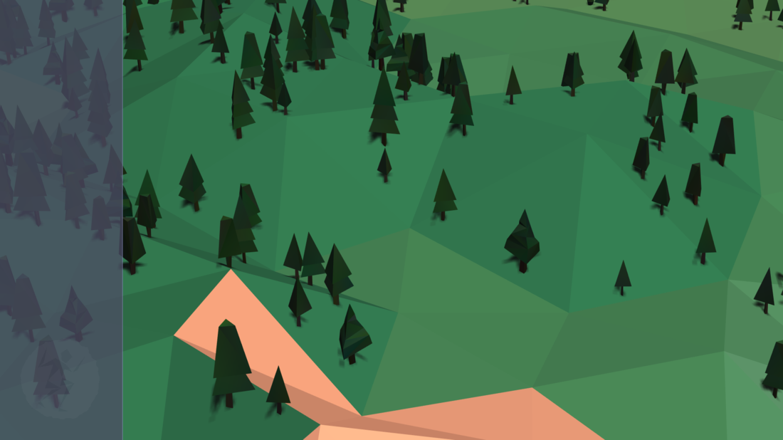
Aaand the vegetation seemed boring.  Seeing as all the models were made with the same color palette I decided to spice up each tree by slightly adjusting the RBG color channel for each vertices.  This happens on the client side and so each time the game loads so do the slight color variations.  It gives subtle character to the vegetation.
1766571585_Screenshotfrom2019-02-0313-14-38.thumb.png.07f8dca4088dd7198e3220b06f4cd5c5.png

Preliminary GUI
I offset the center of the world to the right of the screen to make way for a left menu GUI.  This GUI will hold information that is most important and crucial to winning.  I already know of the first and most important thing that will be displayed, but I'll talk more about that in later blog. ( On a side note: I'm always conflicted as to what to write about in my blogs.  A part of me wants to wait to unveil certain things, and another part of me is like who cares, just put it out there ).
58951719_Screenshotfrom2019-02-0312-39-30.thumb.png.74b8337d314d440e77d3beb2e39a9bb7.png

Final note about the performance.  
The world build I am demonstrating in this blog is home to about 30,000 individual trees and 10,000 simulin.  When a user registers they can select their own shadow and ocean quality settings before the world is loaded.  This allows for each user to achieve the best possible performance/look for their system.

On my system:
The simulation server uses ~2 Gb of ram
The data server uses ~750 Mb of ram
With the highest quality settings Chrome uses ~750 Mb of ram at ~60 fps.

While writing this blog I have a game session open to take screen shots and am also trying to record my desktop and I think that's maxed out my system.  So the videos I'm recording are choppy.   I'm gonna try to close out this blog and try recording again.  If the chop goes I'll post the results.  I might also change the shadows so the land doesn't cast shadows.

edit: as soon as I start record my desktop the fps drop to ~40 , ahh well, here's the video anyways.

 In the past I've reached out the members of this community for critique and feedback and that has always worked out handsomely.  So please, if you see anything that you think might look better if done differently, please don't hesitate to mention it.
3 likes 0 comments

Comments

cowcow

That's #*@!in cool, man!

February 03, 2019 08:01 PM
Rutin

I really like the shadows. :) Good idea for the ocean as well.

February 03, 2019 08:06 PM
Septopus

Wow!  Nice work man!  I might suggest adding some color variation/noise to the terrain as well, looks great on the trees.  Unless you have texture plans for that down the road.  Looking good!

Edit: took a closer look, are you already doing that, varying the terrain colors or is that shadows? 

February 03, 2019 08:06 PM
Awoken
30 minutes ago, Septopus said:

took a closer look, are you already doing that, varying the terrain colors or is that shadows? 

Yes there is, very subtle though.

@Septopus, I'm trying to figure out a way to include uv's.  I've played around with them but haven't come up with anything yet.  Instead of using straight textures I'm toying with using them in combination with face colors.  I'm going to start doing that with the assets.  Make the rock look more like rock, marble look like marble is what I'm thinking...


February 03, 2019 08:17 PM
JoeJ

Looks nice. But for me the contrast of light / shadow is a bit too high, and in case multiple faces are in shadow, all of them have the same shade which gives a flat look (meaning 'flat' in a way not intended here, in contrast to the low poly look).

So i would make the ambient more dynamic. I have an image to show what i mean:

shade.JPG.b55dc48de605e7aa51e9a9282e020d82.JPG

I only use this for debug visuals so it's ugly, but just to show even in shadow there always is some variance in shade.

So some kind of fake bounce light, working by utilizing full dot product, not just the positive side.

My code is this, but you surely want to do better:

    static float Light (const vec &normal)
    {
        vec lightDir = vec(1,-2,-1).Unit();
        float d = lightDir.Dot( normal );
        if (d>=0) d*=d;
        else d = -sqrt(-d);
        return pow(d * 0.5f + 0.5f, 2.2f);
    }
 

Another thing i would try is to make a mix of flat triangle normal with a bit of smooth vertex normals, so it still looks flat and low poly, but maybe a bit better.

The overall tone of the image is a bit too blue for me, which gives it a sad feeling. You might want to make the colors warmer. This is not just about tone mapping, you could even do things like making shadow of sand not yellow -> black, but yellow->red->black. This works for every color and is often used to get very clean, saturated, even childish images, good for something like an App Icon for a typical iPhone game. Doing it decently would give a more optimistic feeling with populating your world i think. (The same happens in nature with day night cycle: bright day: yellow and orange, sunset: red, night: blue, or in Hollywood movies with typical orange light and blue shadows.)


February 03, 2019 09:48 PM
Septopus
1 hour ago, Awoken said:

@Septopus, I'm trying to figure out a way to include uv's.  I've played around with them but haven't come up with anything yet.  Instead of using straight textures I'm toying with using them in combination with face colors.  I'm going to start doing that with the assets.  Make the rock look more like rock, marble look like marble is what I'm thinking...

Hmm, I guess I didn't realize you could do things like that with UVs..  Does this method/process have a name or are you just talking about using the UV data for a homebrew method?  ;)

February 03, 2019 10:15 PM
Awoken
2 hours ago, Septopus said:

Hmm, I guess I didn't realize you could do things like that with UVs..  Does this method/process have a name or are you just talking about using the UV data for a homebrew method?

Um... I'm not exactly sure... hahaha
Here is a screen shot of one of my experiments with uv's and face colors.
57576513_Screenshotfrom2019-02-0317-56-00.thumb.png.6b6785baf8d3fec5cea74aed27e91dbc.png I'm using whatever three.js allows.  So I suppose it's a combination of various shaders three.js supports?
What three.js allows for are vertex colors, face colors and uv's.  I believe the uv coordinates of a particular image are blended with either the vertex colors or face colors.  In my project the terrain uses face colors and the vegetation use vertex colors.  I can apply uv coordinates and load an image to reference for each material if I'd like but I haven't come up with anything that adds to the visual effect.  So I'm thinking of using the uv's sparingly or else it may over-complicate the look fast.  I guess I kinda am thinking of using a uv map as a texture map as a normal map if that makes any sense.  hmmm.... now that I think about it maybe I should use a normal map.  To me I think 'normal map? too complicated, this combo of stuff works'. :) 

2 hours ago, JoeJ said:

So i would make the ambient more dynamic. I have an image to show what i mean:

Right now I rely on what is under the hood so to say, what three.js supports with its latest build.  I assume what you're referring to here has to do with shader code, is that right?  I played with shaders before and I found them very complicated, I'll admit I haven't delved too much.  For me there seems a huge disconnect in my understand of shaders and a desired effect I have ( I don't know how to make good shaders ).  But your example would be a good starting base for me for sure.  I agree the shadows look flat.  That was part of the reason why I left them out because they seem an afterthought really.  three.js projects don't use a lot of shadows.  I think this is because they had to choose between game developers and artists.  In the end there are more artists using the API and so they specialised in that direction.

2 hours ago, JoeJ said:

Another thing i would try is to make a mix of flat triangle normal with a bit of smooth vertex normals, so it still looks flat and low poly, but maybe a bit better.

I like it.  Now I just got to figure out how to do that.

2 hours ago, JoeJ said:

The overall tone of the image is a bit too blue for me, which gives it a sad feeling. You might want to make the colors warmer. This is not just about tone mapping

This is very interesting and helpful.  I agree the blue is sad for sure. huh... Do you have a recommendation for colors for the background sky and the left GUI bar?

February 04, 2019 12:21 AM
JoeJ
5 hours ago, Awoken said:

I assume what you're referring to here has to do with shader code, is that right?  I played with shaders before and I found them very complicated

You could do it with two lights from opposite directions, so white light, grey ambient, darker gray backlight.

Or, for the 'tone mapping': Yellowish light, reddish ambient, blueish backlight.

I assume the backlight shall not differ too much from the ambient, otherwise the planet looking from the night side may look strange... never tried myself. Likely the coloring of the lighting will end up subtle, just enough to get rid of the blue tint. With shaders you would have control how to map the dot product to brightness, but that's not so important i guess.

For the GUI bar it is very hard to make a recommendation, does not look bad. But if you look at image in the middle with full planet zoomed out, the GUI color shows disagreement with the color of water (both colors are similar but slightly different in hue, which often looks bad also here, especially because the hue of sky goes in the other direction). So, as an artist i would use a color picker and try colors from the ocean for the bar so they match (may be more boring, but less contradicting). Green might work too, but i guess blue is fine.


shade.JPG

February 04, 2019 06:17 AM
You must log in to join the conversation.
Don't have a GameDev.net account? Sign up!
Profile
Author
Advertisement
Advertisement