Welcome to the ninth Dev diary of Project Taival!
Today's topic is Menu graphics. For the last week, I have been planning and doing Menus for the test version of the game, so it is easier to quit than always having to resort to Windows task manager. The first menu I started designing though, is the Start Menu.
Today's Menu
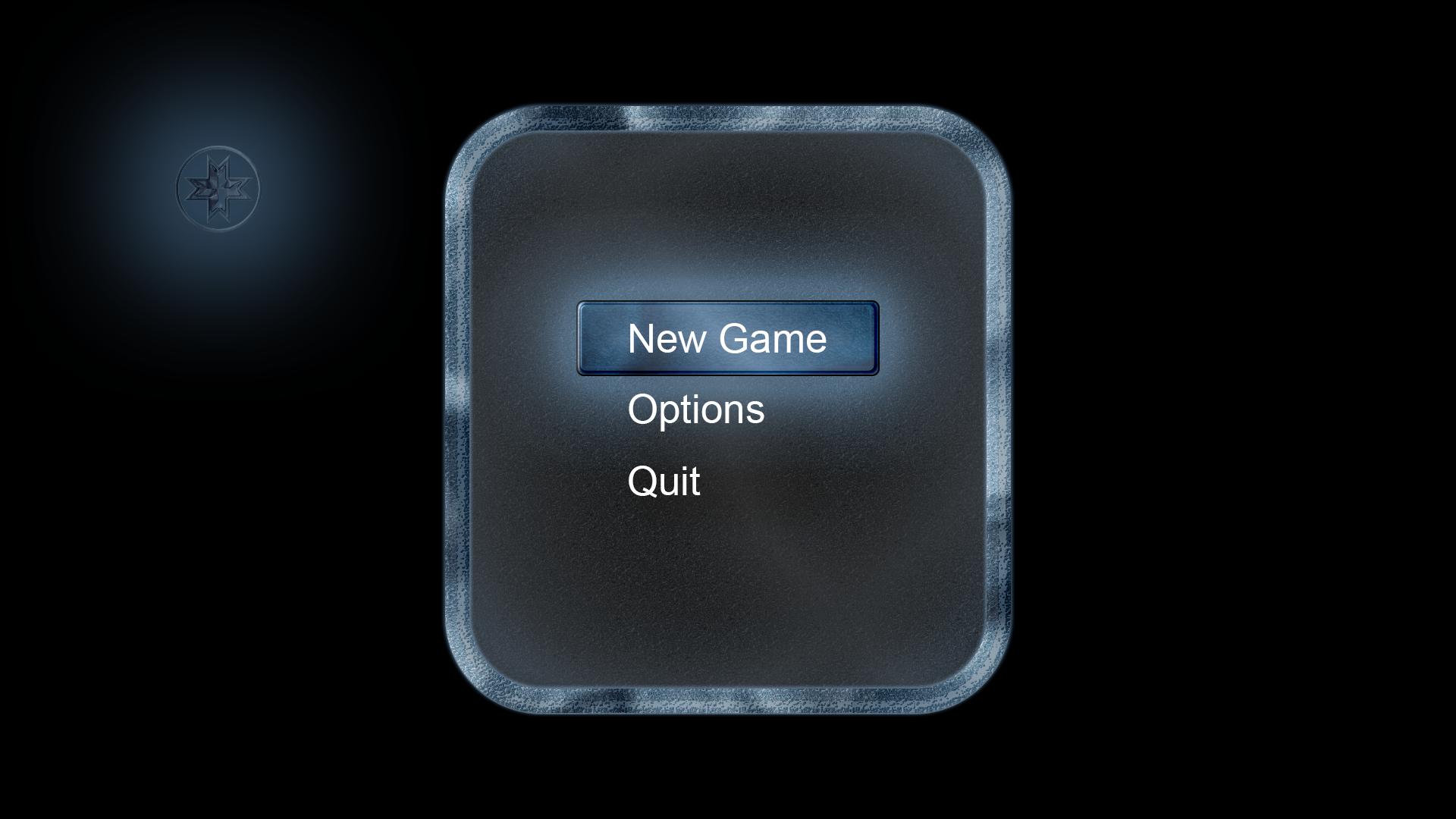
As you can see, I try to keep the Ice as a theme here also. I used the same layer effects here as in the latest Preview of the Intro Video and fidled with the settings a bit. I'm quite pleased about the direction this is going, but still, it is too clean at this stage. Hence, I started adding more details - and this is where most of the time in the design work sank; Icicles and snow.
While making the icicles, I managed to get some detail to the side of the panels, but It still feels a bit off. What I'm thinking now is, that I need to do the detail layer a little thicker than the original borders of the menu window. I'm also wondering how frequent the icicles should be, as the current settings seems quite much, even though in real life this many would be plausible. If anyone has suggestions on how to create realistic icicle settings, feel free to educate me a bit ![]() All the constructive criticism is welcome.
All the constructive criticism is welcome.

As for the snow, it is a bit tricky to make it look as realistic as possible - for a novice, at least. I tried searching for tutorials how to make realistic snow, but all google suggested was how to make realistic snow fall effect in Photoshop. Since all the effects will be done either in a 3D software, like Blender, or with a video editing software like After Effects, I will also try making this menu entirely out of 3D assets and texturing at a later point.
But back to the issue here; the snow. I haven't found the proper settings from the layer options to make the snow look more realistic and currently is looks like a thick mist. I was wondering last night though, after I stopped working in it (around 5 in the morning - yes, no wonder my sense of setting fidling dimmed out), that maybe I should try changing the internal shadowing and change the lighting directions of all the used effects, like I tried to do in the logo sample in the first picture, to make it darker and bring more details out from all sides.
What do you think of the looks of this Menu theme? Does it speak to you, as of a unusually cold winter is coming? What would you change about it to bring this message through to people more thoroughly? feel free to comment on and suggest anything you would feel would bring the message, that the theme of this game tries to convey, more thoroughly to as many people as possible All constructive feedback is welcome. I honestly wouldn't have gotten even this far without all the online resources available these days, but the only thing that is still missing, is feedback from people that I don't know.
Thank you for tuning in again for the Project Taival Dev Diary, and I hope to see you on the next one ![]()
Here is a link to the Preview Intro history video, that premiered on Thursday last week (28th of February);